There is a sad beauty in these artworks drawing the tragedy of war.
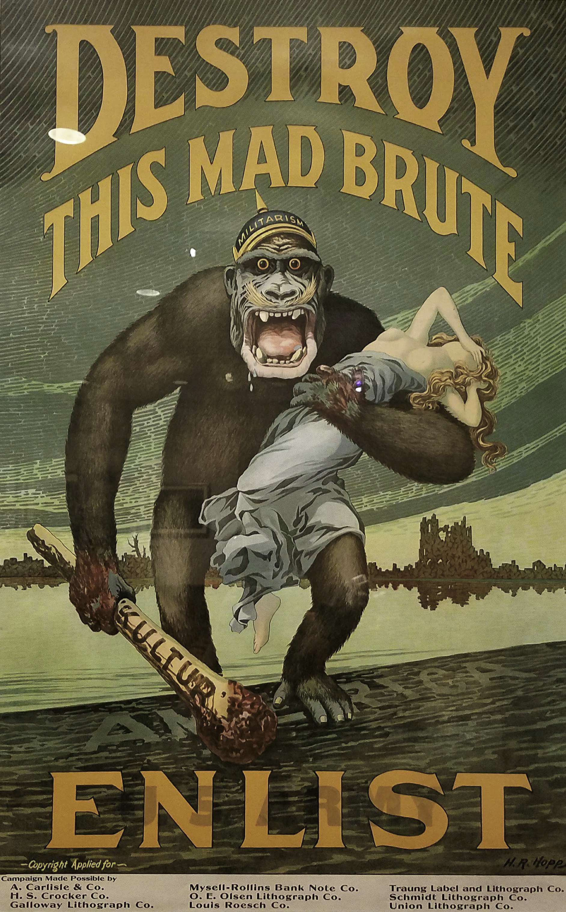 Harry R. Hopps (1869-1937)
Destroy This Mad Brute-Enlist, 1917
Colour lithograph
 French, early 20th century
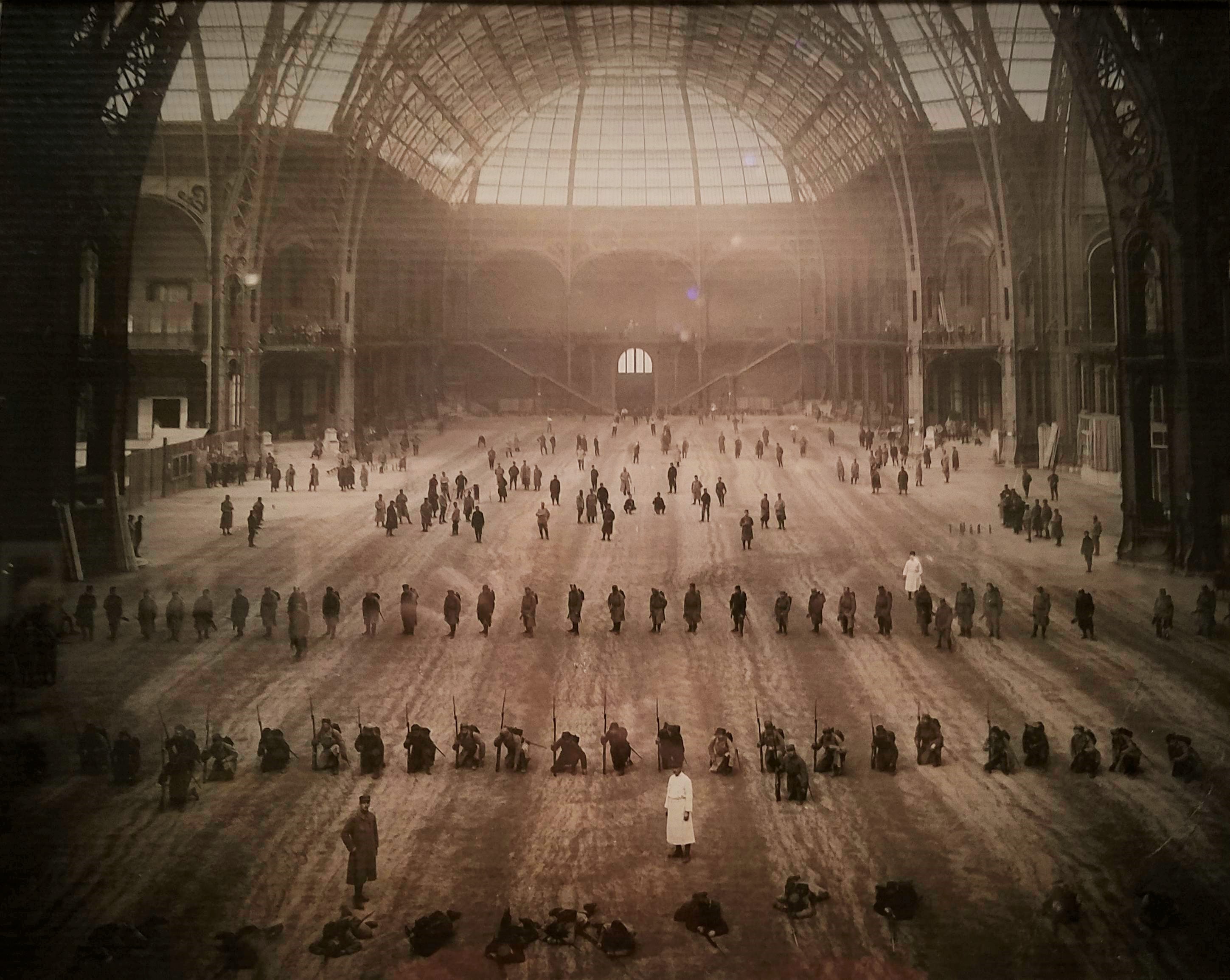
The Great Nave: Wounded Soldiers Performing Arms Drill at the End of Their Medical Treatment, 1916
Gelatin silver print
During WWI, Paris’ magnificent Grand Palais, a Beaux-Arts structure that opened in 1900 as an exhibition hall, was repurposed as a temporary military hospital that served injured French soldiers. It held one thousand beds and had two operating rooms, as well as an extensive physical rehabilitation centre where soldiers could recover from their injuries, exercise and practice military drills before returning to the front.
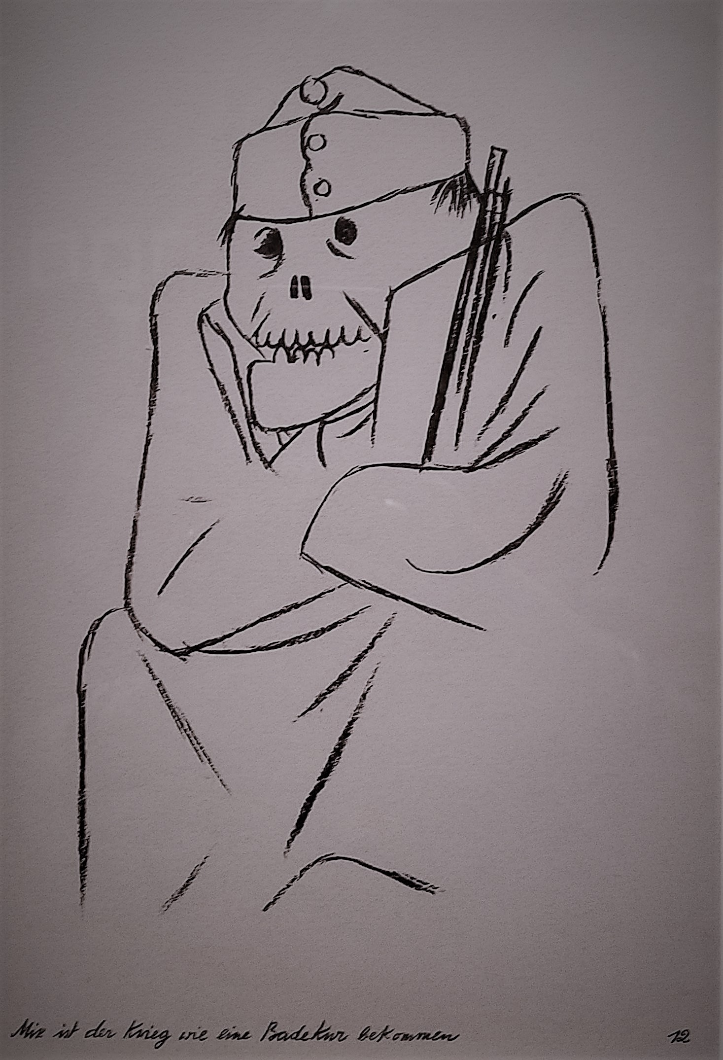
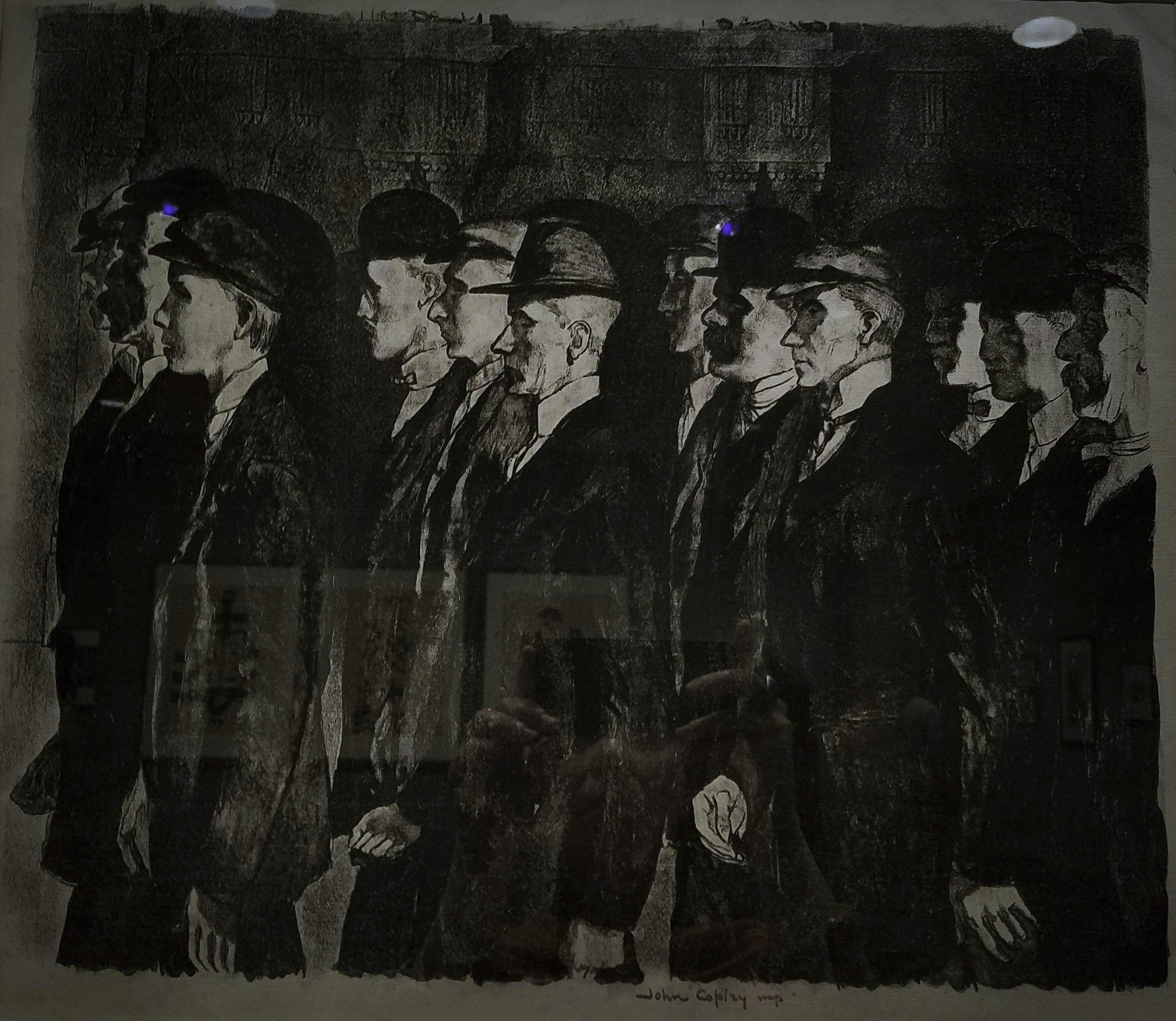 John Copley (1875-1950)
Recruits, 1915
Lithograph
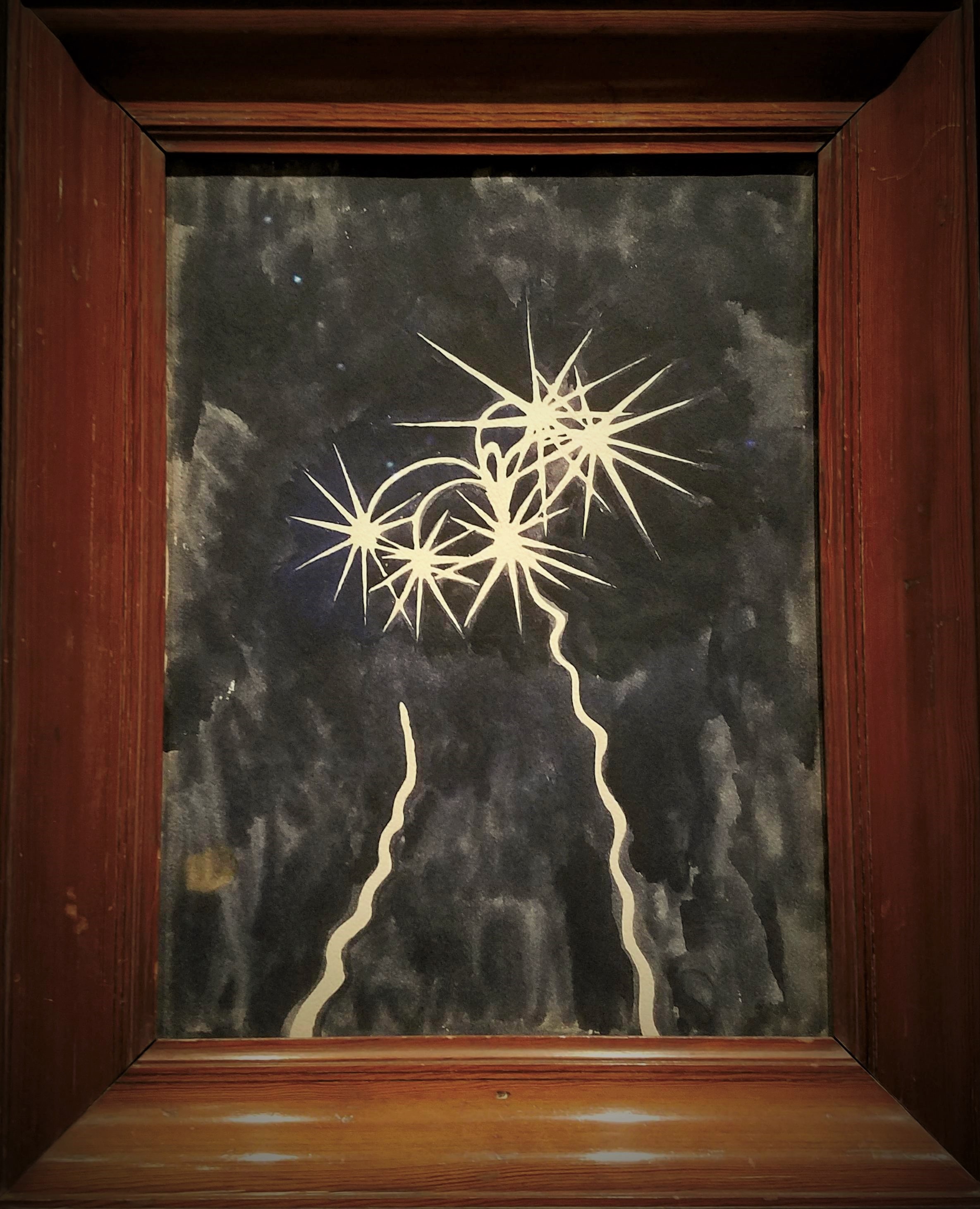 Léon Spilliaert (1881-1946)
Rockets, 1917
Watercolour, gouache, graphite
Spilliaert served briefly in the Belgian civil guard after the German invasion. A pacifist by nature, he was greatly affected by the violence of war. Here, he depicts a deep blue sky illuminated by the flare of rockets, an image witnessed by both soldiers and civilians in occupied territories. The artist concentrated not on the rockets’ violent potential but on the graceful forms they generate and their resemblance to stars and comets.
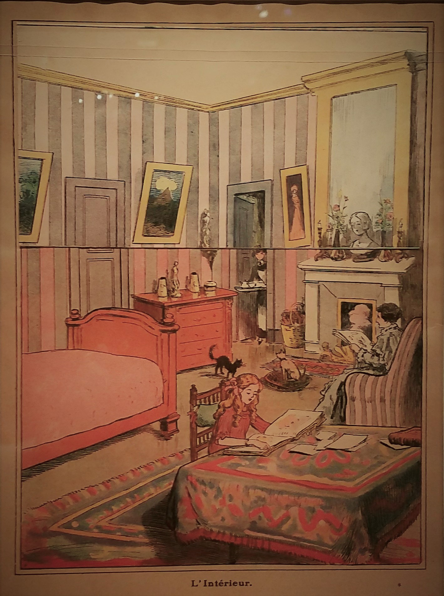
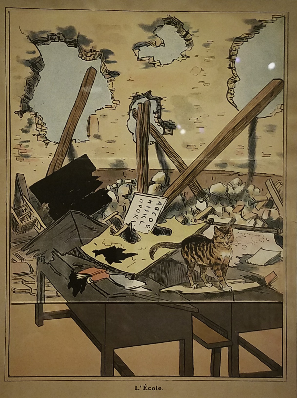 French, 20th century
After the Victory (Au Lendemain de la Victoire), 1918
Printed by Imprimerie Kapp
Published by Librairie Hachette & Co.
Colour lithograph
Many children lost loved ones to the war and were traumatized by the sounds and sights of combat. Ostensibly, celebrating victory, this book, like much wartime propaganda for children, reflects these dark events. Its interior presents images of rebuilding: each page shows a scene of destruction, but when a flap is raised, it shows the same site restored.
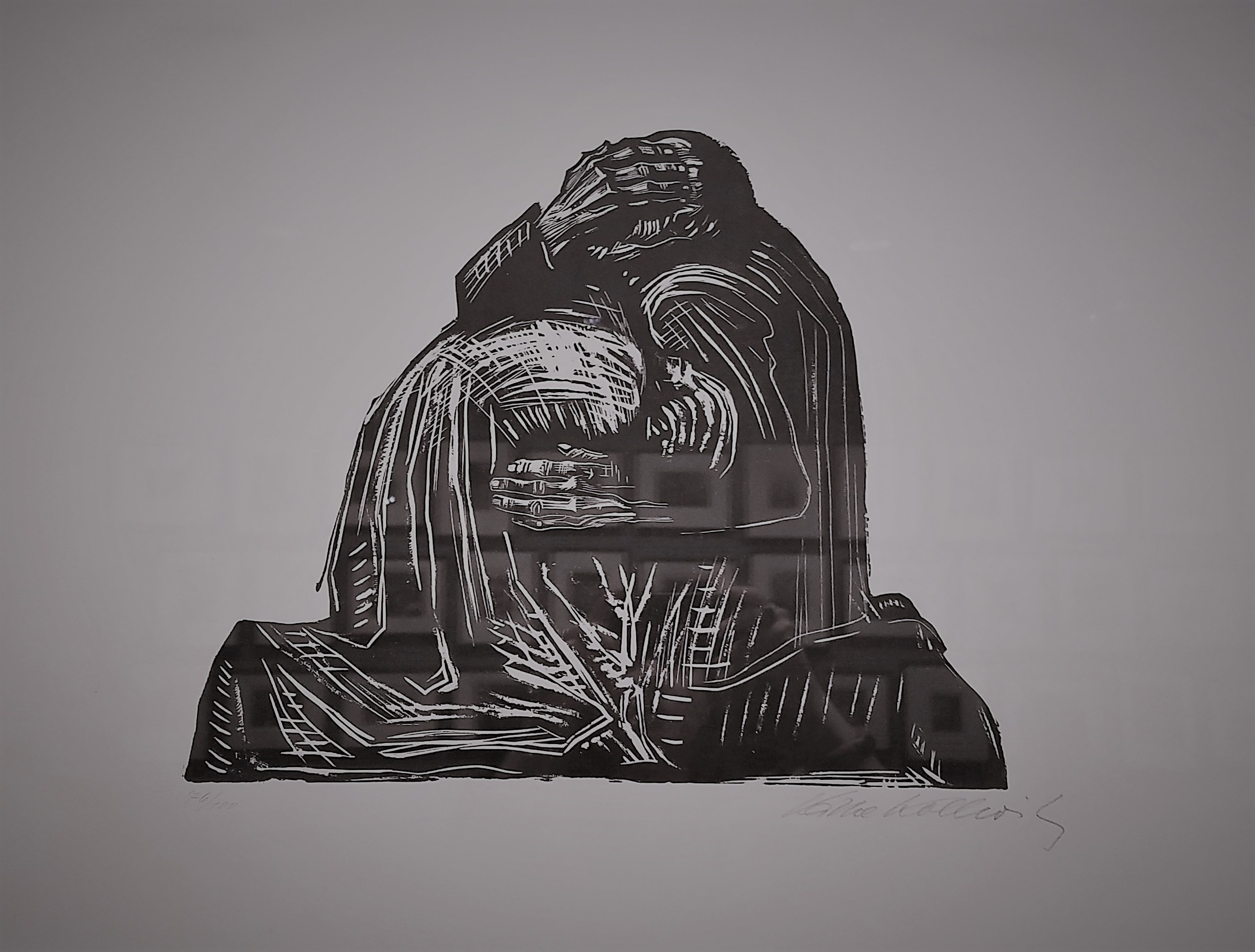 Käthe Kollwitz (1867-1945)
The Parents (Die Eltern), from War (Krieg), 1921-22
Printed by Fritz Voigt, Berlin
Woodcut
”Pain,” Kollwitz noted, ”is totally dark.” This raw images portrays the profound grief of parents who, like the artist, lost a child to war. Kollwitz began working in this medium after seeing an exhibition of woodcuts by Ernst Barlach and being inspired by their graphic power; the War series is considered her most important in the technique. Kollwitz spent fifteen years working on a sculpture based on this print. The Grieving Parents, located in the cemetery for German soldiers in western Belgium where her son Peter is buried, is composed of two separate sculptures, showing the parents isolated in their despair.
 George Grosz (1893-1959)
Background (Hintergrund), 1928
3 out of 17 photolithographs with printed portfolio
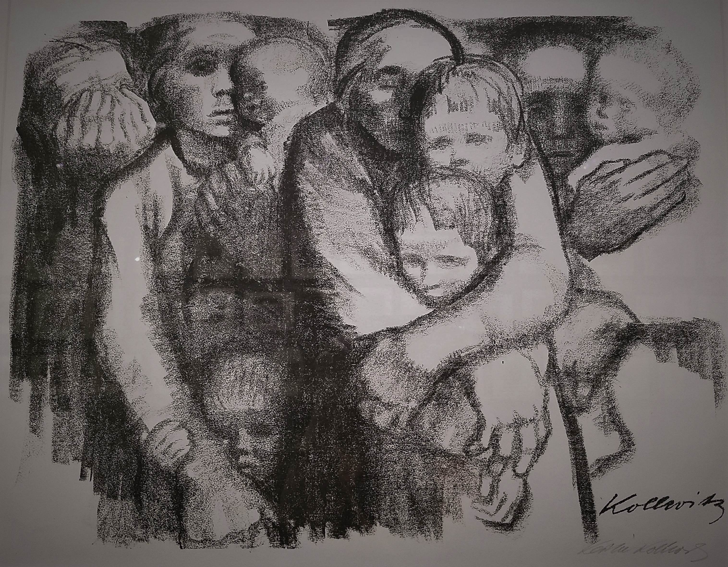 Käthe Kollwitz (1867-1945)
Mothers (Muetter), from War (Krieg), 1919
Lithograph
In Mothers, women and children huddle together, their linked bodies forming a solid structure that fills the composition. Kollwitz drew herself in the centre, eyes closed and arms wrapped protectively around her two sons: Hans, the elder, and Peter, who was killed in combat at eighteen.
Images from ”World War I and the Visual Arts”, an exhibition exploring ”the myriad and often contradictory ways in which artists responded to the first modern war”.
The Metropolitan Museum of Art
August 6th, 2017