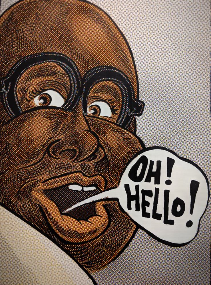
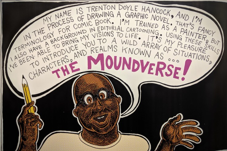
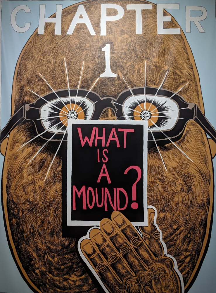
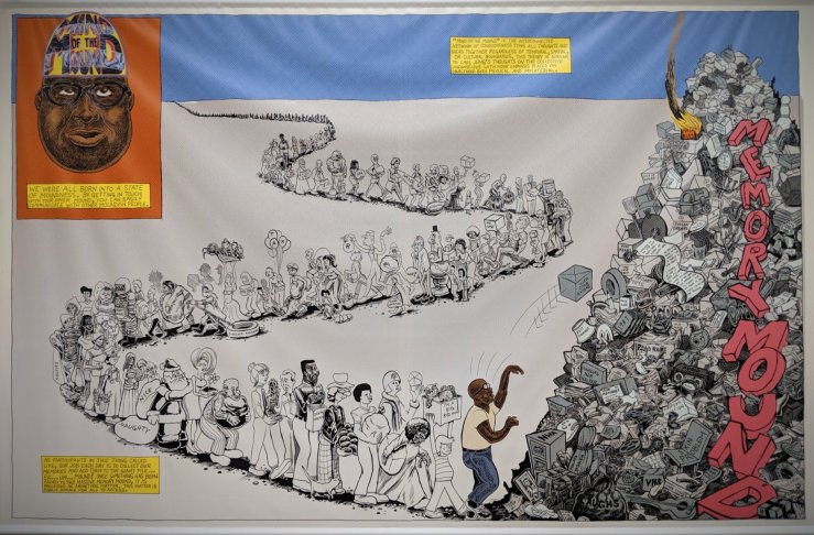
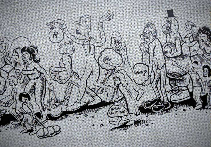
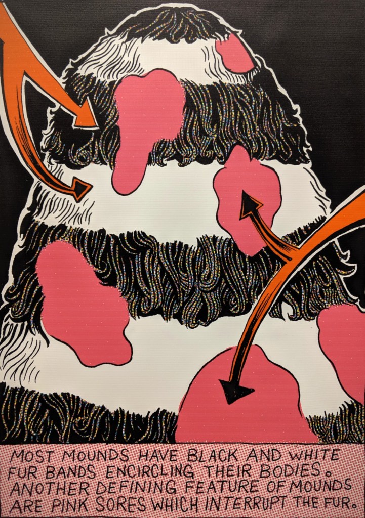
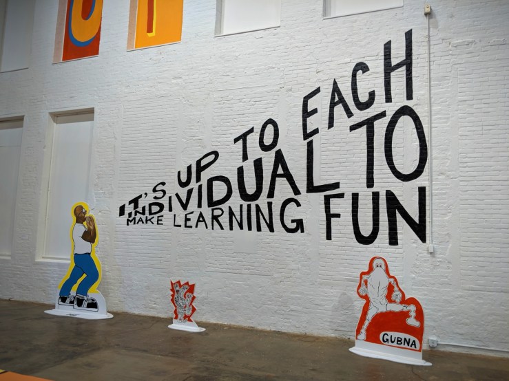
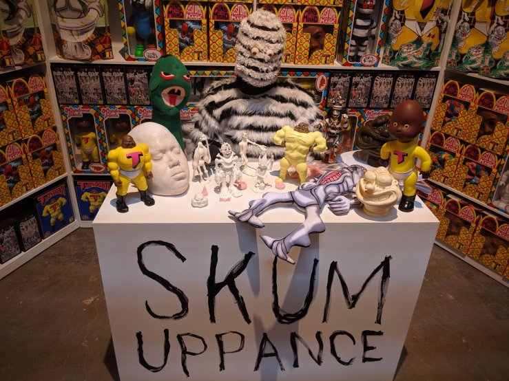
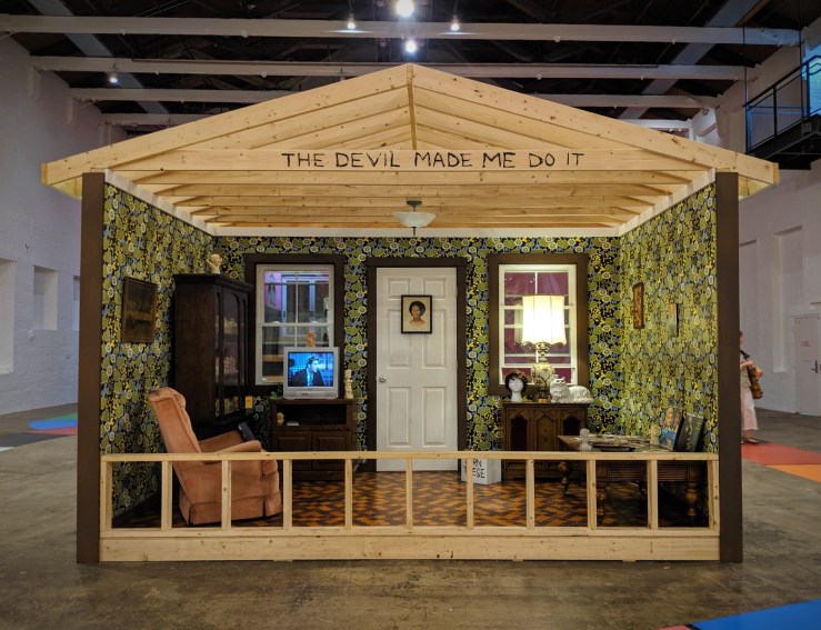
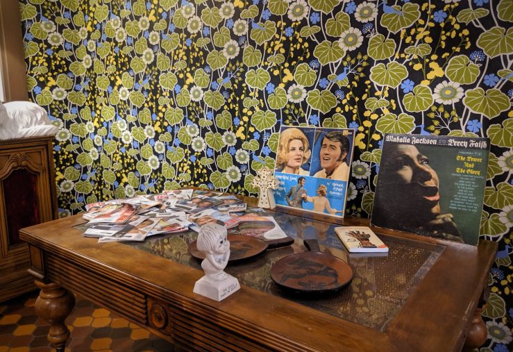
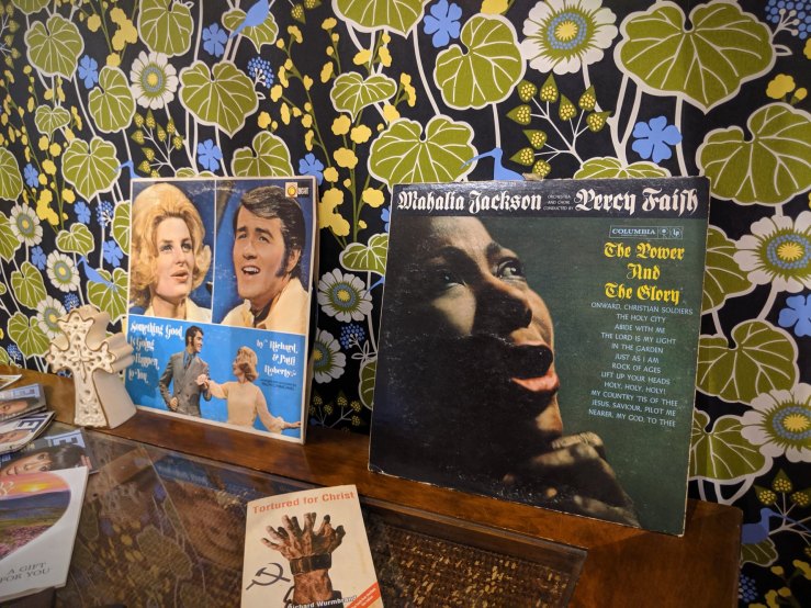
Mind of the Mound: Critical Mass by Trenton Doyle Hancock
MASS MoCA, North Adams, MA
September 1st, 2019
Mind of the Mound: Critical Mass by Trenton Doyle Hancock
MASS MoCA, North Adams, MA
September 1st, 2019
Colton Worley
Batman
Illustrating Batman: Eighty Years of Comics and Pop Culture
Society of Illustrators, 2019
June 29th, 2019
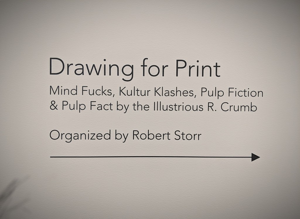
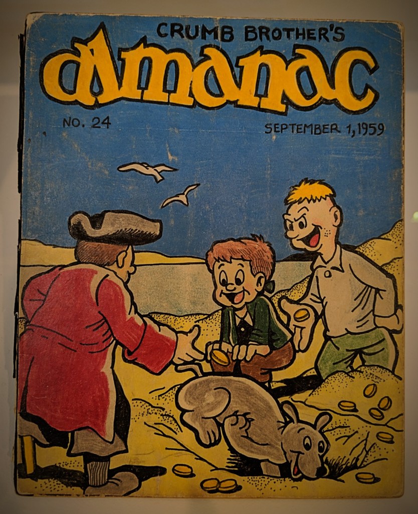
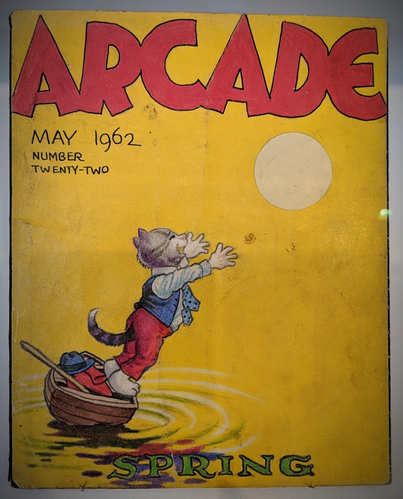
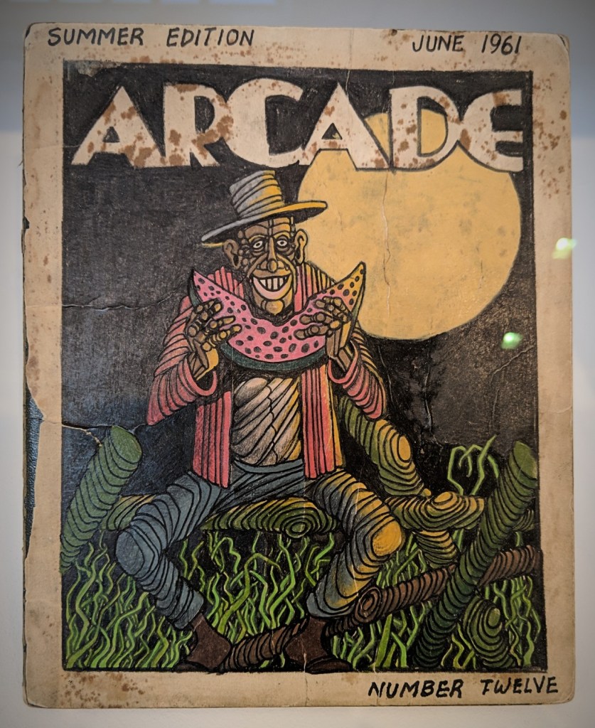
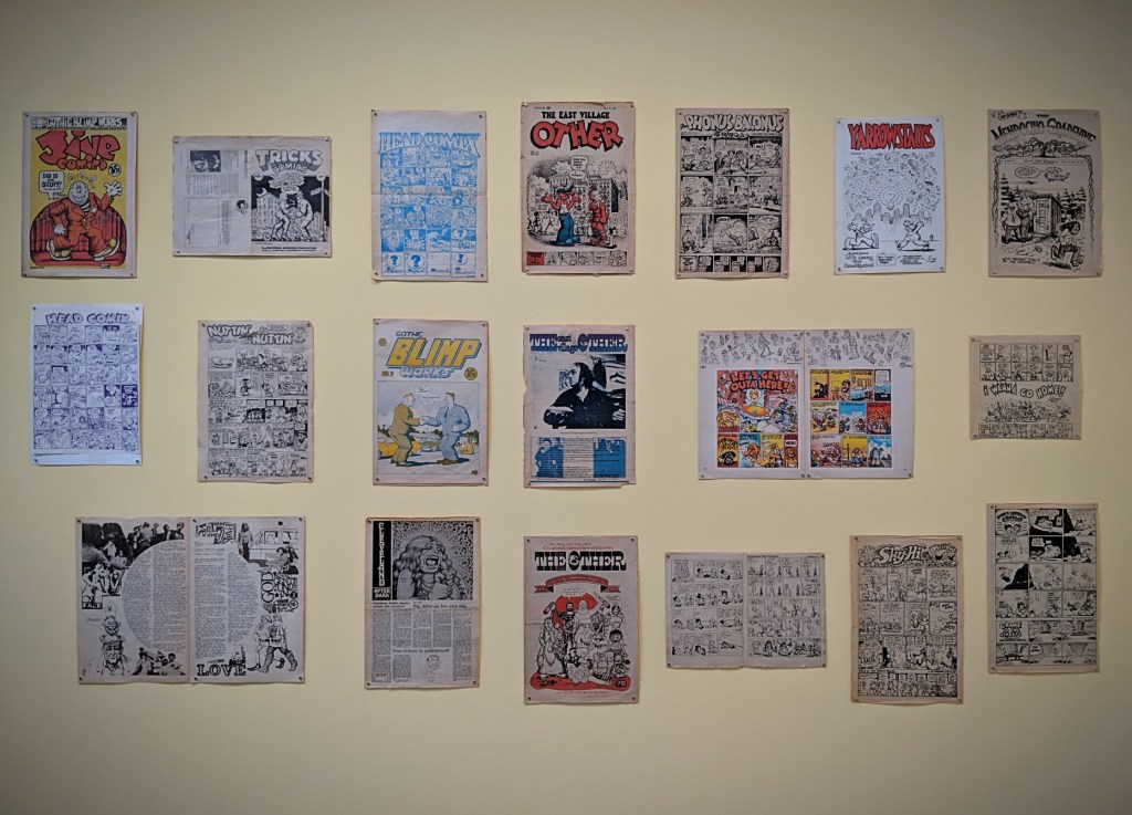
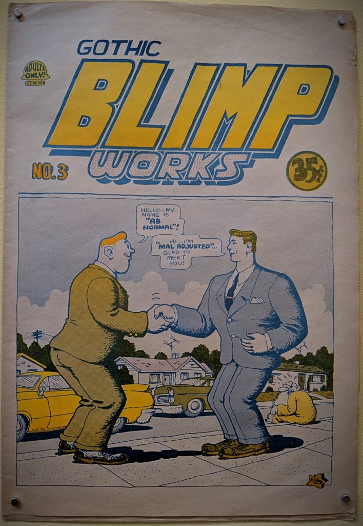
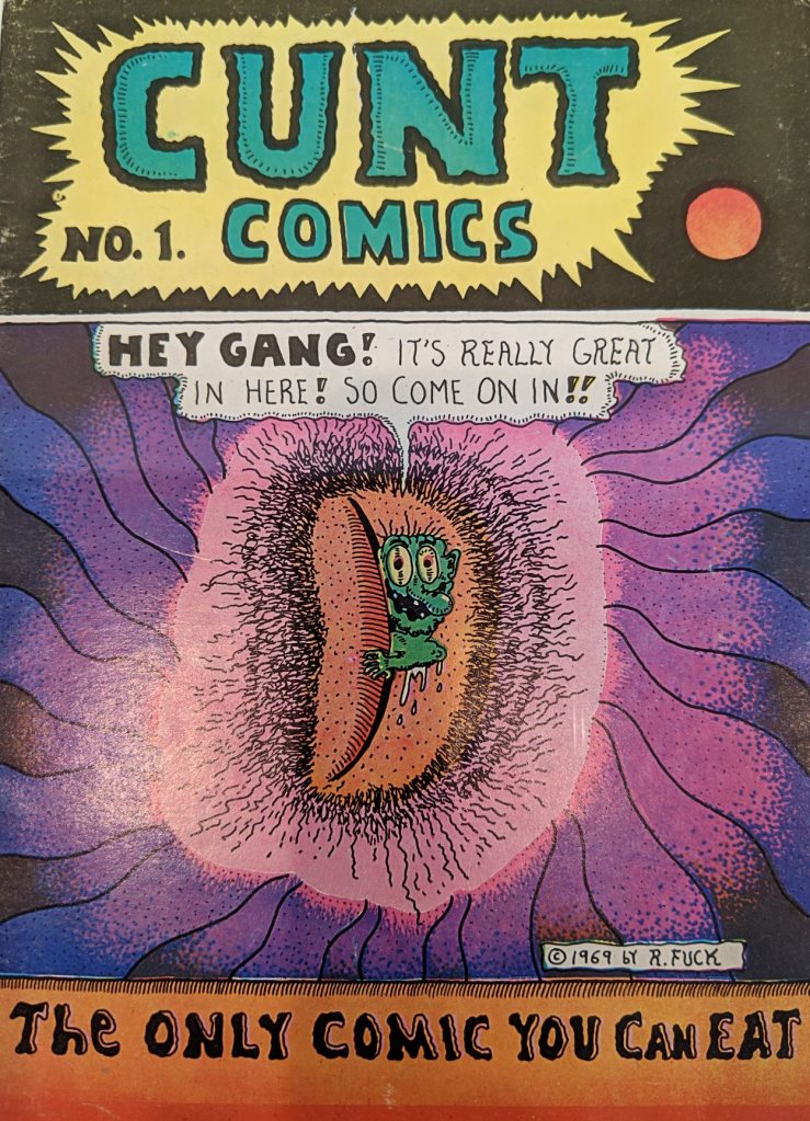
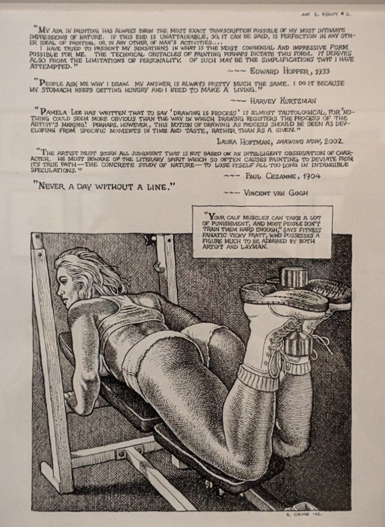
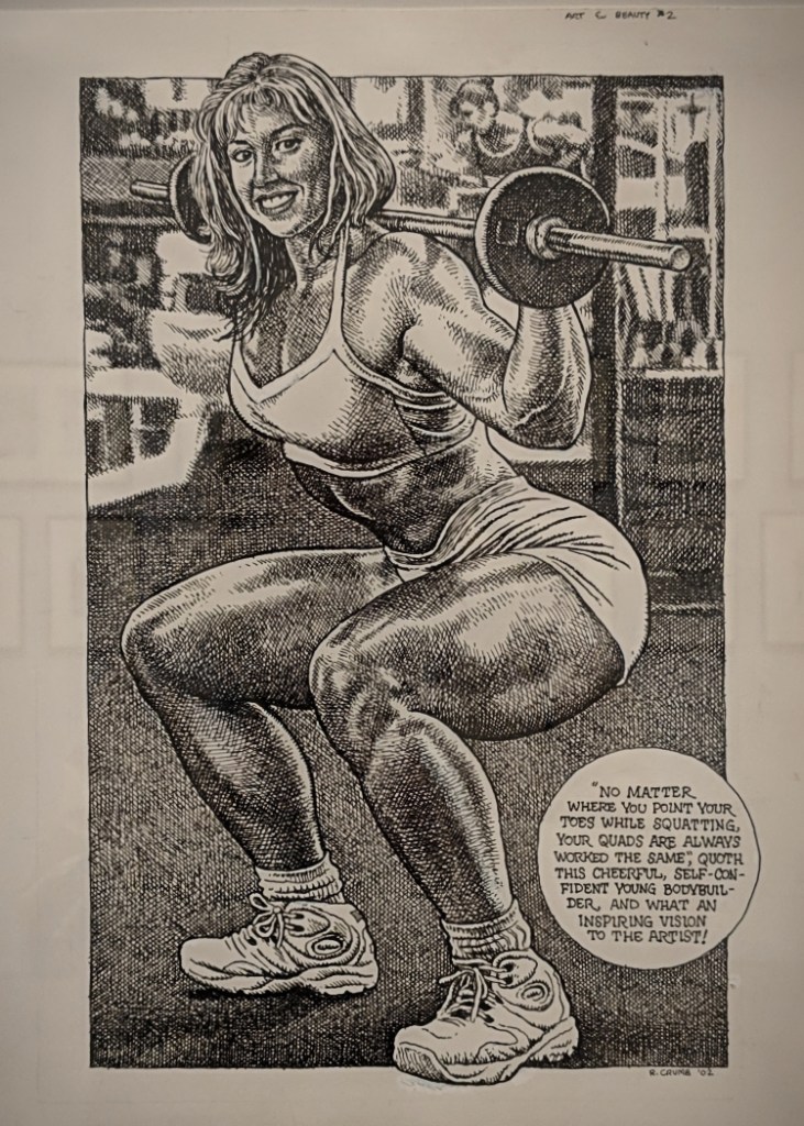
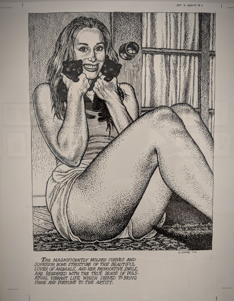
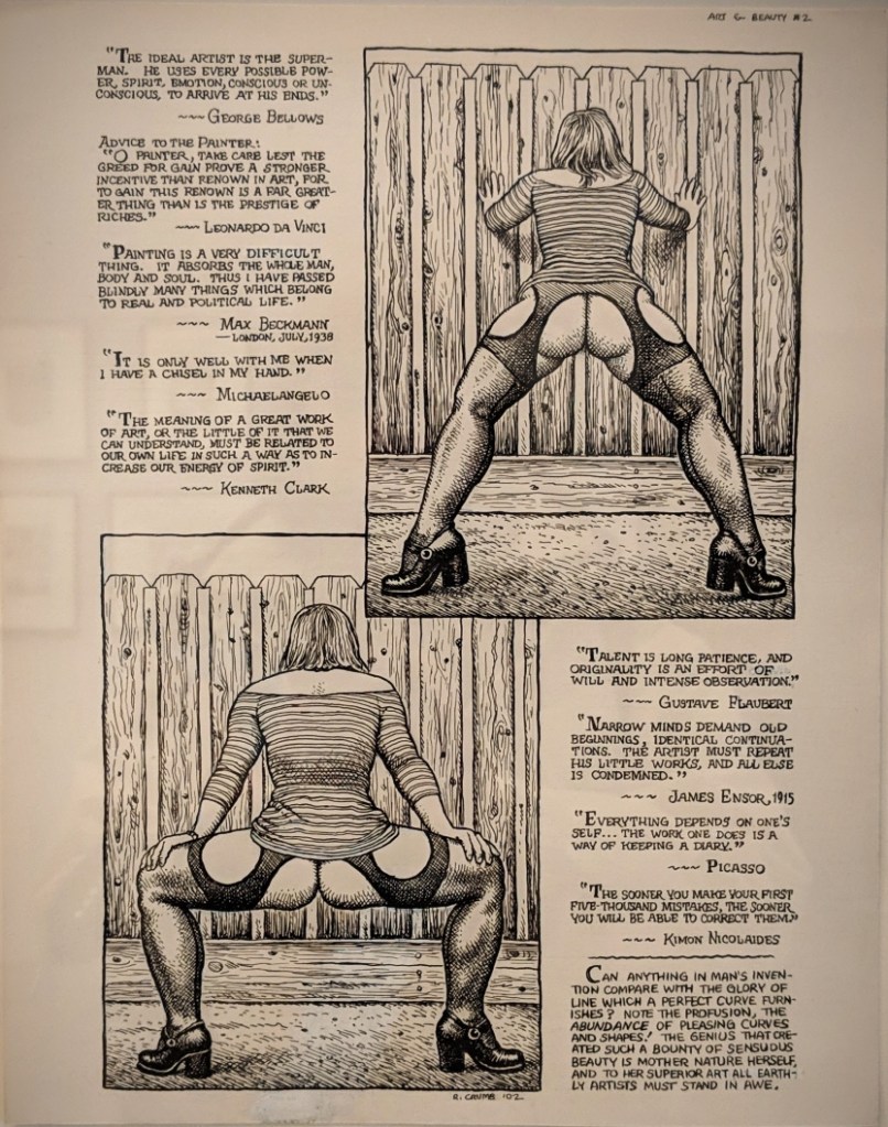
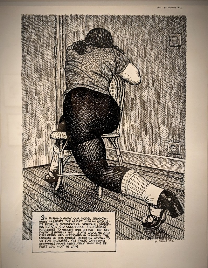
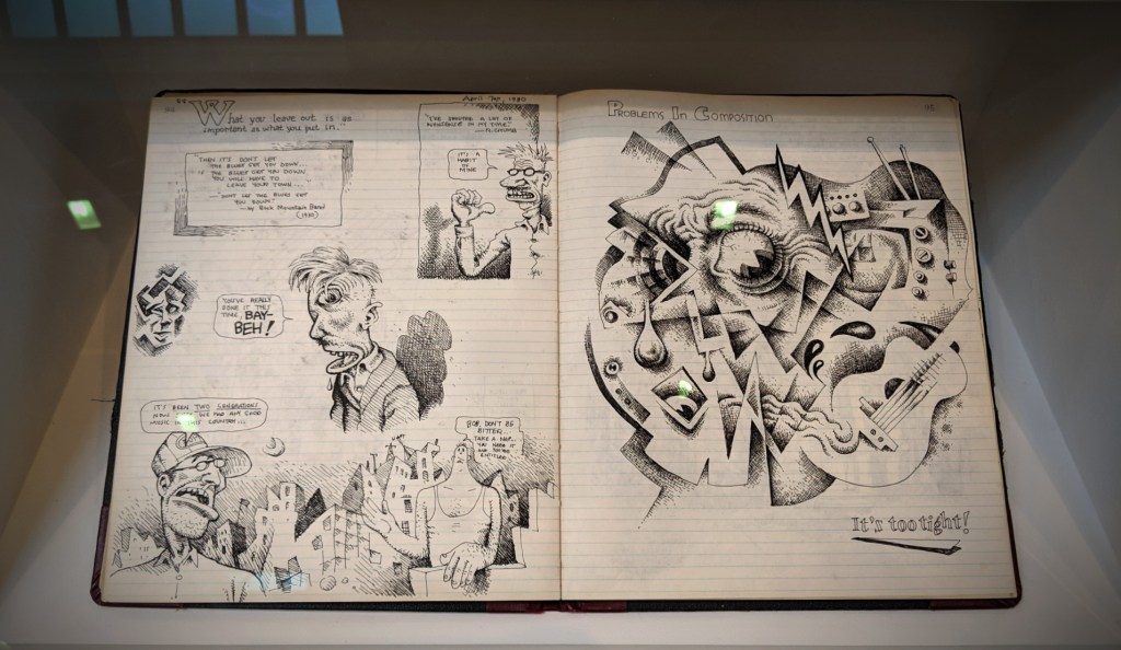
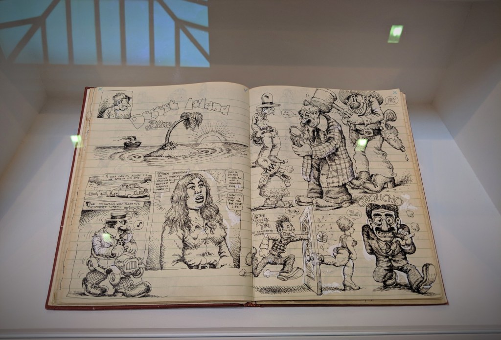
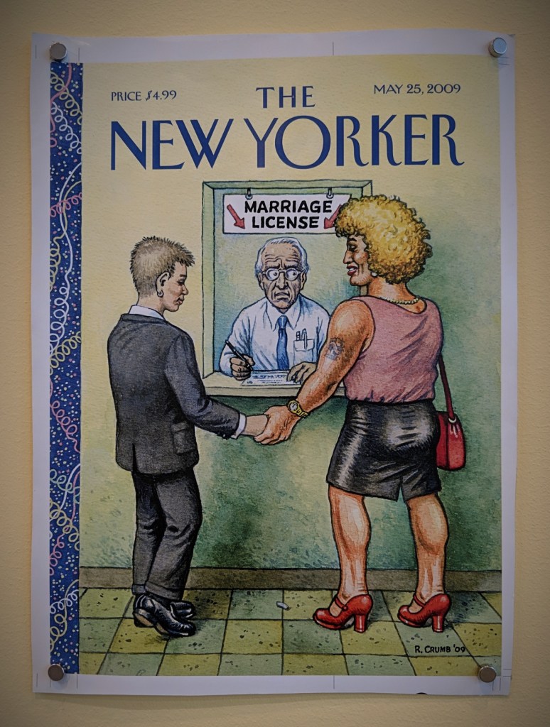
Robert Crumb is an unblinking witness to and graphic critic of the dysfunctional strangeness of the Disunited States. He is peerless in that regard because there’s simply no one like him and no one is as ”far out”. – Robert Storr
Drawing for Print: Mind Fucks, Kultur Klashes, Pulp Fiction & Pulp Fact by the Illustrious R. Crumb
David Zwirner Gallery, New York
March 07th, 2019
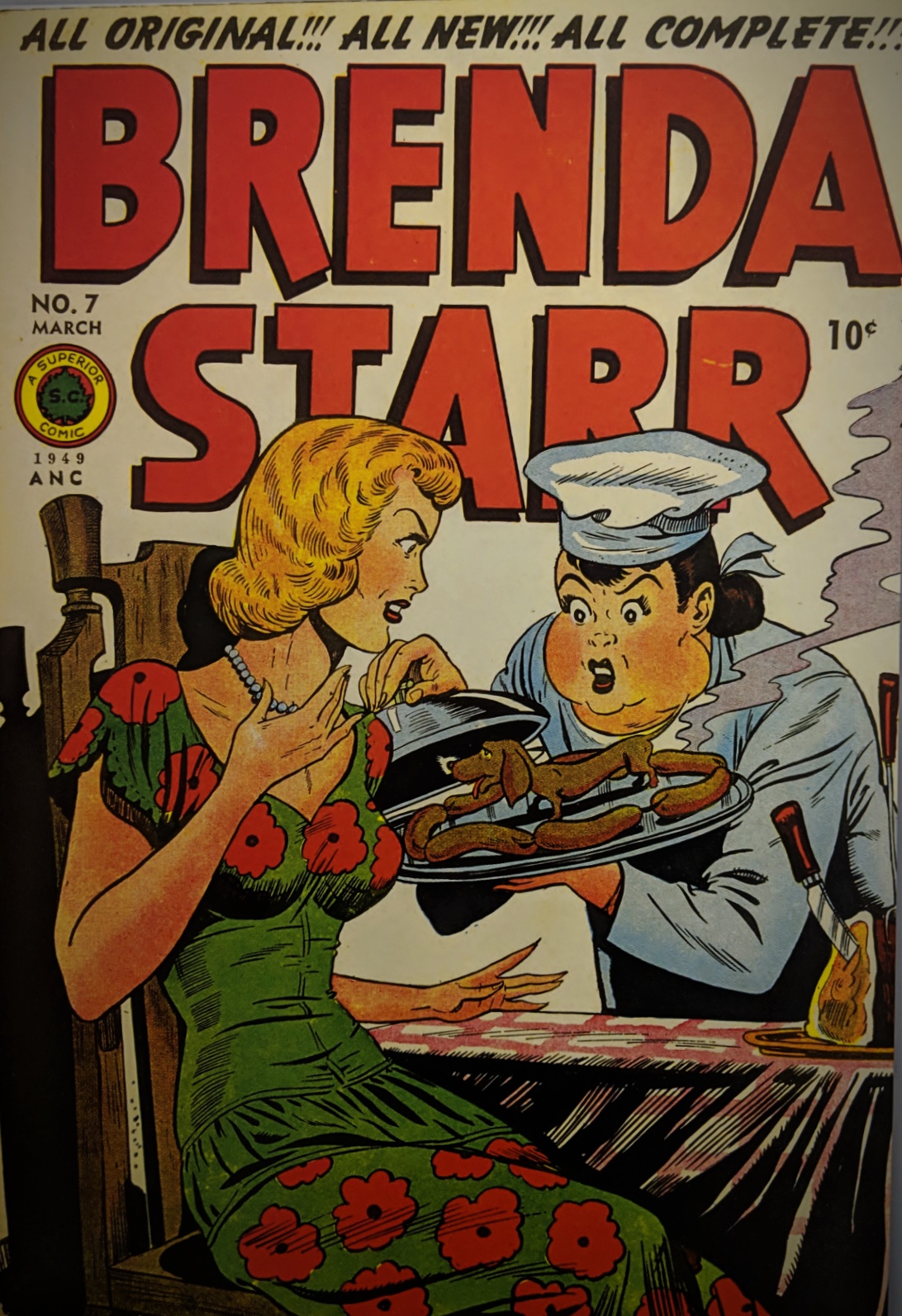
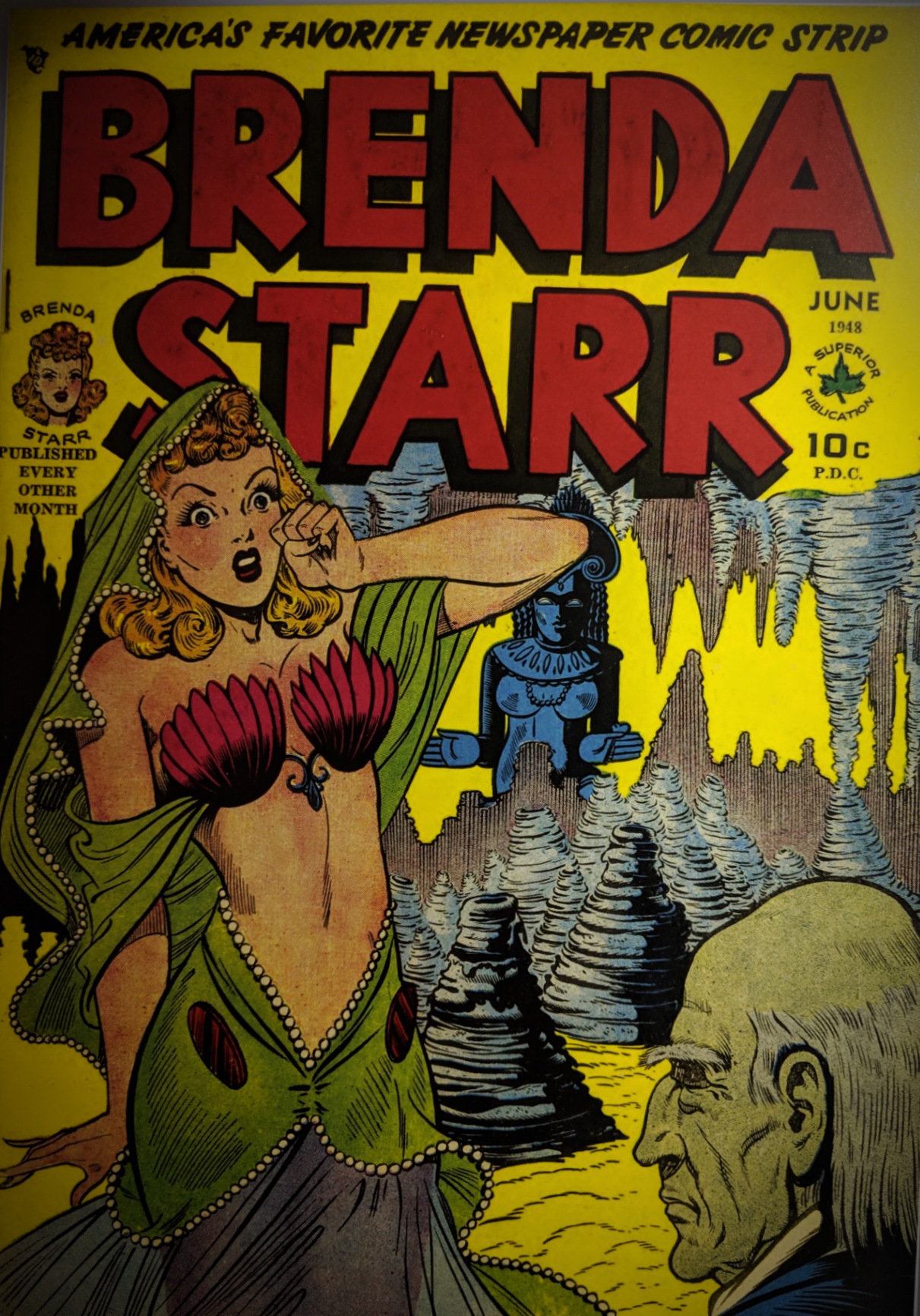
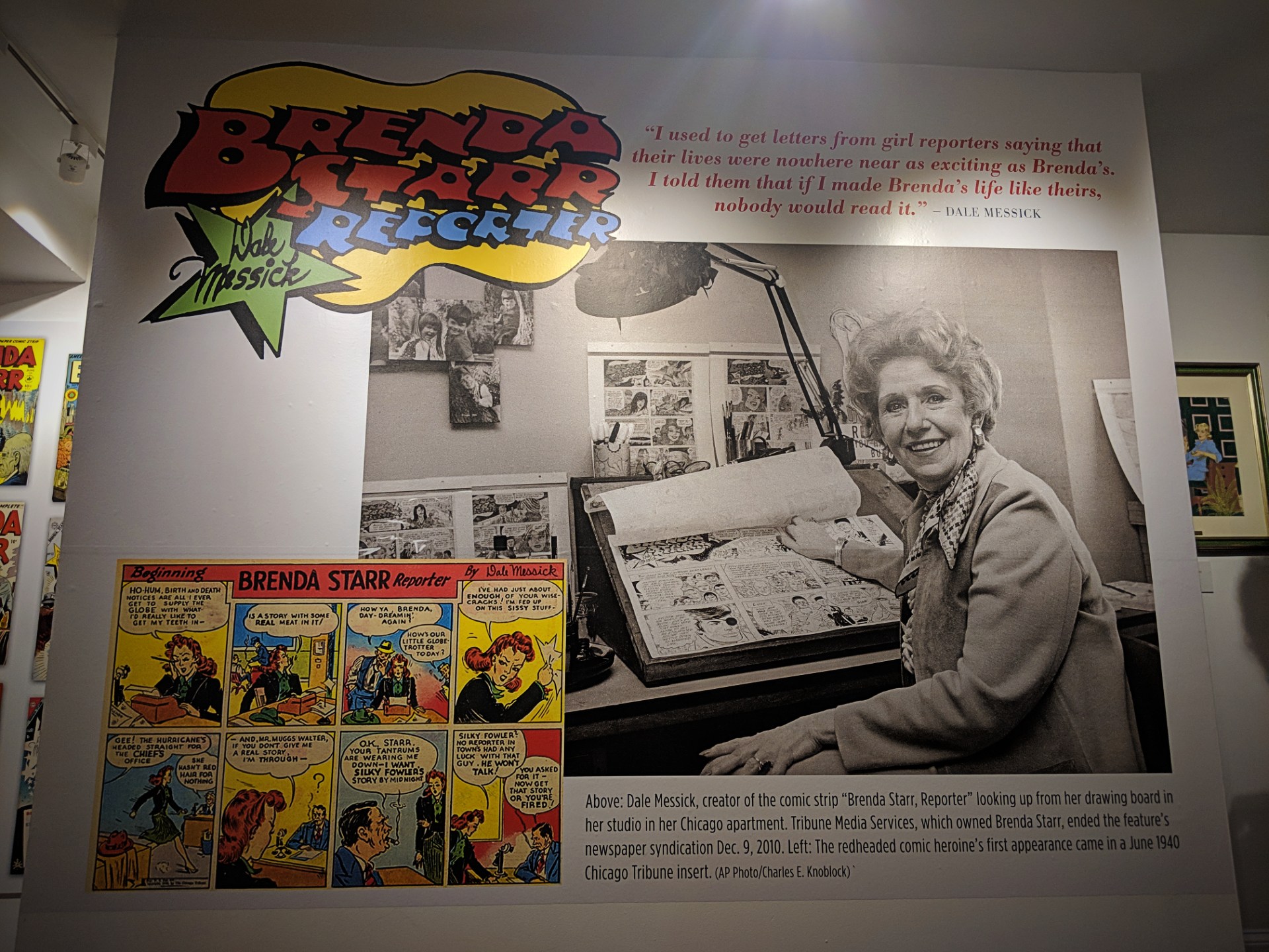
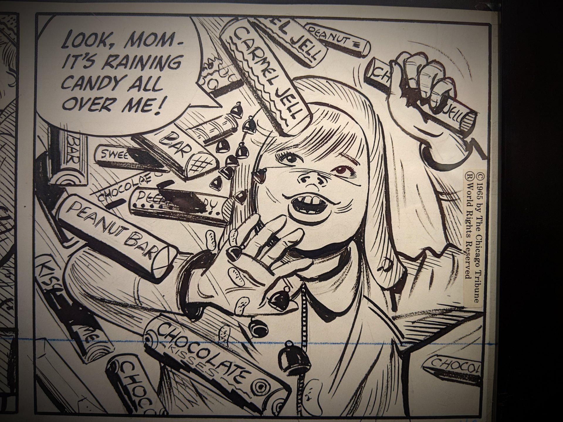
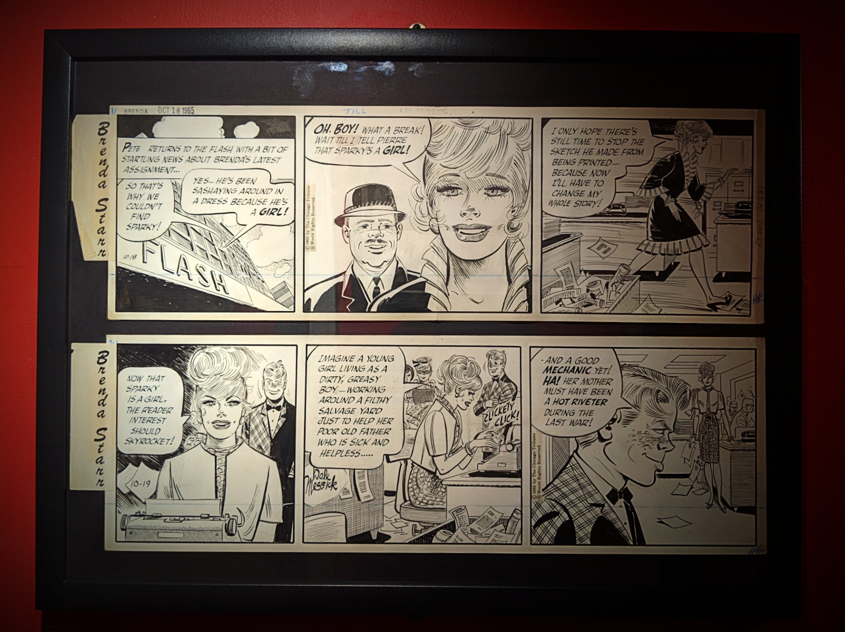
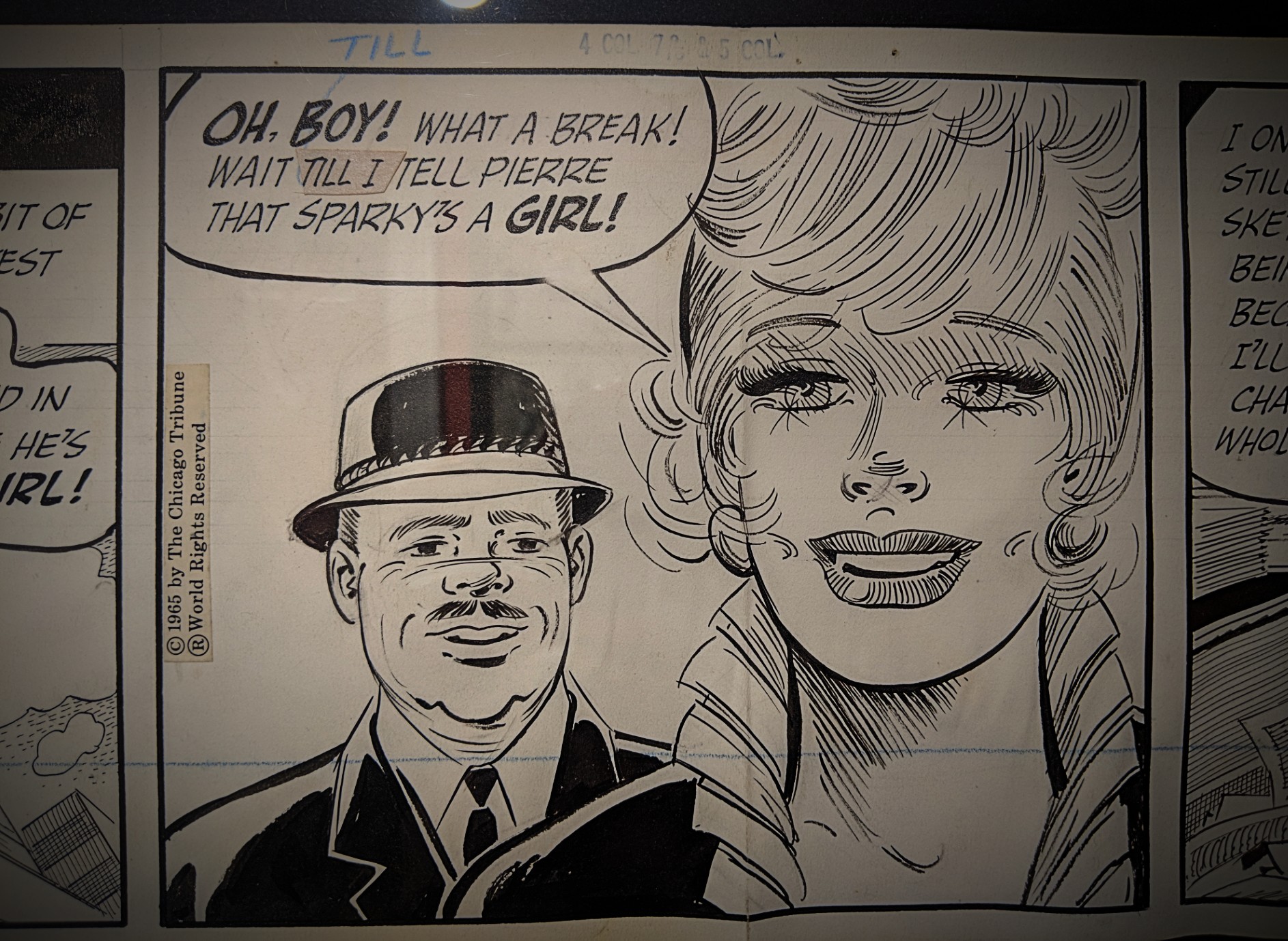
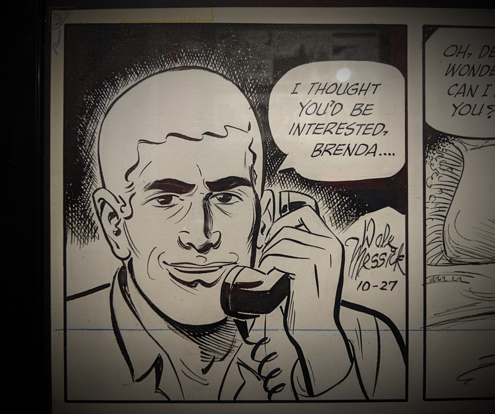
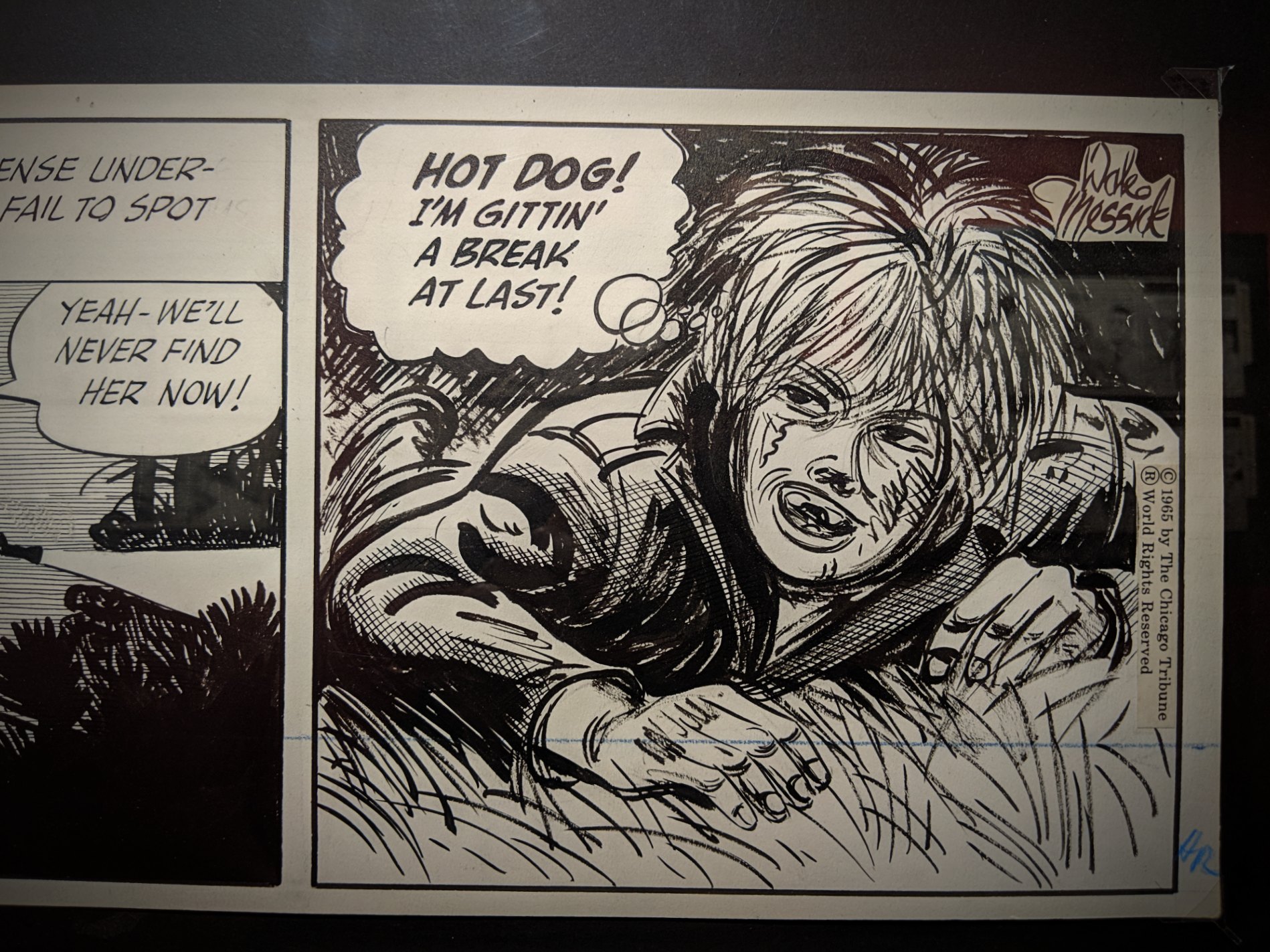
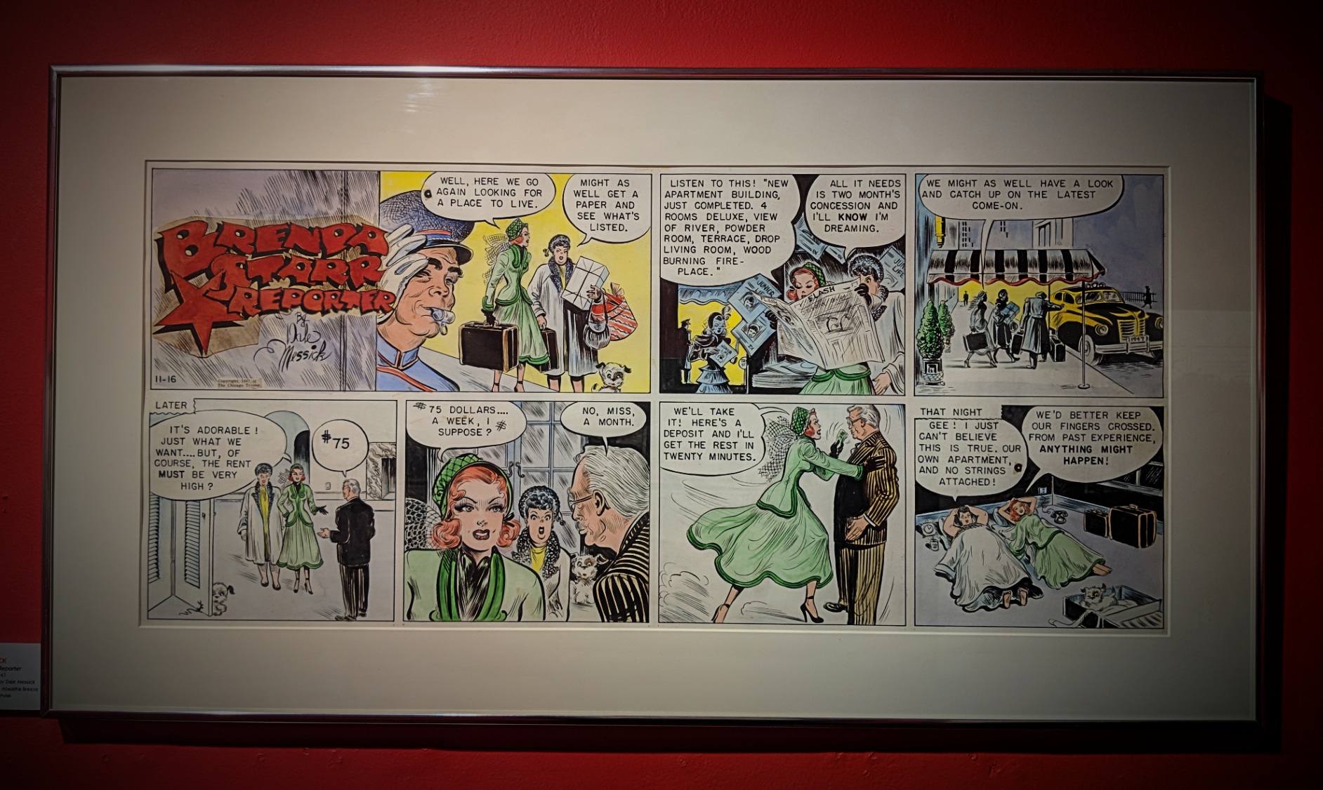
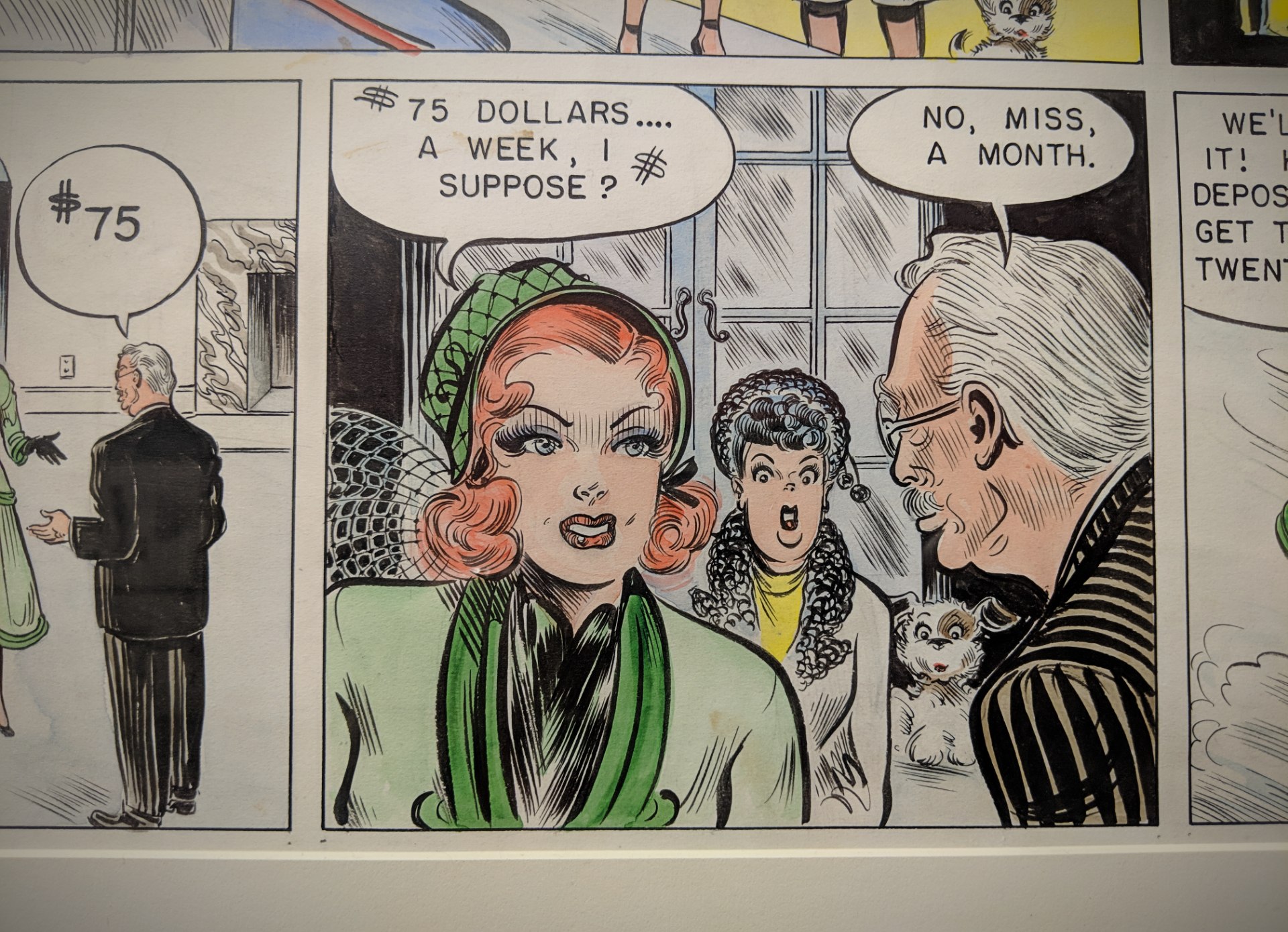
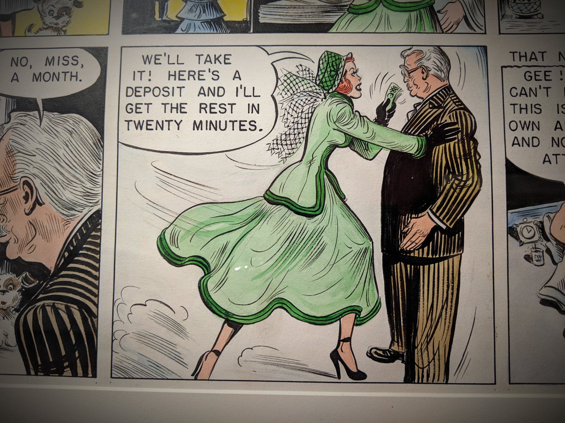
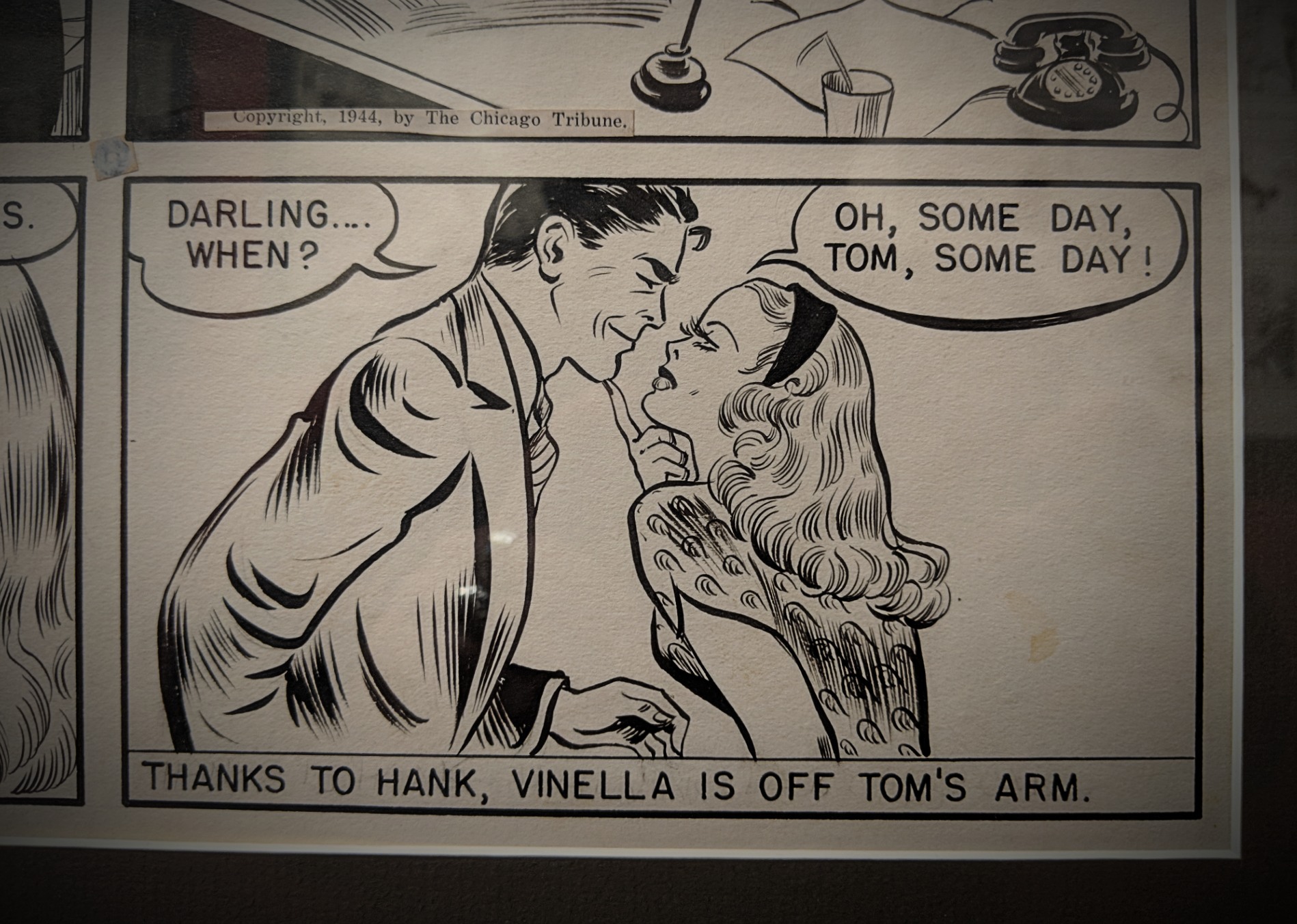
Brenda Starr, Reporter debuted in June of 1940 and was an immediate hit with young women and girls. Brenda Starr’s name came from a 1930’s debutante, Brenda Frazier, and her body, fashion sense, and persona mirrored leading Hollywood actress, Rita Hayworth, complete with matching long red hair and a curvaceous figure.
At its peak, Brenda Starr, Reporter was included in 250 newspapers and read by more than 60 million readers. When Starr and her long-time “Mystery Man” boyfriend, whose very survival depended on the serum found in the fictitious but famous black orchid, finally married after 36 years in 1976, President Gerald Ford sent a congratulatory telegram. [source]

Random squares from an exhibition @ The Society of Illustrators
February 9th, 2019
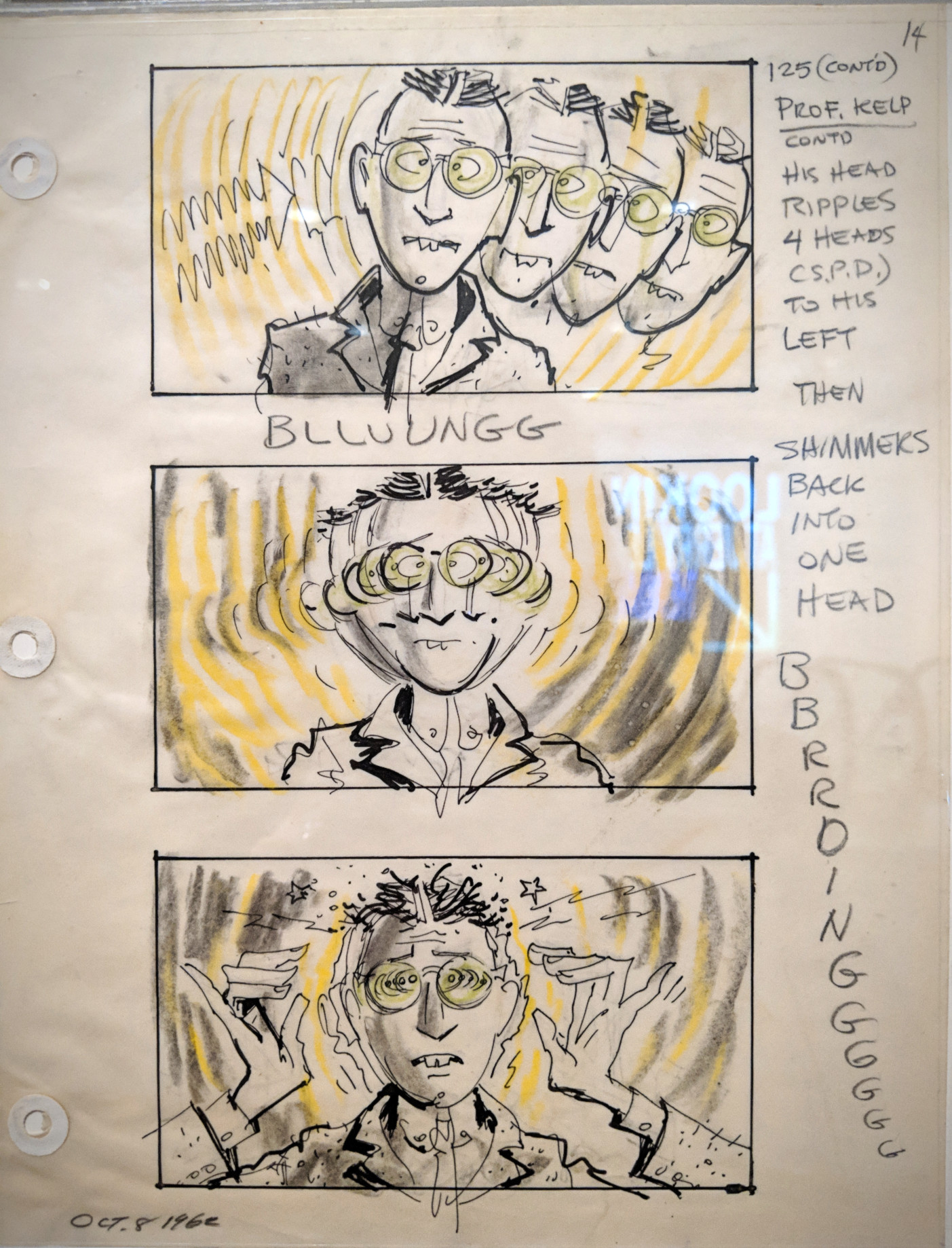
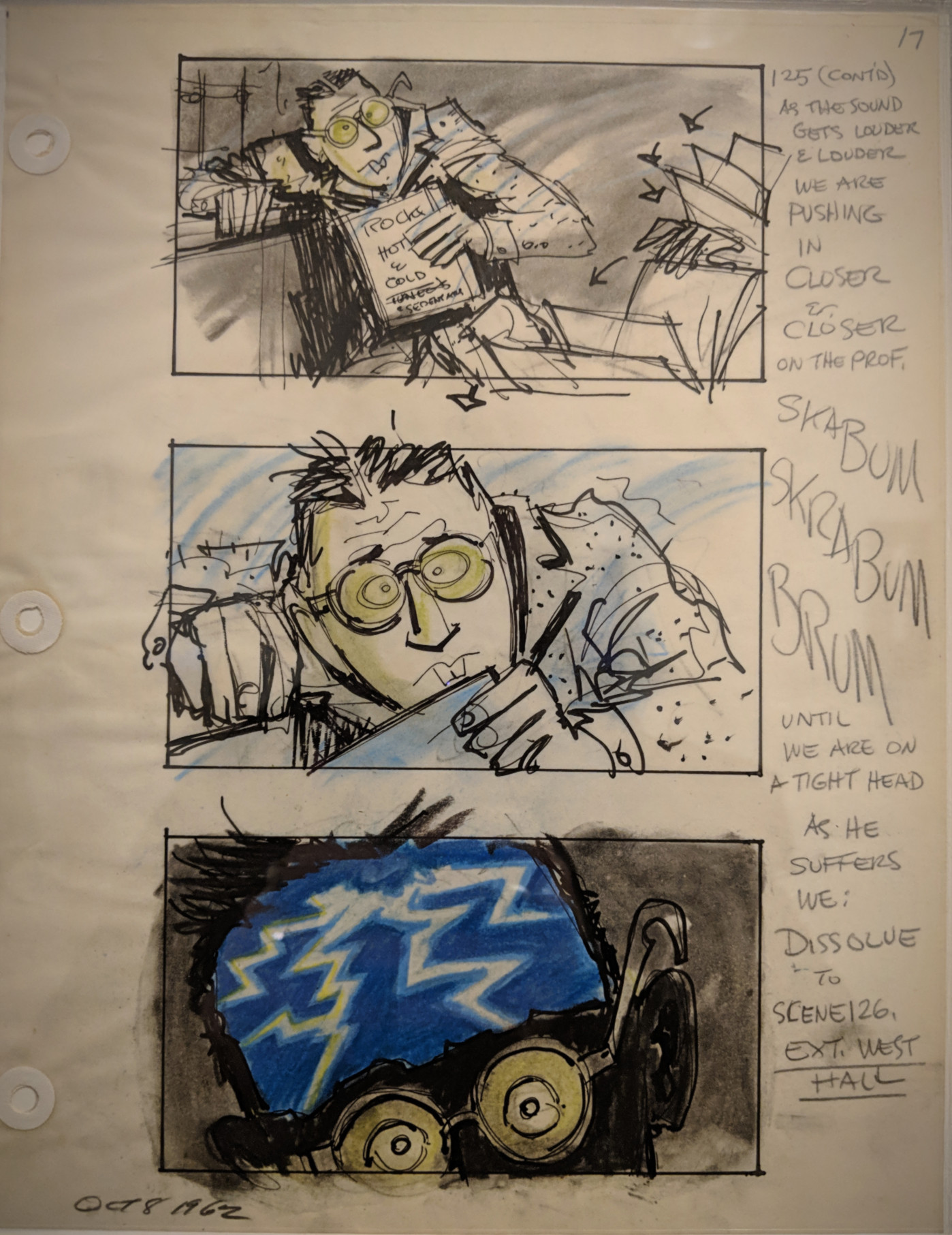
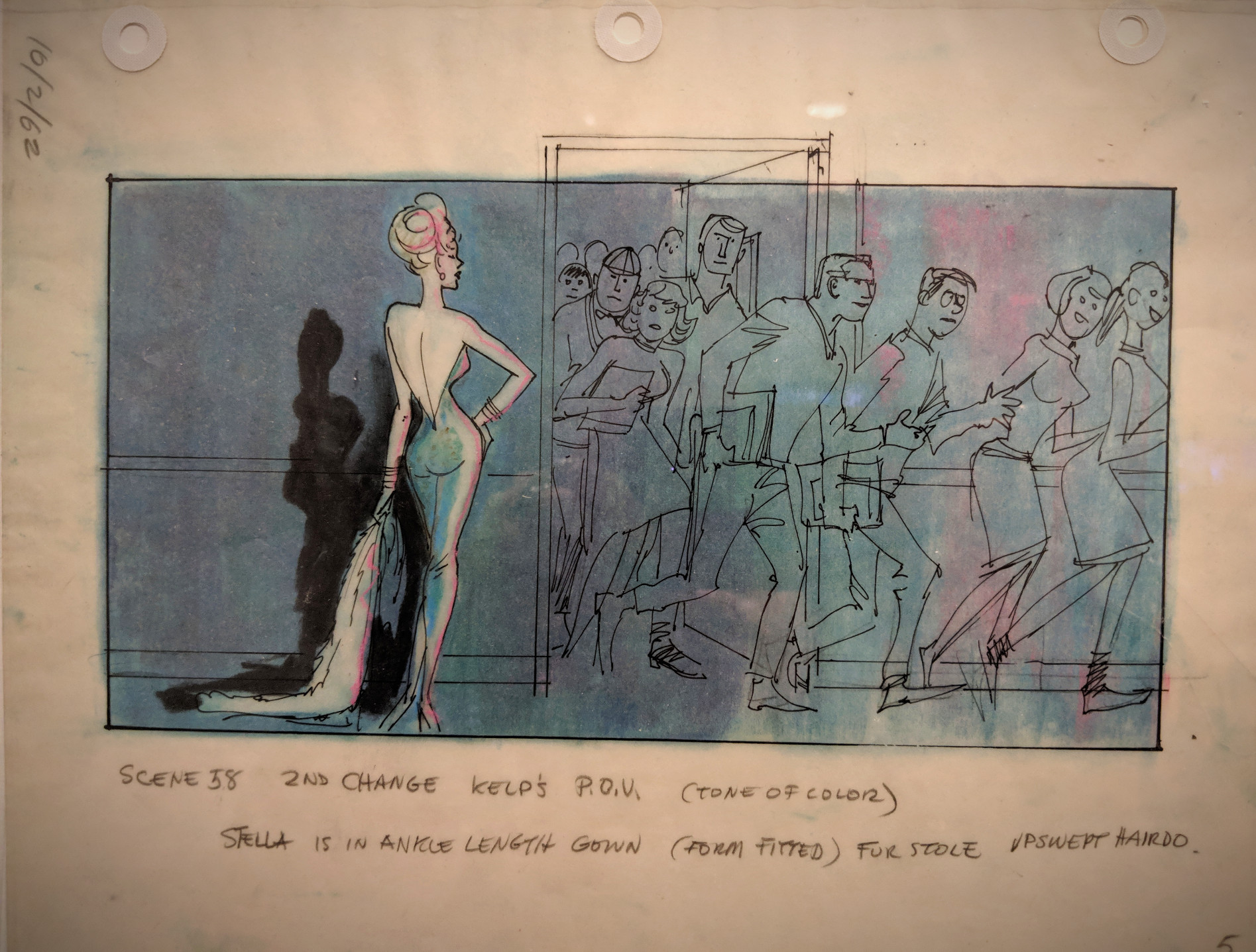
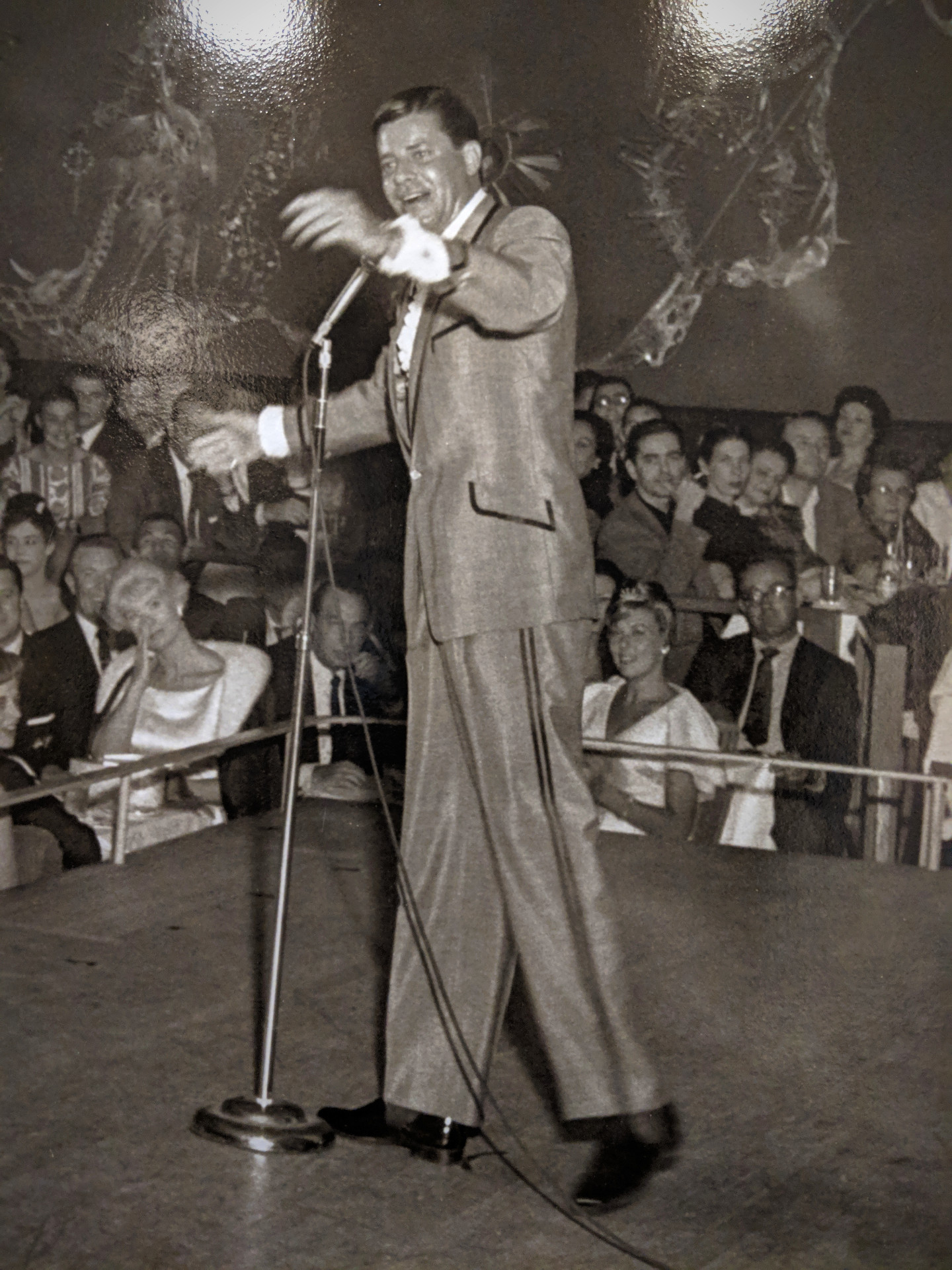
Of all the stars who worked in the golden age of the Hollywood studio system, few valued the acts of looking and being looked at more than Jerry Lewis. Lewis had years of stage experience behind him by the time he emerged as a major screen actor and director, and acknowledging the audience became an essential aspect of the ”comedy of looks” that characterized his work. In no other Lewis film is the experience of being seen so central a theme as it is in The Nutty Professor (1963), in which he treats his audience as a main character. In this adaptation of the Dr. Jekyll and Mr. Hyde story, his masterly dual performance as the self-effacing Professor Kelp and the narcissistic Buddy Love represents different sides of the Lewis persona, while on-screen students and night-club audiences who witness his character’s behaviour represent the critical gaze of the movie-going public.
[source: MoMA]

 Bill Avery
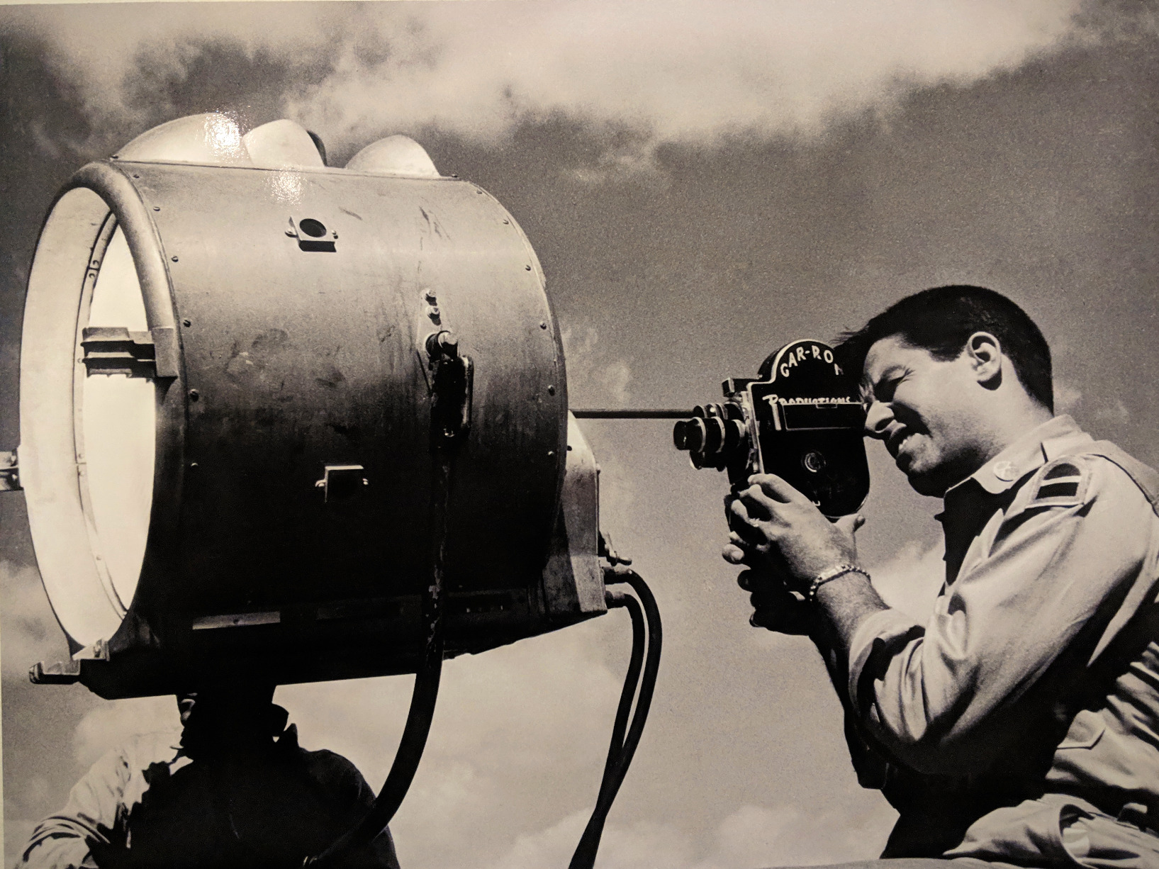
Jerry Lewis shooting a home movie, 1953
 Bill Crespinel
Jerry Lewis mixing music at this home, 1961
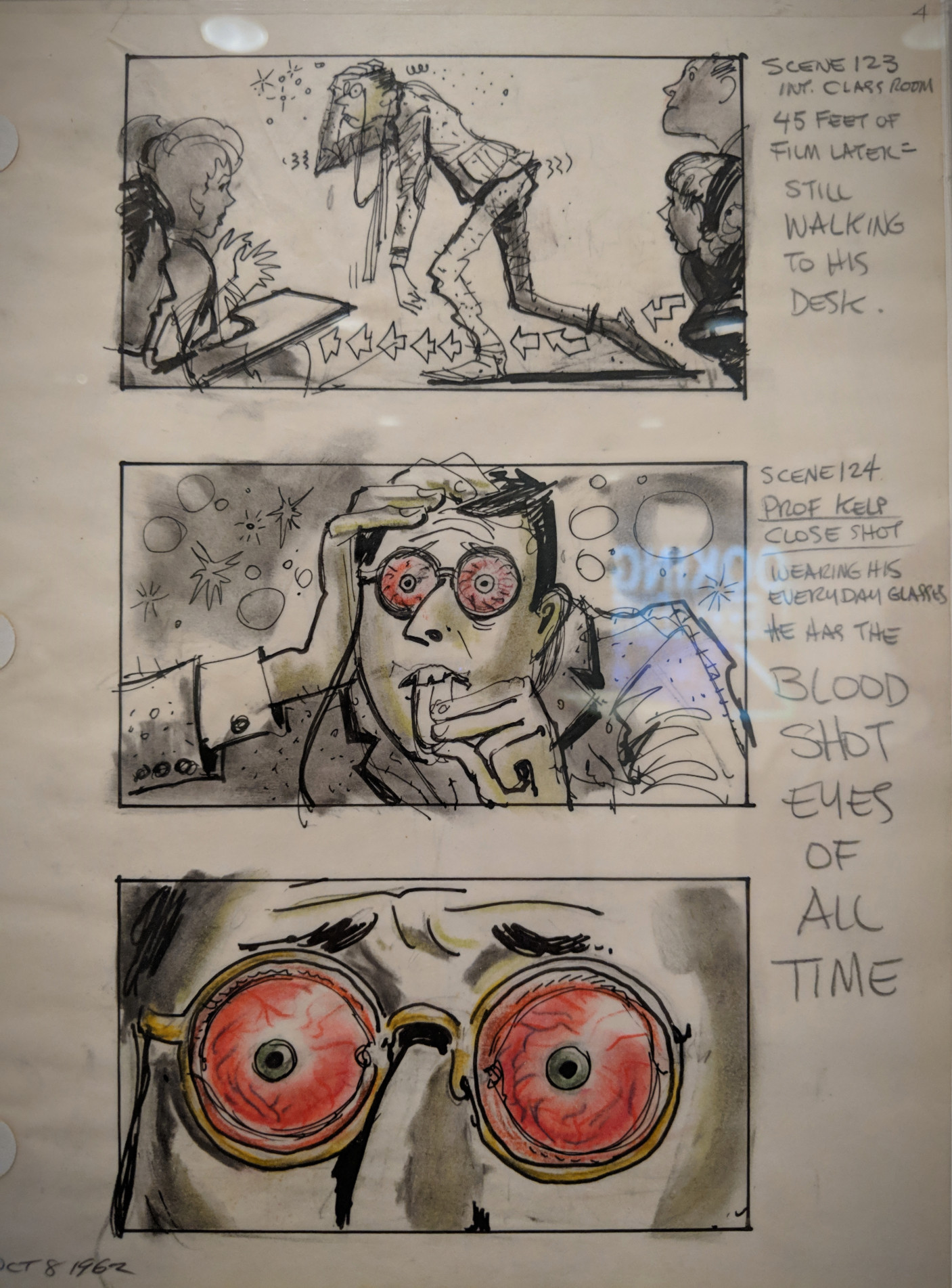 John Jensen (American, 1924-2003)
Scenes from the Hangover sequence, 1962
Black and coloured pencil on vellum paper 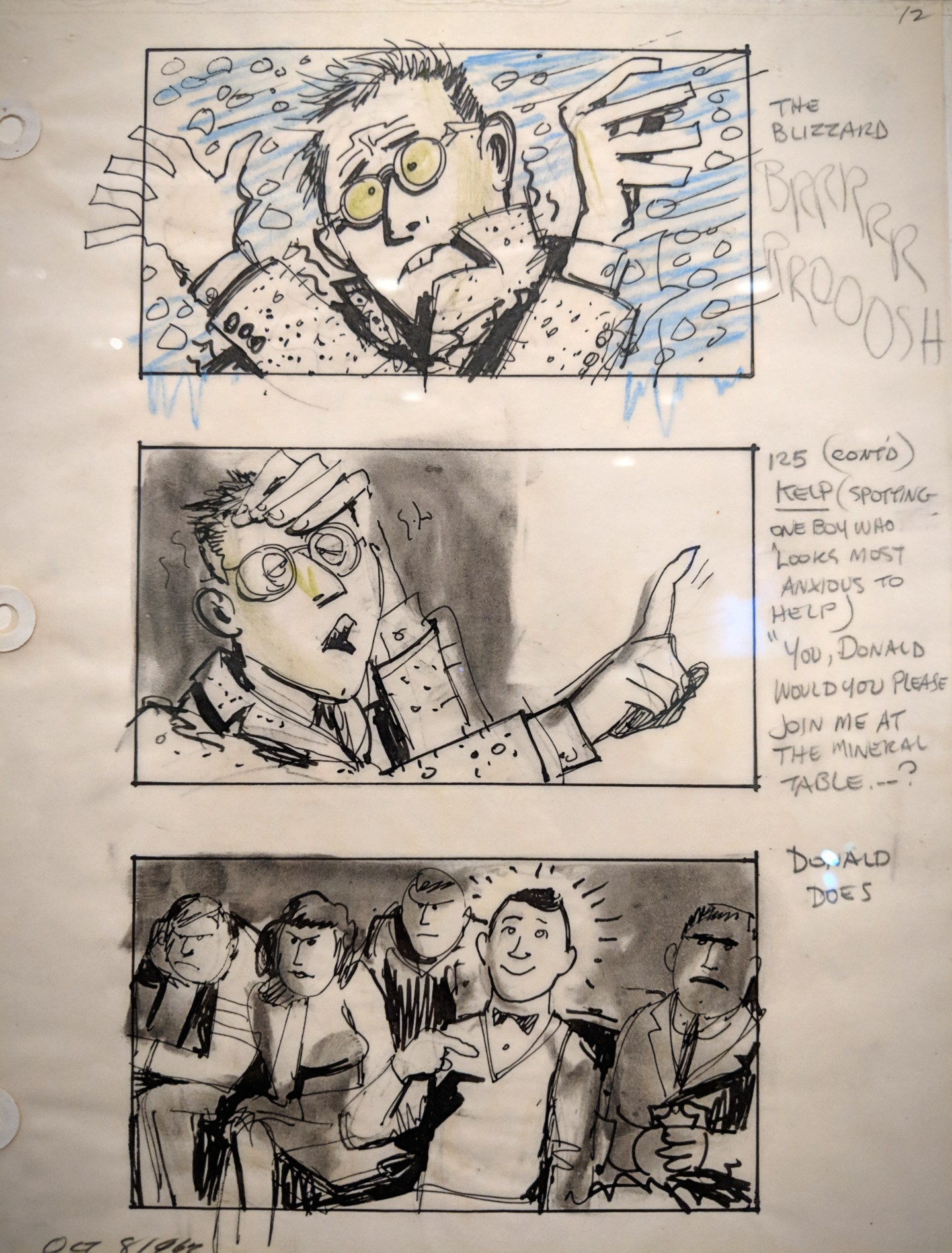
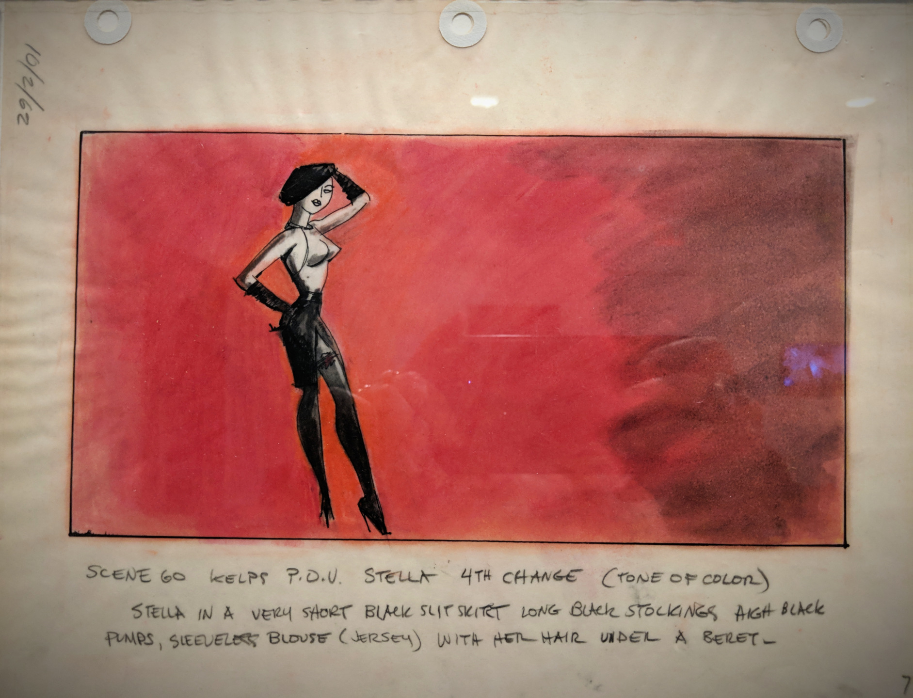
 John Jensen (American, 1924-2003)
Scenes from the Stella fantasy sequence, 1962
Black and coloured pencil and pastel on vellum paper 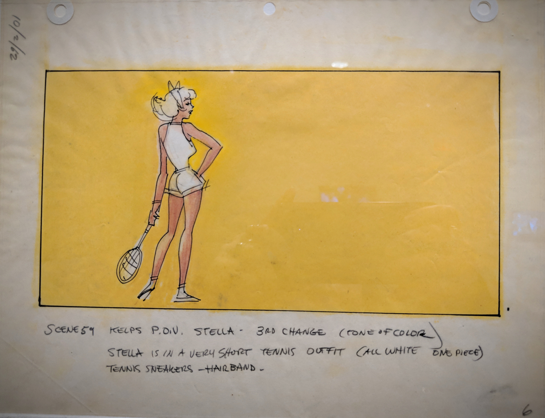
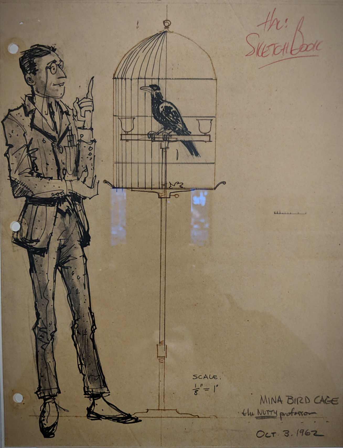 John Jensen (American, 1924-2003)
Mina bird cage sketches, 1962
Pencil on paper 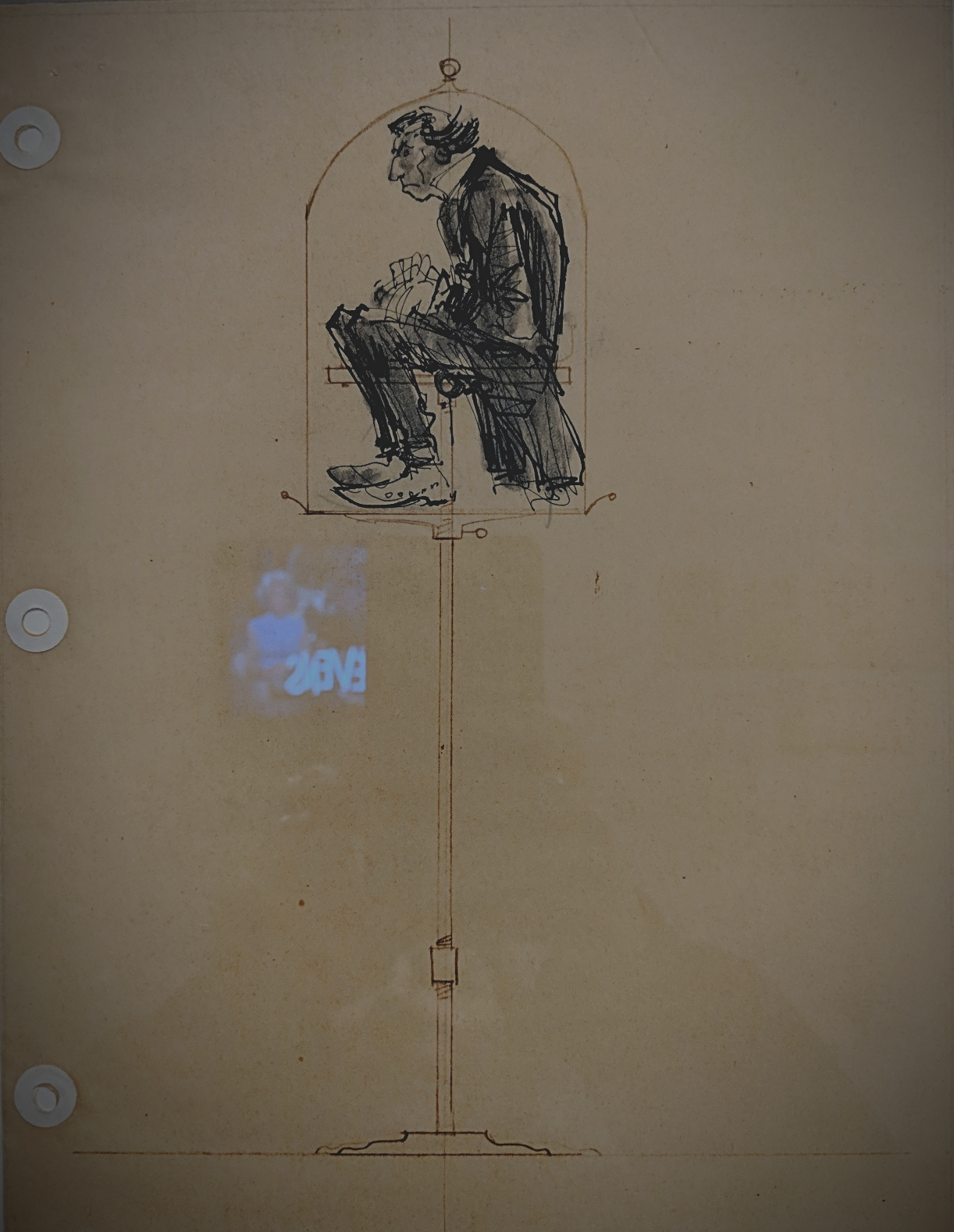
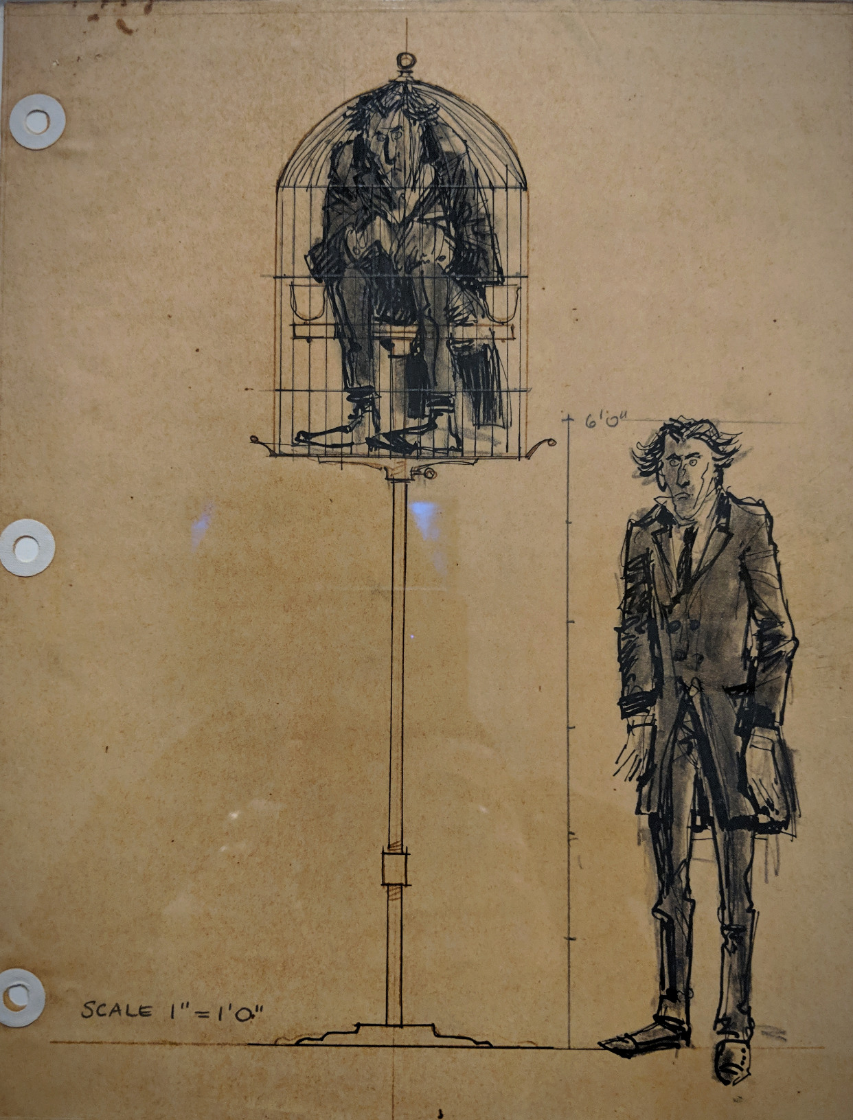
 John Lauris Jensen’s storyboards for The Nutty Professor were on display between October 2018 – March 2019; they were a recent gift to the Museum of Modern Art.
January 5th, 2019
Original art from the Museum of Illustration
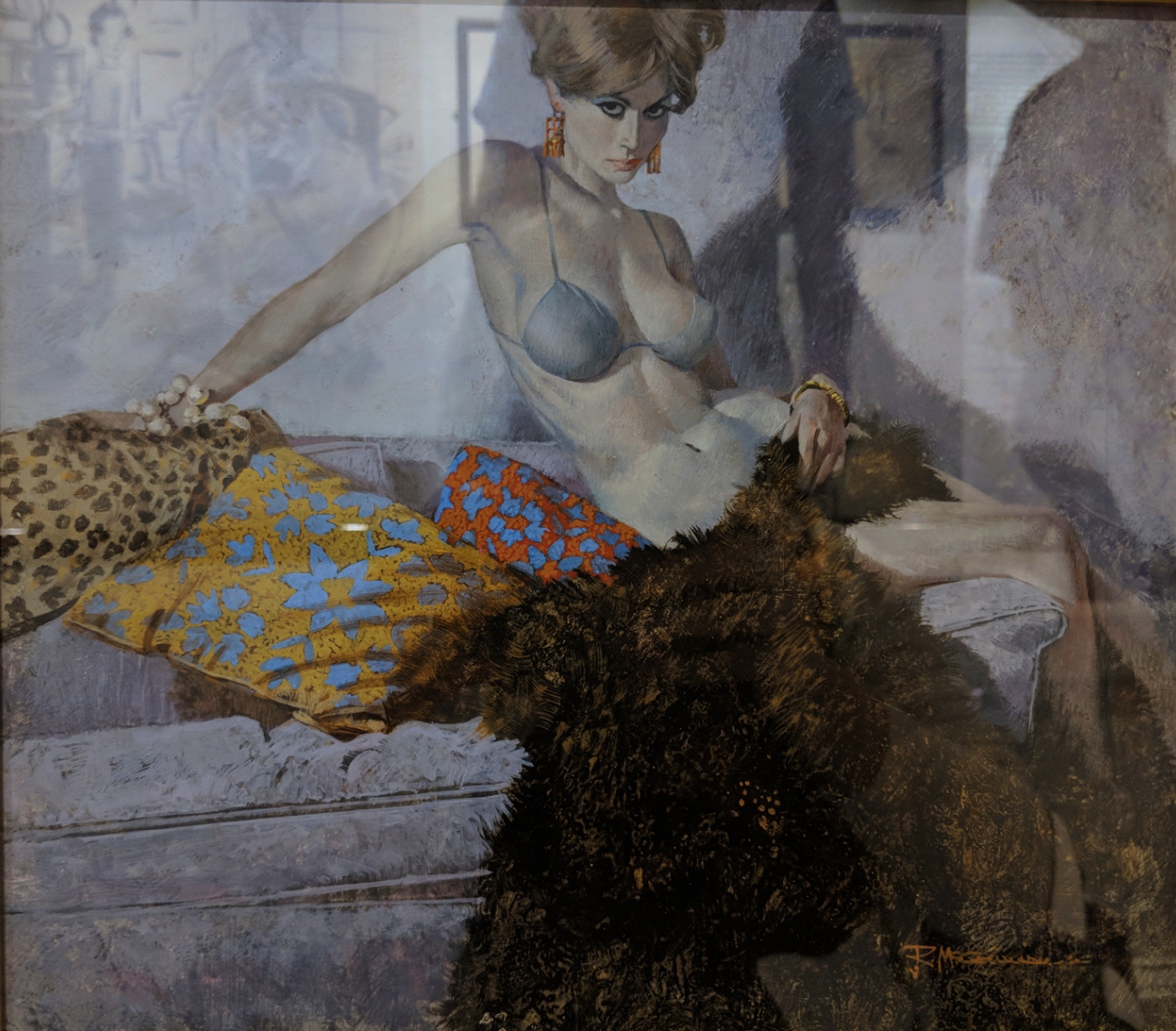 The Scrambled Yeggs by Robert McGinnis
Cover illustration for the story by Richard Prather
Fawcett Gold Medal Books, 1960, 1968
Designers Colours and Casein White on hot press illustration board
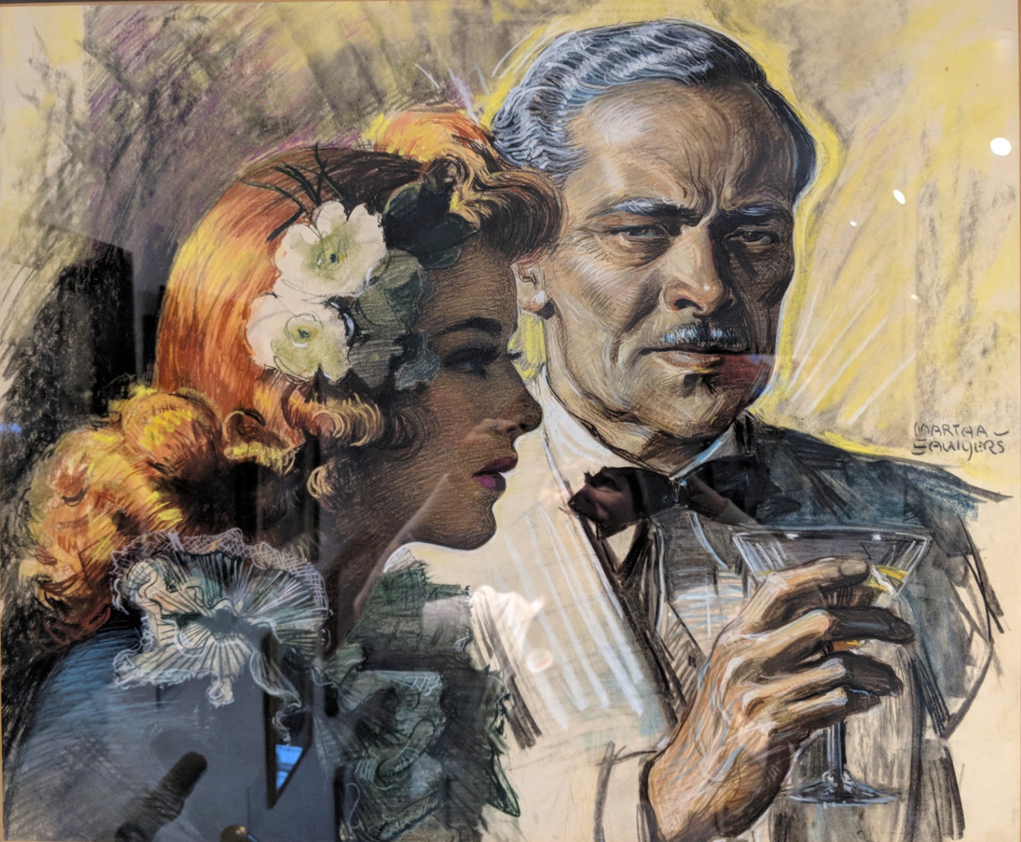 Cafe Sinister by Martha Sawyers
Illustration for the story of the same name by Ben Hecht
Caption: ”I noticed a few evenings later that the baron had a different girl with him. ‘Well, we’ve got a new clue,’ I said. ‘We’ve found out the baron has a redhead fetish.”’
Collier’s magazine, August 21, 1943
Pastel
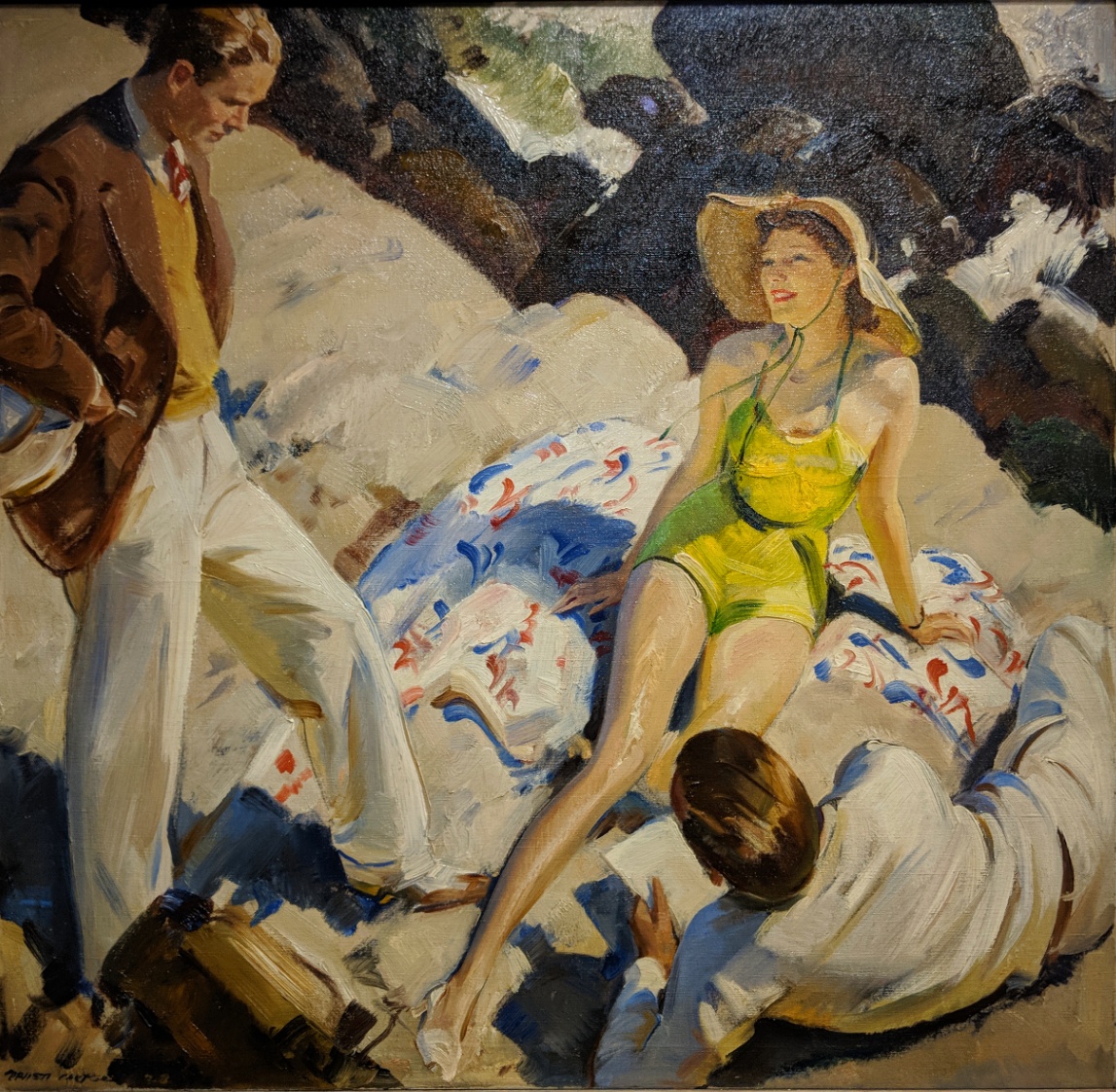 Hail and Farewell by A. Carter
Illustration for the story by Williston Rich
The American Magazine, December 1938
Oil on canvas
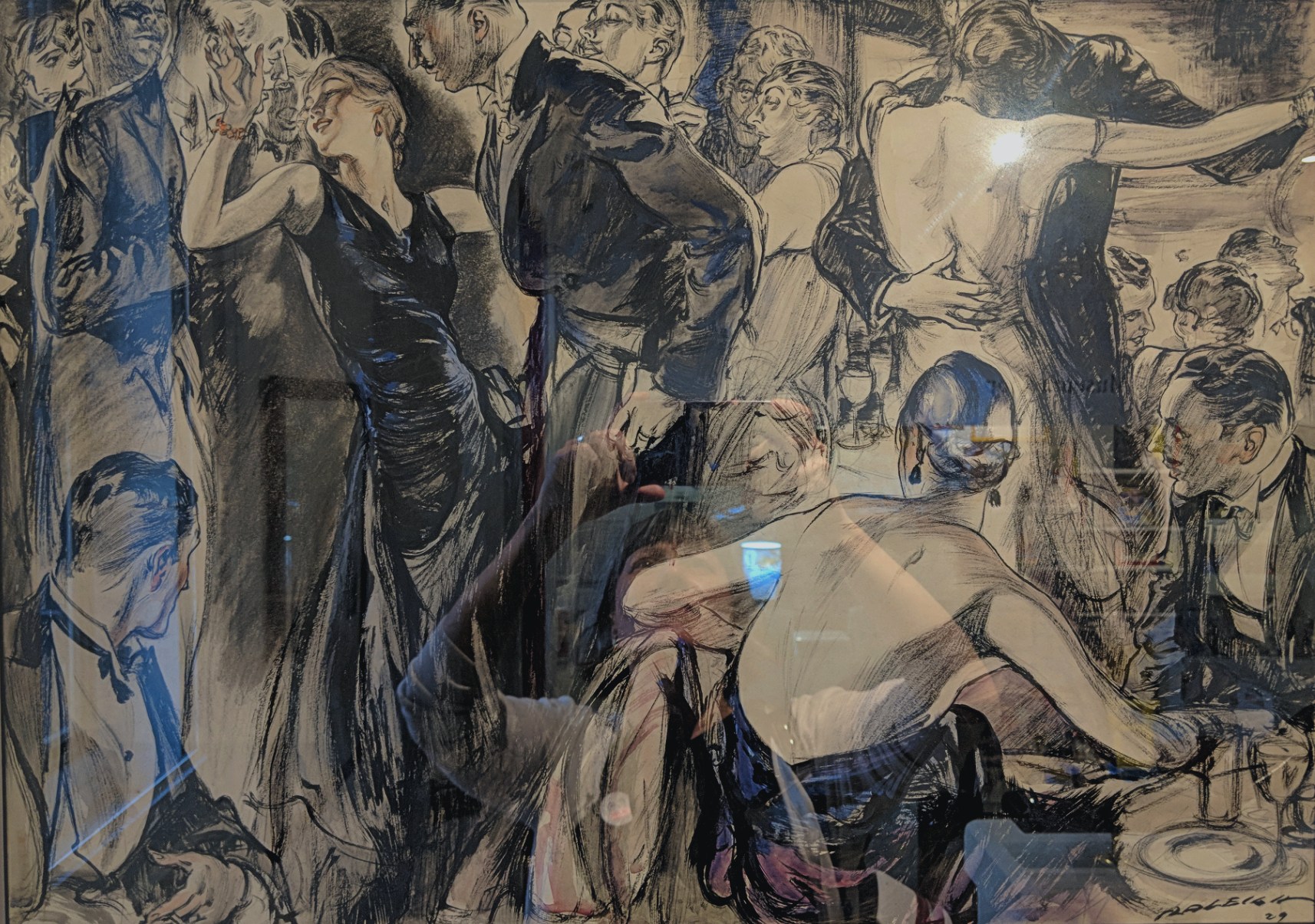 The Party Dress by Henry Patrick Raleigh
Interior illustration for the serialized novel by Joseph Hergesheimer
Caption: ”Lea cut in on Francis. ‘Against my better judgement,’ he said to Nina, ‘I am obliged to tell you are a sweet affair.’ Nina was in a glow of triumph. What especially engaged her was the fact that men rather than women spoke of her dress and praised it.”’
Hearst’s International combined with Cosmopolitan, November 1929
Ink and watercolour on illustration board
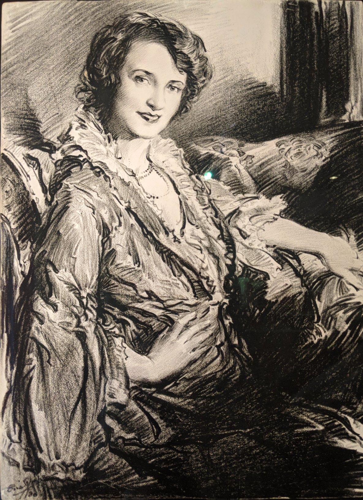 Portrait of Billie Burke by Frederic L. ”Eric” Pape
Published in the theatre section of the Sunday New York Herald Tribune, advertisement for ”The Truth Game”, December 28, 1930
Litho crayon on paper
Society of Illustrators
July 28th, 2018
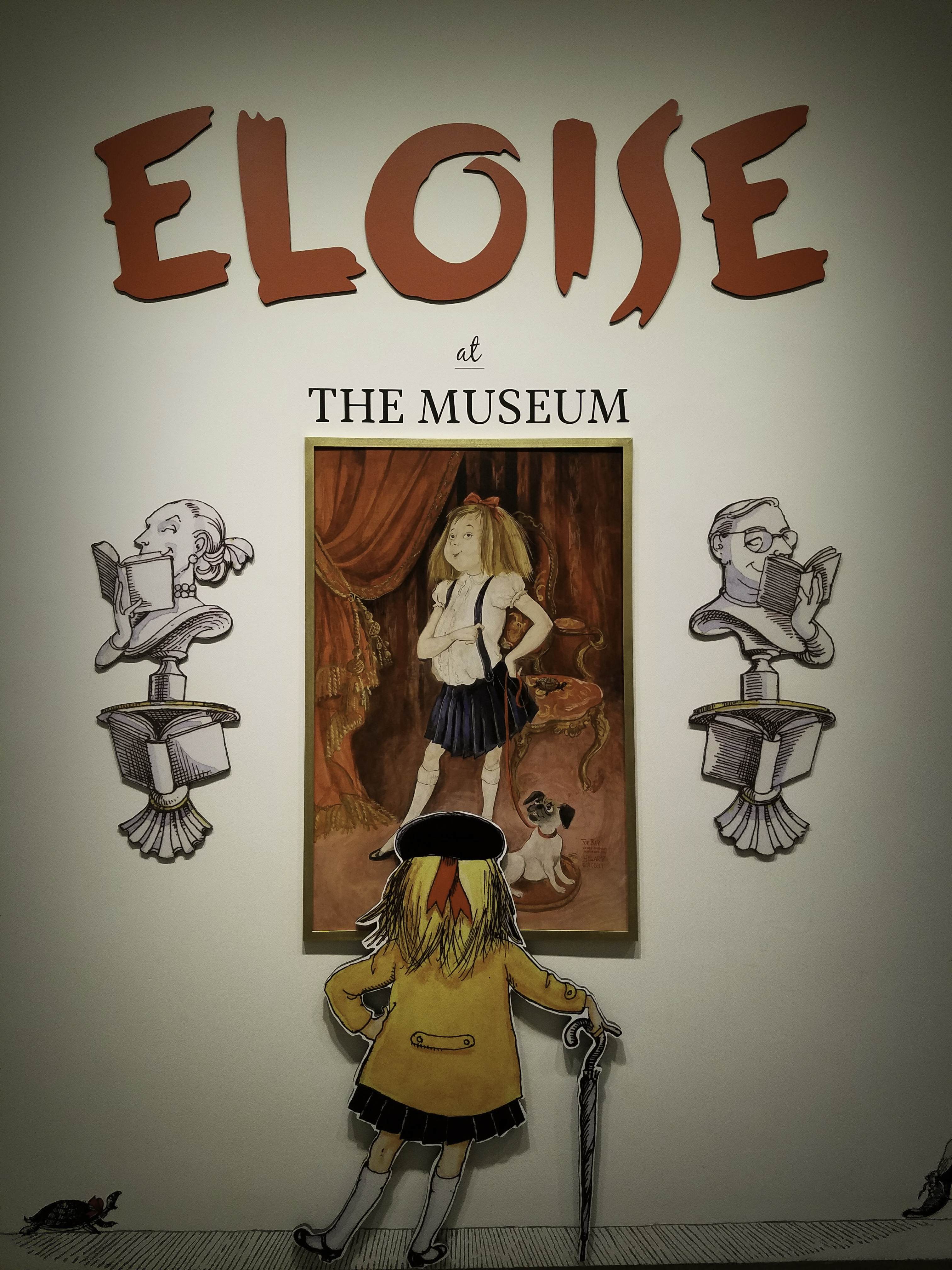
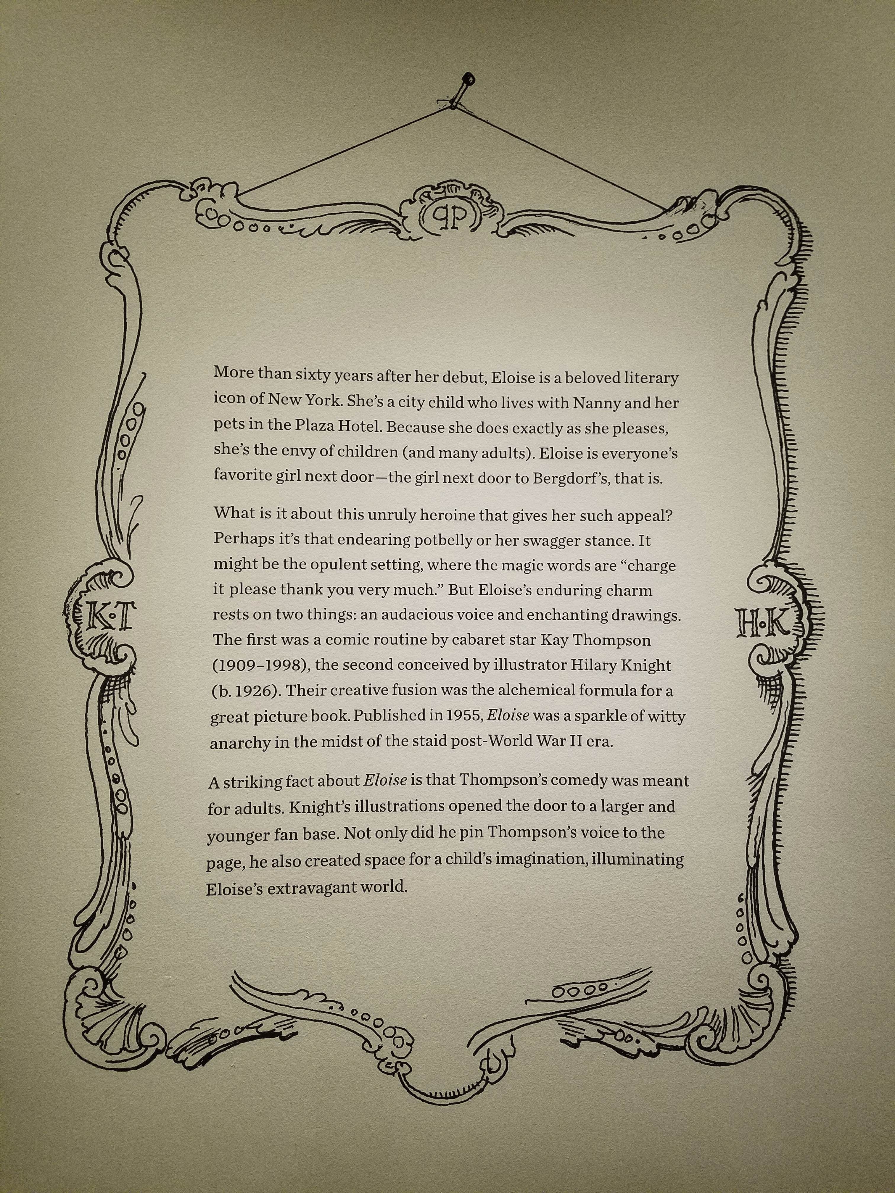
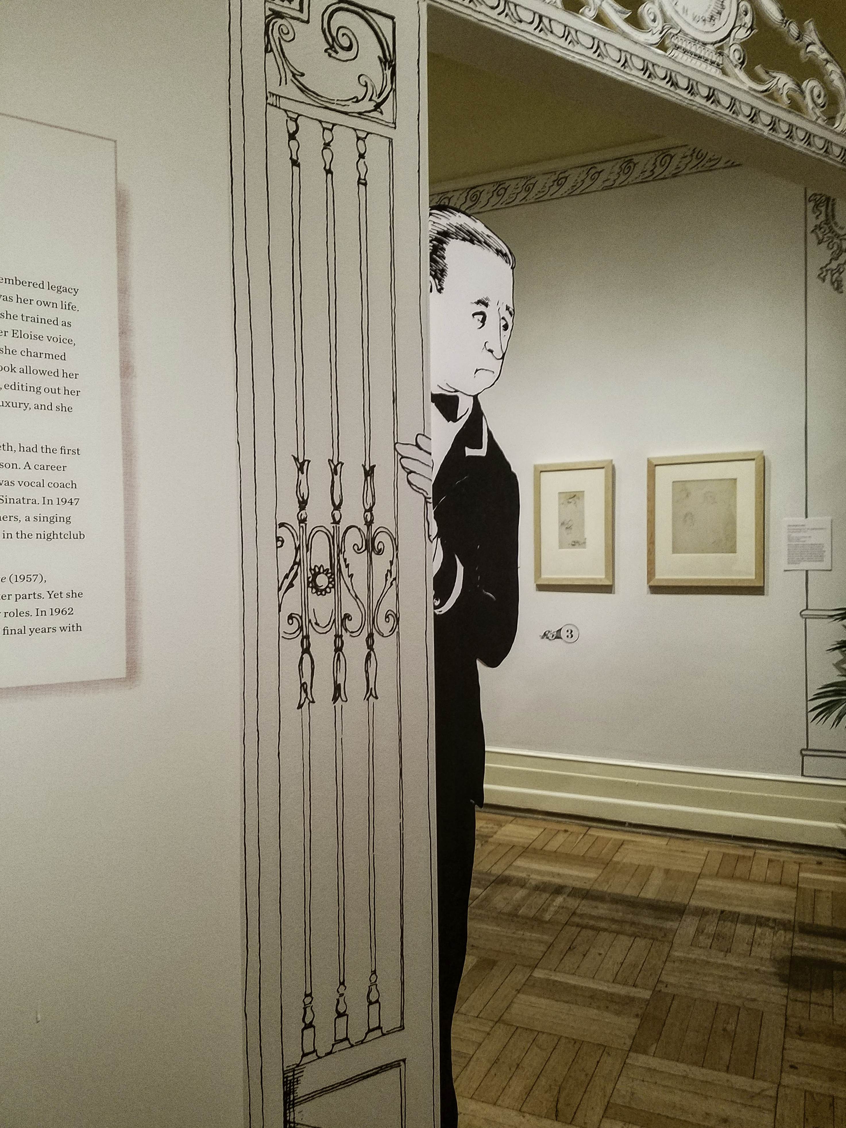
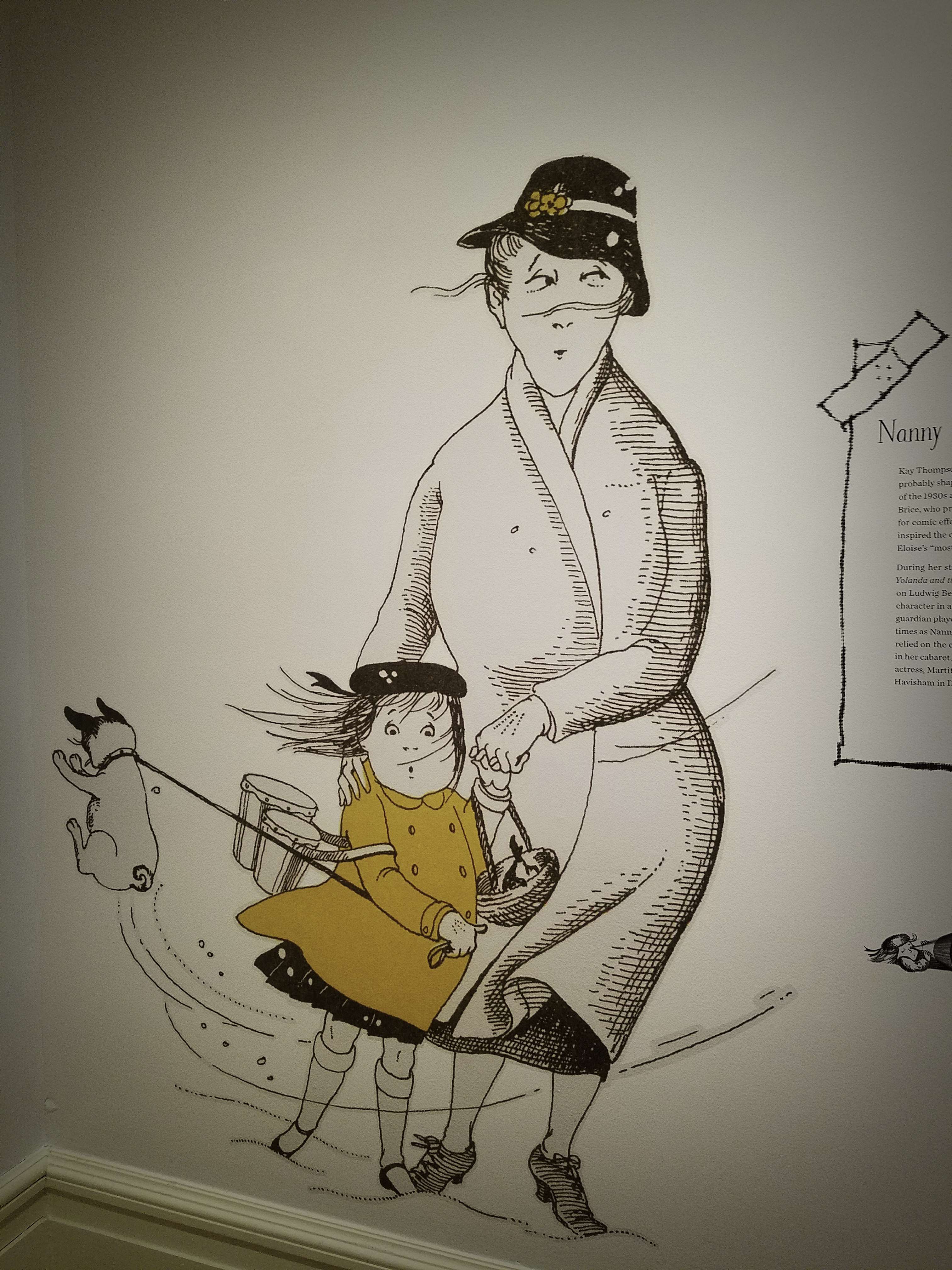
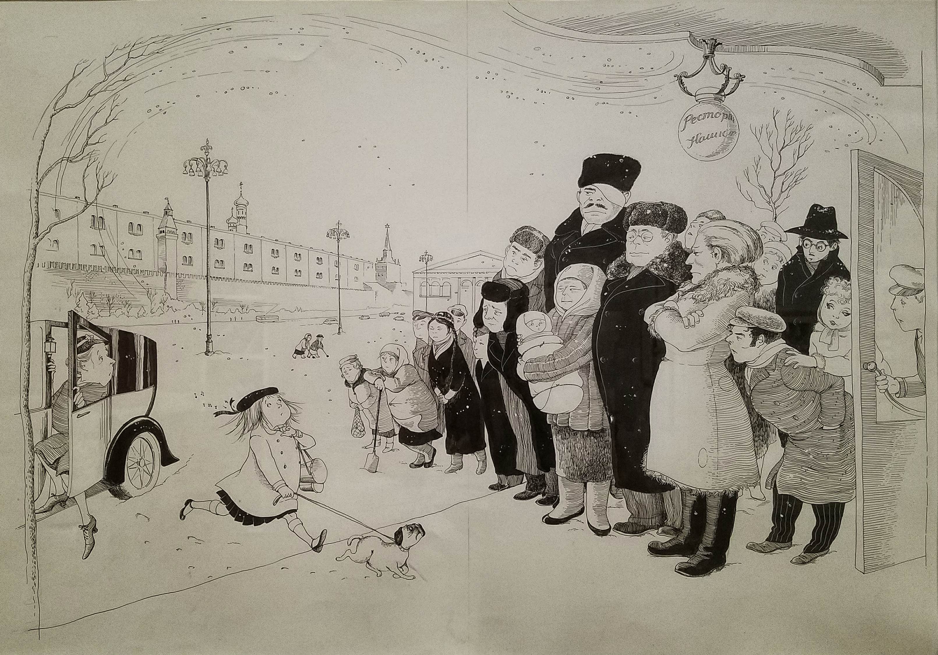
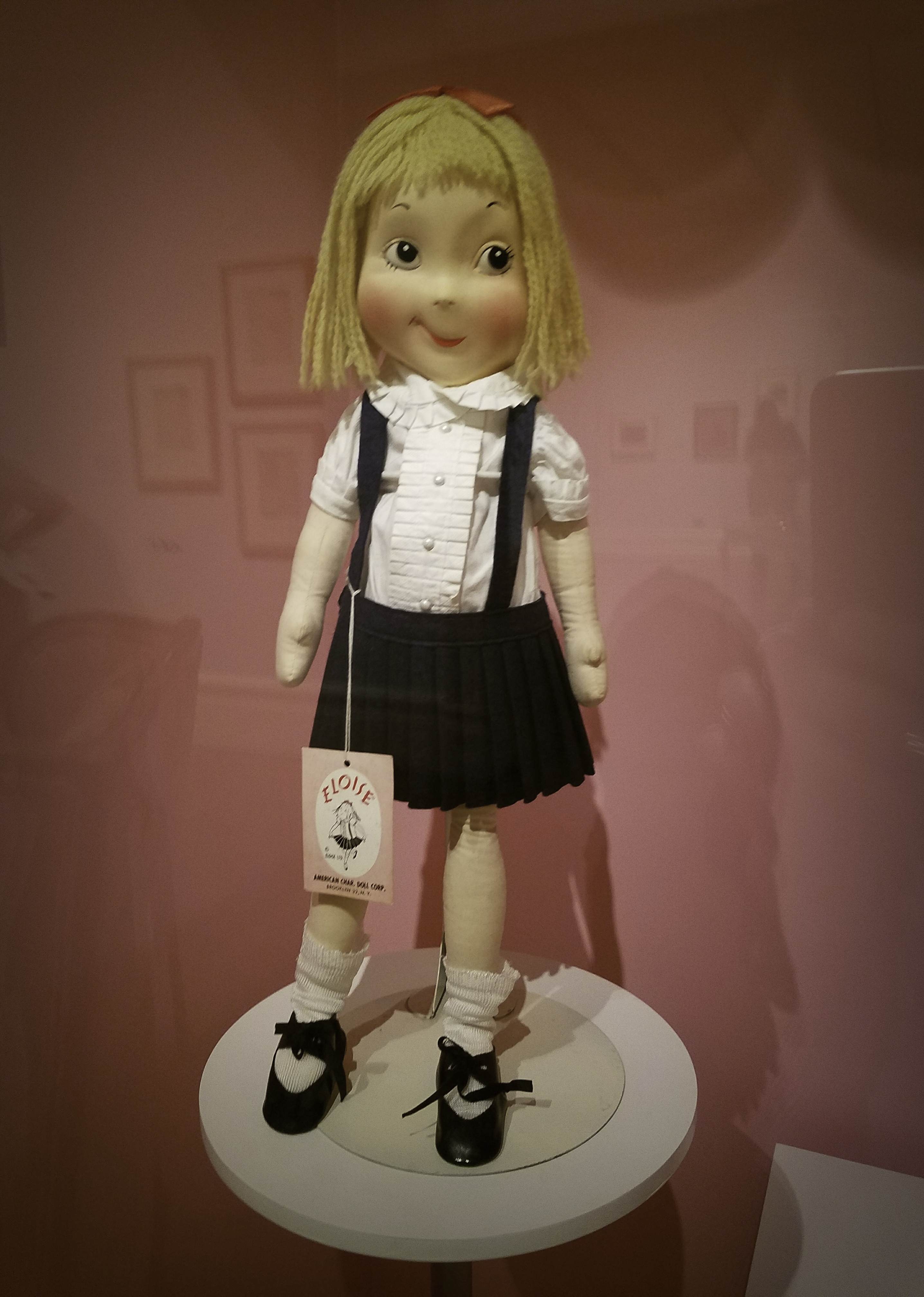
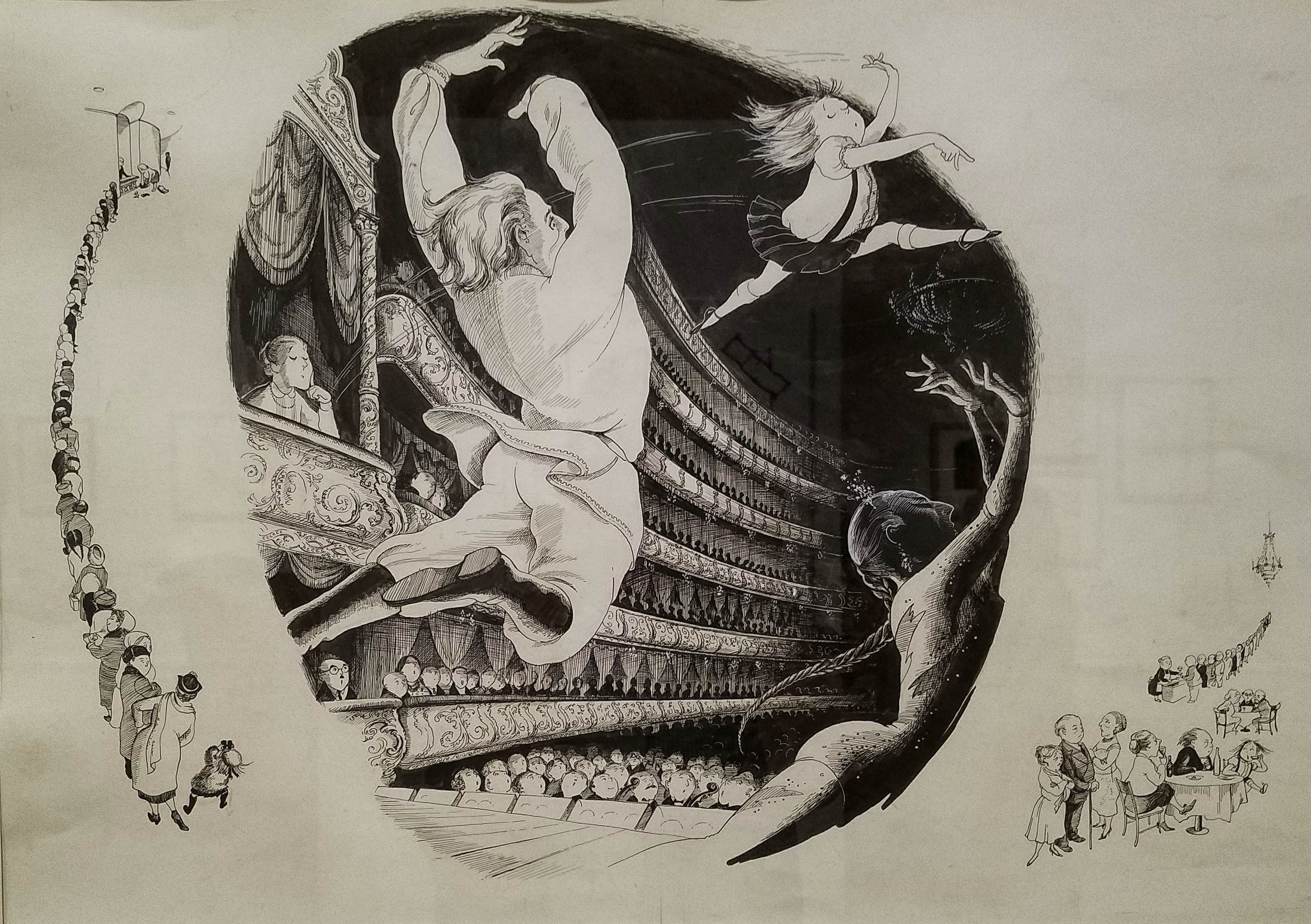
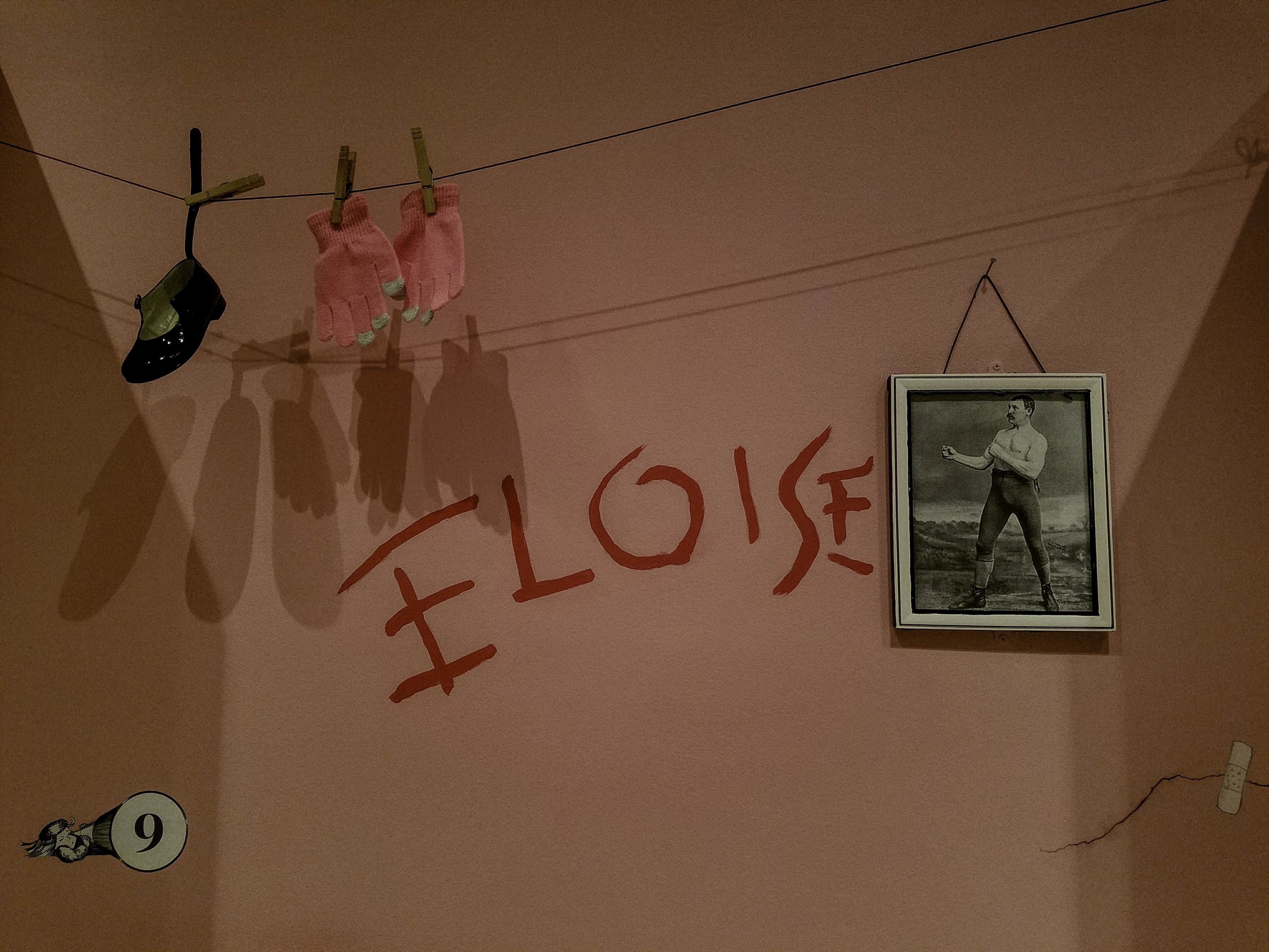
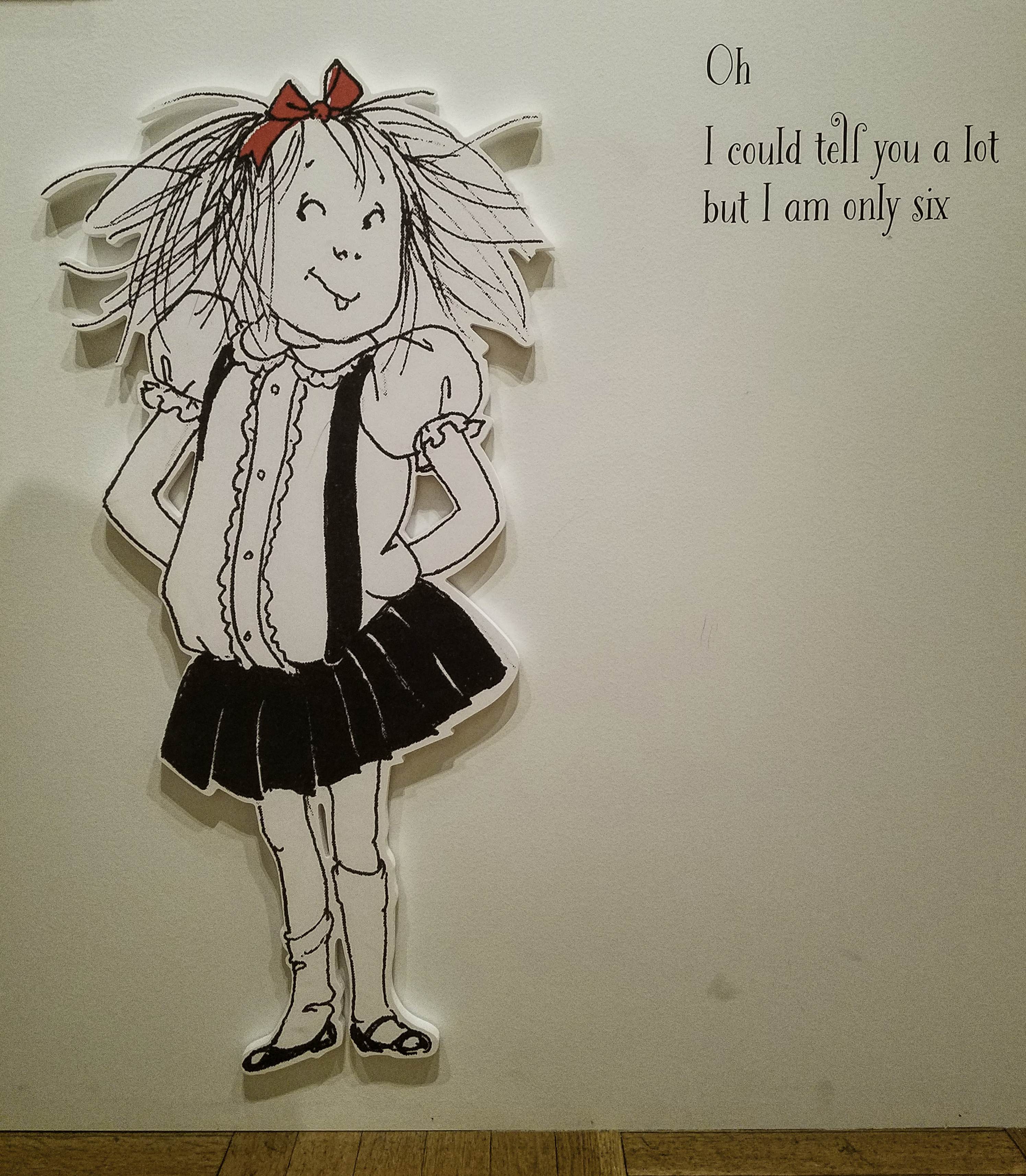
So what if I haven’t read any of her stories? Who wouldn’t want to meet Eloise, a mischievous, annoying, adorable little girl, a native New Yawker, and one who lives in the “room on the tippy-top floor” of the Plaza with her Nanny, her dog Weenie and her turtle Skipperdee, at that. So, put on your comfy slacks and your fancy pink flats, and let’s go see what she has in store for us, shall we? 

 Hilary Knight
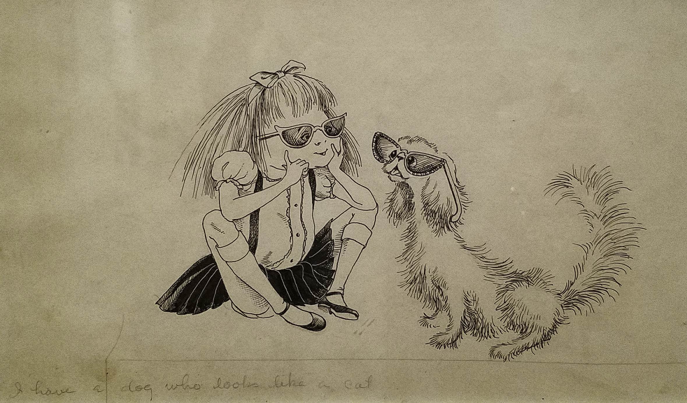
Study for ”I have a dog that looks like a cat”, 1955
Pen and ink on paper
 Hilary Knight
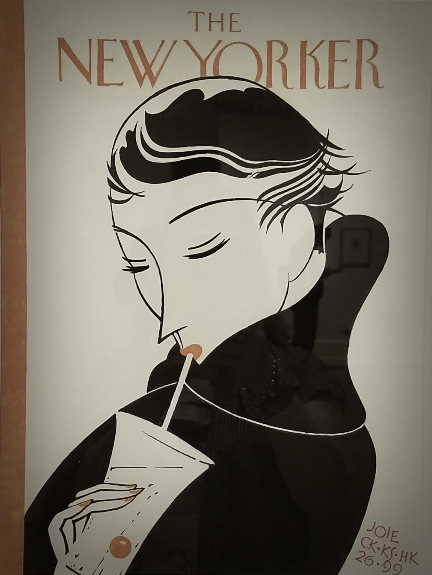
After Clayton Knight (1891-1969) and Katharine Sturges Knight (1890-1979)
Cover of The New Yorker, April 17, 1926, 1996
Gouache
Knight’s father, Clayton, specialised in aviation art. A pilot with the British Royal Air Force in World War I, he survived a crash landing in 1918 and went on to illustrate and write numerous books on the history of aviation. Clayton often collaborated with his wife, as in their cover for The New Yorker. Years later, Knight’s colour scheme for Eloise echoed its palette. His hand-painted copy of the cover is an homage to his parents’ work.
 Hilary Knight
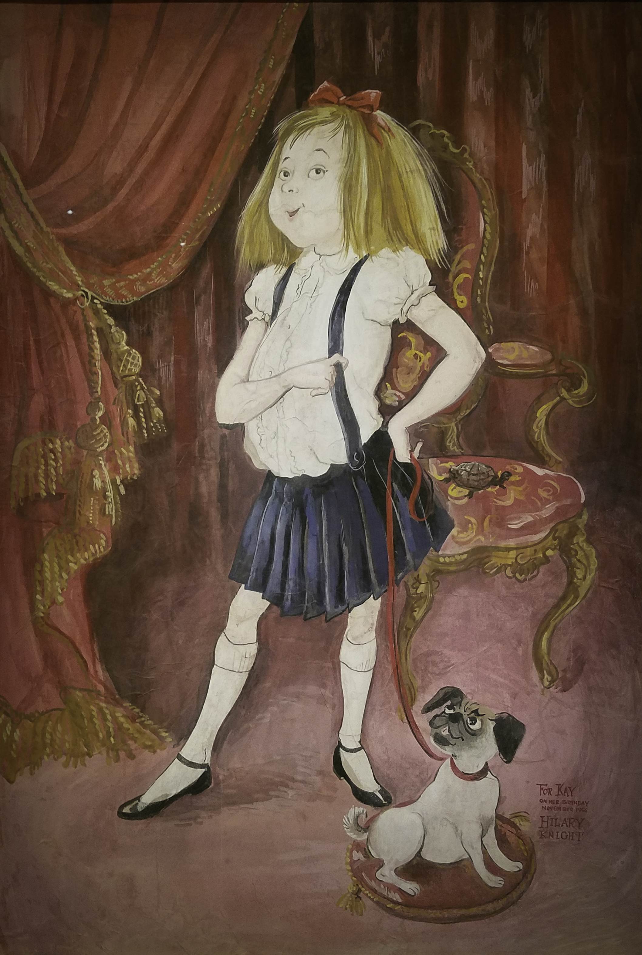
Eloise, 1956
Tempera on paper
A mystery surrounds this Eloise portrait. Painted in 1956 as a birthday gift for Kay Thompson, it vanished from the Plaza Hotel on November 23, 1960, the night of a Junior League debutante ball. ”Eloise kidnapped!” announced Walter Cronkite on CBS Evening News. In spite of Thompson’s offer of a reward, the painted failed to surface.
Two years later, Hilary Knight received a call. A muffled voice told him where his artwork was: in a dumpster, ripped to pieces. Devastated, he retrieved the ruined work and put in a closet.
But the puzzle remained. Who stole Eloise? In retrospect, Thompson herself was the only person who benefited from its disappearance. This may have been the stunt of her career, giving her ample press and a dramatic exit for the character she was done with. Staging a media moment and destroying Knight’s work underlined the primacy of the author’s voice. A final clue came when Thompson confessed in a 1993 interview that she had found the portrait ”on Eight-something Street… torn up.” There’s so much we’ll never know about Kay Thompson – and that’s just how she liked it.
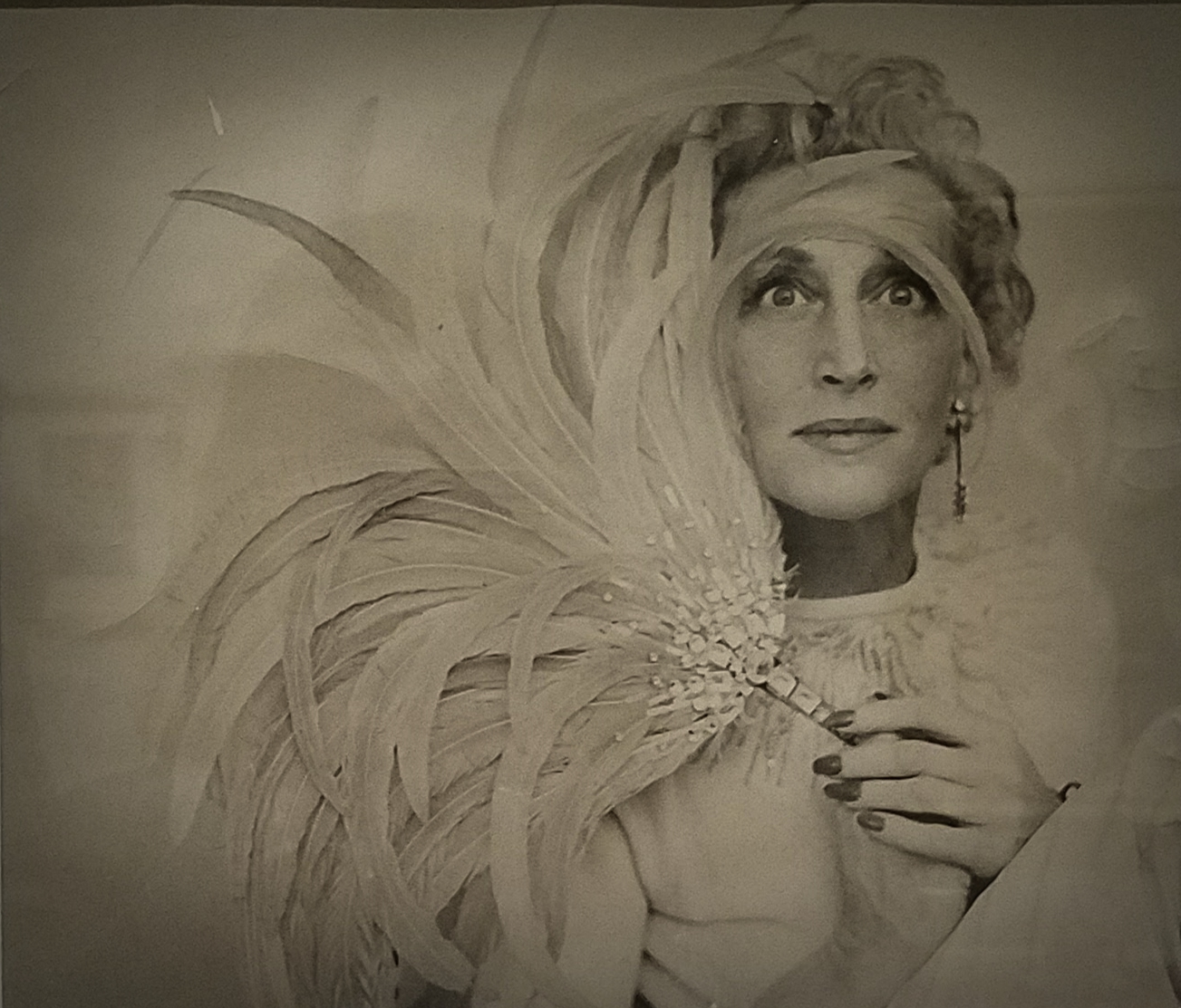 Richard Avedon
Kay Thompson, 1951
Photograph
For her session with Richard Avedon, Thompson held a sequinned fan made by Knight. But the had not met yet! D.D. Dixon, Avedon’s assistant for the shoot, had borrowed the prop from Knight, her across-the-hall neighbour. Four years later, Dixon suggested to Thompson that her Eloise voice might make a good book, if she could find the right illustrator. She introduced Knight to Thompson at the Plaza’s Persian Room, in December 1954.
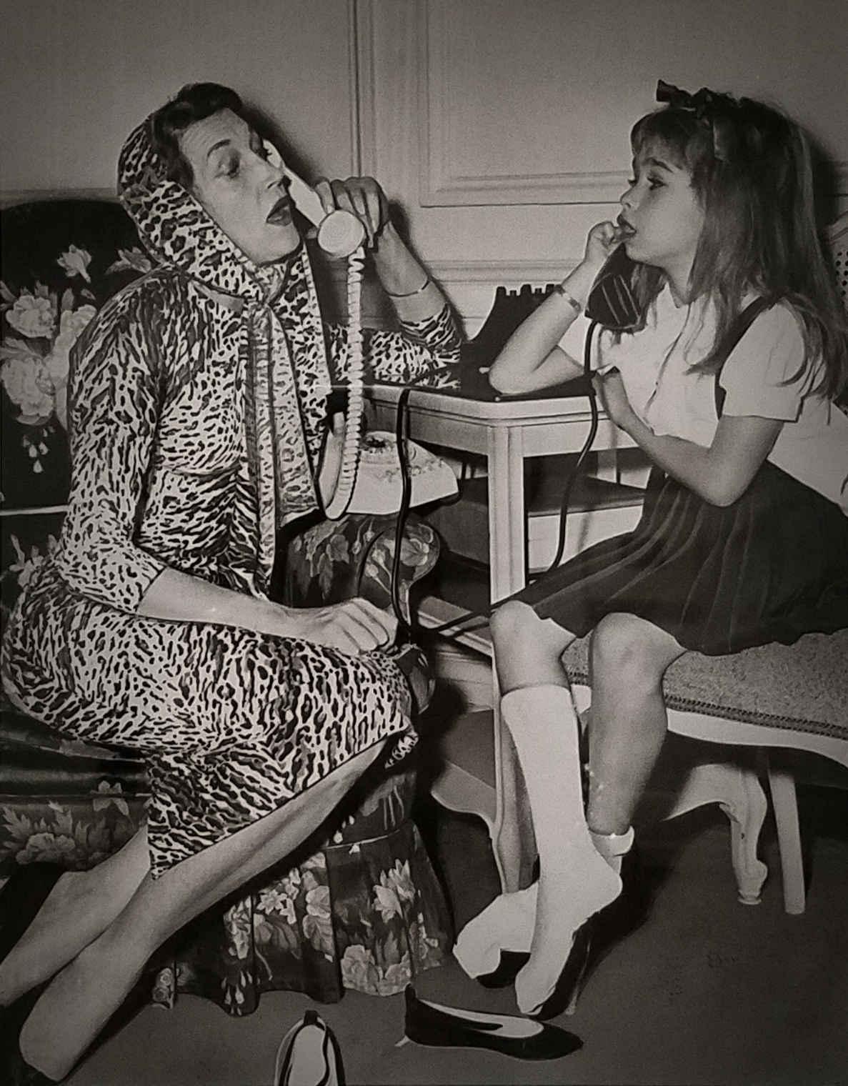 Kay Thompson and Evelyn Rudie, publicity still from the Playhouse 90 movie Eloise, 1956
 Hilary Knight
Final illustration for ”I always stay at the National whenever I am in Moscow”, 1959
Pen &brush and ink & graphite on paper
 Hilary Knight
Final illustration for ”Here’s what we did a lot of”, 1959
Graphite & pen and brush & ink with gouache on paper
 A rawther fluzzery picture, don’t you see?
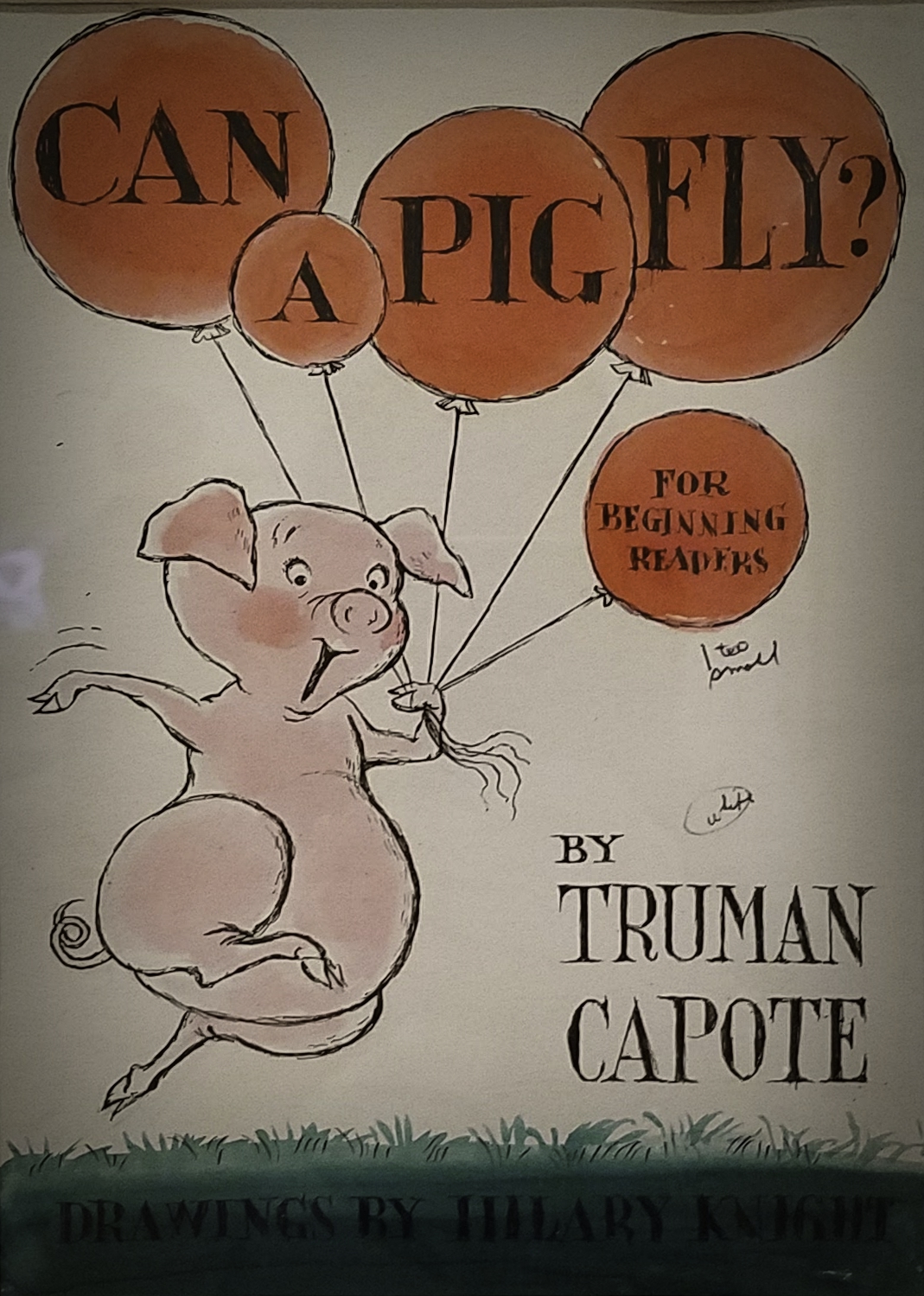 Hilary Knight
Cover illustration for Truman Capote’s manuscript Can a Pig Fly?, 1958
Pen and ink and watercolour on paper
A curious project that never saw publication was Knight’s collaboration with the Truman Capote. The success of Dr. Seuss’ easy reader The Cat in the Hat in 1957 prompted the editors at Random House, its publisher, to ask their entire author list to try this popular new form. None made it to completion, but Knight and Capote enjoyed working together on sketches and notes.
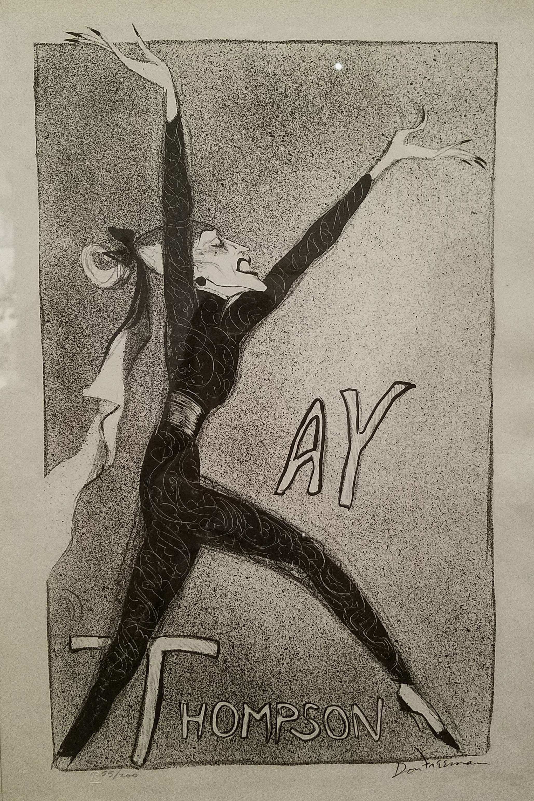 Don Freeman
Kay Thompson, 1951
Lithograph on paper
 Unidentified photographer
Kay Thompson and the Williams Brothers, ca. 1948
Eight songs, forty minutes and no encore. Thompson’s athletic act with the Williams Brothers was innovative, witty, and a smash success. Taking the concept of the overhead boom mike used on movie sets, Thompson had microphones strung all over the ceiling to allow the five performers to move freely about the stage. ”There’d never been an act like it”, Andy Williams said.
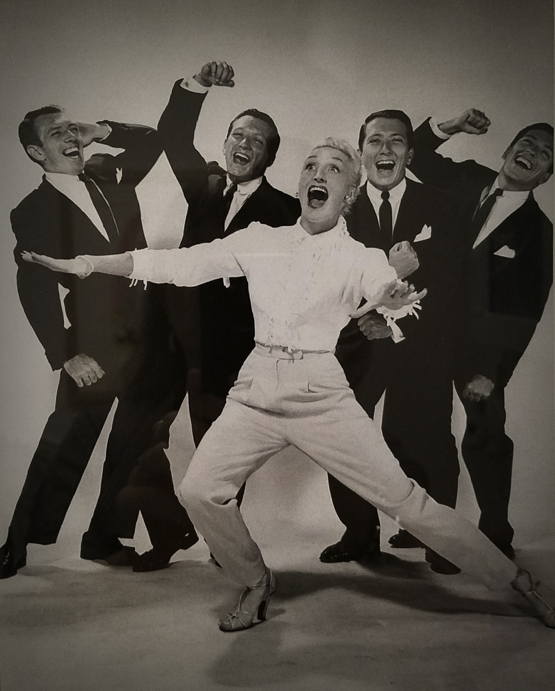
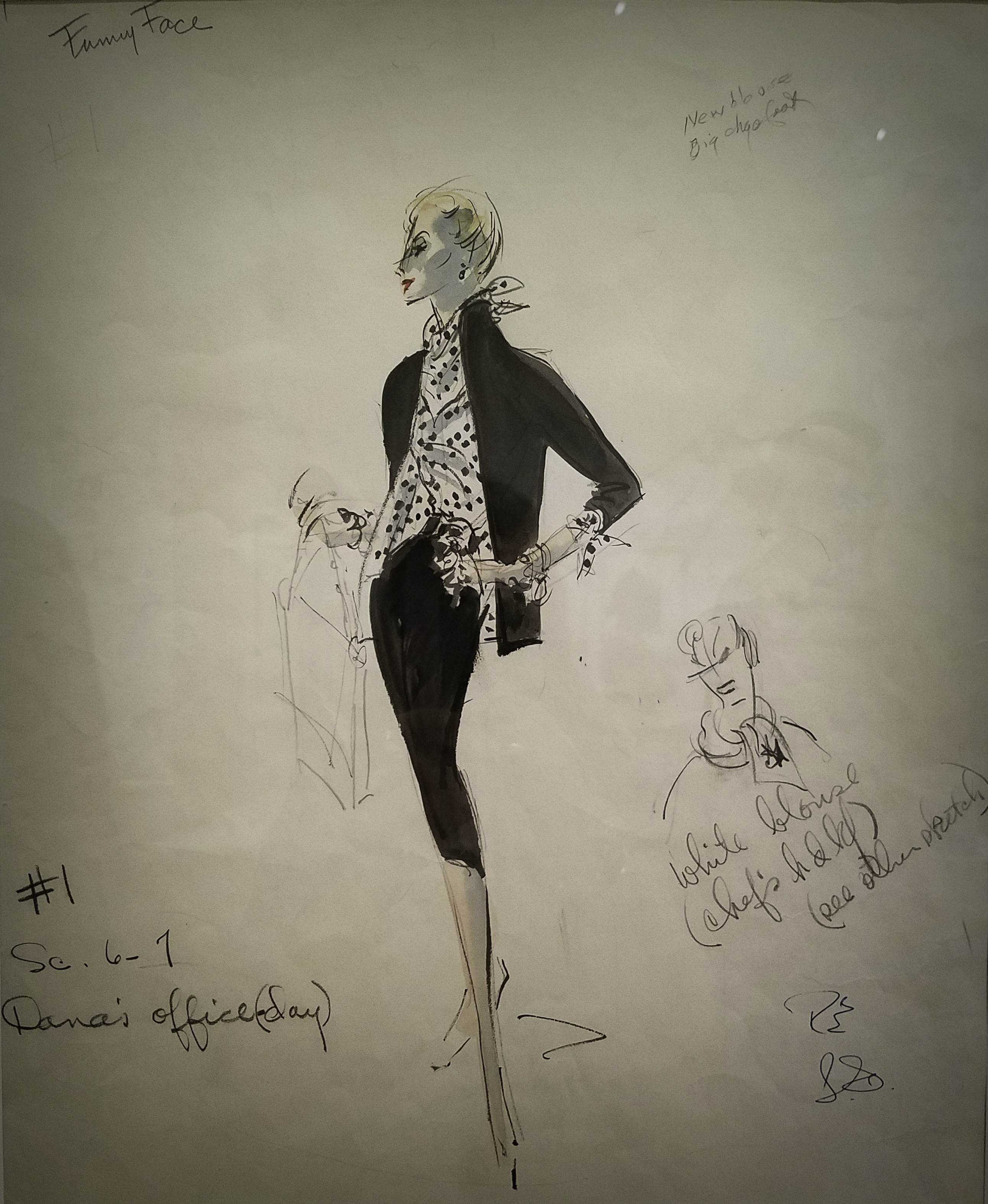 Edith Head
Kay Thompson’s office costume for Funny Face, 1956
Pen, ink and watercolour on paper
This meticulously detailed working drawing from Edith Head’s studio documents the cost of Thompson’s office outfit: $480 and another $65 for accessories.
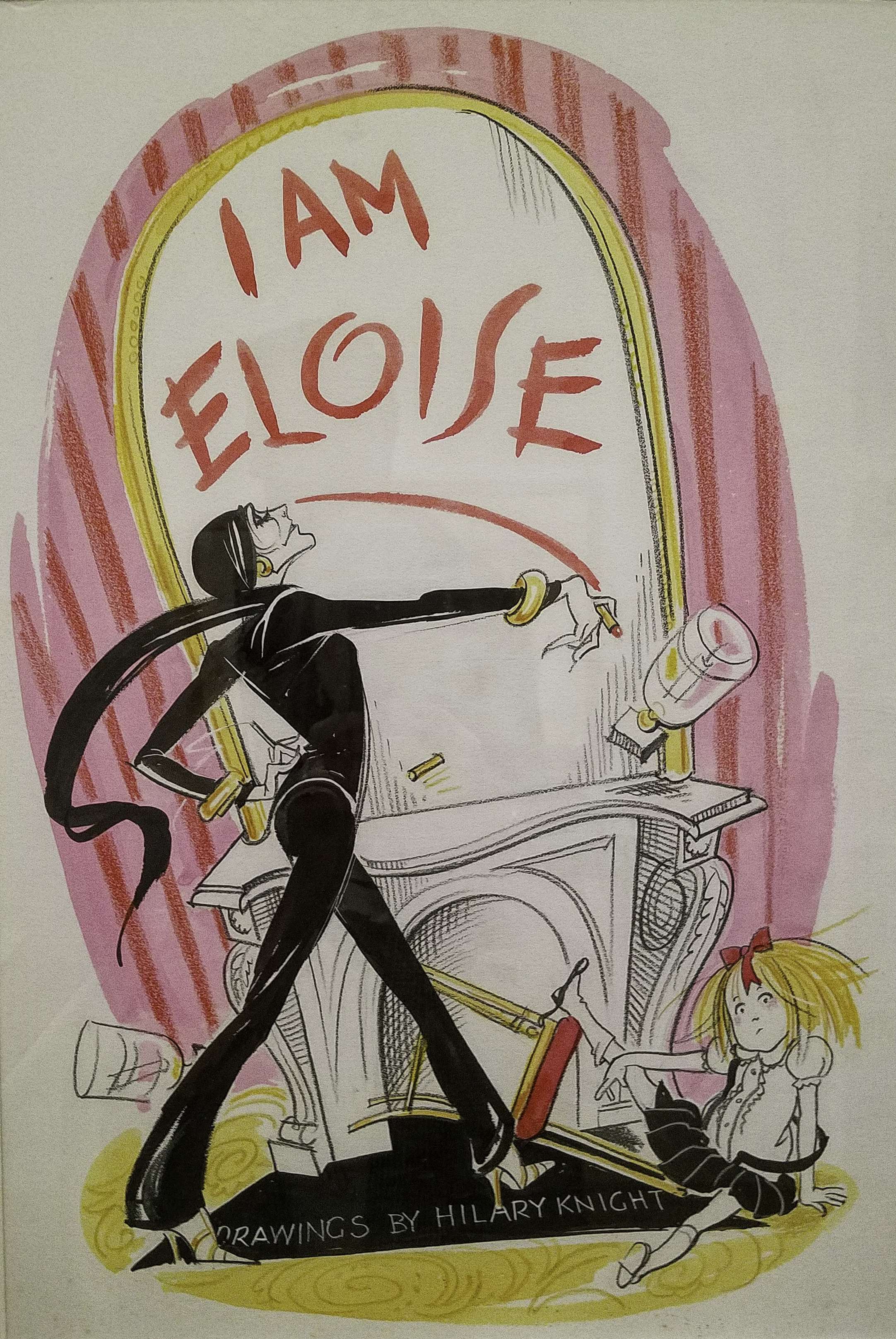 Hilary Knight
Sketch for ”I AM ELOISE”, 1996
Watercolour, brush and ink, crayon and graphite on Bristol board
Eloise is the alter ego of cabaret star Kay Thompson (1909–1998), best known for her role as fashion magazine editor in Funny Face (1957), and her collaboration with writer and illustrator Hilary Knight (b. 1926), best known as the Man who Drew Eloise.
These and many more objects, manuscript pages, sketchbooks, portraits, photographs and vintage dolls were on view at the New-York Historical Society, back in 2017. If you missed it fret not. Think Pink and head over to the Plaza. You may just catch a glimpse of the elusive enfant terrible skibbling down the hallway.
New-York Historical Society
September 23rd, 2017
The work of a Polish artist on show at the New-York Historical Society? That seemed strange at first, but a quick read of the introduction shed light on the artist’s relation with the United States and his deep admiration of, and dedication to American democratic values – those same values that are under thread today, shaking American society to its core.
Arthur Szyk fought the demons of WWII in his own creative way, by focusing on political cartooning and producing works that were published as magazine covers, reproduced as posters, and exhibited in art galleries. Among the many admirers of his work during this period was Eleanor Roosevelt, who wrote in her newspaper column My Day: “In its way [Szyk’s work] fights the war against Hitlerism as truly as any of us who cannot actually be on the fighting fronts today.” [source]
Arthur Szyk was so dedicated to American democratic values that he actually became an American citizen in 1948. These are some of the artworks he made during his years in New York City. 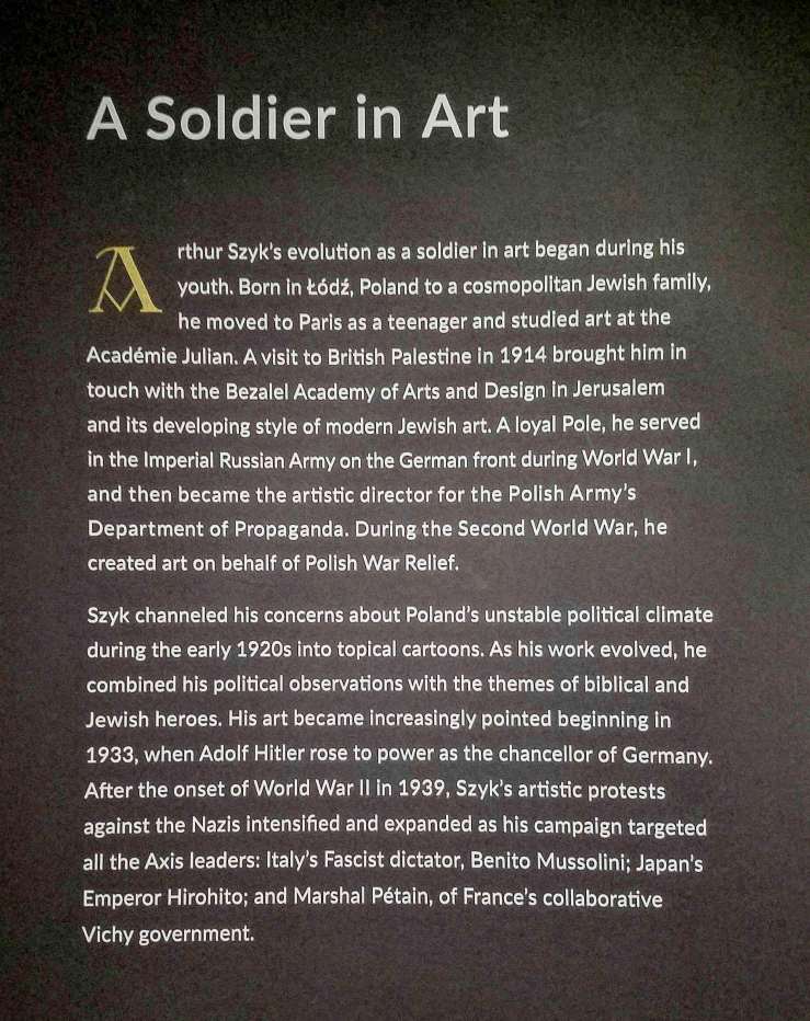
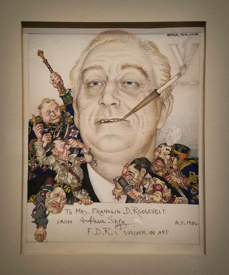 FDR’s Soldier in Art, 1944
Pencil, watercolour, pen and ink on paper
Szyk’s lively portrait of Franklin Delano Roosevelt (1882-1945) conveyed the artist’s reverence for the US and its principles of freedom and justice, and his belief that the president would lead the Allies – United States, Great Britain and Russia – in defeating the Axis powers. He dedicated the portrait to Eleanor Roosevelt in 1946 following the president’s death. Mrs. Roosevelt admired Szyk and mentioned his artistic crusade in her newspaper columns on several occasions.
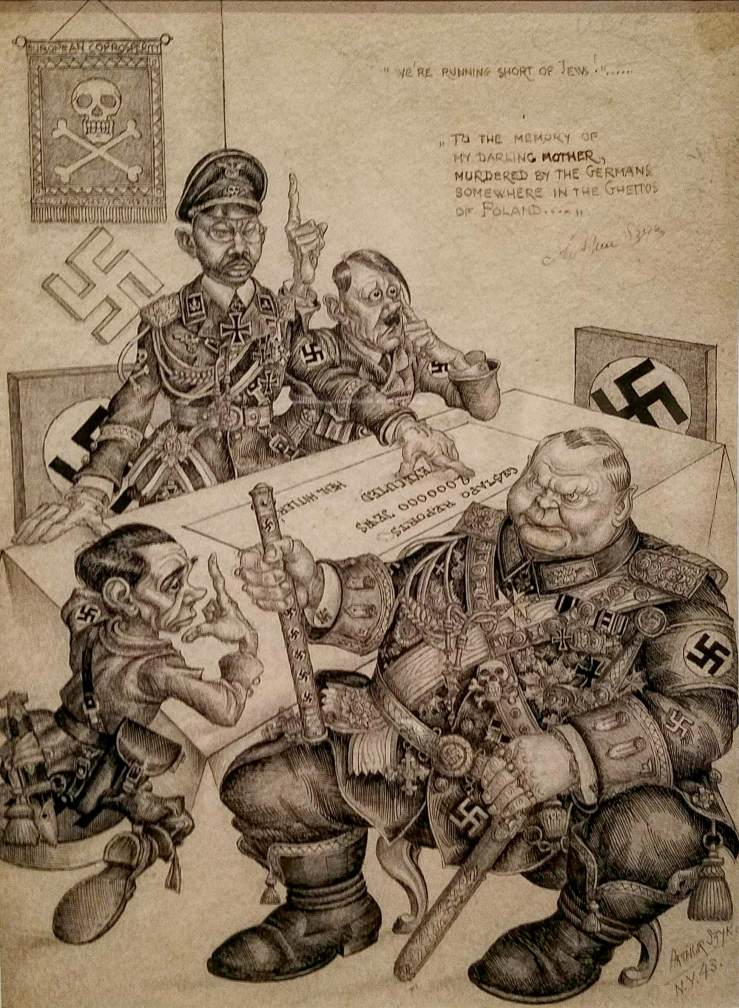 We’re running short of Jews!…, 1943
Ink and graphite on paper
The drawing responded to an announcement made by the World Jewish Congress in November 1942 that confirmed the Nazis’ plan to annihilate Europe’s Jewish population. Szyk later dedicated the drawing to his mother, who died at the Chelmno extermination camp near the Łódź ghetto.
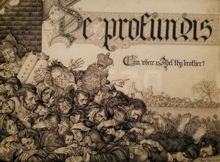 De Profundis. Cain, where is Abel thy Brother?, 1943
Ink and graphite on board
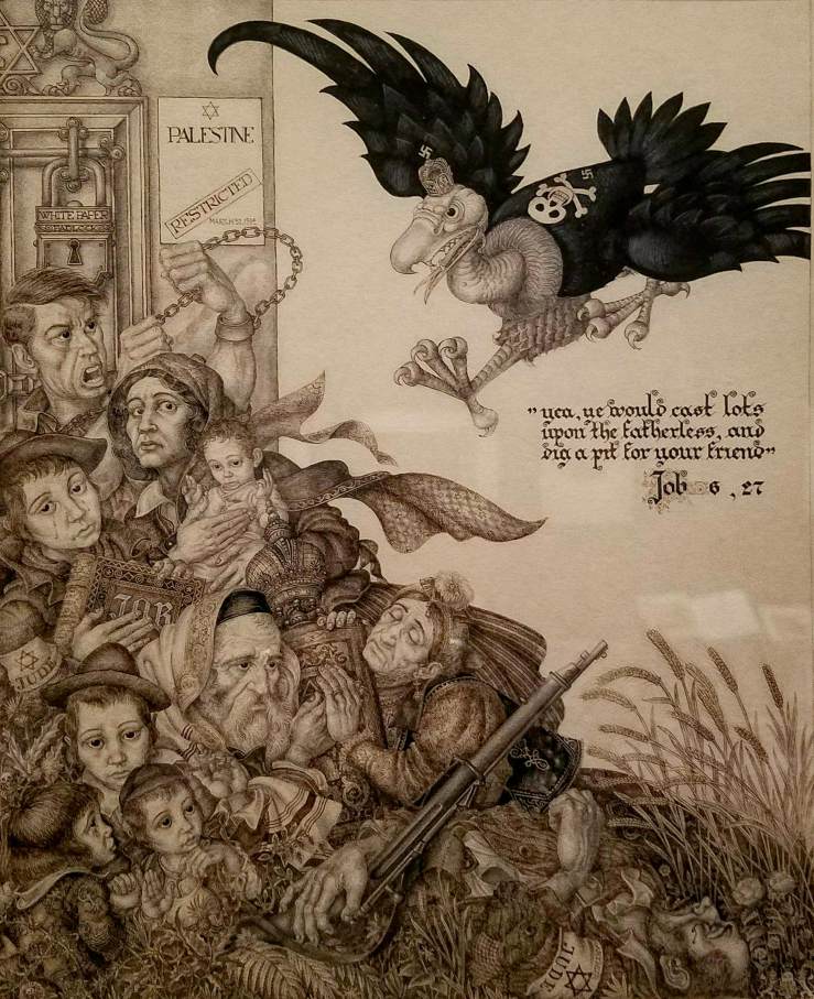 Palestine Restricted, 1944
Pen, ink and pencil on paper
Palestine Restricted furthered Szyk’s condemnation of the White Paper by likening it to a fierce vulture descending on masses of dead and dying men, women and children. The notation, March 31, 1944, marks the date when the British further tightened Jewish immigration, requiring the consent of Palestinian Arabs.
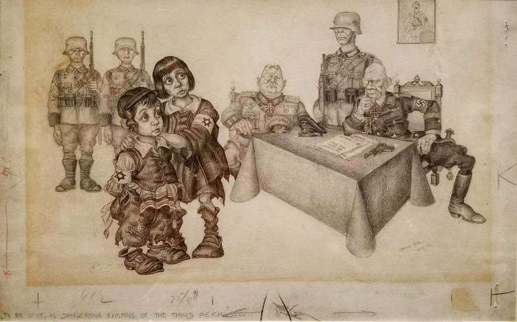 To be shot, as Dangerous Enemies of the Third Reich!, 1943
Ink and graphite on card
Szyk’s biting depiction of Heinrich Himmler declaring innocent Jewish children as enemies of the Third Reich emphasized the senselessness of Nazi anti-Semitism.
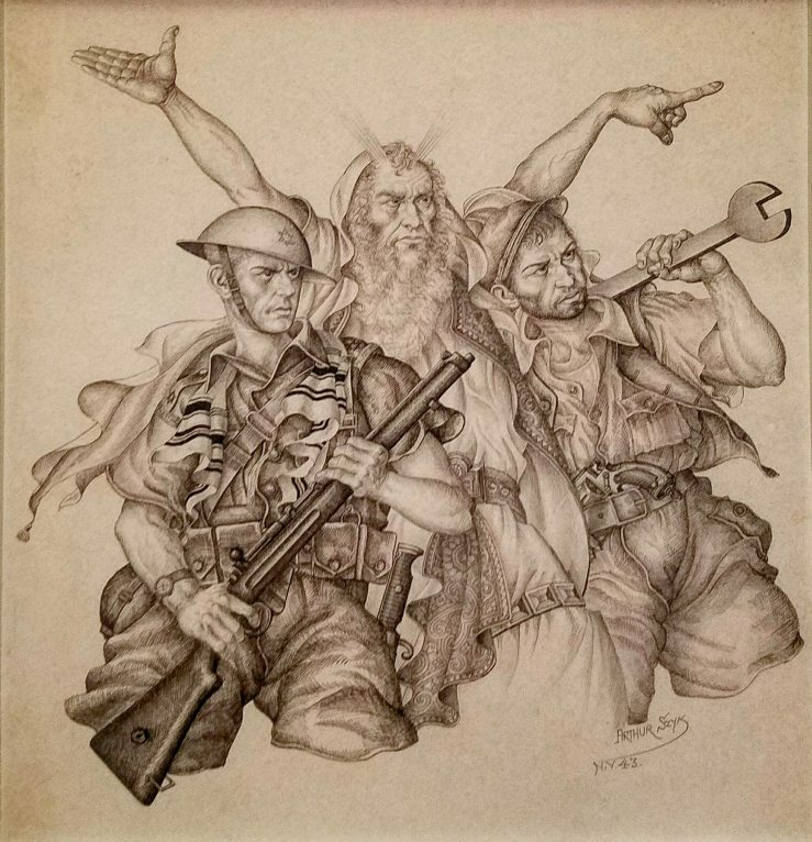 Modern Moses, 1944
Pen, ink and pencil on paper
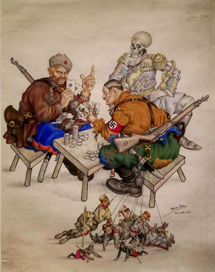 Untitled (The Silent Partner), September 1941
Watercolour, gouache, ink and graphite on paper
Szyk anticipated the US entry into WWII and Hitler’s eventual downfall in this depiction of a decorated figure of Death observing a dangerous poker game between Hitler and ”Ivan”, a pre-Soviet Union Russian leader. Gambling with the fate of the world, Hitler’s cards represent his alliance with Italy, Japan and Vichy France. Ivan’s hand includes the US and Great Britain. Seven puppets, the collaborating leaders of Hungary, Finland, Japan, Italy, Vichy France and Spain, hang from Hitler’s belt. The painting appeared on the cover of Collier’s on November 1, 1941, one month before the US entered the war.
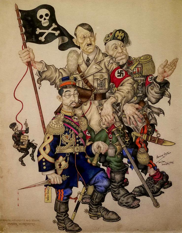 Murder Incorporated: Hirohito, Hitlerhito, Benito, December 1941
Watercolour and gouache on paper
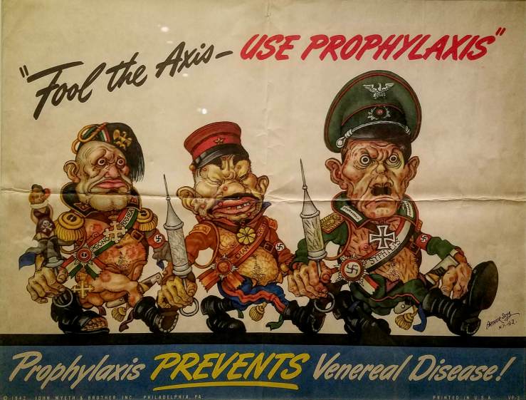 Offset lithograph. Here, Szyk characterizes Mussolini, Hirohito and Hitler as venereal diseases, offering perfect incentive to stay healthy and fight in the war effort.
More than 40 artworks by illustrator and miniaturist Arthur Szyk (1894–1951), were on view at the New-York Historical Society between September 2017 and January 2018.
New-York Historical Society
September 23rd, 2017
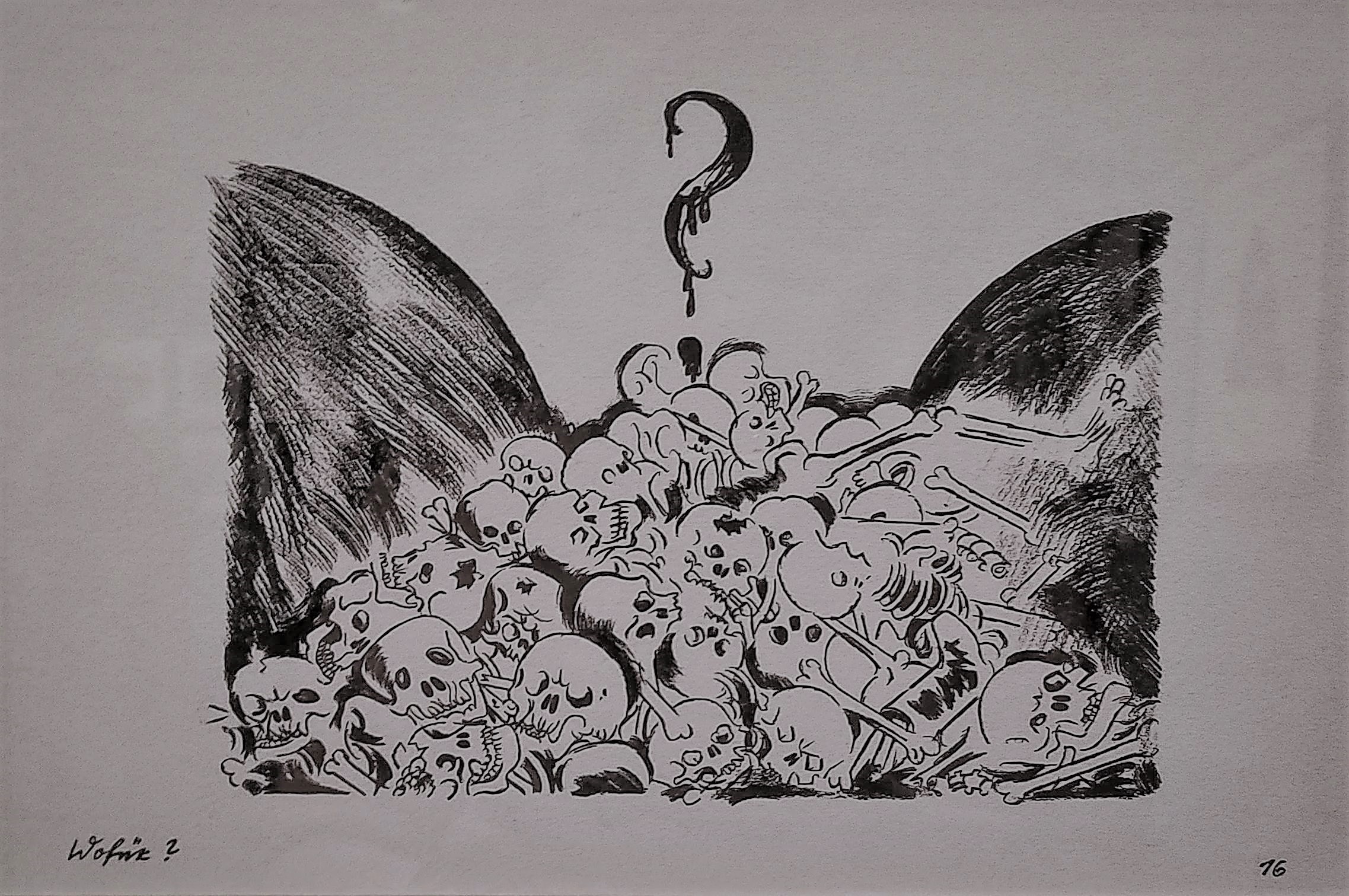
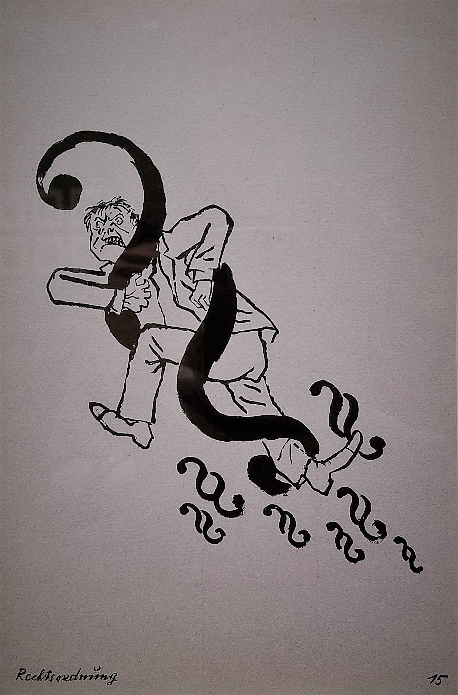
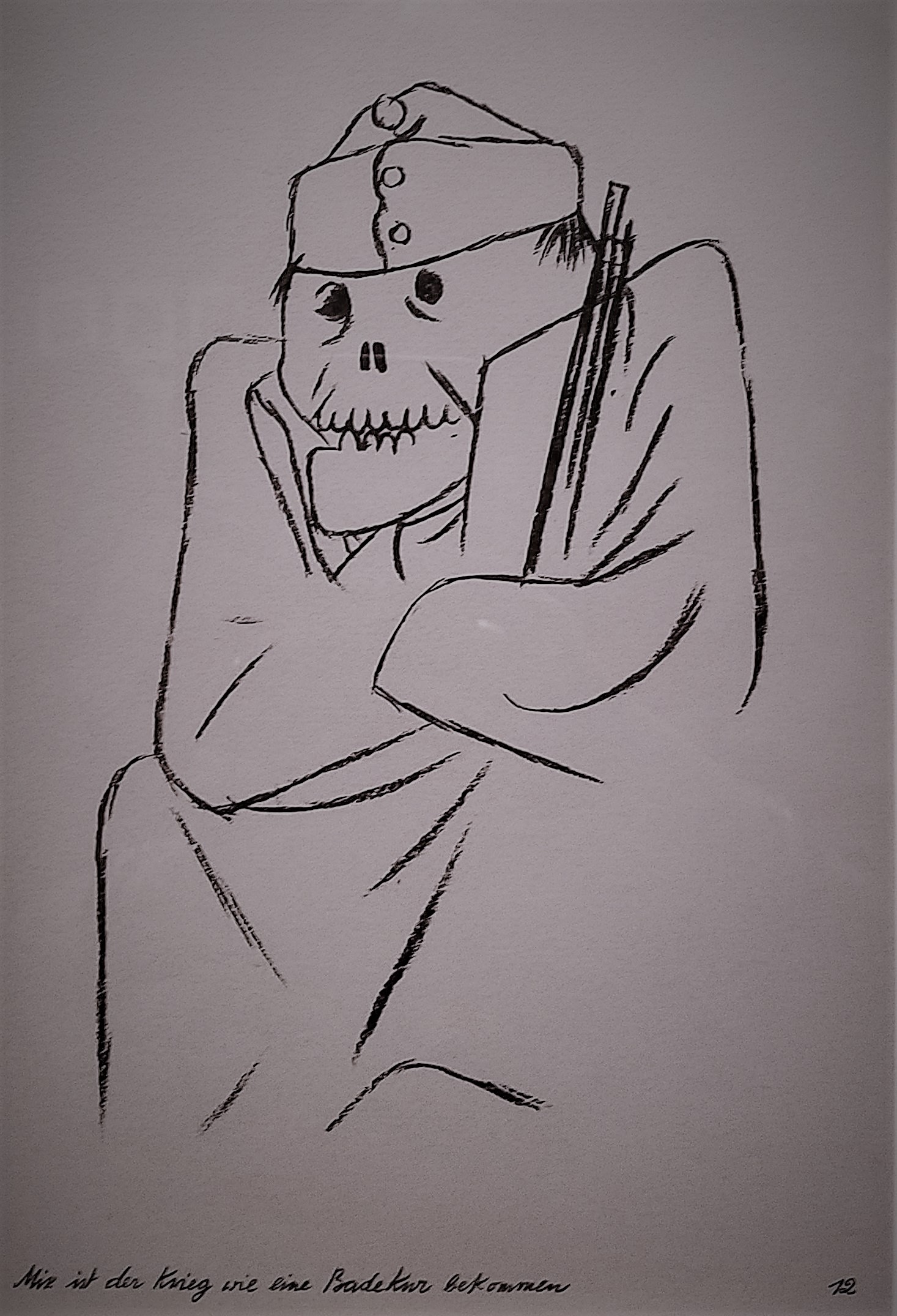
There is a sad beauty in these artworks drawing the tragedy of war.
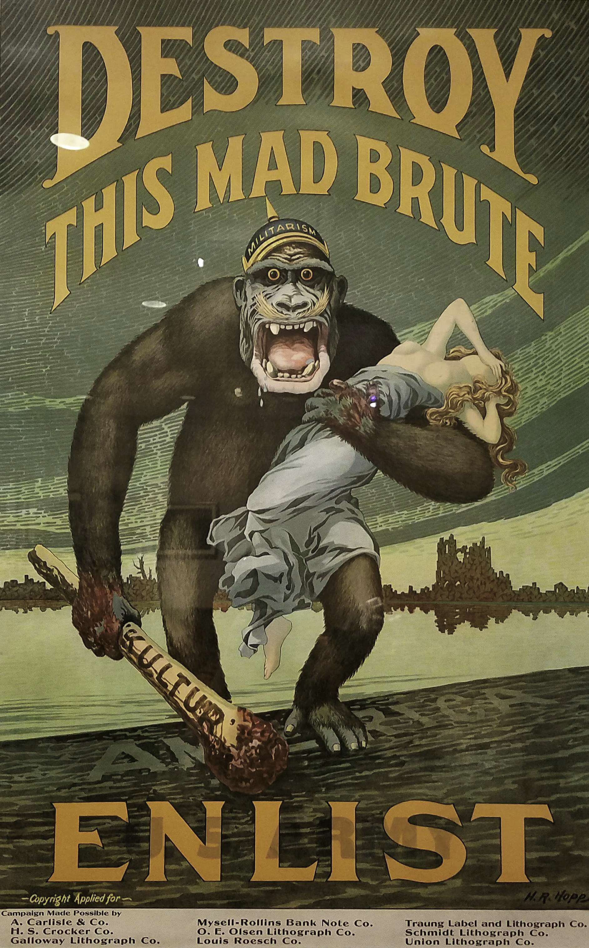 Harry R. Hopps (1869-1937)
Destroy This Mad Brute-Enlist, 1917
Colour lithograph
 French, early 20th century
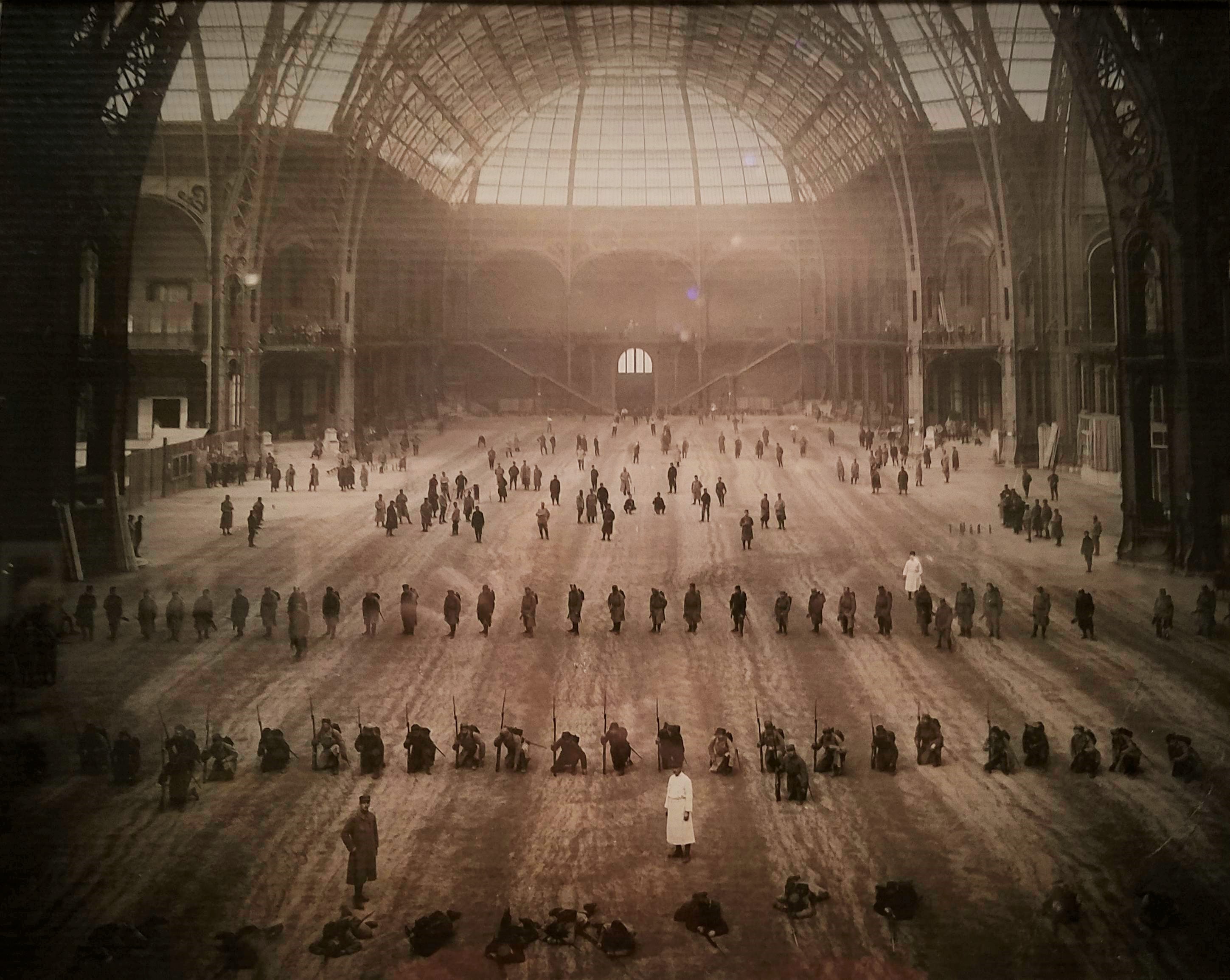
The Great Nave: Wounded Soldiers Performing Arms Drill at the End of Their Medical Treatment, 1916
Gelatin silver print
During WWI, Paris’ magnificent Grand Palais, a Beaux-Arts structure that opened in 1900 as an exhibition hall, was repurposed as a temporary military hospital that served injured French soldiers. It held one thousand beds and had two operating rooms, as well as an extensive physical rehabilitation centre where soldiers could recover from their injuries, exercise and practice military drills before returning to the front.
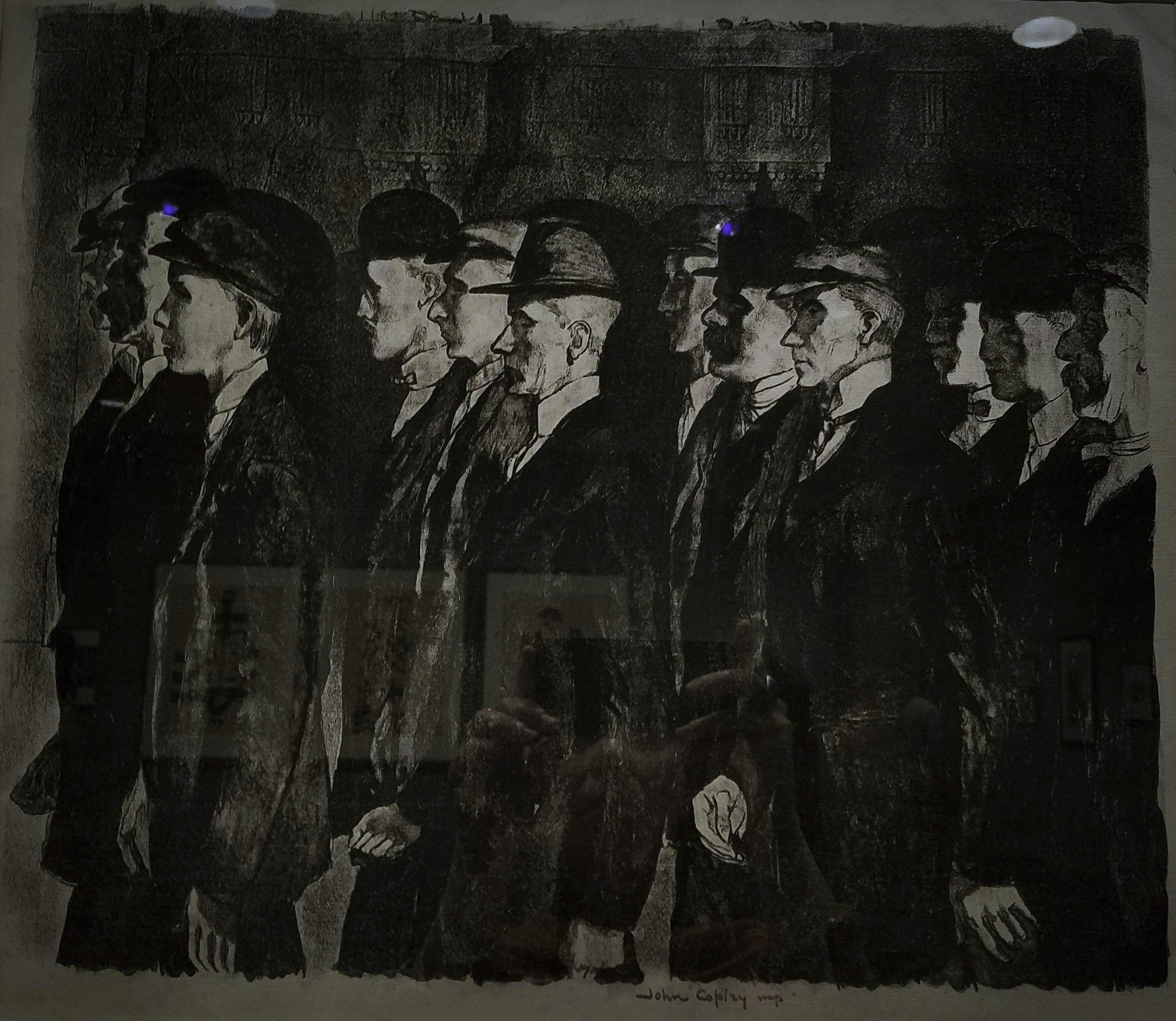 John Copley (1875-1950)
Recruits, 1915
Lithograph
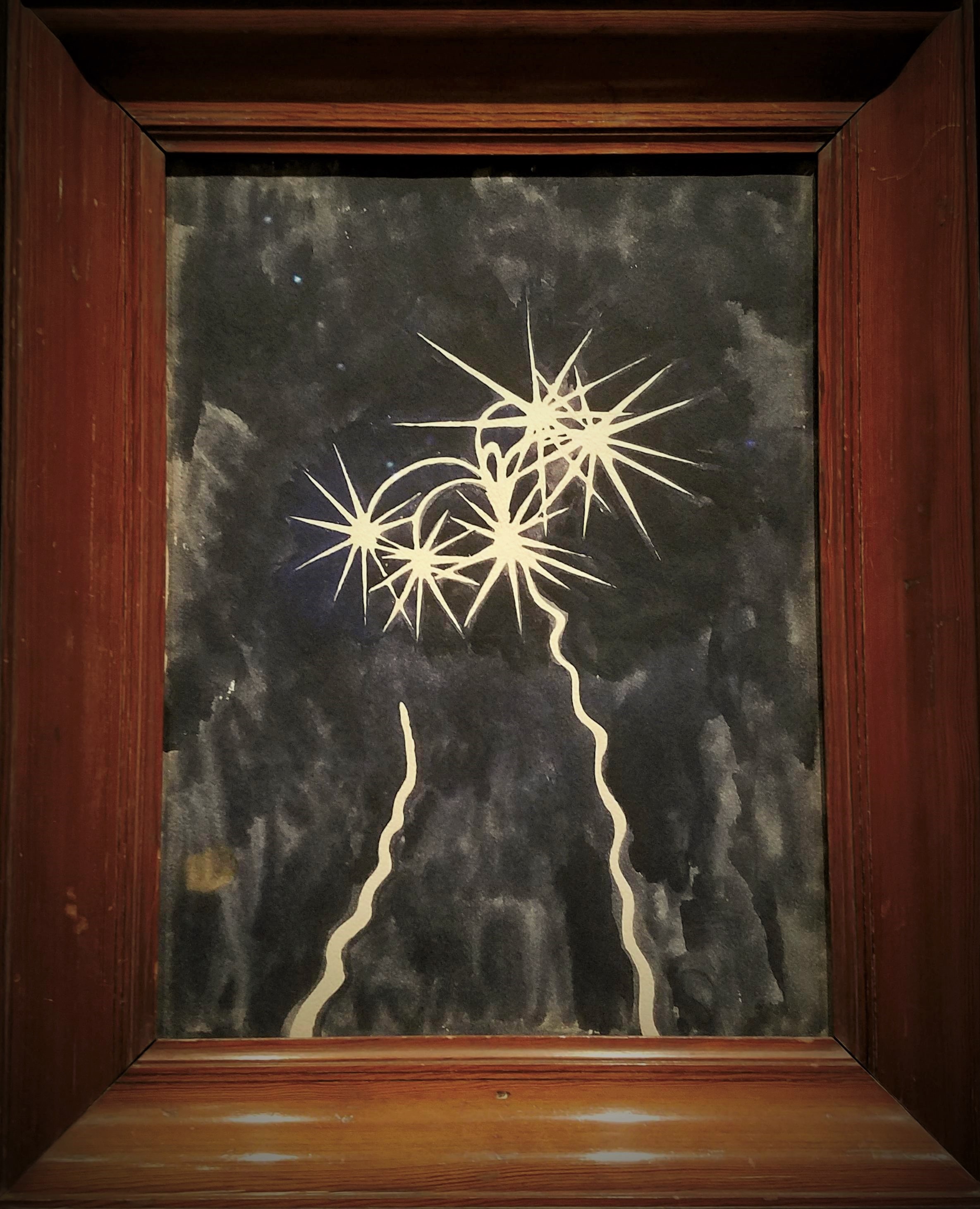 Léon Spilliaert (1881-1946)
Rockets, 1917
Watercolour, gouache, graphite
Spilliaert served briefly in the Belgian civil guard after the German invasion. A pacifist by nature, he was greatly affected by the violence of war. Here, he depicts a deep blue sky illuminated by the flare of rockets, an image witnessed by both soldiers and civilians in occupied territories. The artist concentrated not on the rockets’ violent potential but on the graceful forms they generate and their resemblance to stars and comets.
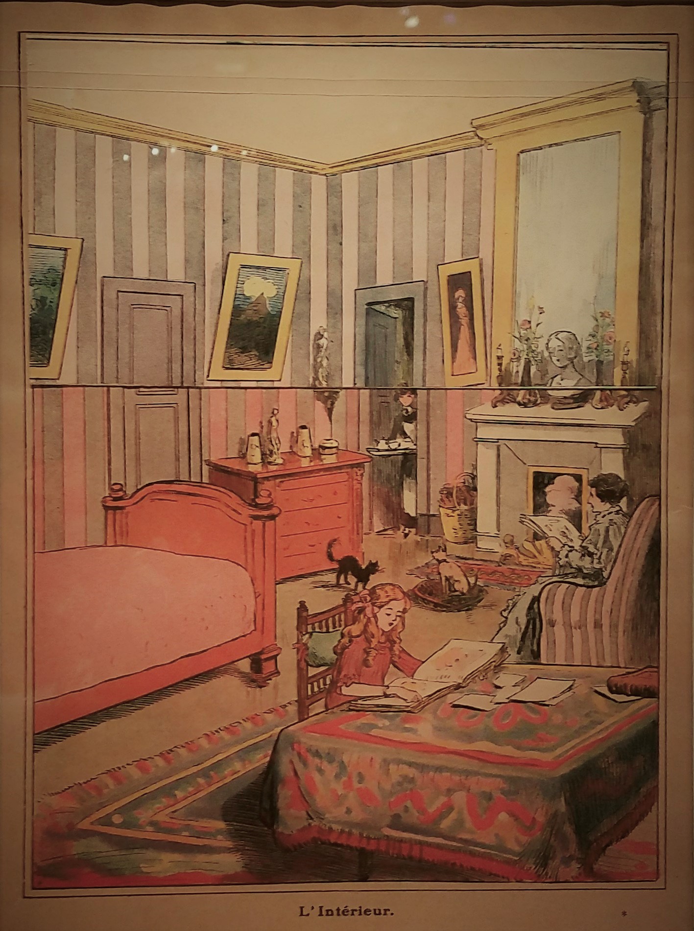
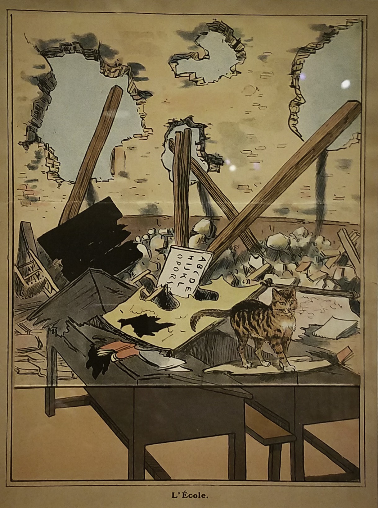 French, 20th century
After the Victory (Au Lendemain de la Victoire), 1918
Printed by Imprimerie Kapp
Published by Librairie Hachette & Co.
Colour lithograph
Many children lost loved ones to the war and were traumatized by the sounds and sights of combat. Ostensibly, celebrating victory, this book, like much wartime propaganda for children, reflects these dark events. Its interior presents images of rebuilding: each page shows a scene of destruction, but when a flap is raised, it shows the same site restored.
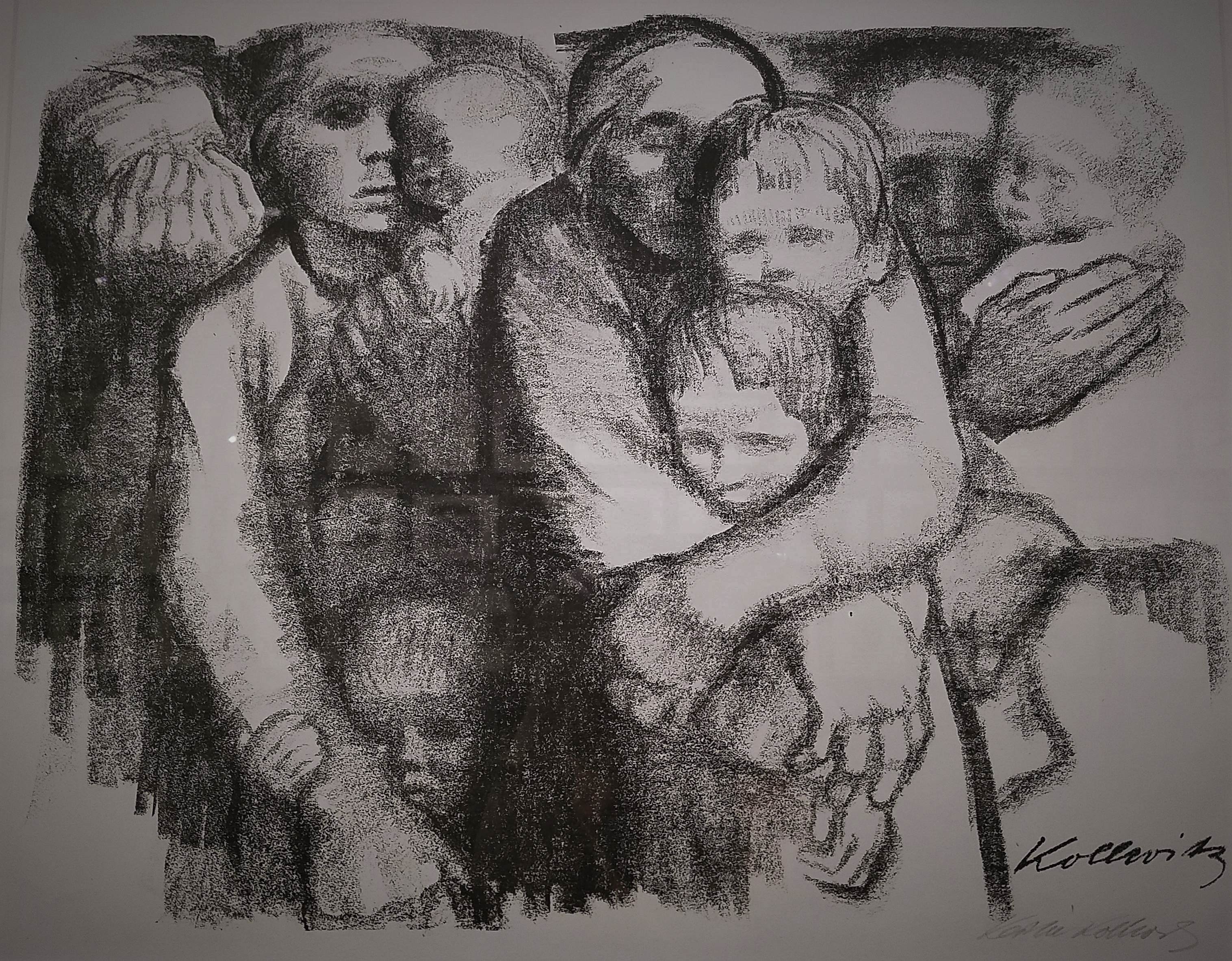
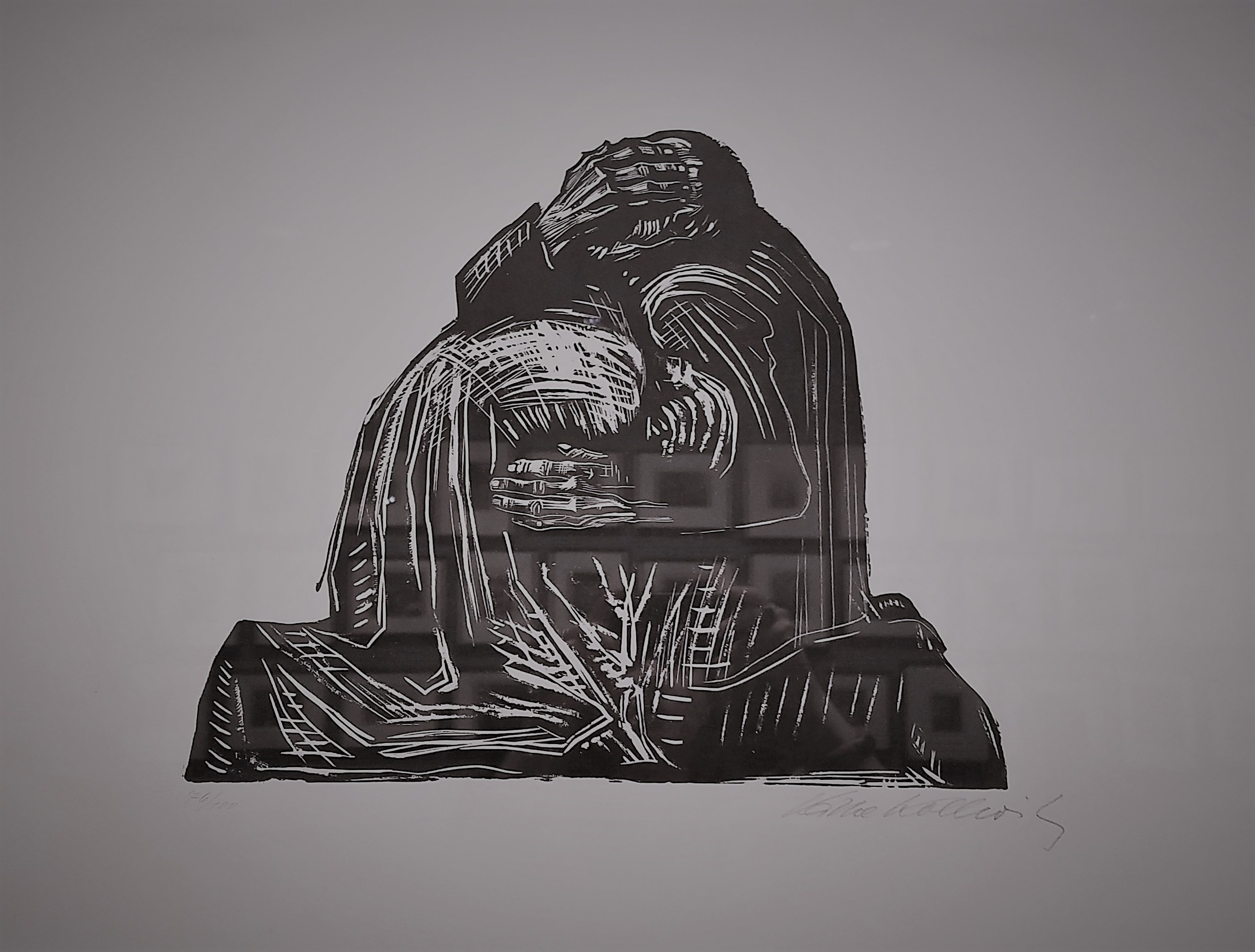 Käthe Kollwitz (1867-1945)
The Parents (Die Eltern), from War (Krieg), 1921-22
Printed by Fritz Voigt, Berlin
Woodcut
”Pain,” Kollwitz noted, ”is totally dark.” This raw images portrays the profound grief of parents who, like the artist, lost a child to war. Kollwitz began working in this medium after seeing an exhibition of woodcuts by Ernst Barlach and being inspired by their graphic power; the War series is considered her most important in the technique. Kollwitz spent fifteen years working on a sculpture based on this print. The Grieving Parents, located in the cemetery for German soldiers in western Belgium where her son Peter is buried, is composed of two separate sculptures, showing the parents isolated in their despair.
 George Grosz (1893-1959)
Background (Hintergrund), 1928
3 out of 17 photolithographs with printed portfolio
 Käthe Kollwitz (1867-1945)
Mothers (Muetter), from War (Krieg), 1919
Lithograph
In Mothers, women and children huddle together, their linked bodies forming a solid structure that fills the composition. Kollwitz drew herself in the centre, eyes closed and arms wrapped protectively around her two sons: Hans, the elder, and Peter, who was killed in combat at eighteen.
Images from ”World War I and the Visual Arts”, an exhibition exploring ”the myriad and often contradictory ways in which artists responded to the first modern war”.
The Metropolitan Museum of Art
August 6th, 2017
In five scratchboard illustrations and one gouache.
In his 35-year career, Virgil Finlay produced over 2,600 illustrations, a remarkable achievement considering his labor-intensive and time-consuming drawing style.
”Instead of the typical pen and ink or carbon pencil drawings produced by most pulp illustrators, Finlay used a unique technique combining scratchboard—in which a clay-covered board is coated with black ink and the artist scratches away white lines from the black using a sharp blade—with intricate pen cross-hatching and an astonishingly painstaking method of creating tones called stipple.
Contrasted with hatching, or crossed lines, stippling is a time-consuming process in which tones are created with hundreds of tiny individual dots, carefully placed and dripped off the end of an ultra-fine dip pen, one dot at time.” [source]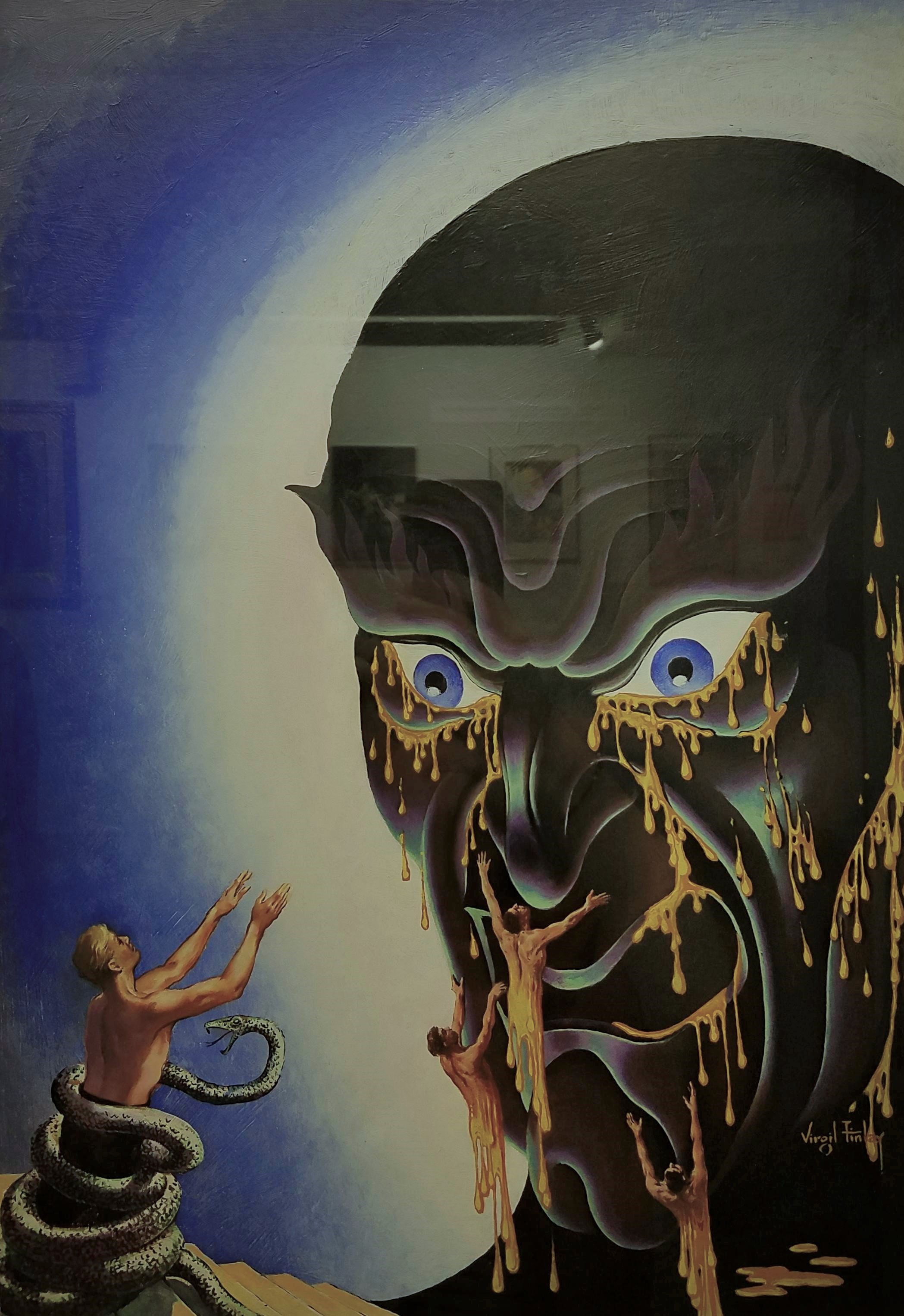 Face in the Abyss
Gouache on illustration board
Appeared on the cover of Famous Fantastic Mysteries magazine for ”Face in the Abyss” by A. Merritt, Frank A. Munsey Co., October 1940
”He came out of his coma. We left a sketch pad and pencils by the bed. He did a drawing, he went back into the coma, and died.”– Lail Finlay, Virgil Finlay’s daughter

 Three Against the Stars
Scratchboard, pen and ink
Interior illustration in Fantastic Novels Magazine for ”Three Against the Stars”, by Eric North, New Publications, Inc., May 1950
 The Lovers
Scratchboard, pen and ink
Appeared in Startling Stories magazine for ”The Lovers” by Philip José Farmer, Better Publications, August 1952
For the first time in science fiction history an Earth man and an alien woman have a sexual love affair in Philip José Farmer’s ”The Lovers”. This was quite groundbreaking yet controversial in 1950s American pop culture; however, it would seem quite tame compared to today’s science fiction books and films.
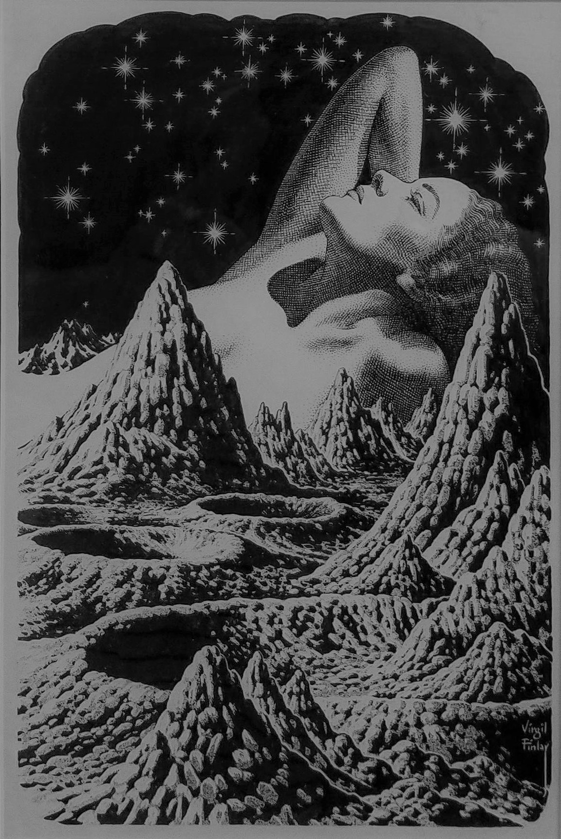 Woman reclining in lunar landscape, c. 1955
Scratchboard, pen and ink
 Conquest of the Moon Pool
Scratchboard, pen and ink
Interior illustration in Fantastic Novels magazine for ”Conquest of the Moon Pool” by A. Merritt, New Publications, September 1948
From ”Conquest of the Moon Pool”:
”… and suddenly there before us stood two figures! One was a girl – a girl whose eyes were golden… whose softly curved lips were red as the royal coral and whose golden-brown hair reached to her knees! And the second was a gigantic frog – a woman frog… six feet high if an inch and with one webbed paw of its short, powerfully muscled forelegs resting upon the white should of the golden-eyed girl!”
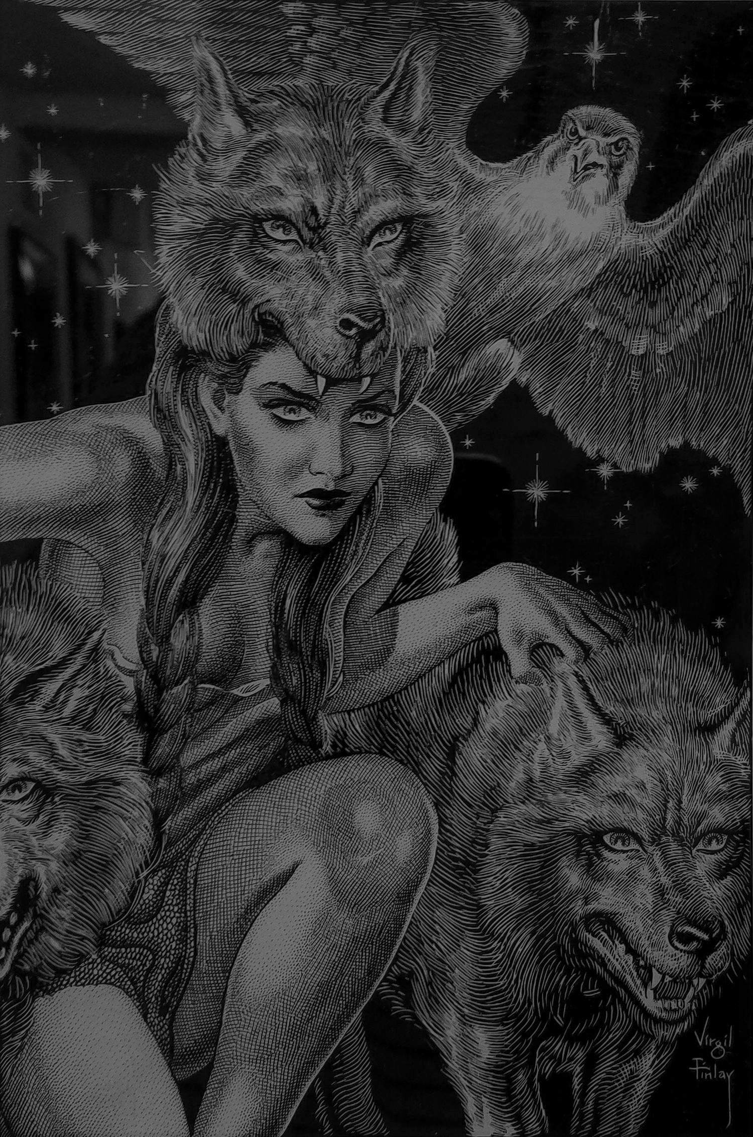 Lur the Witch Woman with Her Consorts, Dwellers in the Mirage
Scratchboard, pen and ink
Appeared on the cover of Fantastic Novels for ”Dwellers in the Mirage”, written by A. Merritt, Frank A. Munsey Co., NY, April 1941
”Dwellers in the Mirage” introduction:
”The strangest adventure any man had encountered since time began faced Leif Langdon when he tumbled through that Alaskan mirage into a lost world.”
Adenturer Leif Langdon stumbles upon an uncommonly warm, hidden Arctic valley where he finds and falls in love with Evalie. Also in this valley are the Little People – elfin warriors fighting against Lur the Witch Woman and her demon riders who raid the Little People’s land for sacrifices to Kraken, their dark lord. Tapping into buried memories of another lifetime, Langdon realizes he had a past life as Kraken and as Lur’s lover. So begins Langdon’s inner struggle between his two selves.
All artwork by Virgil Finlay (1914 – 1971), photographed at the Society of Illustrators
August 15th, 2017
subjective worldview
Actor, writer, cook and author
Travel experiences & Strasbourg city guide
Writer
joy, happiness, travel, adventure, gratitude
"Rêve onirique & Bulle d'évasion"
makes pretty things on paper
This WordPress.com site is Pacific War era information
Welcome to my curious world of words....
Photographs, music and writing about daily life. Contact: elcheo@swcp.com
Free listening and free download (mp3) chill and down tempo music (album compilation ep single) for free (usually name your price). Full merged styles: trip-hop electro chill-hop instrumental hip-hop ambient lo-fi boombap beatmaking turntablism indie psy dub step d'n'b reggae wave sainte-pop rock alternative cinematic organic classical world jazz soul groove funk balkan .... Discover lots of underground and emerging artists from around the world.
A 365 analogue photography project
Barcelona's Multiverse | Art | Culture | Science
Een digitaal atelier aan de (zee)slag.
‘Doodling Ambiguity’s in Ink.’
Miscellaneous photography
Glimpses along the way on a journey of discovery into symmetry...
