Jan Tschichold was the most important typographer of the twentieth century; his career framed many of the great debates in graphic design. Trained as a calligrapher in German Gothic script, he rejected this ”nationalist” approach in favor of a style inspired by avant-garde Constructivist art. He even briefly changed his name to ”Ivan” in sympathy with Soviet art and politics. His writings helped define the New Typography, a movement that sought to make printed text and imagery dynamic, efficient, and attuned to the demands of modern life. Tschichold’s designs and theories were controversial and provoked hostility from conservative critics. Imprisoned by the Nazis in 1933, Tschichold and his family escaped to Switzerland, where he began to question the values of modernism. By 1947, when he was appointed design director of Penguin Books in London, he was advocating a return to classical design principles: orderliness, clarity, and uniformity.

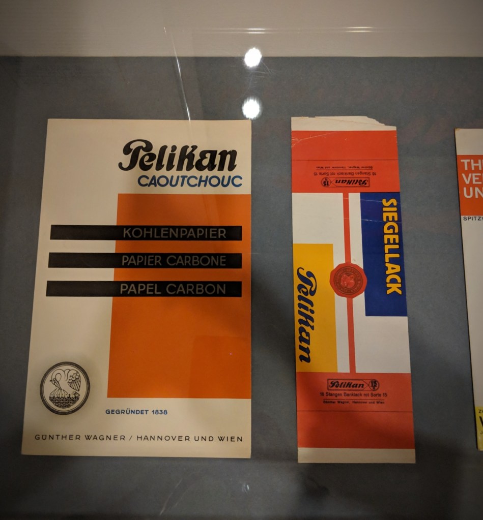
Pelikan carbon paper packaging, after 1928
The Museum of Modern Art, New York, Jan Tschichold Collection
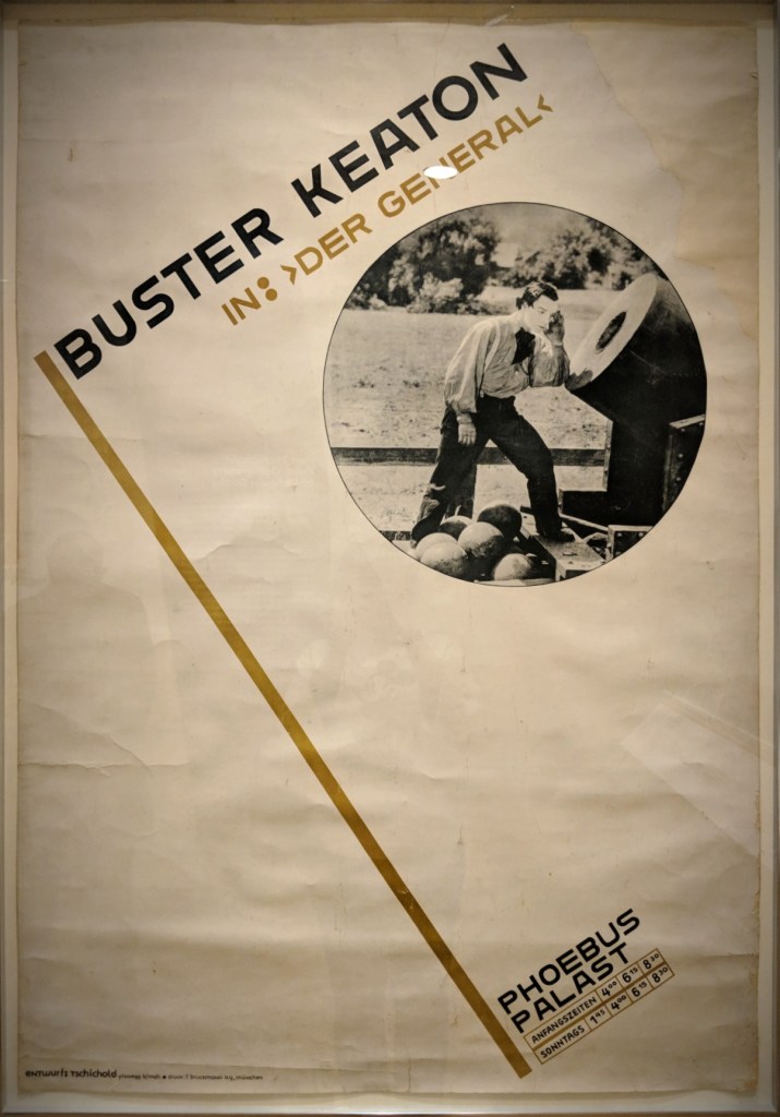
Buster Keaton in: ”Der General” Phoebus-Palast Poster, 1927
The Museum of Modern Art, New York

Phoebus-Palast: Music and Film Performances by rank; program, 1927
The Museum of Modern Art, New York

Dwelling and Workplace poster, 1929
The Museum of Modern Art, New York, Jan Tschichold Collection
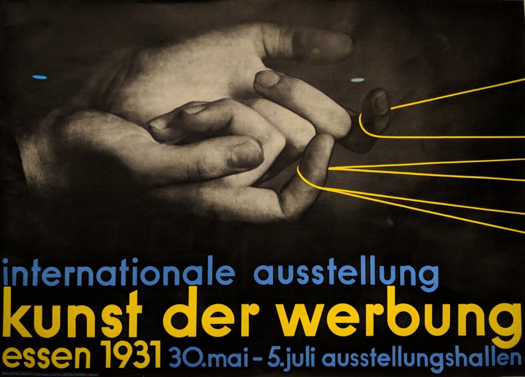
International Exhibition: Art of Advertising poster, Essen 1931
The Museum of Modern Art, New York

Nutricia, le lait en poudre advertisement, 1927-28
The Museum of Modern Art, New York, Jan Tschichold Collection
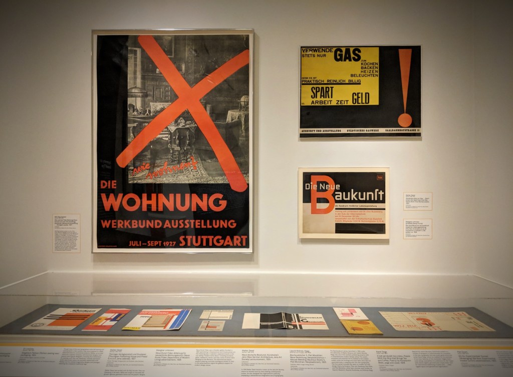
The New Typography was a movement based in Germany during the period of the Weimar Republic (1918-33) that sought to make printed text and imagery a dynamic expression of modern life. Proponents advocated adopting asymmetrical layouts, sanserif letterforms, and integrating photography with text in a manner that expressed a new sensibility, shaped by advertising and the mass media. Jan Tschichold, a young typographer trained in Leipzig, was the author of the landmark texts ”elementare typographie” (1925) and Die neue Typographie (1928), which did much to define the movement. Tschichold contacted many leading artist-designers throughout Europe and the Soviet Union to acquire examples of their finest designs and added them to his personal collection, most of which is now in the Museum of Modern Art in New York.
From the ”Jan Tschichold and the New Typography” exhibition @ Bard Graduate Center (February – July 2019)
March 02nd, 2019


 Edward V. Brewer (1883-1971)