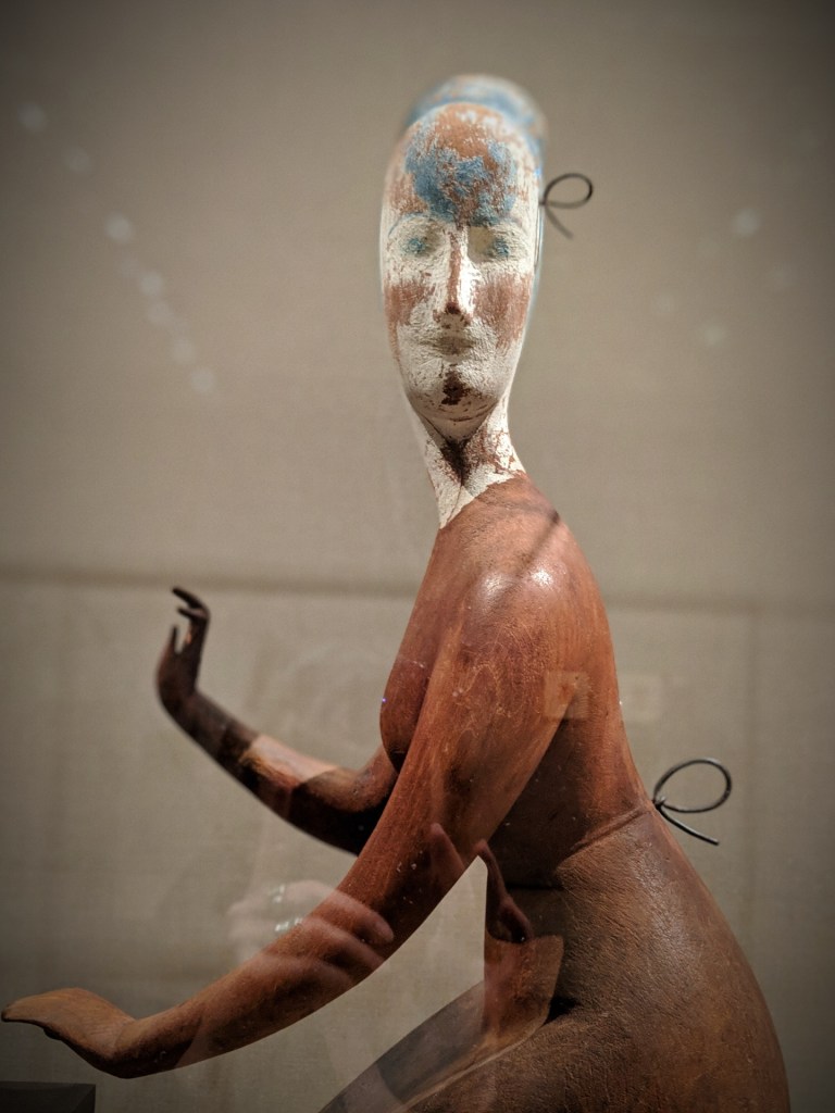
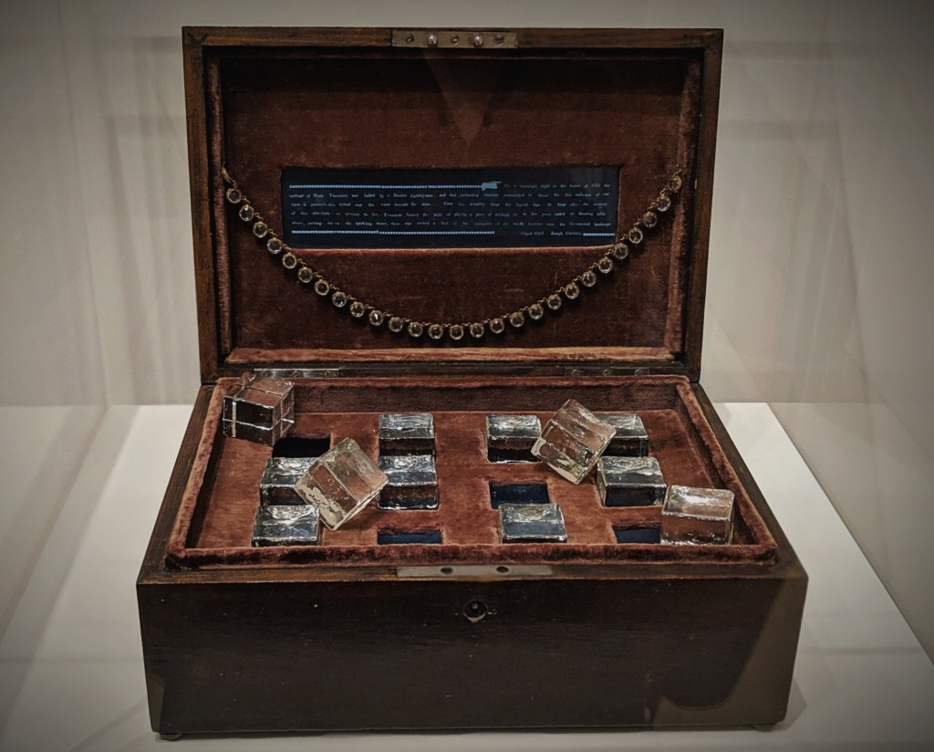
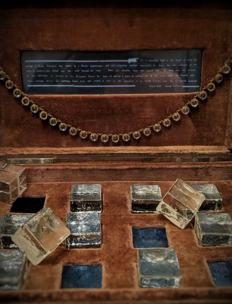
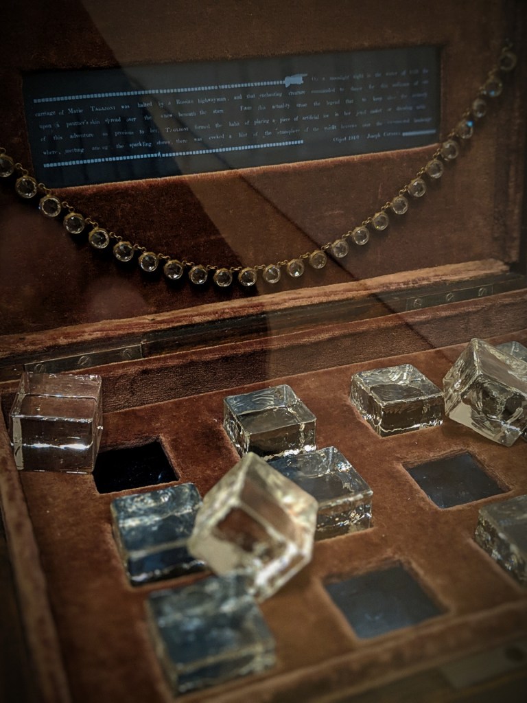
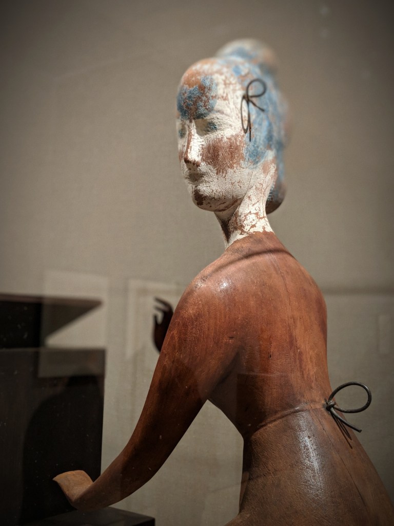
Elie Nadelman (American, born Poland, 1882–1946) Woman at the Piano, c. 1917 (detail) Stained and painted woodJoseph Cornell Taglioni’s Jewel Casket, 1940Joseph Cornell Taglioni’s Jewel Casket, 1940Joseph Cornell Taglioni’s Jewel Casket, 1940Elie Nadelman (American, born Poland, 1882–1946) Woman at the Piano, c. 1917 (detail) Stained and painted wood
The first of dozens of works that Cornell made in honor of famous ballerinas, this box pays homage to Marie Taglioni, an acclaimed nineteenth-century dancer of Italian origin, who, according to the legend inscribed in the box’s lid, kept an imitation ice cube in her jewelry box to commemorate the time she danced in the snow at the behest of a Russian highwayman. The box is infused with erotic undertones—both in the tactile nature of the glass cubes, velvet, and rhinestone necklace (purchased at a Woolworth’s dime store in New York) and in the incident itself, in which Taglioni reportedly performed on an animal skin placed across a snowy road. Adding to the intimacy of this delicate construction, the glass cubes were designed to be removed, revealing a hidden recess below that contains two beaded necklaces and rhinestone chips placed on a mirrored surface and seen through blue-tinted glass. [source: MoMA]
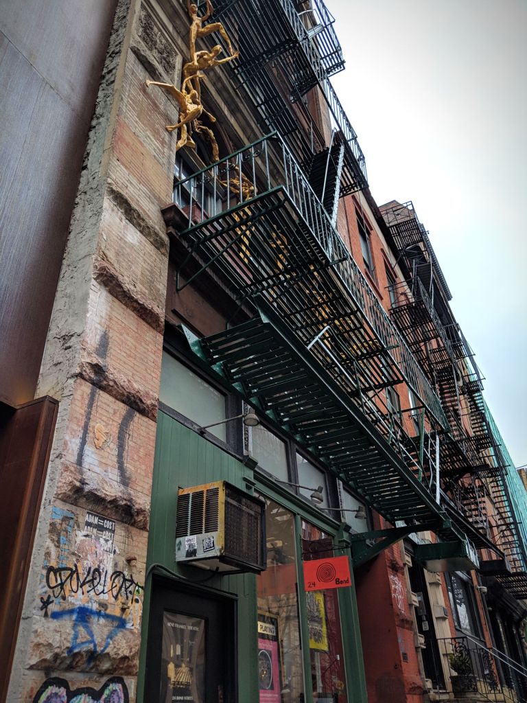
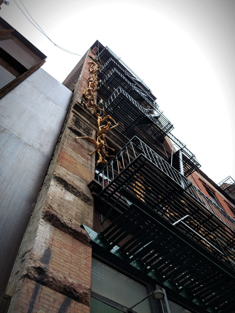
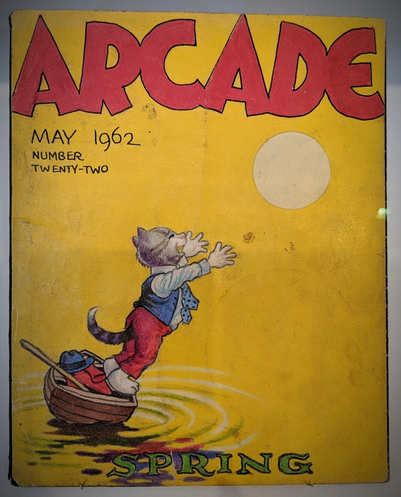
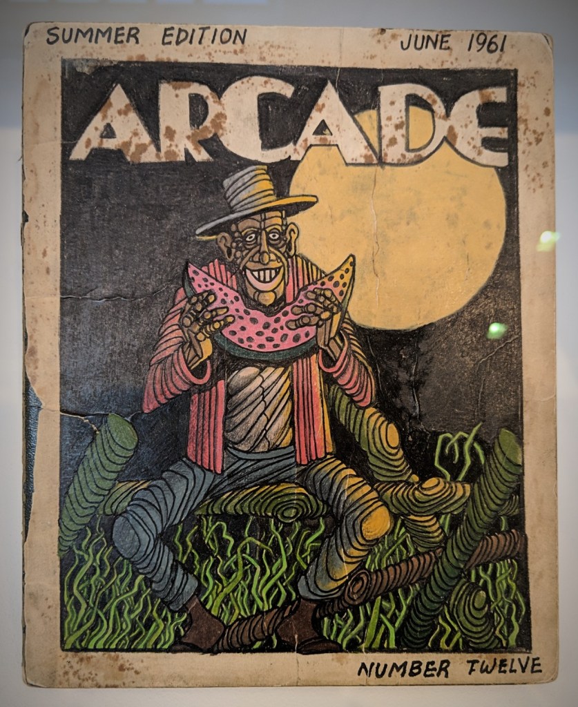
Travelling in time and space in just a few steps, from gallery to gallery, at The Morgan; when three fantastic exhibitions ran simultaneously through May 2019.
By any means: Contemporary drawings from The Morgan
Stephen Vitiello (American, b. 1964) Speaker Drawing (22.06), 2006 – Pigment and spray fixative
This work is part of a series in which Vitiello explored the relationship between sound – his primary medium – and drawing. He placed pigment in a speaker that was embedded in a table, laying a sheet of paper on top. Vibrations from a synthesizer’s low-frequency oscillator moved the pigment from the speaker to the paper, creating an image that contrasted in its minimalism with the density of the aural event.
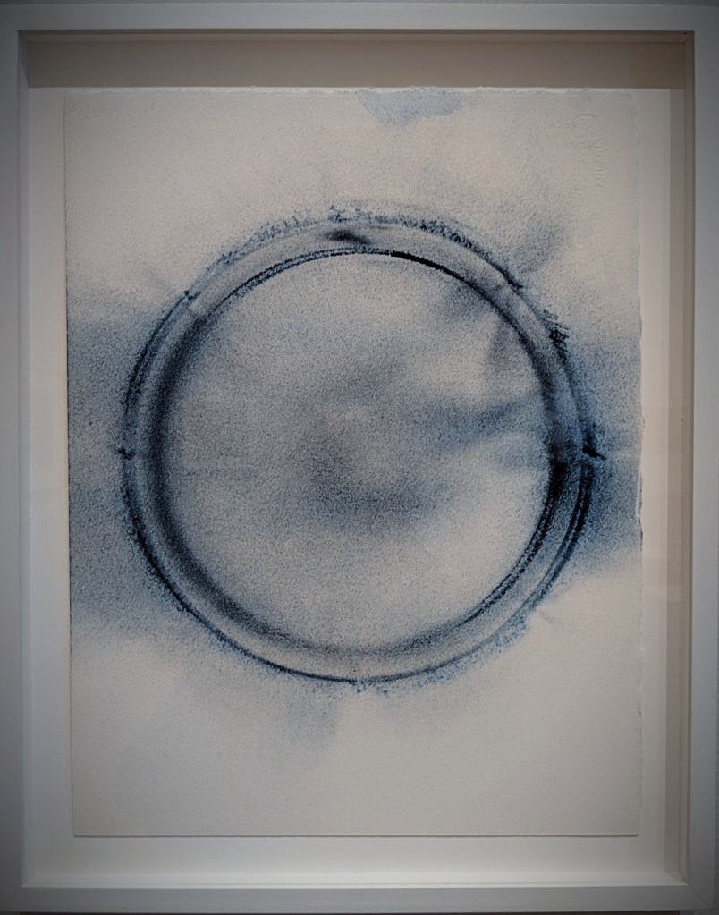
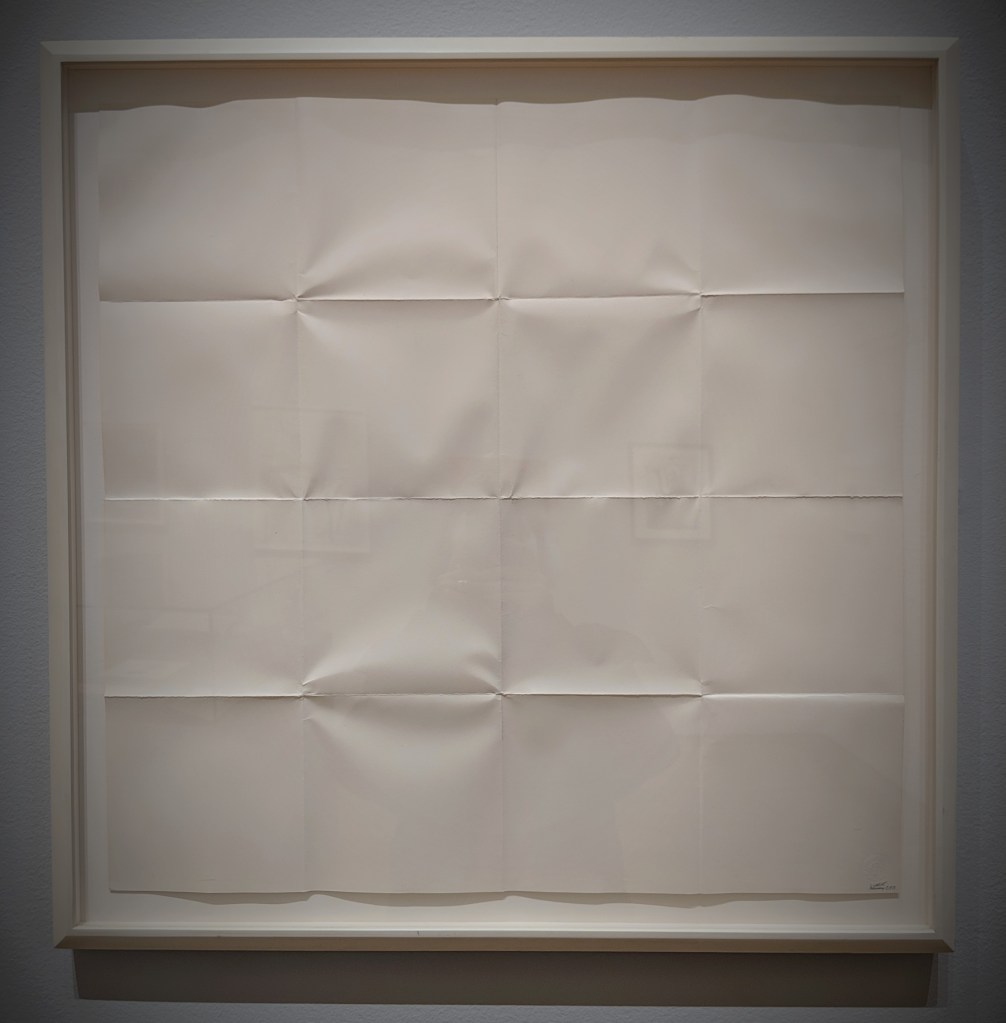
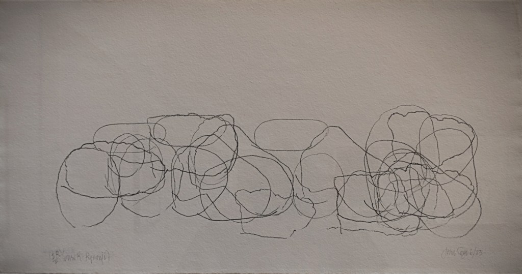
Sol LeWitt (American, 1928-2007) Untitled (folded paper drawing), 1971John Cage (American, 1912-1992) Where R = Ryoanji (2R)/4-6/83, 1983 Graphite pencil
Cage often relied on chance to determine the forms of his works. The present sheet belongs to a series inspired by the Zen rock garden of the Ryoanji Temple in Kyoto, in which fifteen rocks are carefully arranged. The selection of stones, the number of tracings (here 30, as denoted by 2R, where R is equivalent to 15, the number of stones at the temple), their placement, and the number of pencils of different softness that he used (4) were determined by the I Ching, an ancient Chinese divination manual, by way of a computer simulation developed by Bell Labs in New York.
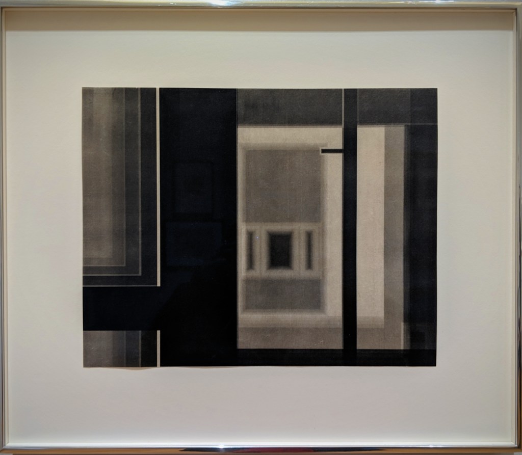
Marsha Cottrell (American, b. 1964) Old Museum (Interior_7), 2015 Laser toner
Although Cottrell uses a computer to make her work, she does not use a computer programme to determine composition but instead passes Japanese paper through a printer numerous times, each time changing or rearranging the shapes on the screen to generate dense, layered images.
Invention and Design: Early Italian Drawings
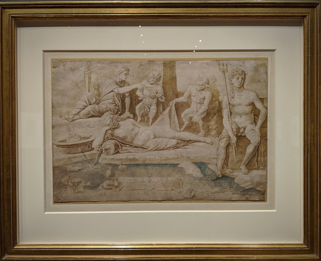
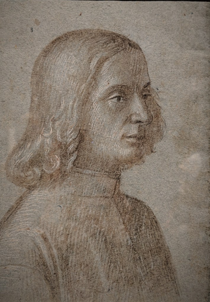
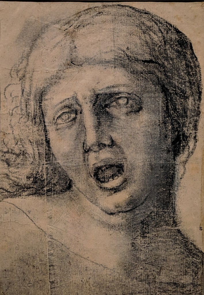
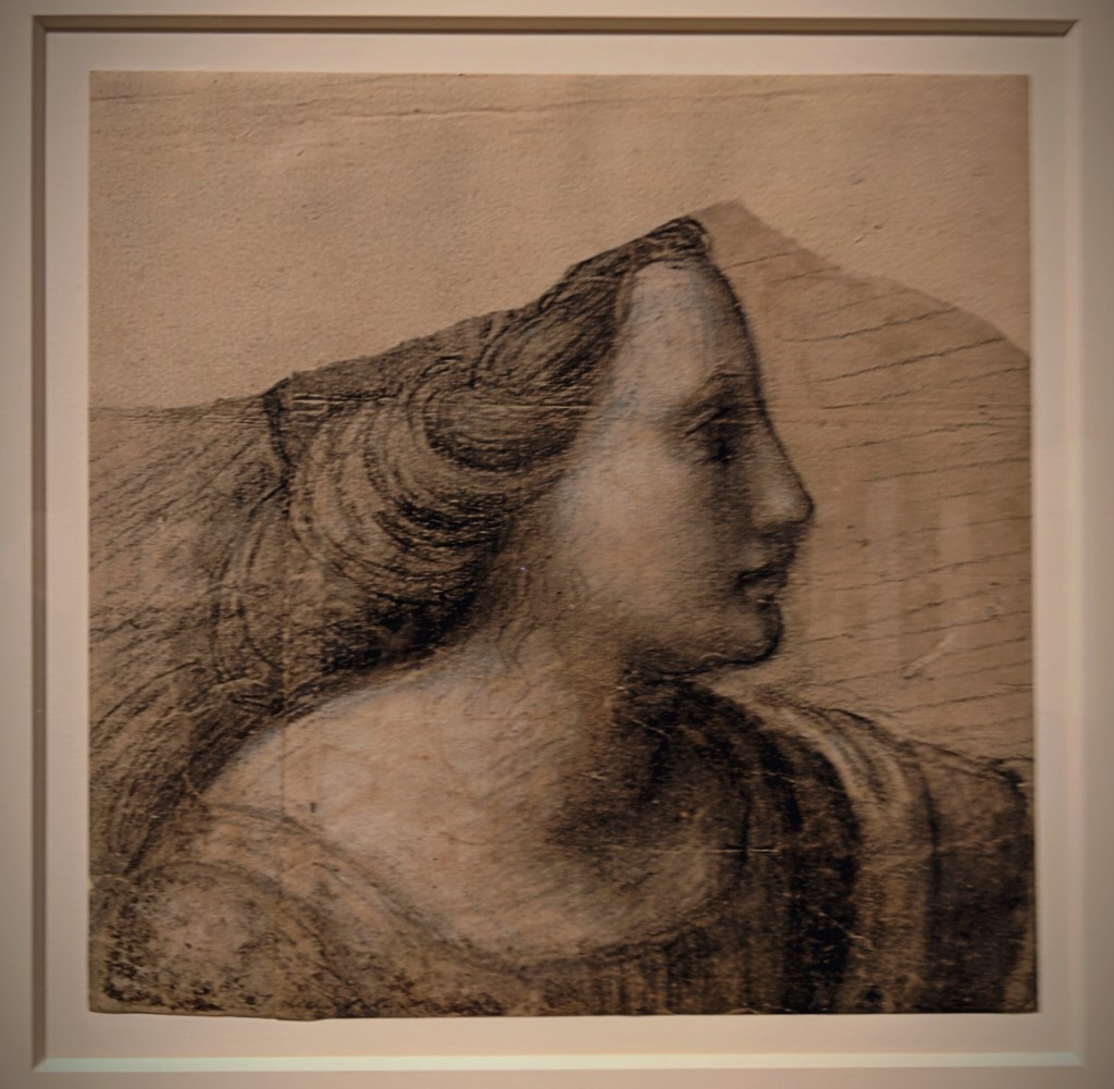
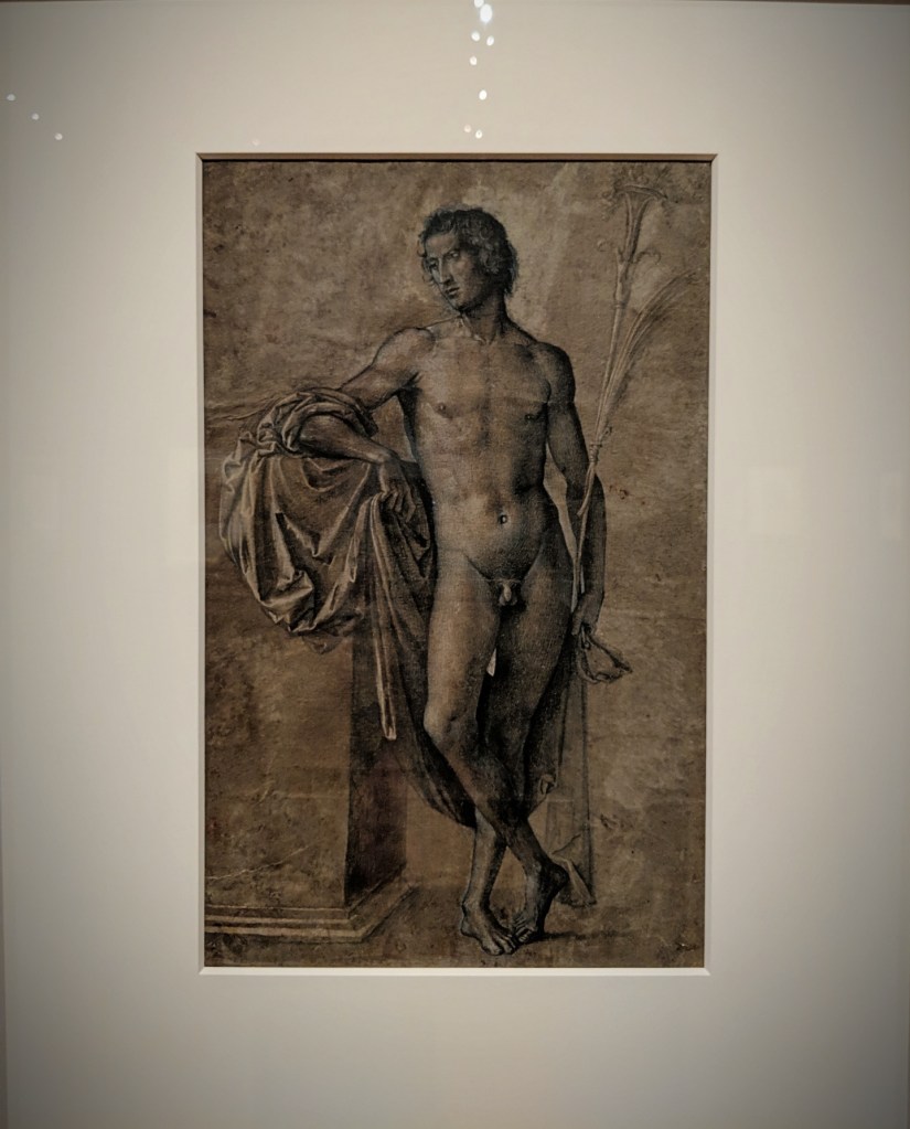
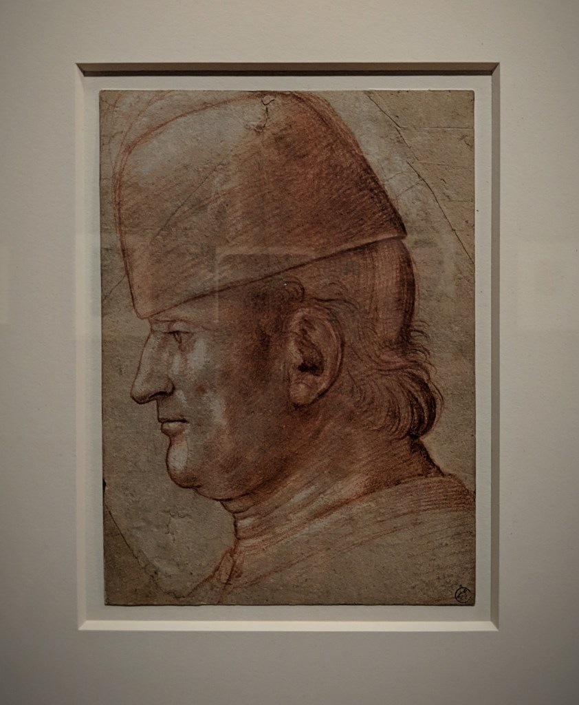
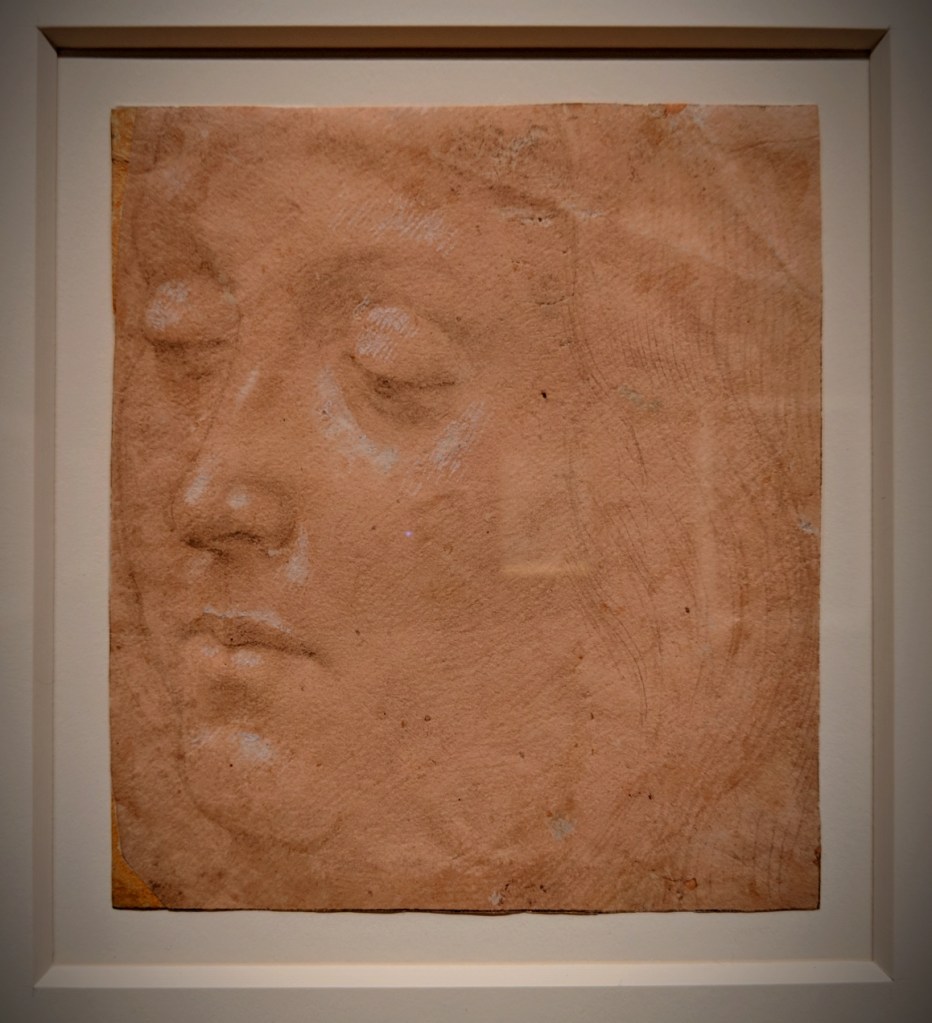
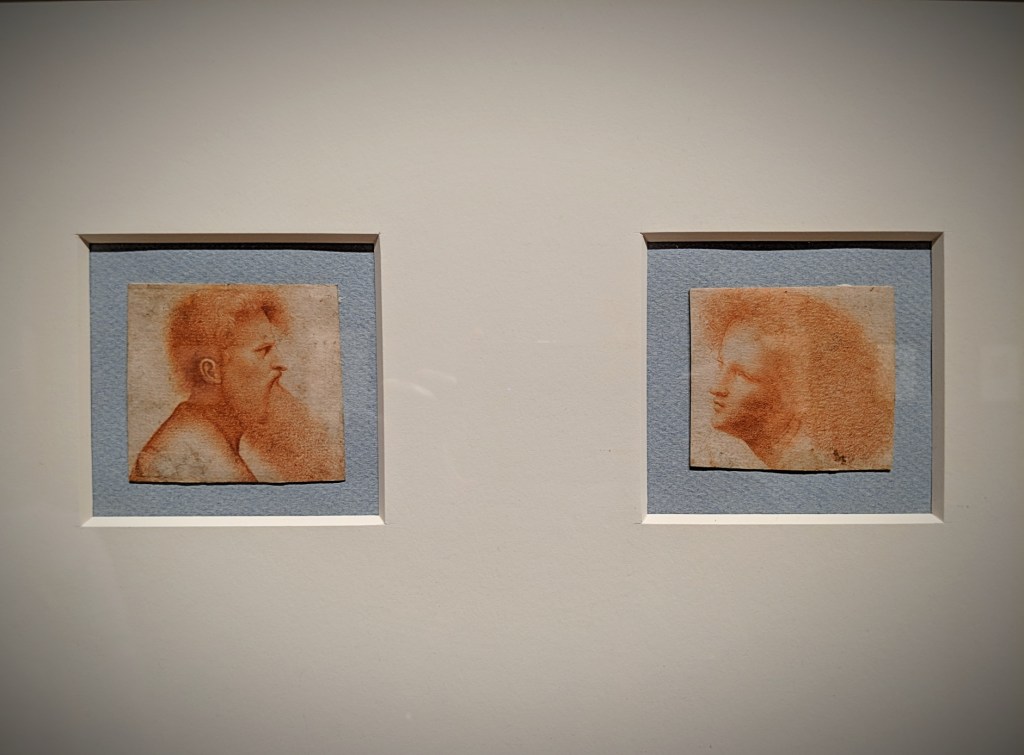
After Girolamo Mocetto (ca. 1458-after 1531) Metamorphosis of the Nymph Amymone, ca. 1500 Brush and brown, green-brown, and blue wash, pen and green-brown ink, and white opaque watercolour, over black chalk, on paperVittore Carpaccio (1460/66-1525/26) Head of a Young Man, in Profile to the Right, 1490-1500 Black chalk, brown wash, and white opaque watercolour, on blue paperAntonio Allegri, known as Correggio (ca. 1489-1534) Head of a Woman Crying Out, ca. 1509-11 Charcoal and black and white chalk, on two pieces of light brown paper joined verticallyTimoteo Viti (1469-1523) Head of a Woman in Profile to the Right, ca. 1515 Black and white chalk, on two pieces of paper joined vertically; incised with stylusBartolomeo Cincani, known as Bartolomeo Montagna (1447/50-1523) Nude Man Standing Beside a High Pedestal, ca. 1515 Brush and black ink and brown wash, heightened with white opaque watercolour, over traces of black chalk, on blue paper faded to brownAttributed to Francesco Bonsignori (1455/60-1519) Head of a Man Wearing a Cap, in Profile to the Left, ca. 1490-1500 Red, black, and white chalkLorenzo di Credi (ca. 1456-1536) Head of a Young Man, Turned to the Left, Looking Downward, ca. 1490 Metalpoint, with white opaque watercolour, on pink prepared paperGiovanni Agostino da Lodi (active ca. 1467-ca. 1524) Head of a Bearded Man in Profile to the Right and Head of a Youth Facing Left, ca. 1500 Red chalk
Tolkien: Maker of Middle-earth
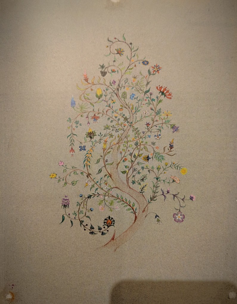
J.R.R. Tolkien The Tree of Amalion, [?1940s] – Coloured pencil, watercolour, silver paint, black in on grey paper MS. Tolkien Drawings 88, fol. 1
”He was the sort of painter who can paint leaves better than trees. He used to spend a long time on a single leaf, trying to catch its shape, and its sheen, and the glistening of dewdrops on its edges. Yet he wanted to paint a whole tree, with all of its leaves in the same style, and all of them different.”
This extract from Tolkien’s allegorical short story, ”Leaf by Niggle”, is a poignant expression of his own creative struggle as he sought to bring his works, both literary and academic, to completion. The story was written in the early 1940s as he worked fitfully on The Lord of the Rings, his Elvish languages and his wider legendarium, all of which seemed very far from completion. His perfectionism often resulted in numerous revisions and rewritings, whilst his interest in the minutiae led him down interesting but distracting side roads.
The only snapshot I could steal; so long were the lines, the guards had to usher Tolkien’s devotees, or the gallery would burst from overcrowding!
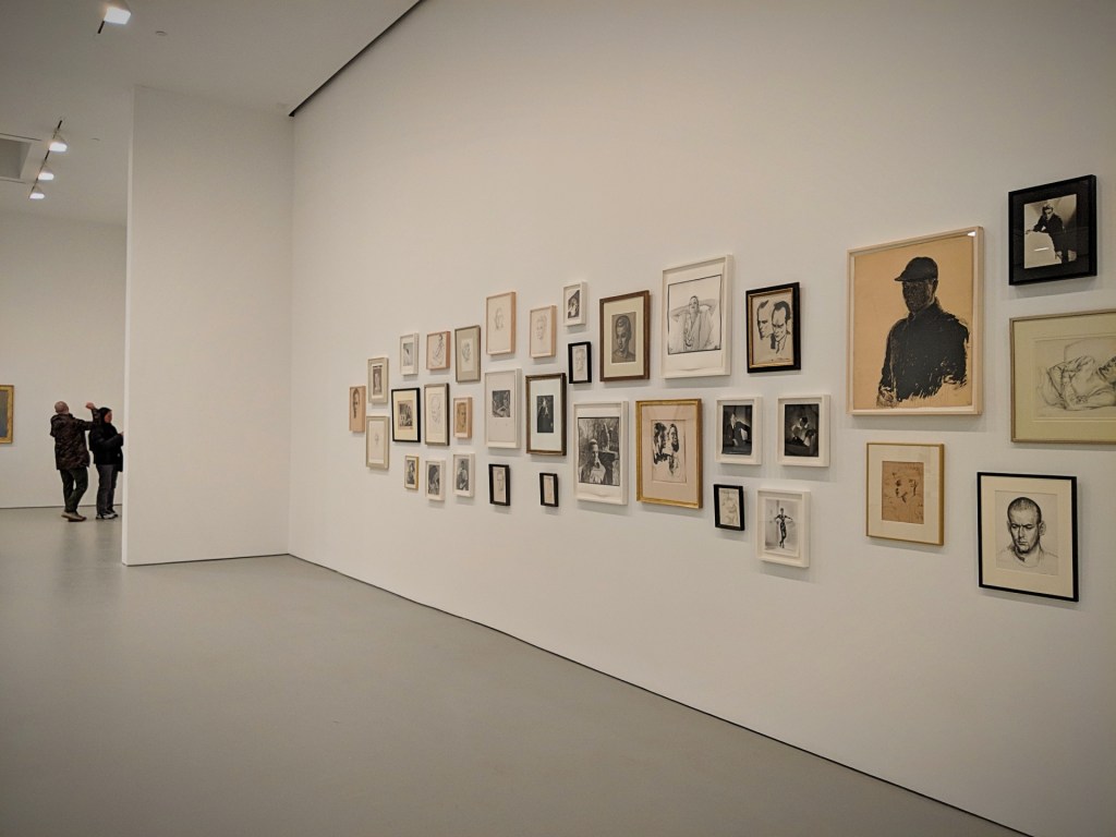
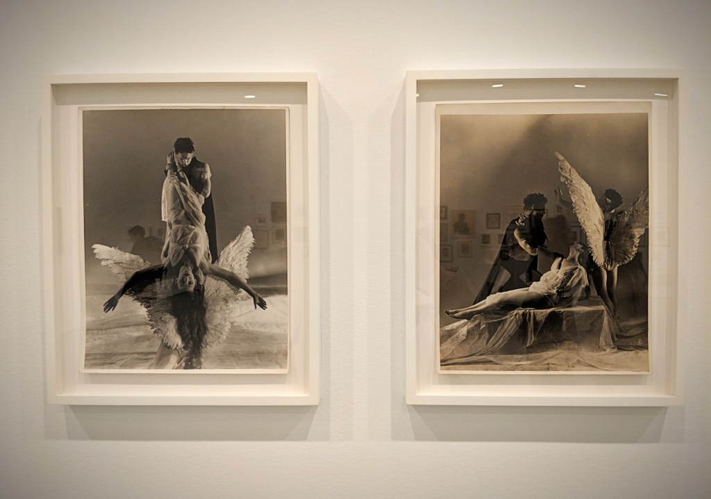
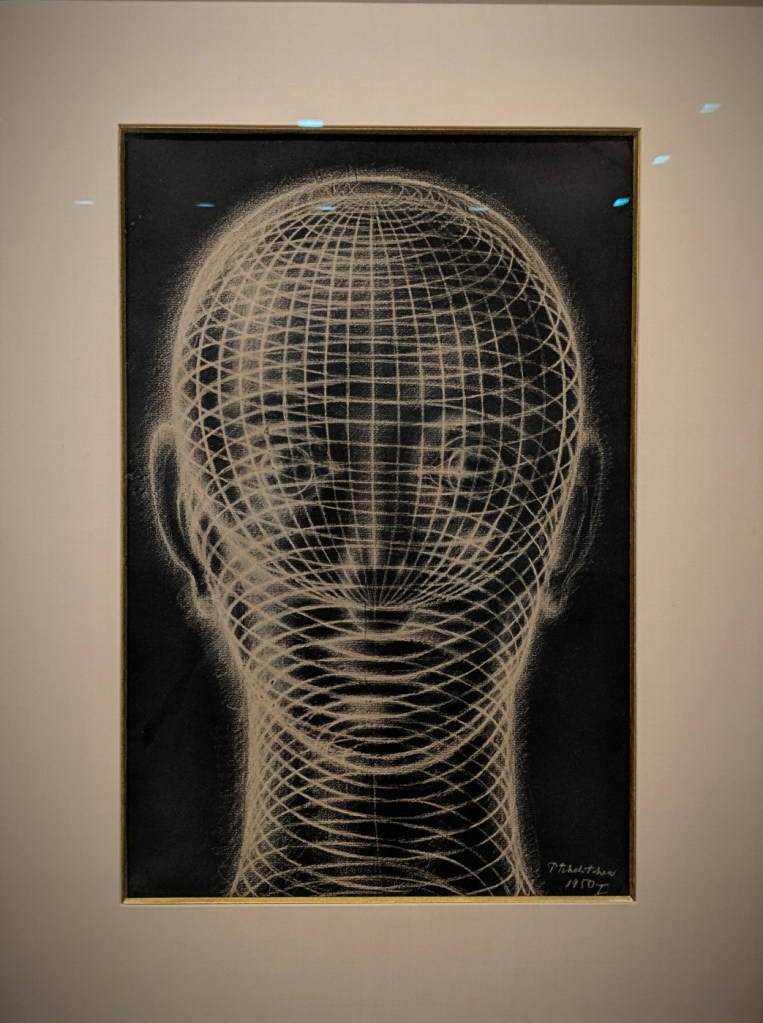
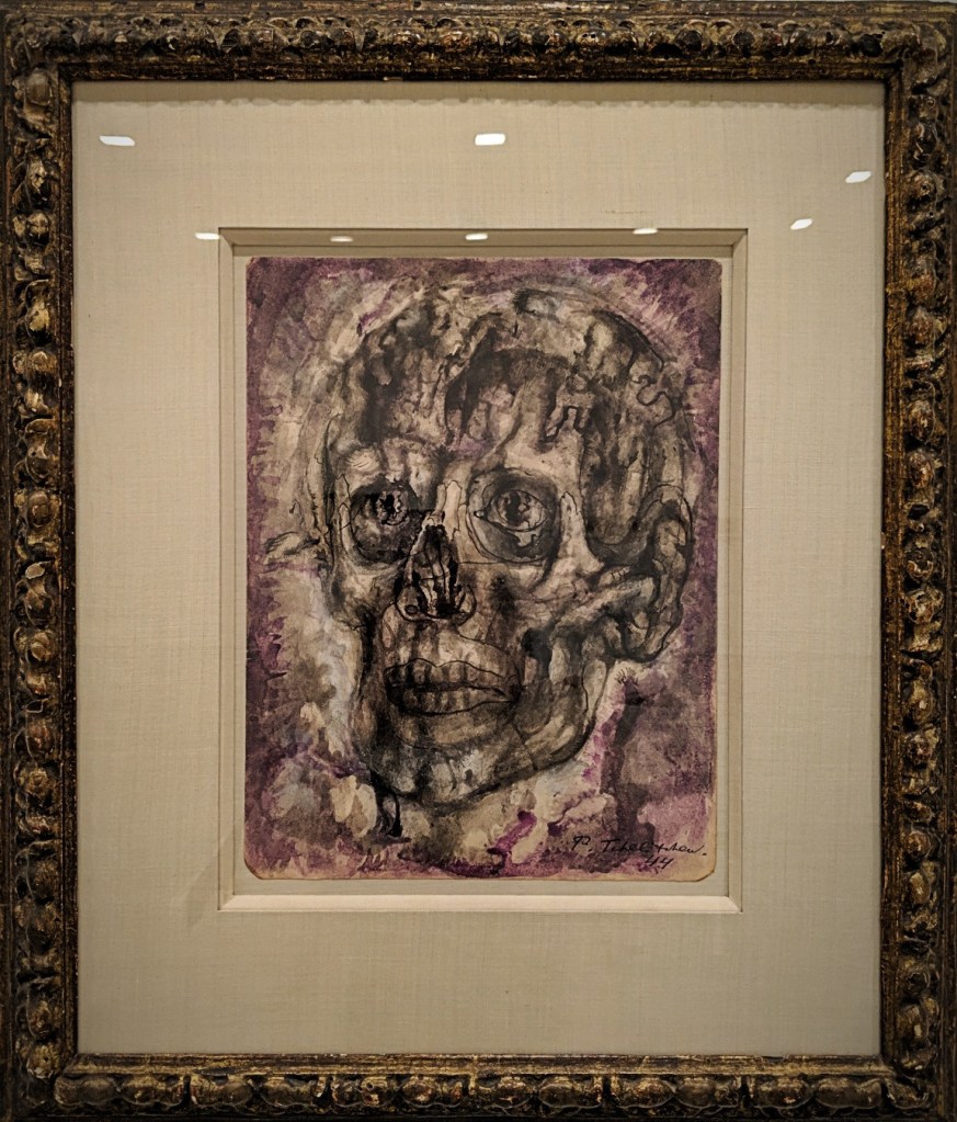
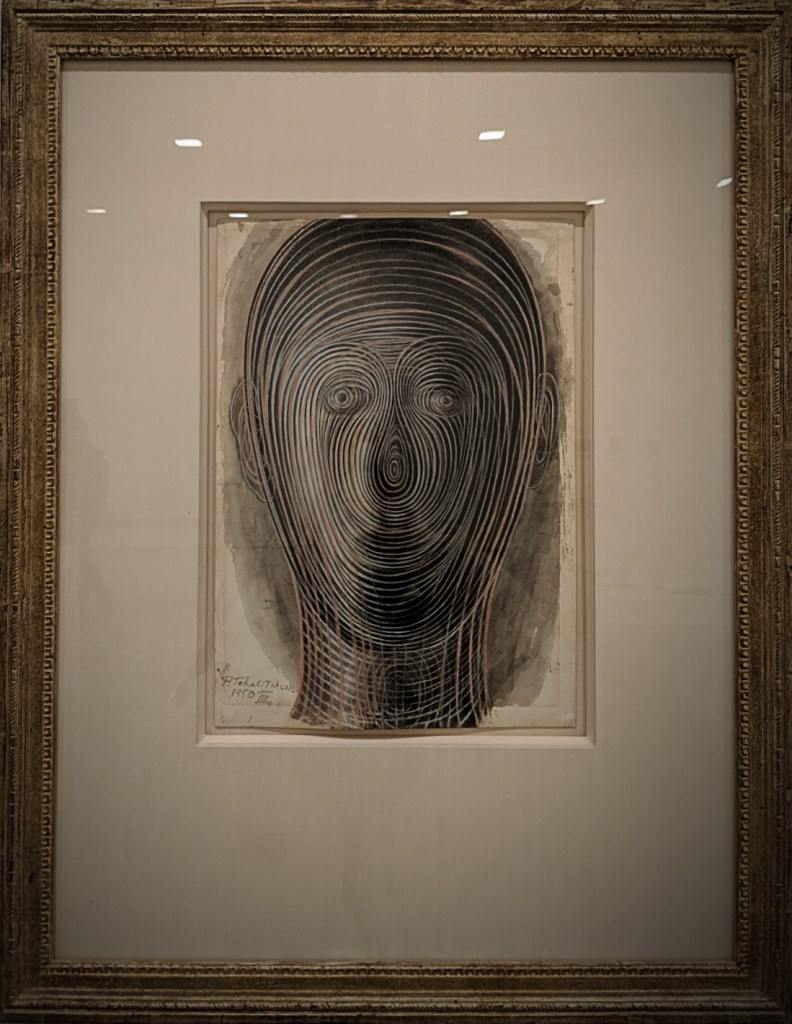
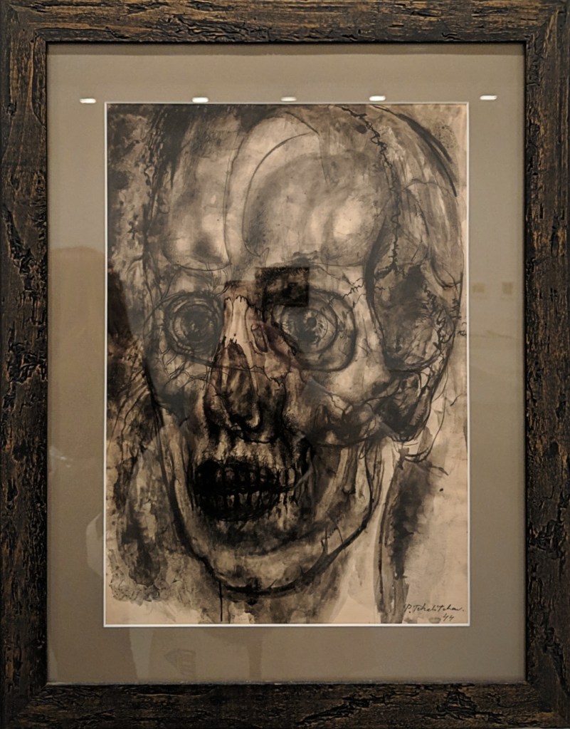
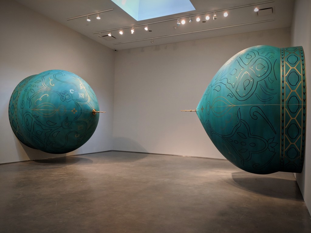
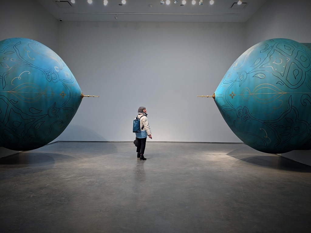
From February through April 2019, David Zwirner presented The Young and Evil, a group exhibition featuring significant works from the first half of the twentieth century by Paul Cadmus, Fidelma Cadmus Kirstein, Charles Henri Ford, Jared French, Margaret Hoening French, George Platt Lynes, Bernard Perlin, Pavel Tchelitchew, George Tooker, Jensen Yow, and their circle.
Among them, some works by Pavel Tchelitchew, to which I was particularly drawn.
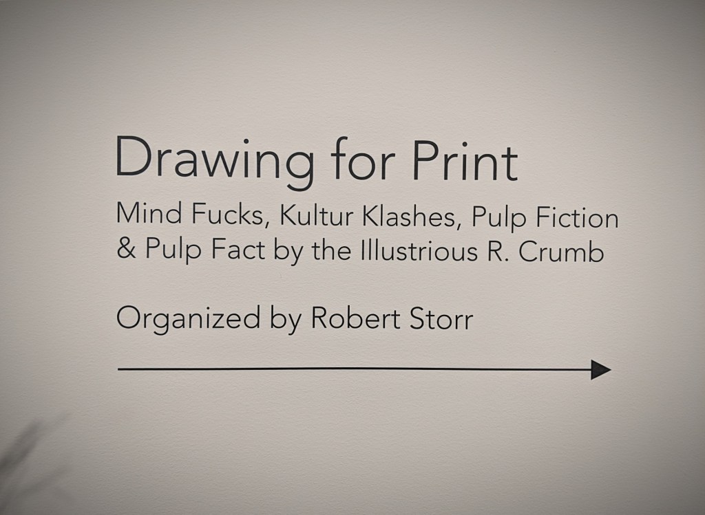
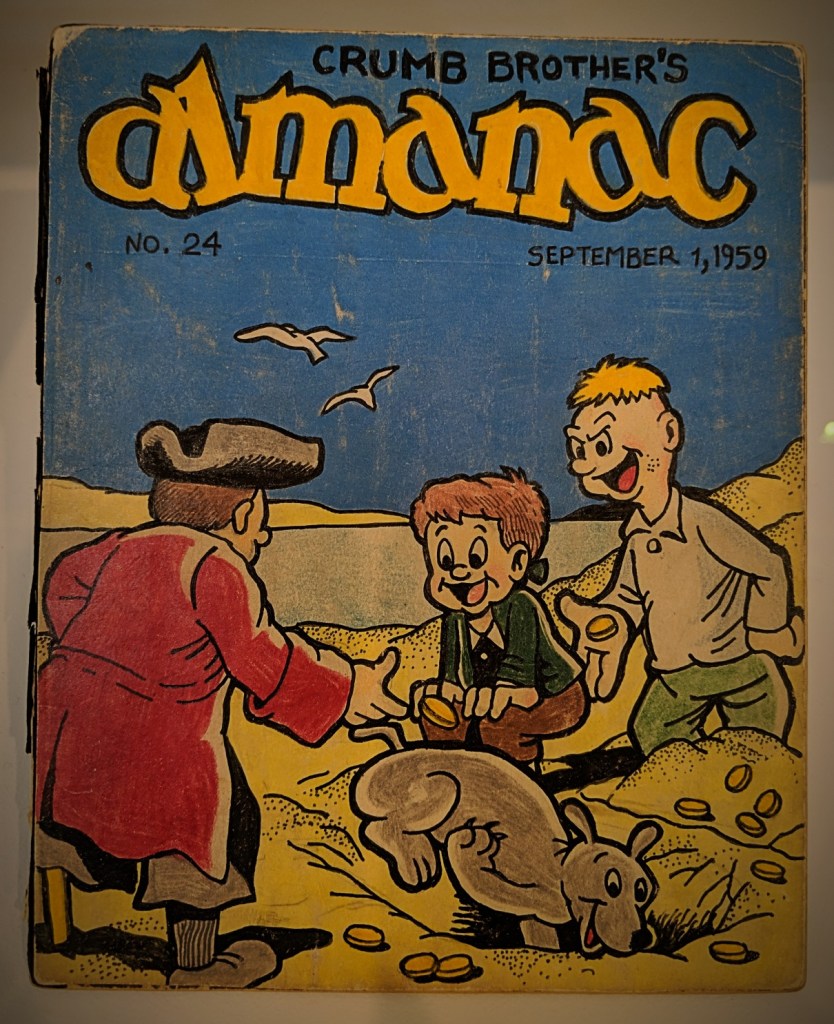
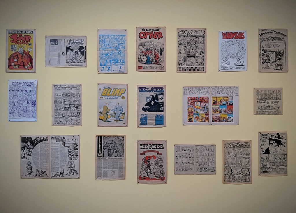
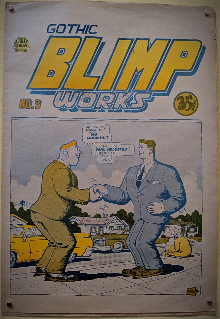
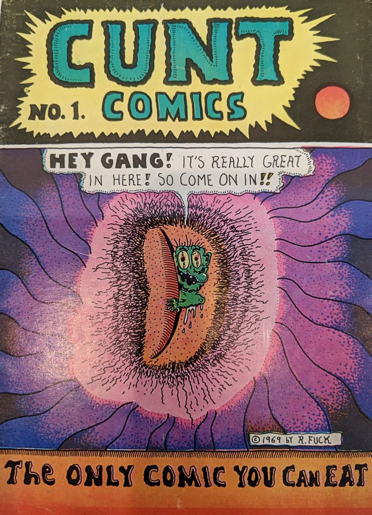
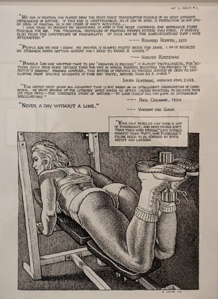
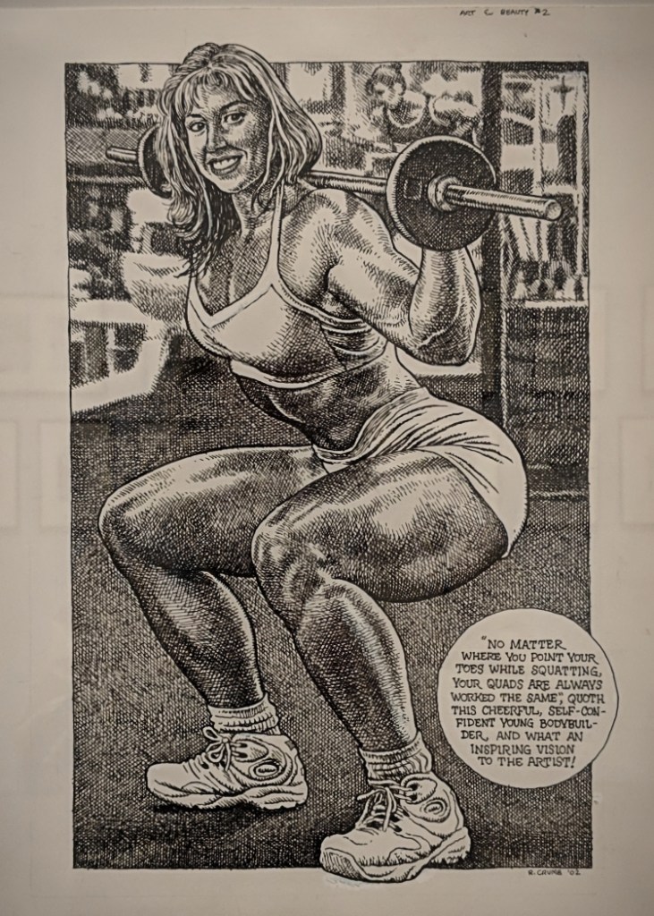
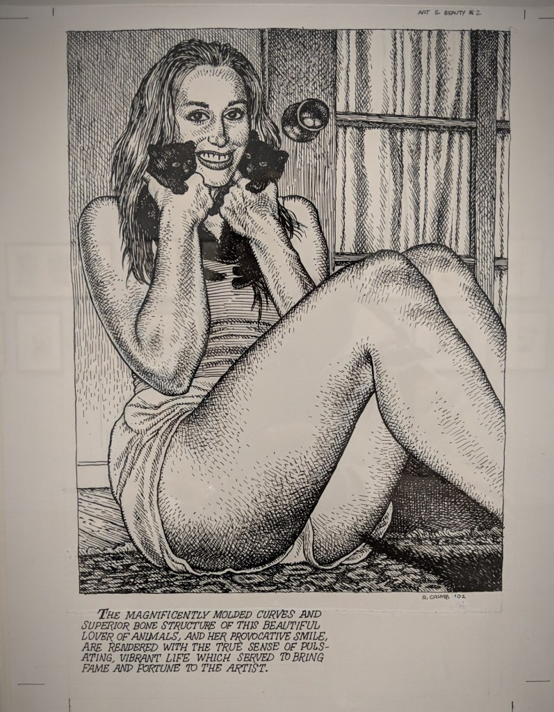
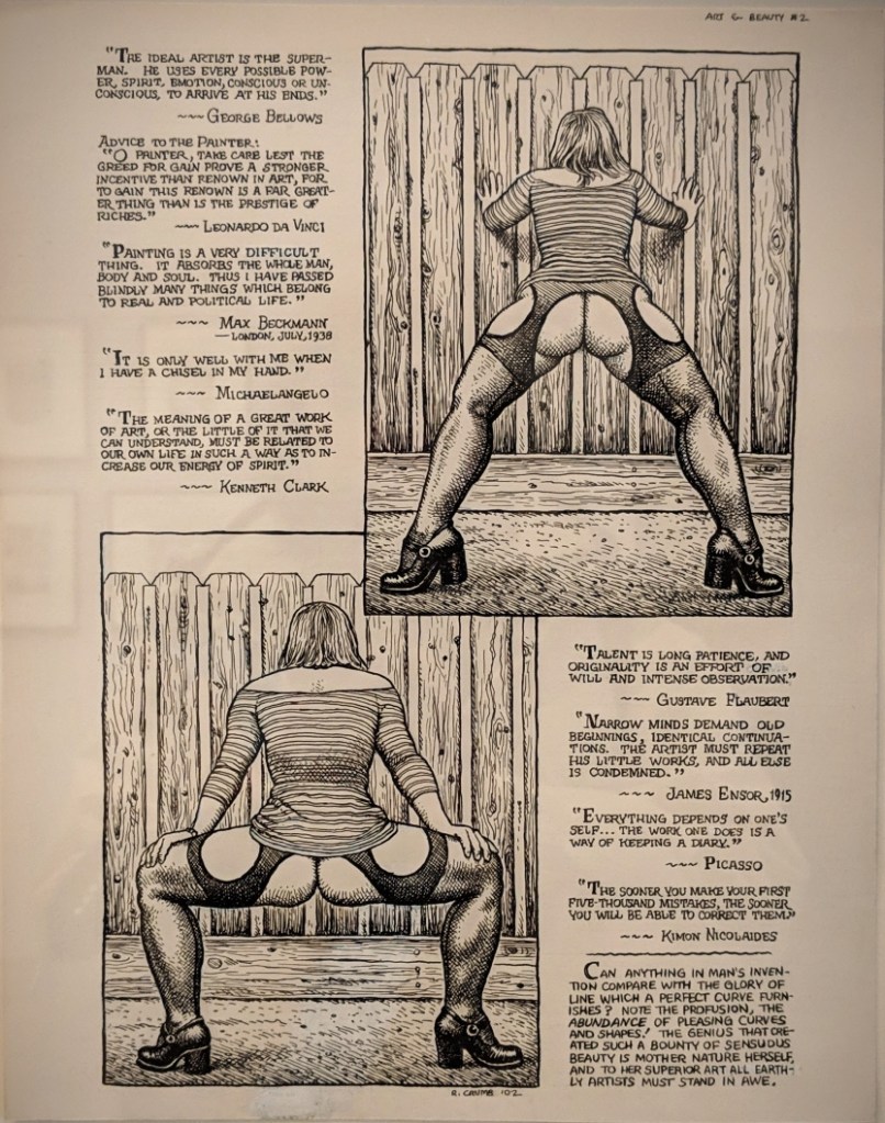
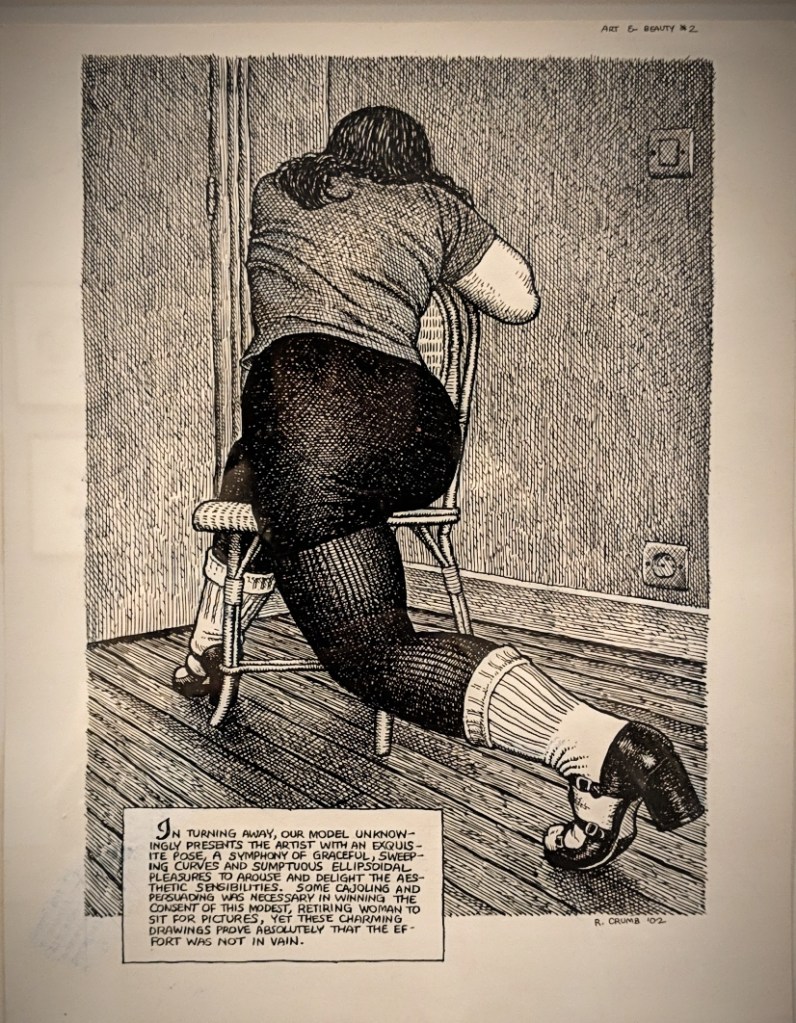
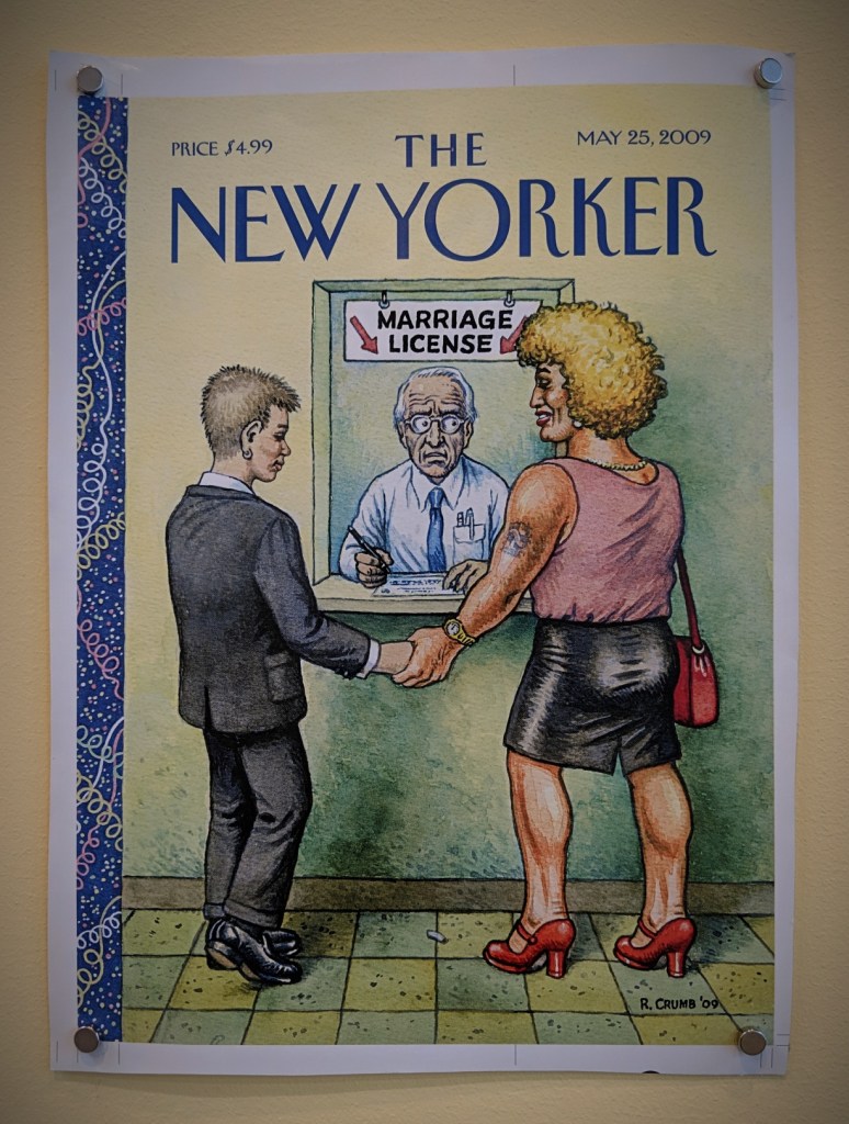
Robert Crumb is an unblinking witness to and graphic critic of the dysfunctional strangeness of the Disunited States. He is peerless in that regard because there’s simply no one like him and no one is as ”far out”. – Robert Storr
Drawing for Print: Mind Fucks, Kultur Klashes, Pulp Fiction & Pulp Fact by the Illustrious R. Crumb
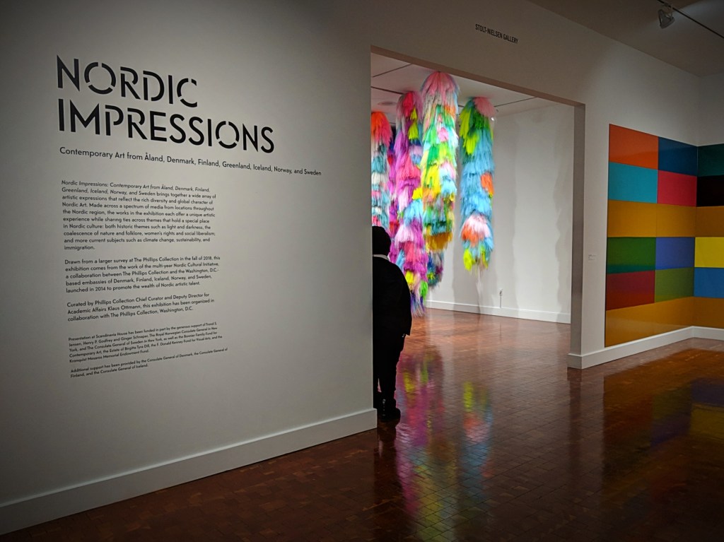
CONTEMPORARY ART FROM ÅLAND, DENMARK, FINLAND, GREENLAND, ICELAND, NORWAY, AND SWEDEN
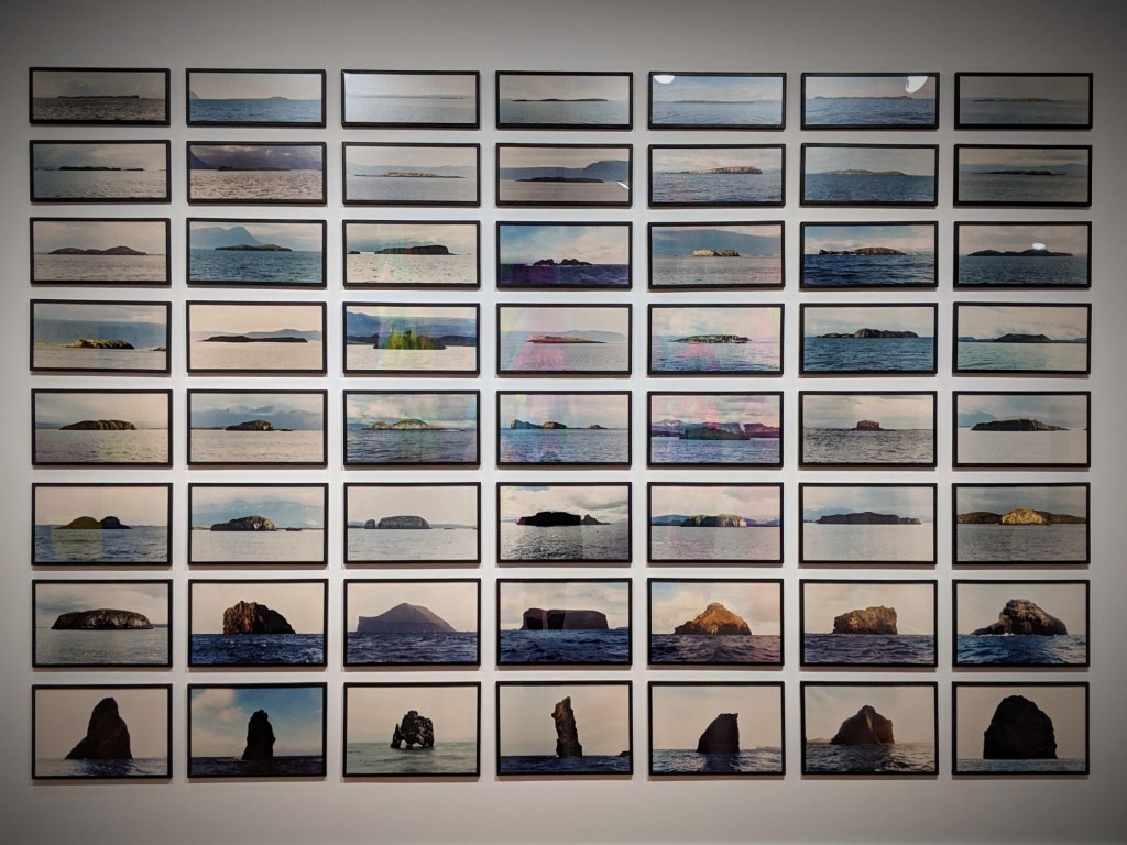
Ólafur Elíasson (b. 1967, Denmark) The Island Series, 1997 56 framed C-prints
For The Island Series, Eliasson photographed the islands that surround Iceland. Sequenced according to island size, the photographs are reminiscent of the faithful depictions of nature – and its elements of water, sky, light, and colour – by the 19th-century Danish Golden Age painters.
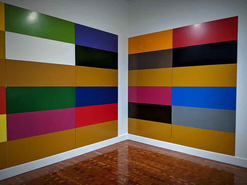
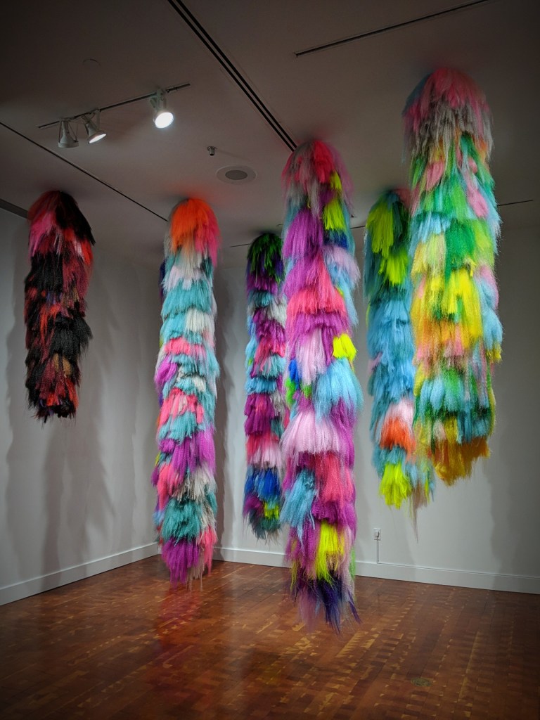
Poul Gernes (b. 1925, Denmark; d. 1996, Sweden) Untitled, 1965 Enamel on masoniteHrafnhildur Arnardóttir / Shoplifter (b. 1969, Iceland) Nervelings I-V, 2018 Synthetic hair and rope
Brooklyn-based artist Hrafnhildur Arnardóttir, who goes by Shoplifter, experiments with artificial hair that she dyes into a rainbow of hypernatural colours and arranges into organic sculptures or massive landscapes.
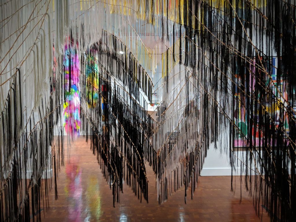
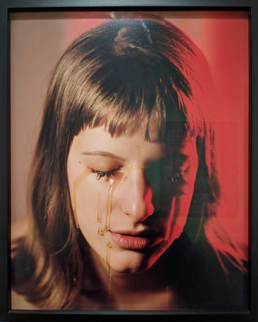
Outi Pieski (b. 1973, Finland) Crossing Paths, 2014 Wood and threadsTorbjørn Rødland (b. 1970, Norway) Golden Tears, 2002 Colour coupler (chromogenic) print mounted on aluminumEggert Pétursson (b. 1956, Iceland) Untitled, 2012-2013 Oil on canvasHenry Wuorila-Stenberg (b. 1949, Finland) Self-Portrait, 2015 Charcoal on paperTori Wrånes (b. 1978, Norway) Ancient BabyPANAM plaque embedded in the walkway Library Way
One of the 96 bronze plaques on East 41st Street, between Madison and Fifth Avenues.
From an exhibition at Scandinavia House on 58 Park Avenue, February through June 2019.
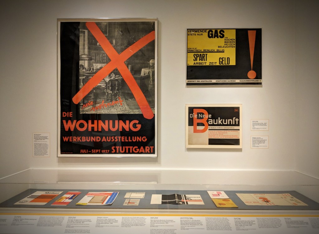
Jan Tschichold was the most important typographer of the twentieth century; his career framed many of the great debates in graphic design. Trained as a calligrapher in German Gothic script, he rejected this ”nationalist” approach in favor of a style inspired by avant-garde Constructivist art. He even briefly changed his name to ”Ivan” in sympathy with Soviet art and politics. His writings helped define the New Typography, a movement that sought to make printed text and imagery dynamic, efficient, and attuned to the demands of modern life. Tschichold’s designs and theories were controversial and provoked hostility from conservative critics. Imprisoned by the Nazis in 1933, Tschichold and his family escaped to Switzerland, where he began to question the values of modernism. By 1947, when he was appointed design director of Penguin Books in London, he was advocating a return to classical design principles: orderliness, clarity, and uniformity.
In March 1947, Tschichold became design director of Penguin Books in London, the world’s largest paperback publisher. To ensure consistency across the firm’s books, one of his first tasks was to standardize the horizontal grid and color schemes that Edward Young had established in 1935: orange for fiction, green for crime, purple for biography, etc.
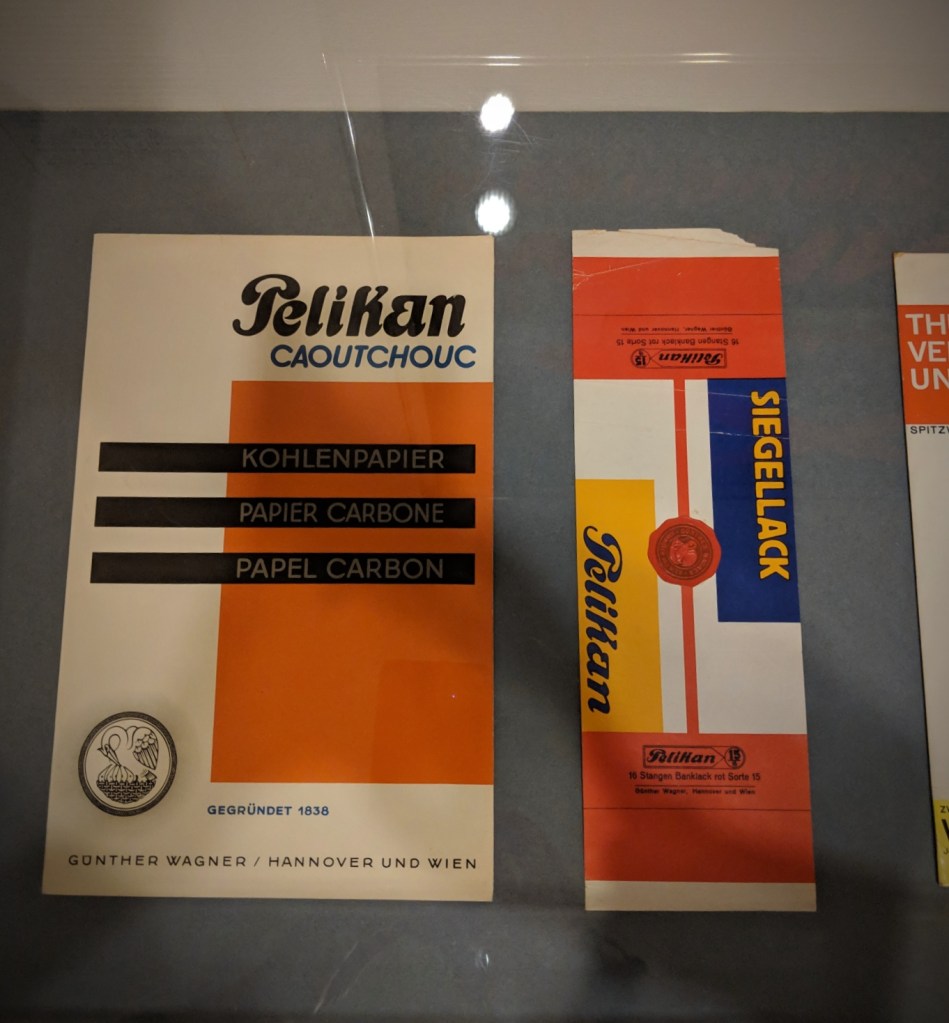
Designer unknown Pelikan carbon paper packaging, after 1928 The Museum of Modern Art, New York, Jan Tschichold Collection
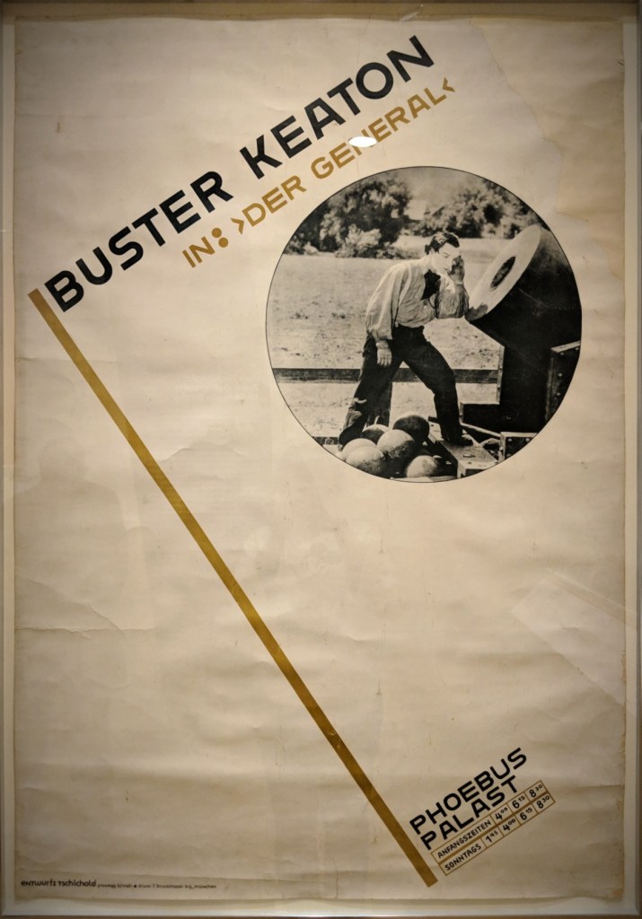
9949Jan Tschichold (Swiss German, 1902-1974) Buster Keaton in: ”Der General” Phoebus-Palast Poster, 1927 The Museum of Modern Art, New York
Jan Tschichold (Swiss German, 1902-1974) Phoebus-Palast: Music and Film Performances by rank; program, 1927 The Museum of Modern Art, New York
Johannes Molzahn (German, 1892-1965) Dwelling and Workplace poster, 1929 The Museum of Modern Art, New York, Jan Tschichold Collection
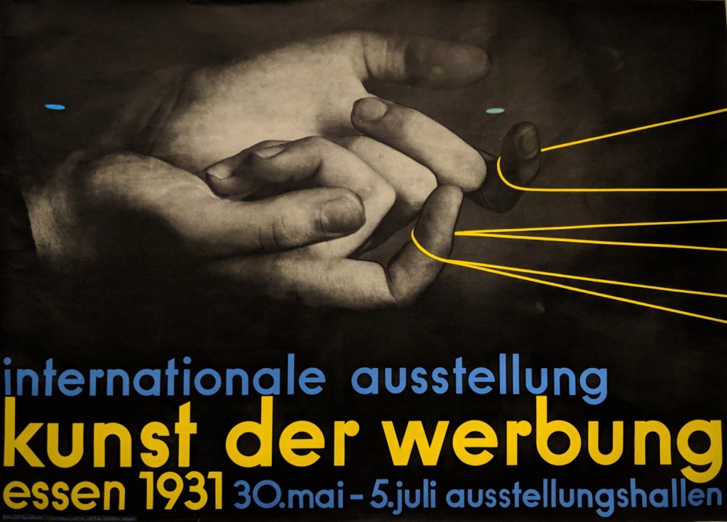
Max Burchartz (German, 1887-1961) International Exhibition: Art of Advertising poster, Essen 1931 The Museum of Modern Art, New York
Paul Schuitema (Dutch, 1897-1973) Nutricia, le lait en poudre advertisement, 1927-28 The Museum of Modern Art, New York, Jan Tschichold Collection
The New Typography was a movement based in Germany during the period of the Weimar Republic (1918-33) that sought to make printed text and imagery a dynamic expression of modern life. Proponents advocated adopting asymmetrical layouts, sanserif letterforms, and integrating photography with text in a manner that expressed a new sensibility, shaped by advertising and the mass media. Jan Tschichold, a young typographer trained in Leipzig, was the author of the landmark texts ”elementare typographie” (1925) and Die neue Typographie (1928), which did much to define the movement. Tschichold contacted many leading artist-designers throughout Europe and the Soviet Union to acquire examples of their finest designs and added them to his personal collection, most of which is now in the Museum of Modern Art in New York.
From the ”Jan Tschichold and the New Typography” exhibition @ Bard Graduate Center (February – July 2019)
Free listening and free download (mp3) chill and down tempo music (album compilation ep single) for free (usually name your price). Full merged styles: trip-hop electro chill-hop instrumental hip-hop ambient lo-fi boombap beatmaking turntablism indie psy dub step d'n'b reggae wave sainte-pop rock alternative cinematic organic classical world jazz soul groove funk balkan .... Discover lots of underground and emerging artists from around the world.