“Cabin crew, please take your seats for landing”

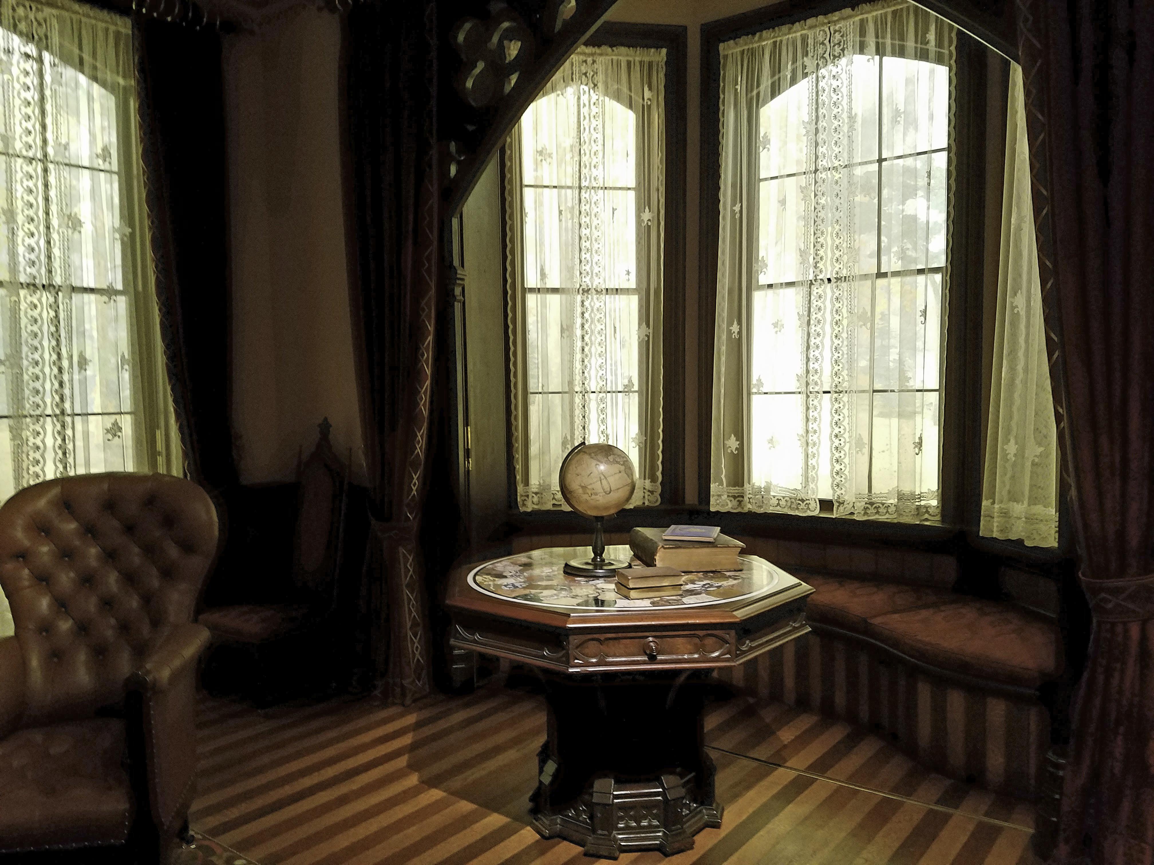
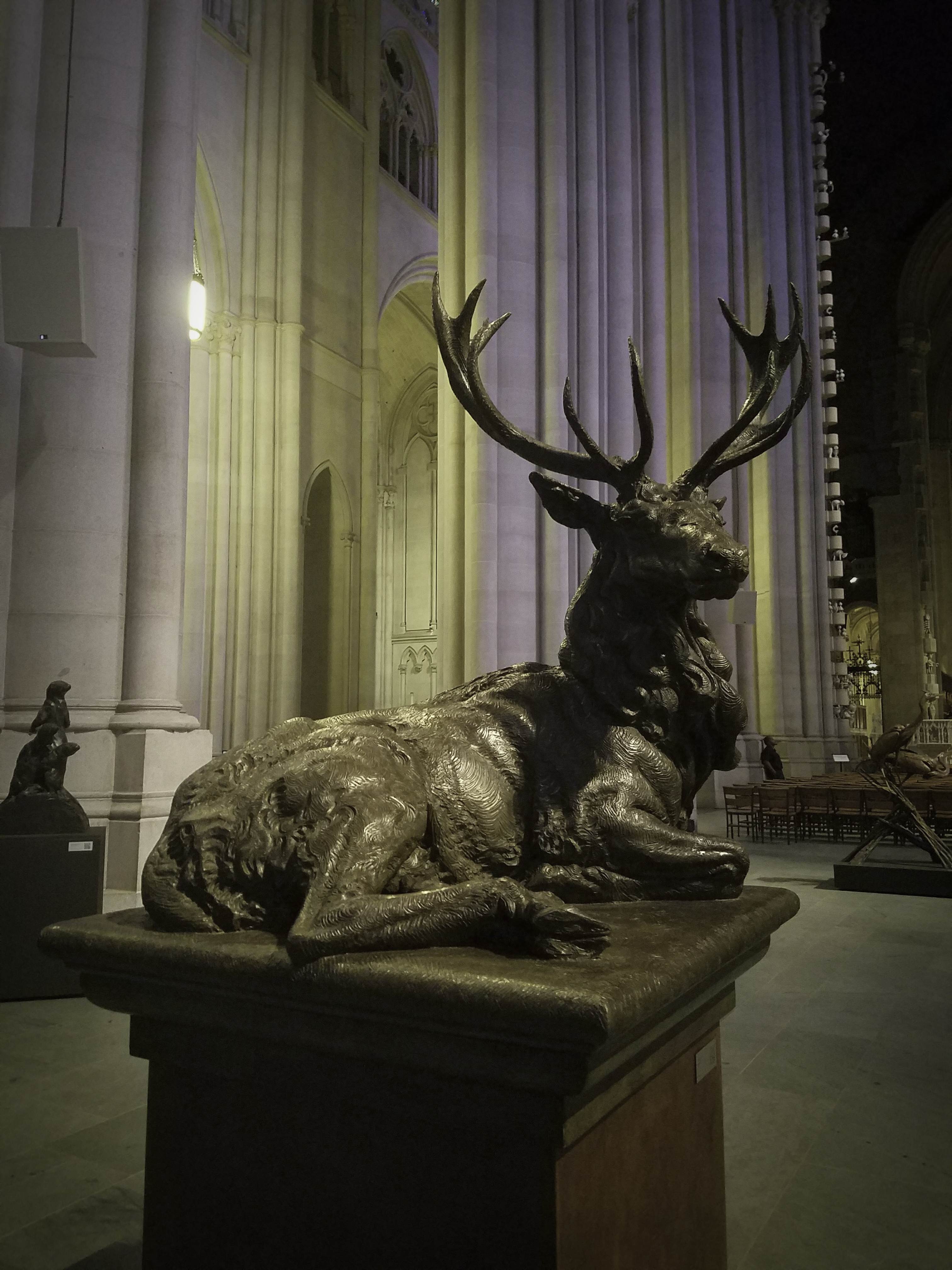
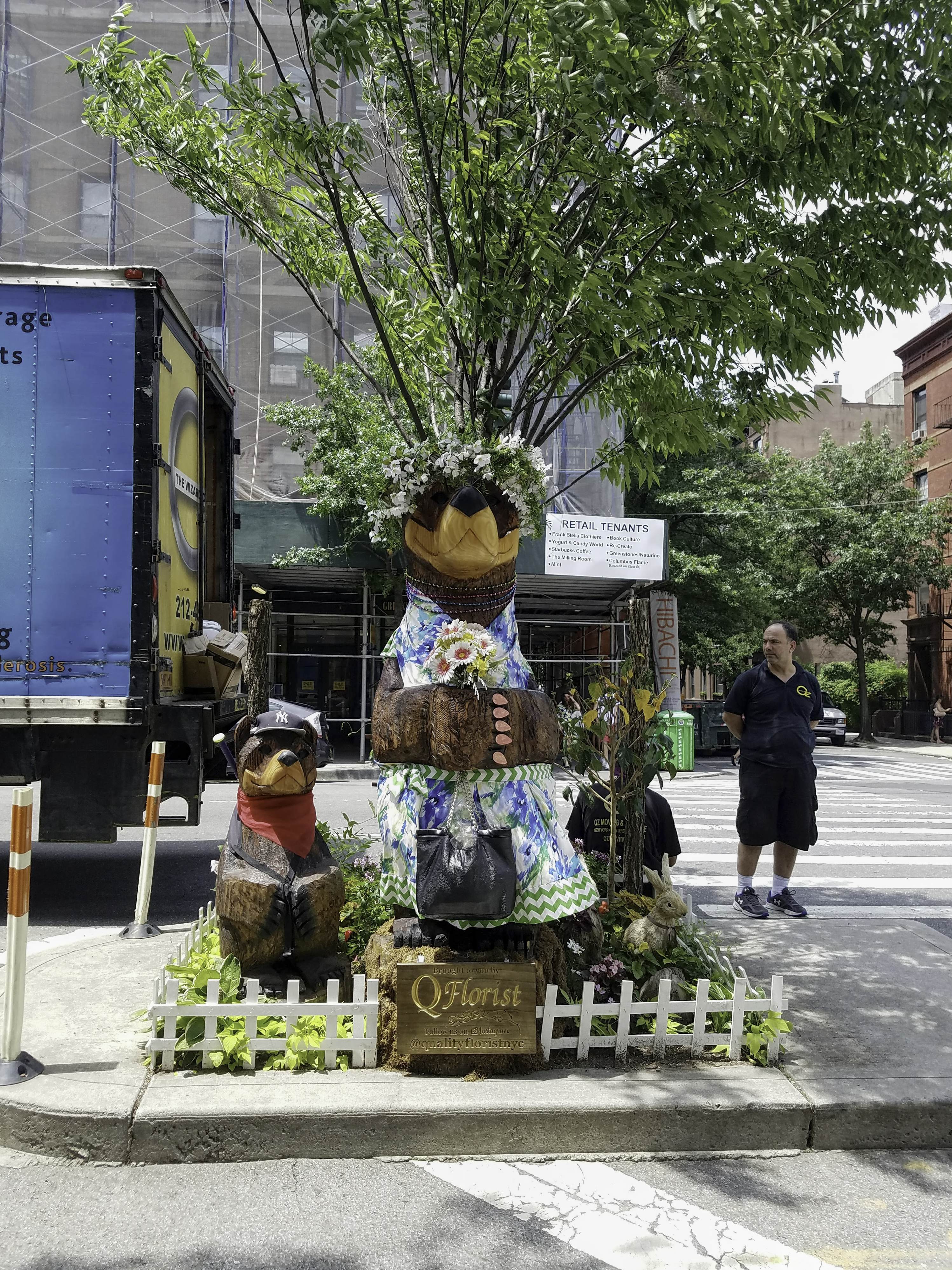
Ladies & Gentlemen, welcome to San Francisco!

You know you’re in the right place when -on touch down- you’re greeted with a display of some of the most iconic antique typewriters ever produced. Japanese Typewriters

Chinese and Japanese script are logographic and utilize characters that represent elements of words or meanings. Chinese is one of the most ancient forms of active writing, with over 80.000 characters identified throughout different eras and regions of China. Modern Chinese is simplified. Around 3.500 characters are defined in the List of Frequently Used Characters in Chinese, with approximately 2.500 in Common-use Character lists published by the Chinese government.

In 1915, Japanese printer and inventor Kyota Sugimoto (1882-1972) patented a typewriter that printed in both Chinese and Japanese. Manufactured by the Nippon Typewriter Company, the machine featured a large, sliding tray to room for 2.450 individual type-slugs. 


The Chinese typewriter

Typing in Chinese or Japanese on a flatbed typewriter is a complex procedure. Operators of these machines must familiarize themselves with the location of more than 2.000 type-slugs, and most early typists averaged twenty to thirty characters per minute. Typing speed substantially increased with the arrangement of type-beds by operators to suit their individual needs. In the early 1950s, the New Typing Method introduced ”radiating compound” organization to Chinese typists. Depending on subject matter, associated characters were arranged around central, primary characters in radiating patterns. Typists were responsible for their own layouts, and organization differed dramatically. For instance, a layout for a government office would be quite different than for a factory, with names of officials substituted for company names and technical terms.

Throughout the 1950s, most Chinese language typewriters were manufactured in Japan. The Chinese government restructured typewriter production under the new communist regime and in 1964, the Shanghai Chinese Typewriter Manufacturers Association introduced a flatbed typewriter. Based on the Japanese typewriter produced by Nippon Typewriter Co. in Tokyo, the revitalized machine was branded the Double Pigeon DHY and made by Shanghai Calculator & Typewriter. Available with either ribbon-or roller-inking mechanisms, the DHY was the iconic typewriting machine of the People’s Republic of China and was manufactured until 1992.


Olivetti Design

The Valentine is perhaps the most iconic Olivetti typewriter, envisioned by designer Ettore Sottsass (1917-2007) as an inexpensive and simple-yet-stylish portable.


Royal Quiet De Luxe with carrying case, 1949
Royal Typewriter Company, Inc. Hartfort, Connecticut


Bar-Lock No. 6, 1895
Columbia Typewriter Company, New York

Double Keyboards

Modern typewriters use a shift-key mechanism to select upper- and lower-case characters. Many models introduced during early typewriter production utilized a double-keyboard arrangement, with two banks of keys organized by upper and lower cases. Initially, makers of double-keyboard machines promoted their potential speed and efficiency. The Smith Premier was the best-selling typewriter of this group and advertised ”a key for every character”. Like the Sholes & Glidden Type Writer and early Remington models, the Smith Premier was an upstroke machine and did not print within the user’s view – its carriage had to be lifted to reveal the paper and printed text.


Williams No. 1, 1895
The Williams Typewriter Company, New York


Crandall New Model, c. 1890
Crandall Machine Company, Groton, New York


Chicago No. 2, 1905
Chicago Writing Machine Co.


Underwood Standard Portable Typewriter with hand-lettered case, 1926
owned by Orson Welles
Underwood Typewriter Company, New York

Typescript for Citizen Kane, 1941


Royal Model P, 1932
owned by Ernest Hemingway
Royal Typewriter Co., Inc. New York

Our amazing trip to the West Coast had just began in the best way possible – in San Francisco International Airport.

July 4th, 2017

My imaginary wish list

Sometime ago I mentioned how much I enjoy wandering about the period rooms at the Metropolitan, so painstakingly reconstructed by the museum curators that they compete in authenticity and splendour with the original ones. Today, let’s go for another walk to see some of the objects high on my imaginary wish list (and a couple of no-nos).

The pianoforte:Pianoforte, New York City, 1810-15
Patented by John Geib and Son. Case attributed to the workshop of Duncan Phyfe (1768-1844). Mahogany, rosewood, satinwood, ivory, gilded gesso, brass with white pine, maple, ash


The Square Piano (when more is too much – too complicated for my wish list, yet very impressive woodwork): Square Piano
Robert Nunns and John Clark (active 1833-58)
New York City, 1853
Rosewood, mother-of-pearl and tortoiseshell

{Lavish decoration and opulent materials distinguish this extraordinary piano…. Its immense scale and excessive decoration make it quite unlike the small and economical upright pianos that became fixtures of middle-class parlours in the second half of the nineteenth century.}


The Four Seasons cabinet: Cabinet
Herter Brothers (active 1864-1906)
New York City, ca. 1869
Rosewood, maple ebonized wood, porcelain plaques, oil on panel, brass

{This rich and imposing cabinet is from a ten-piece parlour suite made by Herter Brothers in 1869 for Jay Gould’s house on Fifth Avenue. Incorporating a design vocabulary taken from the architecture of the day, it is a tour de force of cabinetmaking, combining sophisticated marquetry, assured carving and delicately modeled ceramic plaques depicting the Four Seasons.}


The Étagère in Rococo Revival style: Alexander Roux (active 1843-86)
New York City, ca. 1855
Rosewood, chestnut, poplar, bird’s-eye maple veneer


A Girl’s best friend (not just diamonds): Necklace with Pendant, ca. 1910
Louis Comfort Tiffany
Tiffany and Company
Moonstones, Montana sapphires, platinum


The Gilded Kennel (with the mark of Marie-Antoinette, no less): Kennel
Gilded beech and pine. Signed by Claude Sené (1724-1792): stamped with the mark of Marie-Antoinette’s garde-meuble. French, ca. 1775-80


The Copper Lamp: Dirk Van Erp (1859-1933)
San Francisco, California, ca. 1912-15
Copper base, mica and copper shade


The dressing room (gown included): Worsham-Rockefeller Dressing Room
New York City, 1881-82
George A. Schastey & Co. (1873-97)

{In 1881, Arabella Worsham then-mistress of railroad magnate Collis P. Huntington, hired the cabinetmaking and decorating Firm George A. Schastey & Co. to create a series of distinctive artistic interiors for her townhouse at 4 West 54th Street. The resulting decor, including that found in this dressing room, was the height of cosmopolitan style in the early 1880s and emblematic of Worsham’s quest to fashion her identity as a wealthy, prominent woman of taste.}


The octagon table:Probably New York City, about 1860
Walnut, marble


The Richard and Gloria Manney Greek Revival Parlour:

The Richard and Gloria Manney John Henry Belter Rococo Revival Parlour:

The Working Girl’s table:Worktable
Salem, Massachusetts, 1800-1810
Mahogany, mahogany veneer, ivory with white pine, maple

{Worktables were one of few gender-specific pieces of furniture used in the home. Women relied on them for storing sewing supplies and for conducting correspondence, as such tables often contained a hinged writing surface in a drawer.}


The Richmond Room, 1810-11:

The yellow chairs and the sleek Federal era sofa:Side Chairs
Attributed to the workshop of John Finlay (1777-1851) and Hugh Finlay (1781-1830)
Baltimore, ca. 1815-25
Maple with painted and gilded decoration

{Originally part of a large set, these brilliantly conceived and handsomely executed chairs derive their broad, deeply curved crest tablets and sweeping rear stiles from the ancient Greek klismos form.}

Center Table
Labeled by Anthony G. Quervelle (1789-1856)
Philadelphia, ca. 1830
Mahogany, marble and brass with painted decoration

The Art Nouveau mantelpiece: Attributed to Jean-Désiré Muller (French, 1877–1952)
Glazed stoneware, ca. 1900

The Minimal-Tidy-Closet-I-will-Never-Have-But-Always-Dream-Of:  Sara Berman’s Closet

{The meticulously organized, modest closet in which Sara Berman (1920–2004)—an immigrant who traveled from Belarus to Palestine to New York—kept her all-white apparel and accessories both contained her life and revealed it. Inspired by the beauty and meaning of Berman’s closet, the artists Maira and Alex Kalman (who are also Berman’s daughter and grandson) have recreated the closet and its contents as an art installation.

This exhibition represents Berman’s life from 1982 to 2004, when she lived by herself in a small apartment in Greenwich Village. In her closet Berman lovingly organized her shoes, clothes, linens, beauty products, luggage, and other necessities. Although the clothing is of various tints—including cream, ivory, and ecru—it gives the impression of being all white.}

And, finally, his made-to-order Little Red Hood’s cloak:Child’s cloak
American, 180s
Wool and silk

The Metropolitan Museum of Art

July 2nd, 2017

summer of mischief

there were turtles and peacocks and ethereal angels,
a huge creepy face and menacing eagles,
smiling piglets and playful hounds,
proud looking stags and graceful felines –

all kinds of furry, feathered and mischievous creatures
dancing and stalking and flying –
sweeping across from wall to sacred wall
of one of the world’s largest cathedrals ”Ursus”, Dan Ostermiller


‘Sun Face”, full scale production section by Greg Wyatt, Plaster cast


”River Mates”, Tim Cherry


”Circle of Friends”, Gary Lee Price


”Trouble”, Bob Guelich


”Eagle Rock”, Kent Ullberg


”Peacocks”, Dan Chen


”Stella”, André Harvey


”High Four” and ”Tickled”, Louise Peterson


”Two Peacocks”, Greg Wyatt


”Hope”, Elwira Jarecka, La Guardia Community College


”Hidden Behind”, Chitra Mamidela, Frank Sinatra School of the Arts


”Scottish Stag”, Wesley Wofford


”Top Gun”, Stefan Savides


”Wild Instinct”, Joshua Tobey

A Summer of Sculpture was an exhibition that featured Cathedral Artist in Residence Greg Wyatt’s Peace Fountain and Animals of Freedom; A Blessing of Animals, curated by the National Sculpture Society; and the Art Students League of New York’s Model to Monument Retrospective. It ran in the Cathedral of Saint John the Divine, until September 2017.

June 29th, 2017

Bear in mind

They come in peace

1/Installation courtesy of Q Florist
2/”Ursus”, the gigantic bronze sculpture by Dan Ostermiller was inviting visitors to cross the monumental entrance of St. John the Divine Cathedral. Inside, more wild creatures had taken their places all over the Cathedral in celebration of ”A Summer of Sculpture” – an exhibition that ran through September 2017.

More photos from ”A Summer of Sculpture” coming up tomorrow.

June 29th, 2017

The Art of the In-Between

1/KAYA (Kerstin Brätsch and Debo Eilers), founded 2010, installation view of SERENE, 2017

3/Kaari Upson (b. 1972), In Search of the Perfect Double II, 2016 (detail). Urethane, pigment and aluminium

4/Asad Raza (b. 1974), detail of Root sequence. Mother tongue, 2017

5/Elsie Driggs (1895–1992), Pittsburgh, 1927. Oil on canvas

8/Richmond Barthé (1901–1989), African Dancer, 1933. Plaster

9/View (partial) of Larry Bell’s Pacific Red II, 2017 – also seen in previous post

The 2017 Whitney Biennial

June 10th, 2017

beginning & the end, neither & the otherwise, betwixt & between, the end is the beginning & the end

Made you look, didn’t it? Imagine then, what a head-turner this installation was in real life!

A site-specific work by Raúl de Nieves for the 2017 Whitney Biennial, with floor-to-ceiling windows made to look like stained-glass, using paper, wood, glue, tape, beads, and acetate sheets. In front of them, the most heavily blinged sculptures, completely covered in beads, costume jewelry and heavy fabric, costumes that the artist is actually wearing himself when performing.

Doubtlessly the most bonkers installation of the 2017 Biennial but, for those searching for a deeper meaning, the accompanying tag had it all spelled out:

”In all of his work, de Nieves treats modest materials with meticulous attention, turning the mundane into the fantastical—with metamorphosis a common theme. The windows depict a world in which death and waste are omnipresent, often symbolized by a fly. Unlike many Western spiritual traditions, however, de Nieves presents death as a metaphor for the possibility of spectacular transformation and rebirth in an unpredictable and turbulent world.”

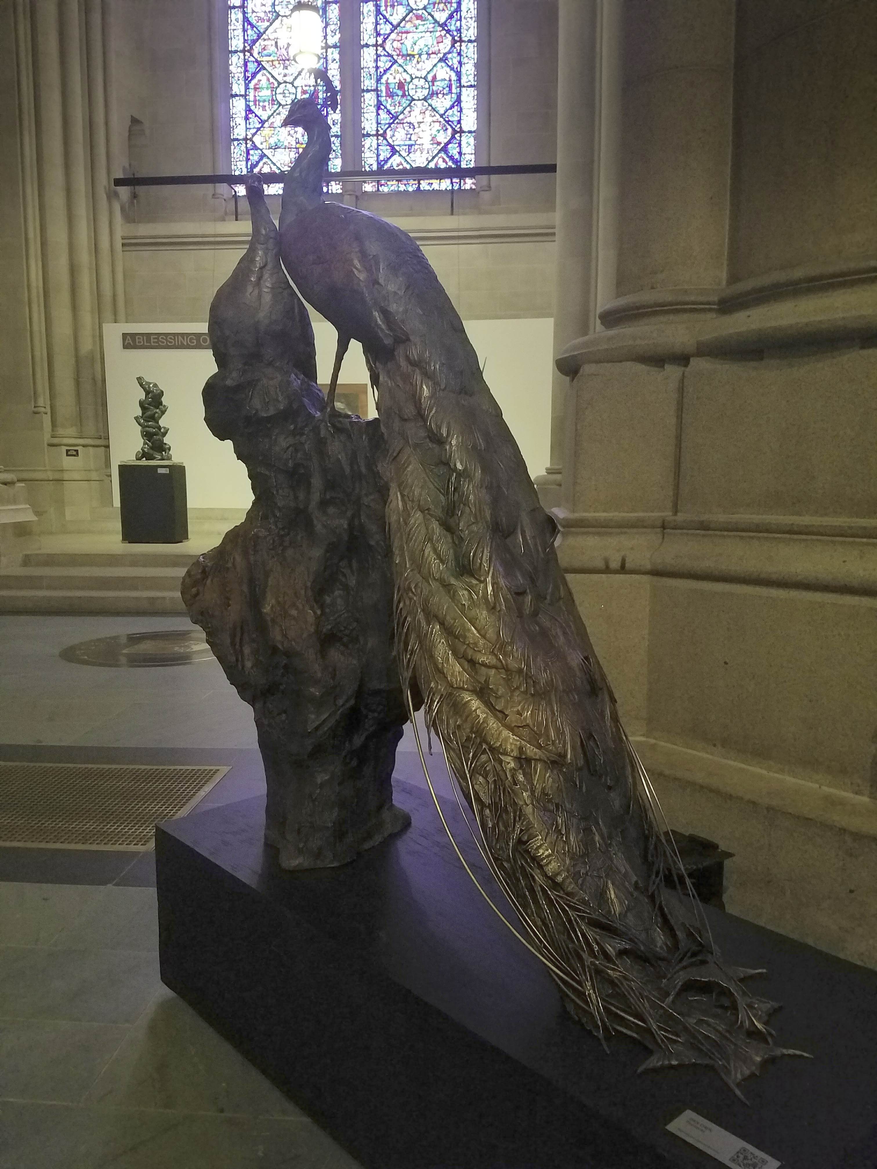
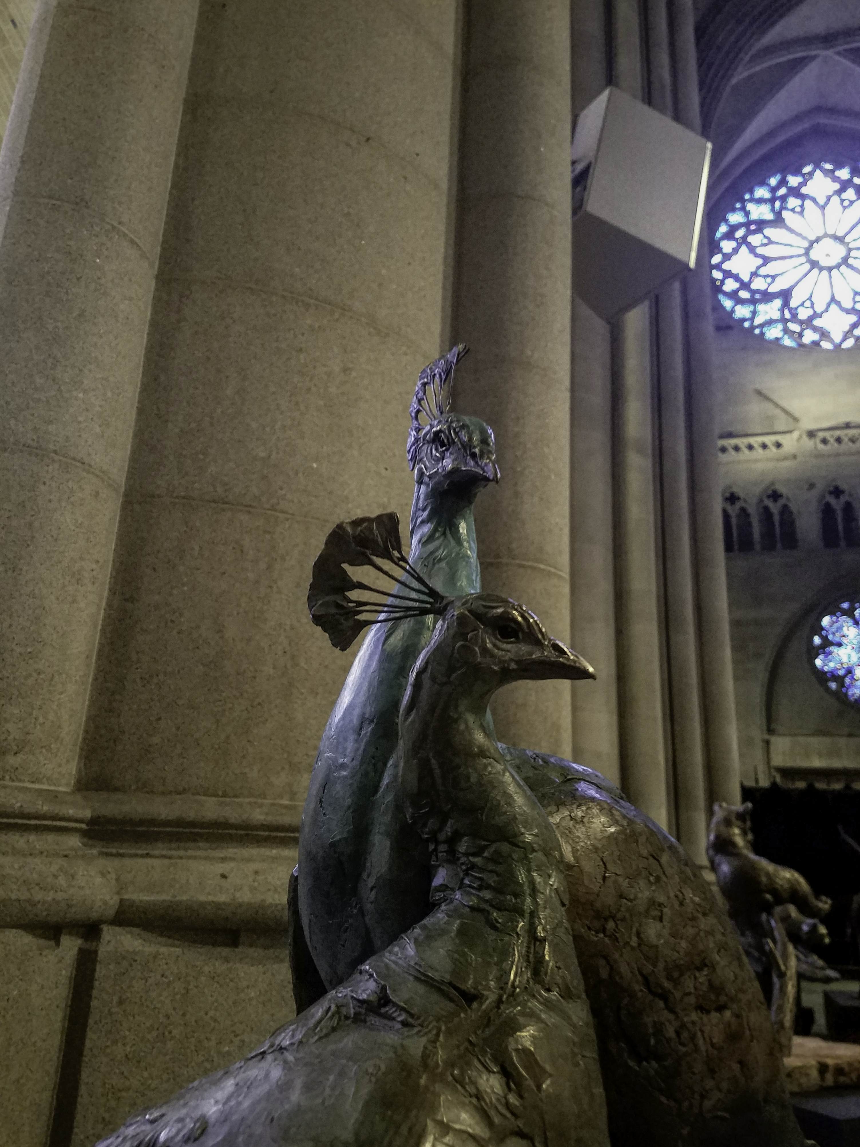
Ha! My nose is bigger than yours!


Raúl de Nieves (b. 1983 in Morelia, Mexico; lives in Brooklyn, NY)

beginning & the end, neither & the otherwise, betwixt & between, the end is the beginning & the end, 2016
Paper, wood, glue, acetates, tape, and beads, 195 x 456 5/16 in. (495.3 x 1159 cm).

Man’s best friend, 2016
Yarn, fabric, glue, beads, cardboard, found trim and mannequin

The longer I slip into a crack the shorter my nose becomes, 2016
Yarn, dress, glue beads, cardboard, found trim, apple, taxidermic bird and mannequin

Somos Monstros 2, 2016
Beads, glue found trim, cardboard, costume jewelry and dress

The 2017 Whitney Biennial

June 10th, 2017

The Society of Illustrators Annual Student Competition 2017

A jury of professional peers including illustrators and art directors have chosen the most outstanding works created by college level illustration and animation students throughout the year. Pieces are accepted based on the quality of technique, concept and skill of medium used. After reviewing 8.082 submissions, only 220 were selected for this year’s exhibition and 25 have received financial awards.

The works were on view between May & June 2017; these images are but a fraction, just enough to get an idea. Individual styles, different types of media, several Art Schools, all sharing a common quality: it was hard to believe these works were created by students, not professionals.

Carina Chong, F is for Fox
Gouache and pencil, Pratt Institute, Instructor: Pat Cummings


Mei Kanamoto, Insignificant Others
Silkscreen on paper, Parsons School of Design, Instructors: Jordin Isip and Steven Guarnaccia 


Amanda Chung, The Fool
Mixed media, Parsons School of Design, Instructors: Jordin Isip


Kyoosang Choi, Illusion
Acrylic and oil on panel, School of Visual Arts, Instructors: Thomas Woodruff and TM Davy


 Oh, look! Steadman was here Varvara Nedilska, The Collector
Watercolour and gouache, OCAD University, Instructor: Jon Todd


Clarissa Liu, Felt Tattoo
Felt, Rhode Island School of Design, Instructor: Melissa Ferreira

Nina Charuza, Train

Acrylic, California College of the Arts, Instructor: Bob Ciano


Mack Muller, Sax man
Monoprint, Syracuse University, Instructor: James Ransome


June 3rd, 2017

That’s The Spirit…!

Of being an old soul but never wanting to grow up.

The Spirit: ”Il Duce’s Locket” page 1
May 25, 1947
Ink on paper

P’Gell, a femme fatale with an impossibly narrow waist, was among the more prominent and persistent in a series of beautiful criminals in Eisner’s long-running Spirit. P’Gell, though a deadly adversary couldn’t shake her love interest in The Spirit. He seldom returned her affectionate overtures. P’Gell was named after the Quartier Pigalle, the notorious red light district of Paris


The Spirit: ”Quirte” seven-page story
November 21, 1948
Ink on paper


The Spirit: ”John Lindsay’s Mayoral Race”, five-page story
New York Herald Tribune magazine (January 9, 1966)
Will Eisner and Chuck Kramer
Ink on paper with wash

Will Eisner had not drawn a new Spirit story since 1952 when the New York Herald Tribune’s Sunday magazine contacted him in late 1965 to create a story based on the city’s mayoral election. The lettering (done on clear acetate) is missing from the original pages, but the story can be read on the smaller reproductions of the published version.


Portrait of Will Eisner by The Spirit
circa 1985
Ink on paper


Spirit Magazine #20 cover art
1979

Ink with watercolour on board


Samples of Eisner’s used pens and brushes
Jules Feiffer script for unpublished Spirit Story
1952
manuscript 


Smash Comics #8: ”Espionage”, page 3
1940
Ink on paper

This original ”Espionage” page on display is among a very small handful of Will Eisner’s surviving comic book pages from the 1930s when the Eisner & Iger Studio ”packaged” stories for client publishers. During that period (and later) publishers routinely destroyed original art after publication. Decades before organized fandom saw value in both vintage comics and art, publishers saw no reason to save such ”production” material. As a result, original art from the comic book industry’s early years is extremely rare. 


Portrait of a Nude Woman
1936

Oil on stretched canvas

A teen-aged Will Eisner painted this model while attending life drawing classes at the Art Students League in New York. Eisner’s disapproving and practical mother was shocked to learn that her young son was painting naked women and she discouraged him from pursuing art, a career she felt would be unremunerative. Eisner’s father, who when younger had aspired to be an artist, quietly gave his son encouragement. 


Late Train
New York City lithograph series
1988
Ink with watercolour on board


Turf War
New York City lithograph series
1988
Ink with watercolour on board


A Contract with God and Other Tenement Stories: ”The Super”, ten-page excerpt
1978
Ink on vellum, adhered to board


Images from WILL EISNER: The Centennial Celebration 1917-2017, a retrospective comprising over 150 pieces of artwork, graphic novel sequences, original pages of The Spirit and Mr. Eisner’s personal items. The exhibition was curated by Denis Kitchen and John Lind and ran between March & June 2017 at the Society of Illustrators. It was the largest Eisner exhibition ever in the United States and made me very happy indeed.

June 3rd, 2017