Colton Worley
Batman
Illustrating Batman: Eighty Years of Comics and Pop Culture
Society of Illustrators, 2019
June 29th, 2019
Colton Worley
Batman
Illustrating Batman: Eighty Years of Comics and Pop Culture
Society of Illustrators, 2019
June 29th, 2019
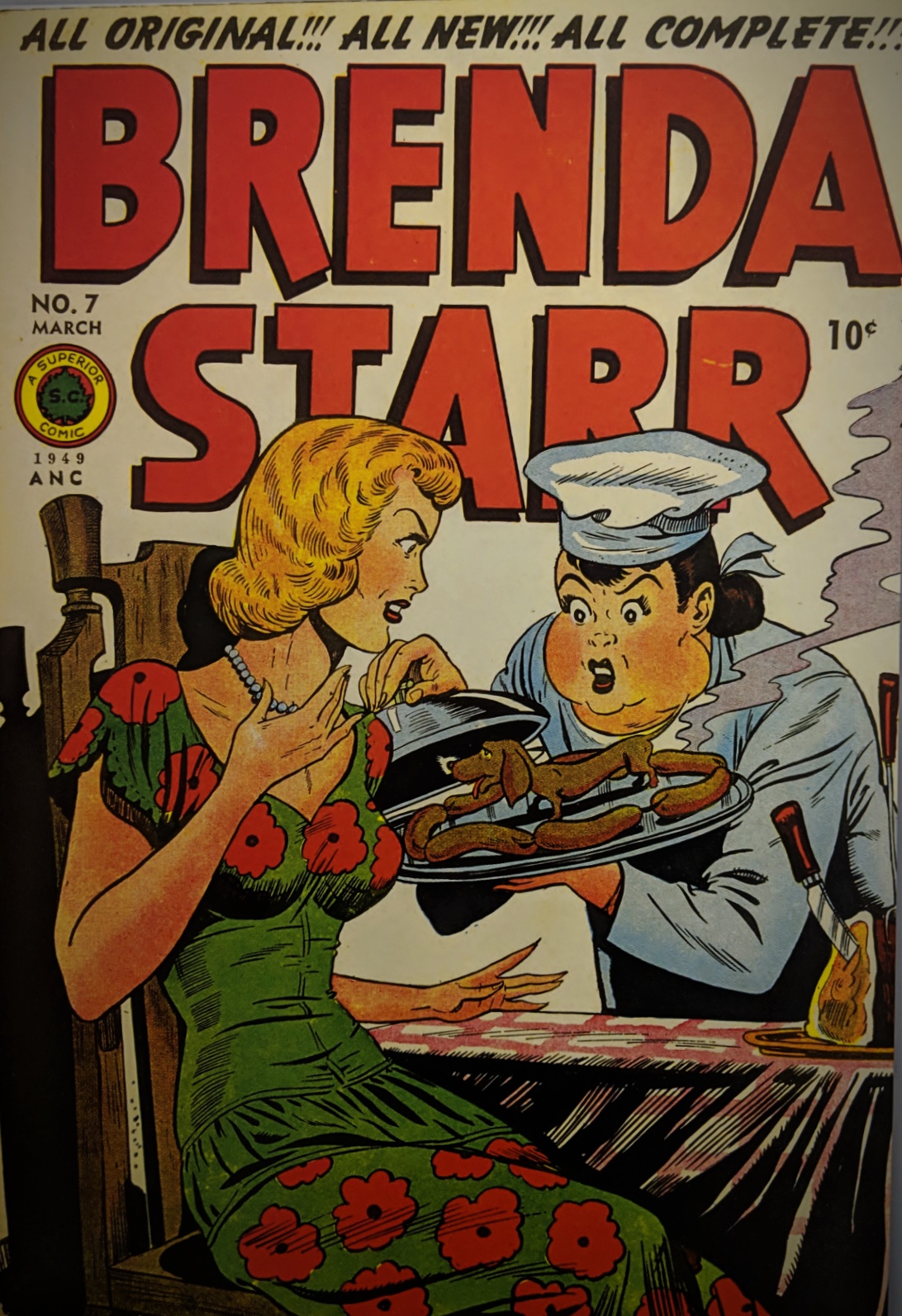
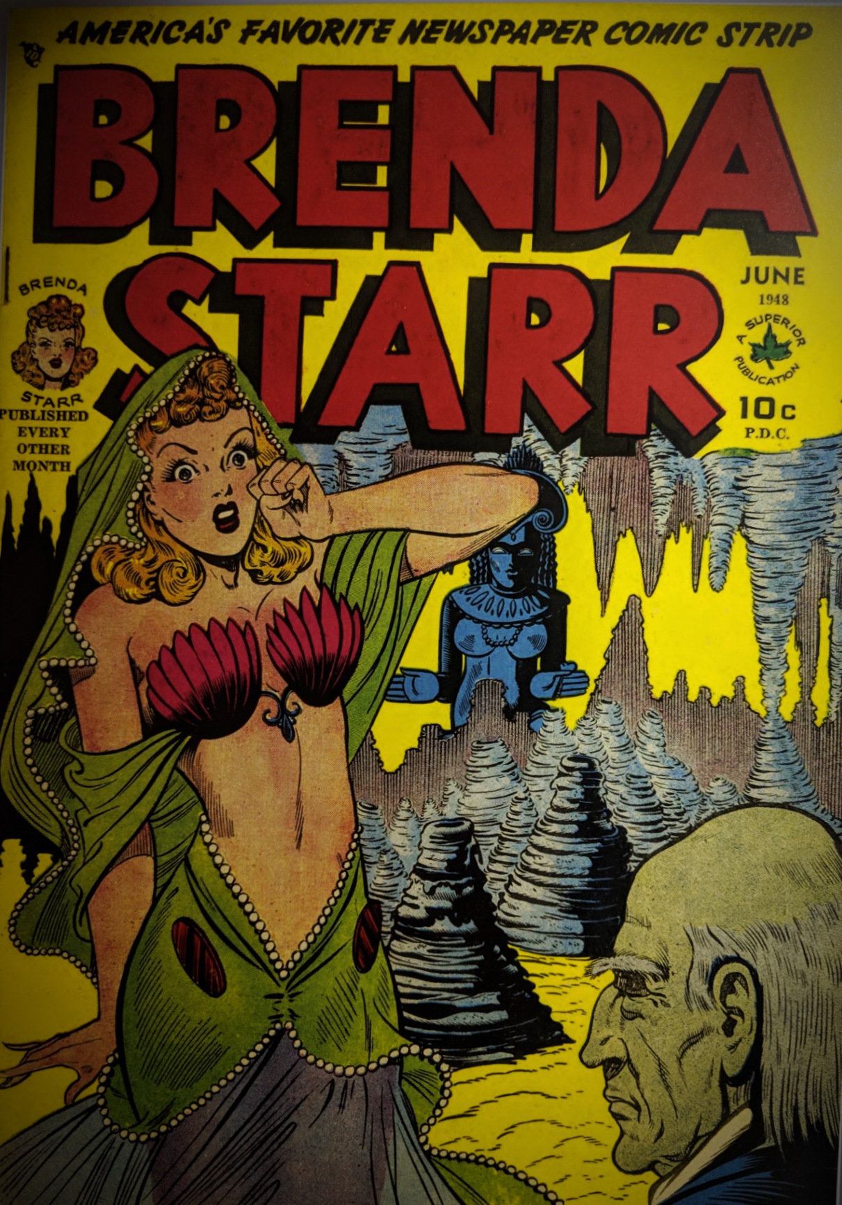
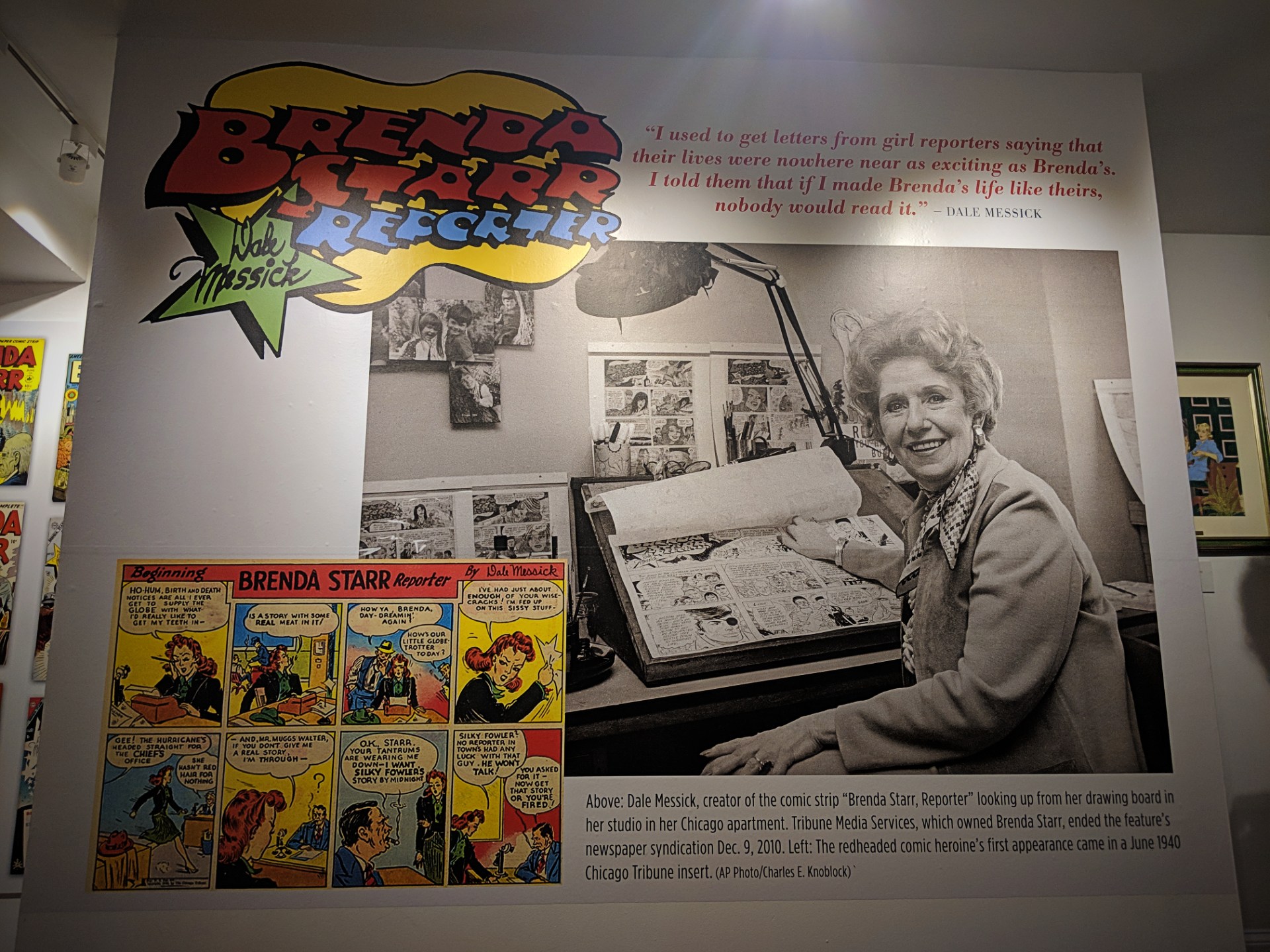
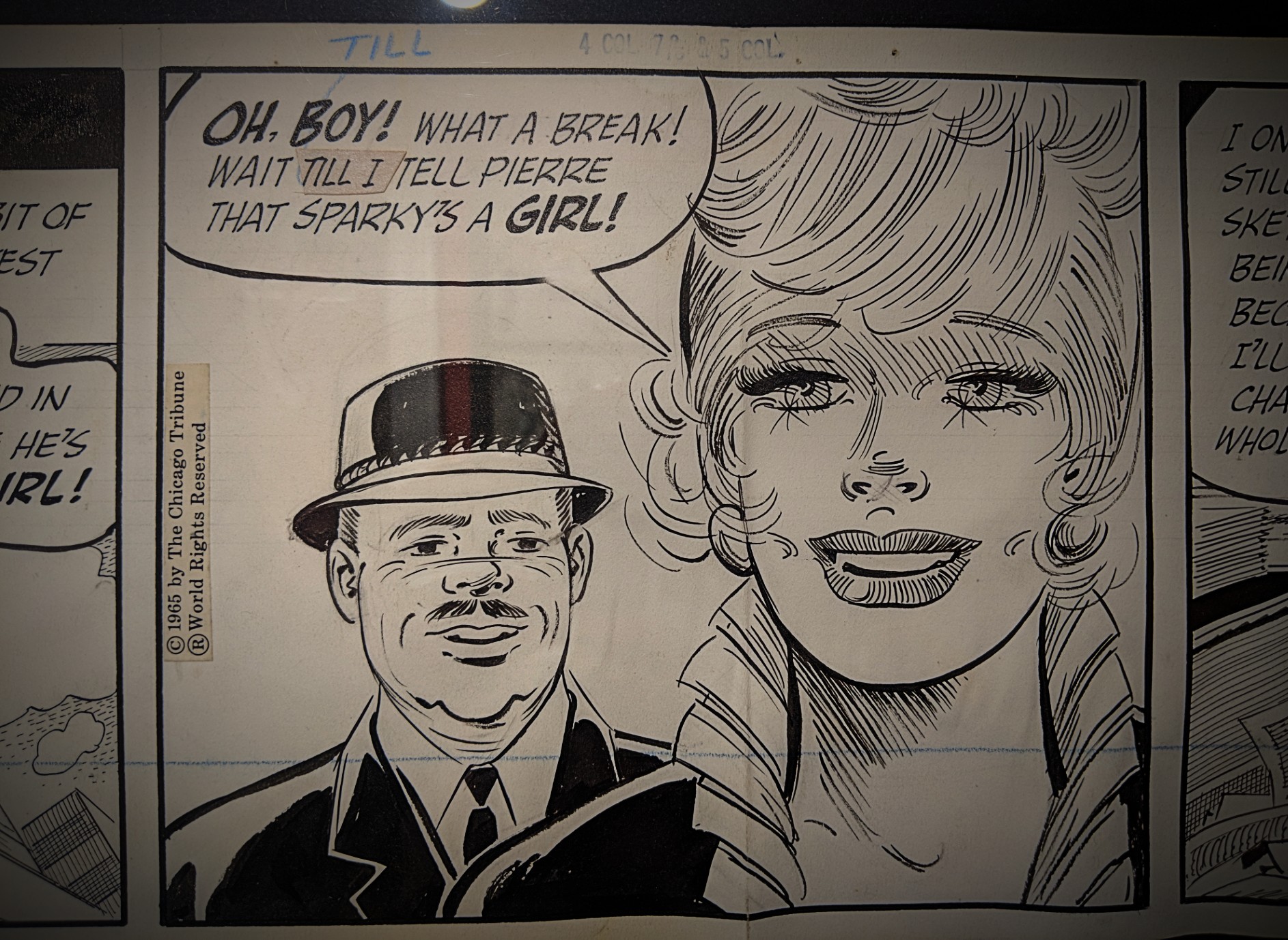
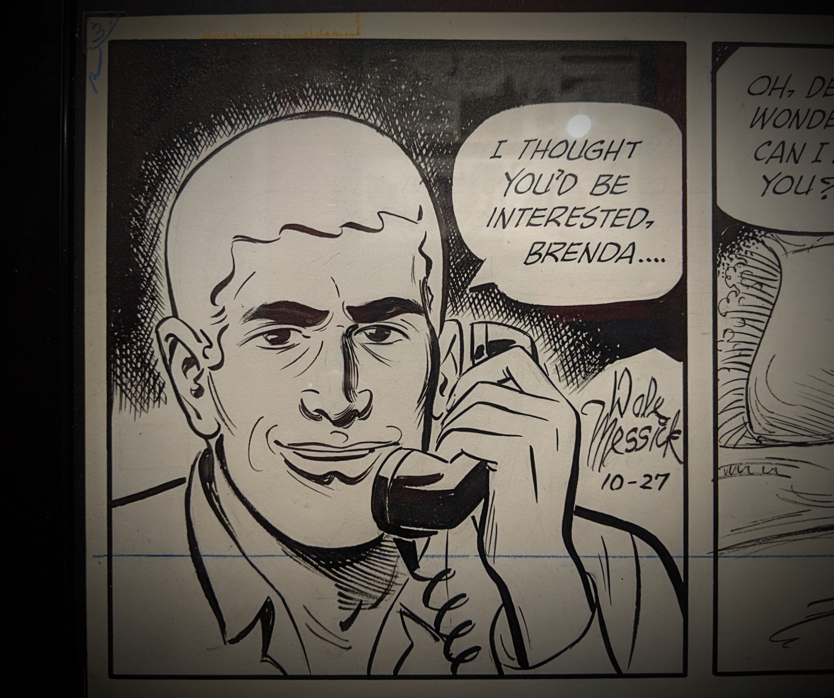
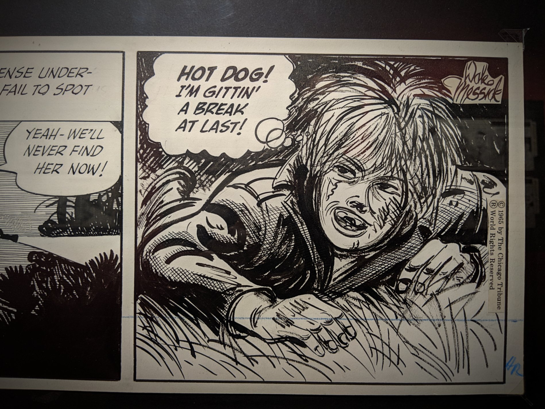
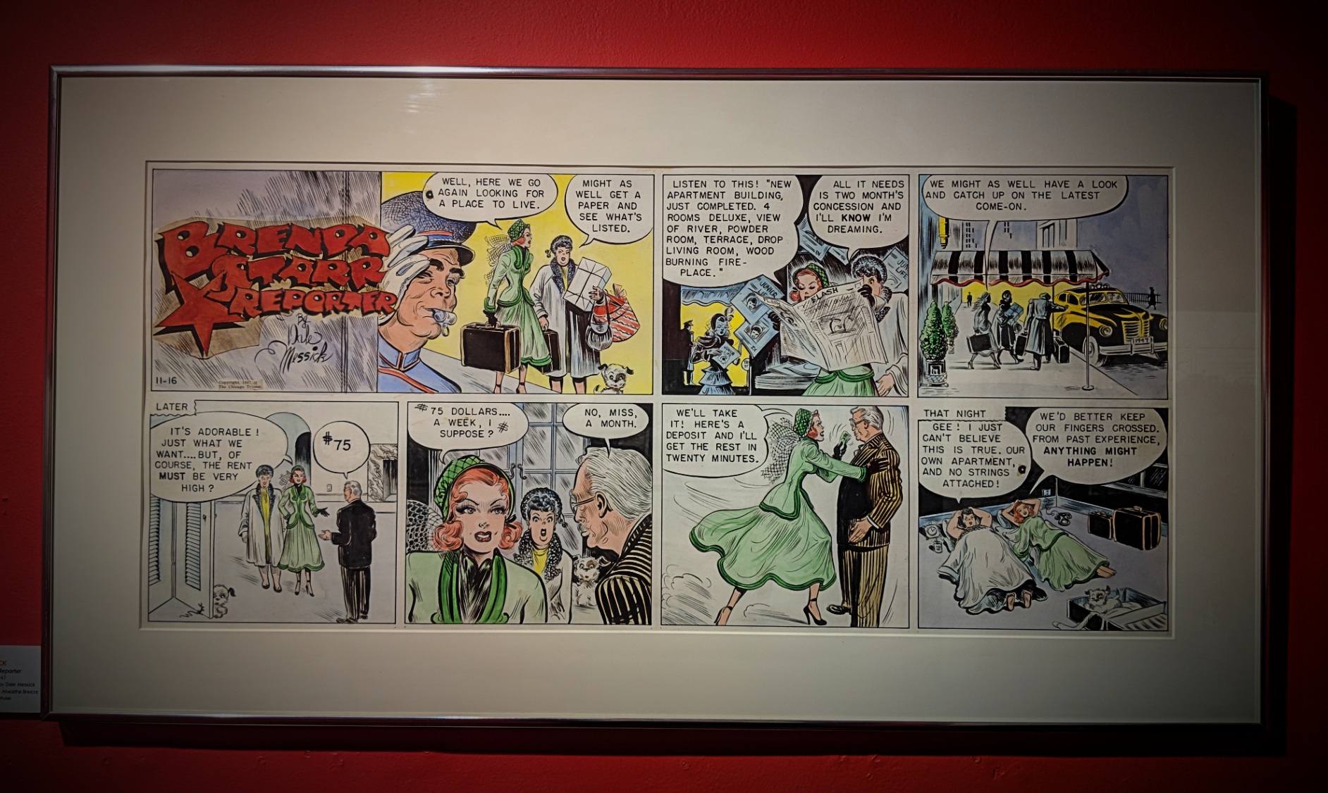
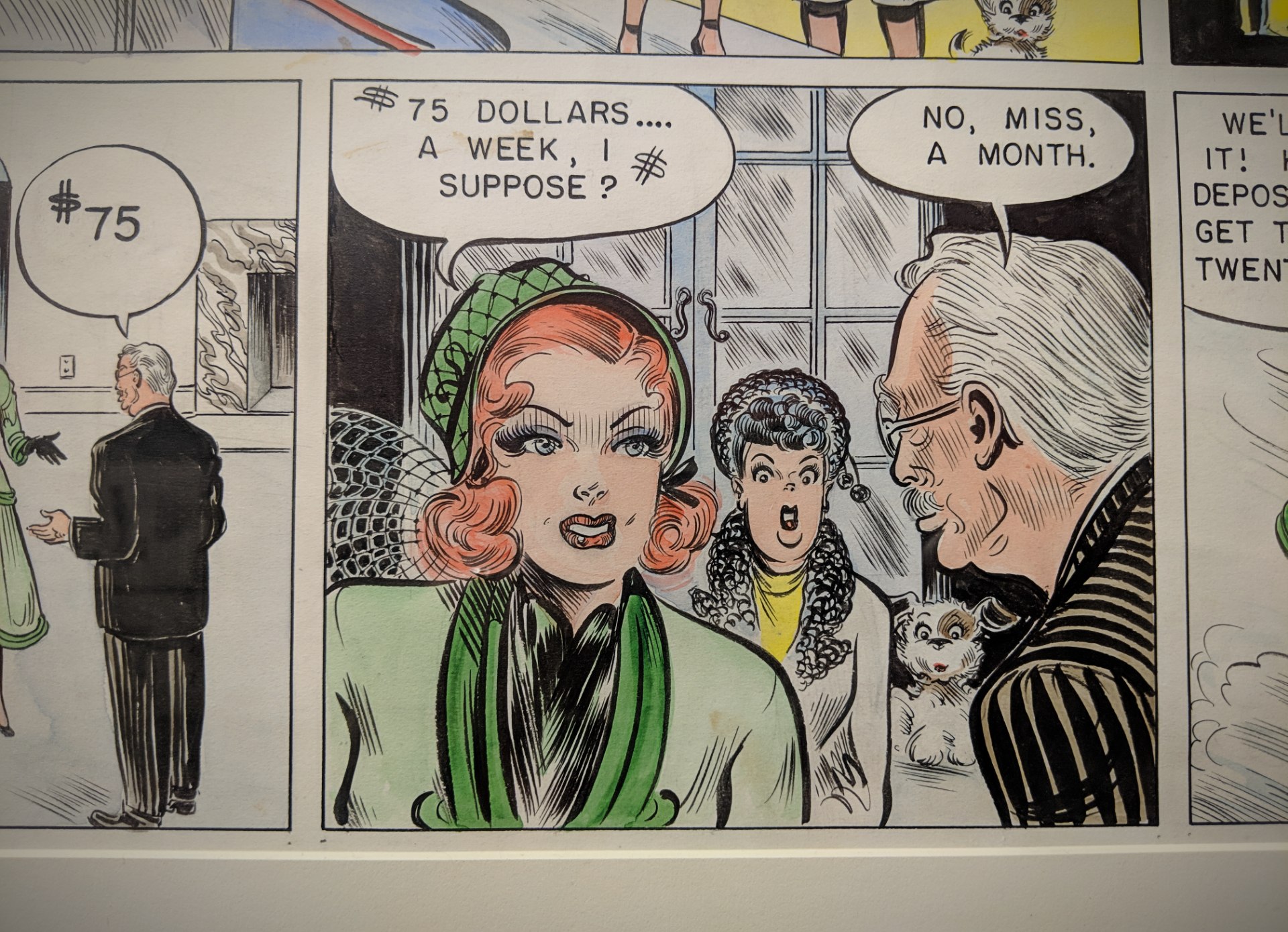
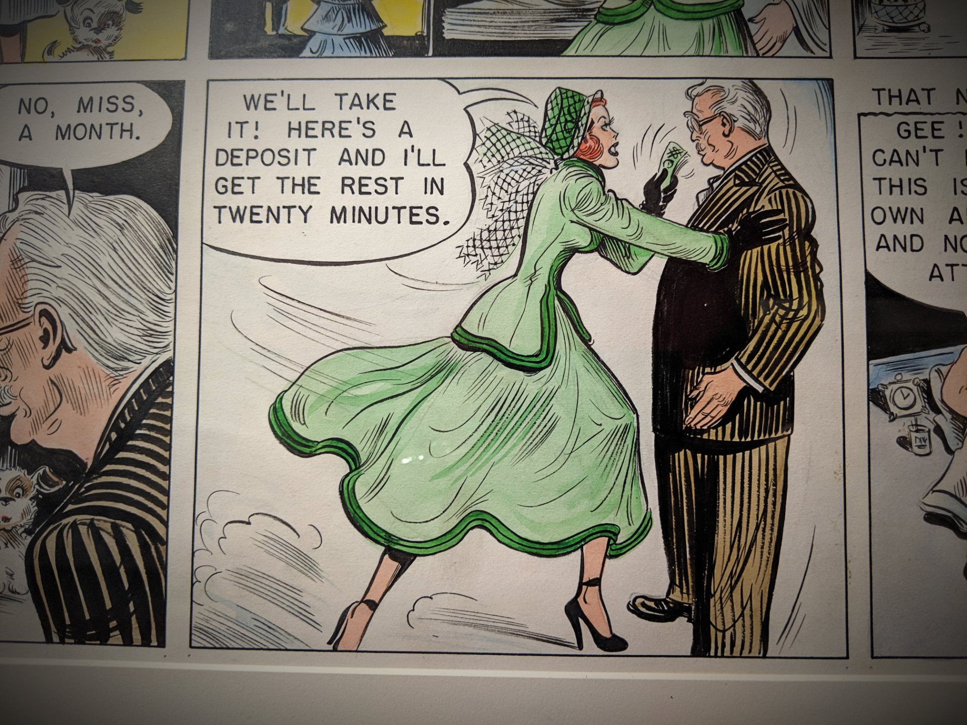
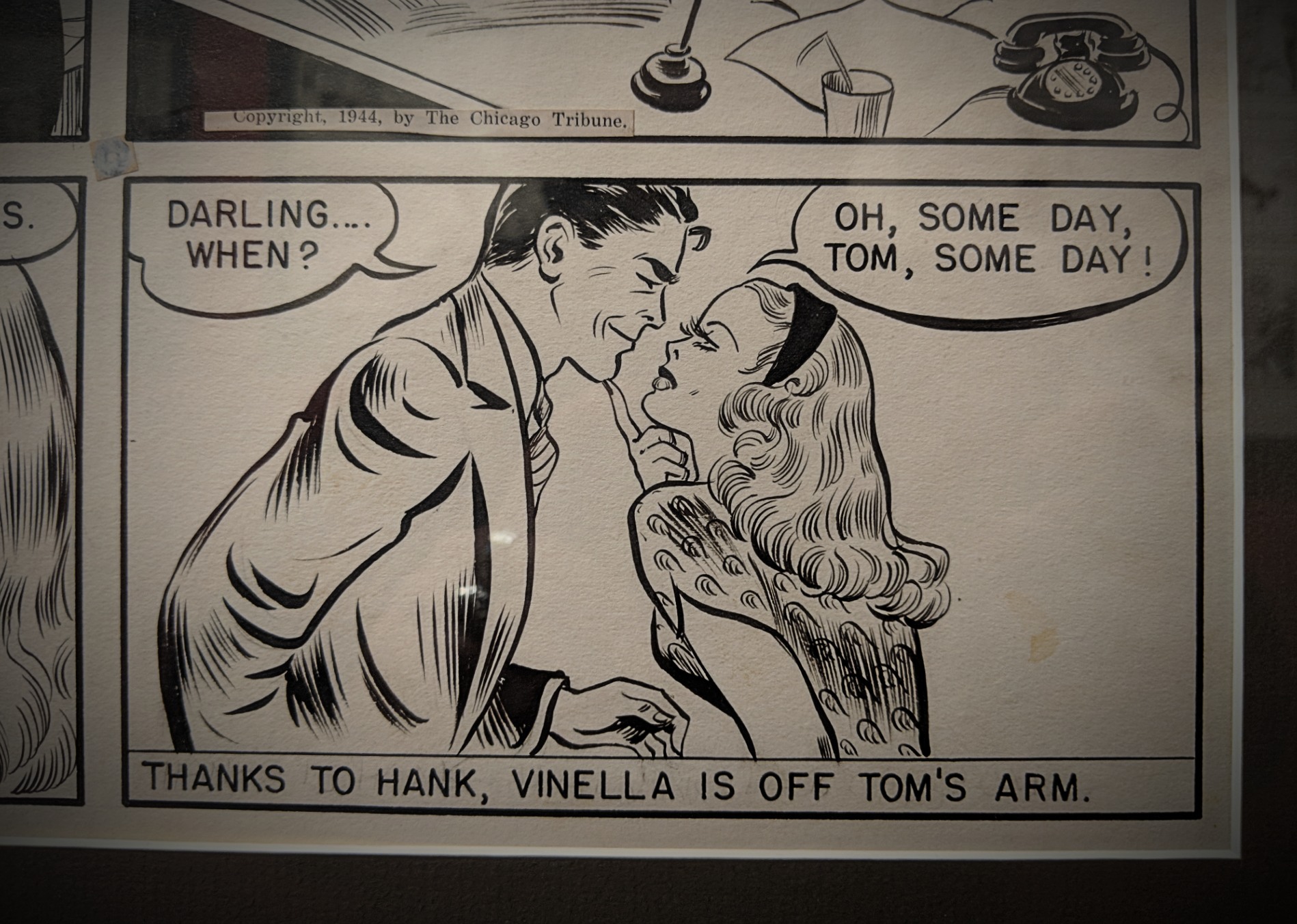
Brenda Starr, Reporter debuted in June of 1940 and was an immediate hit with young women and girls. Brenda Starr’s name came from a 1930’s debutante, Brenda Frazier, and her body, fashion sense, and persona mirrored leading Hollywood actress, Rita Hayworth, complete with matching long red hair and a curvaceous figure.
At its peak, Brenda Starr, Reporter was included in 250 newspapers and read by more than 60 million readers. When Starr and her long-time “Mystery Man” boyfriend, whose very survival depended on the serum found in the fictitious but famous black orchid, finally married after 36 years in 1976, President Gerald Ford sent a congratulatory telegram. [source]
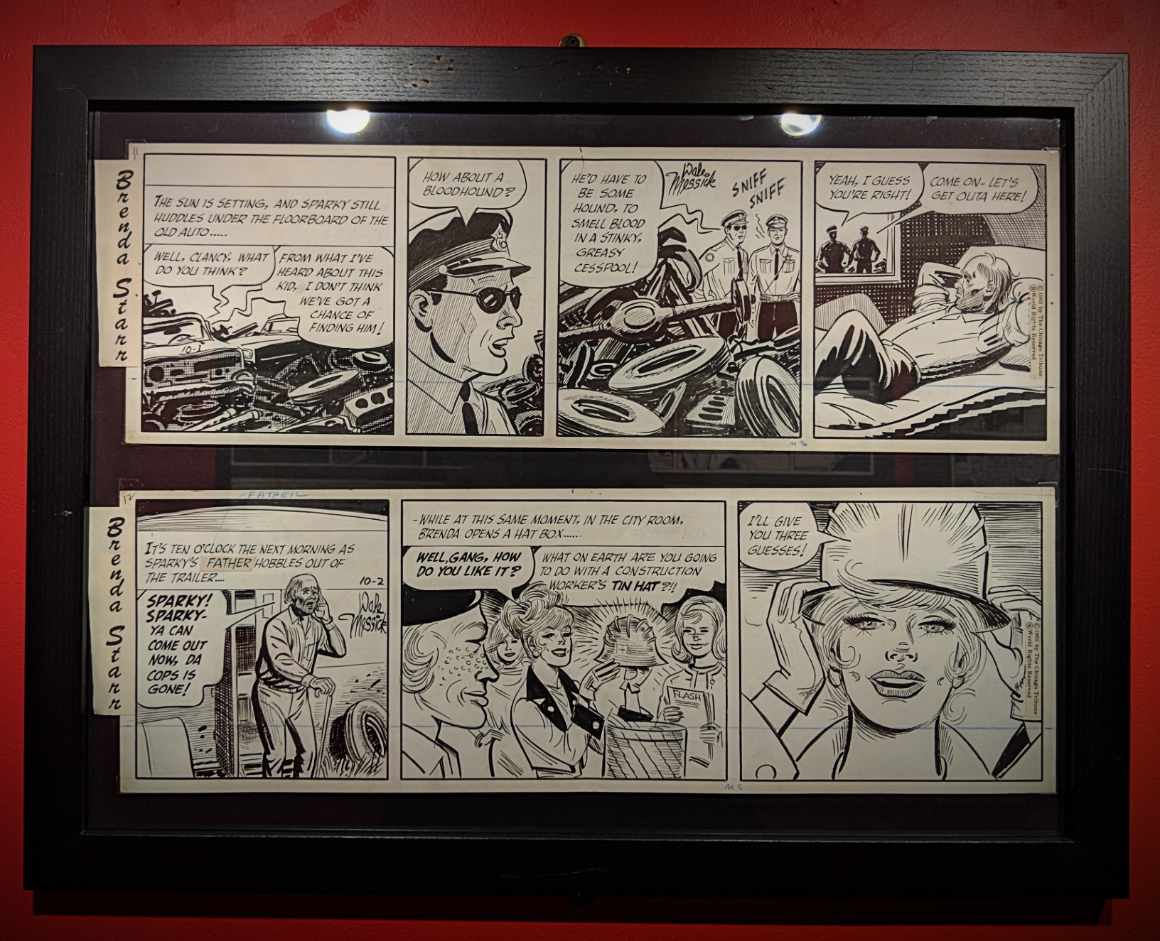
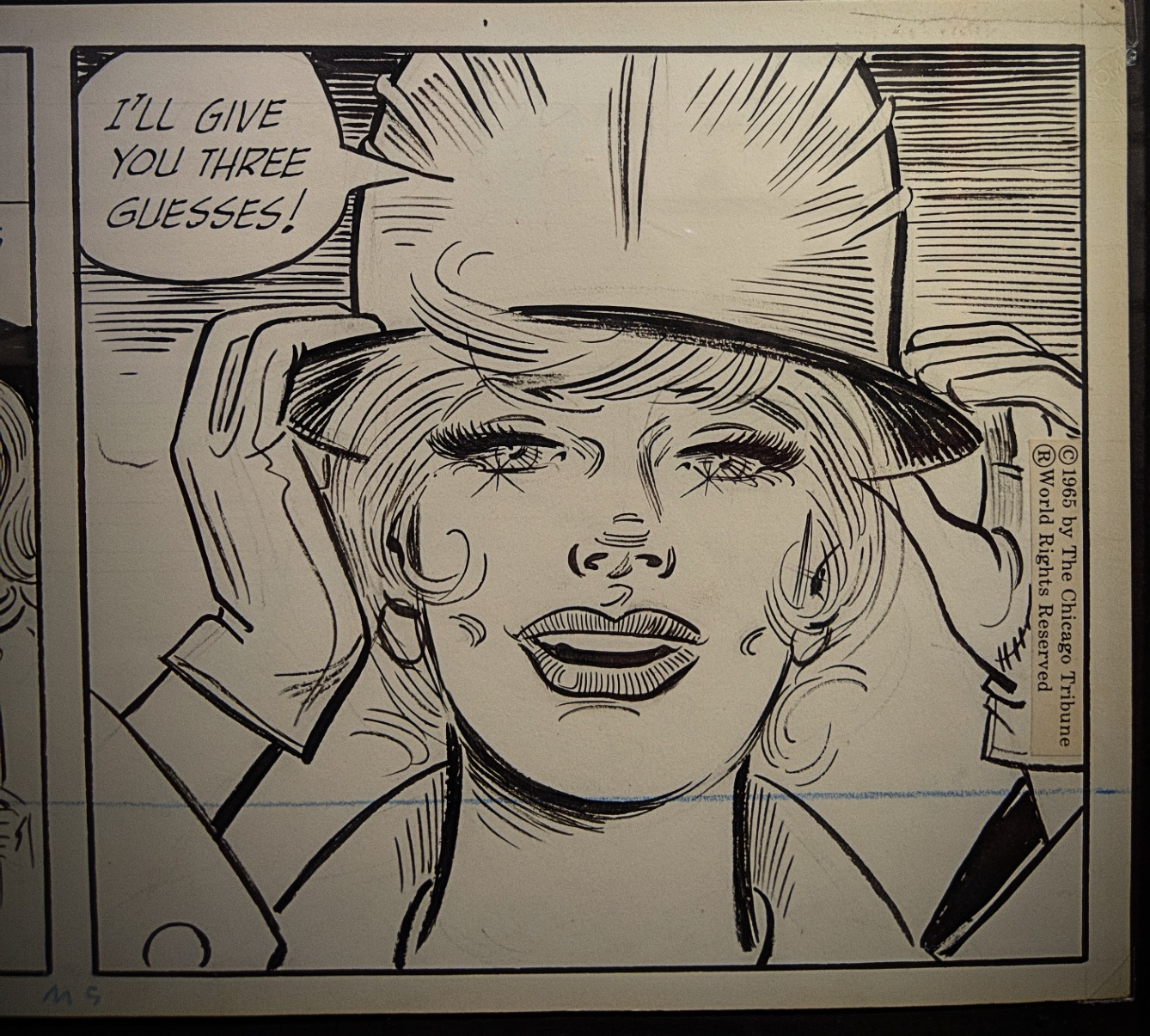
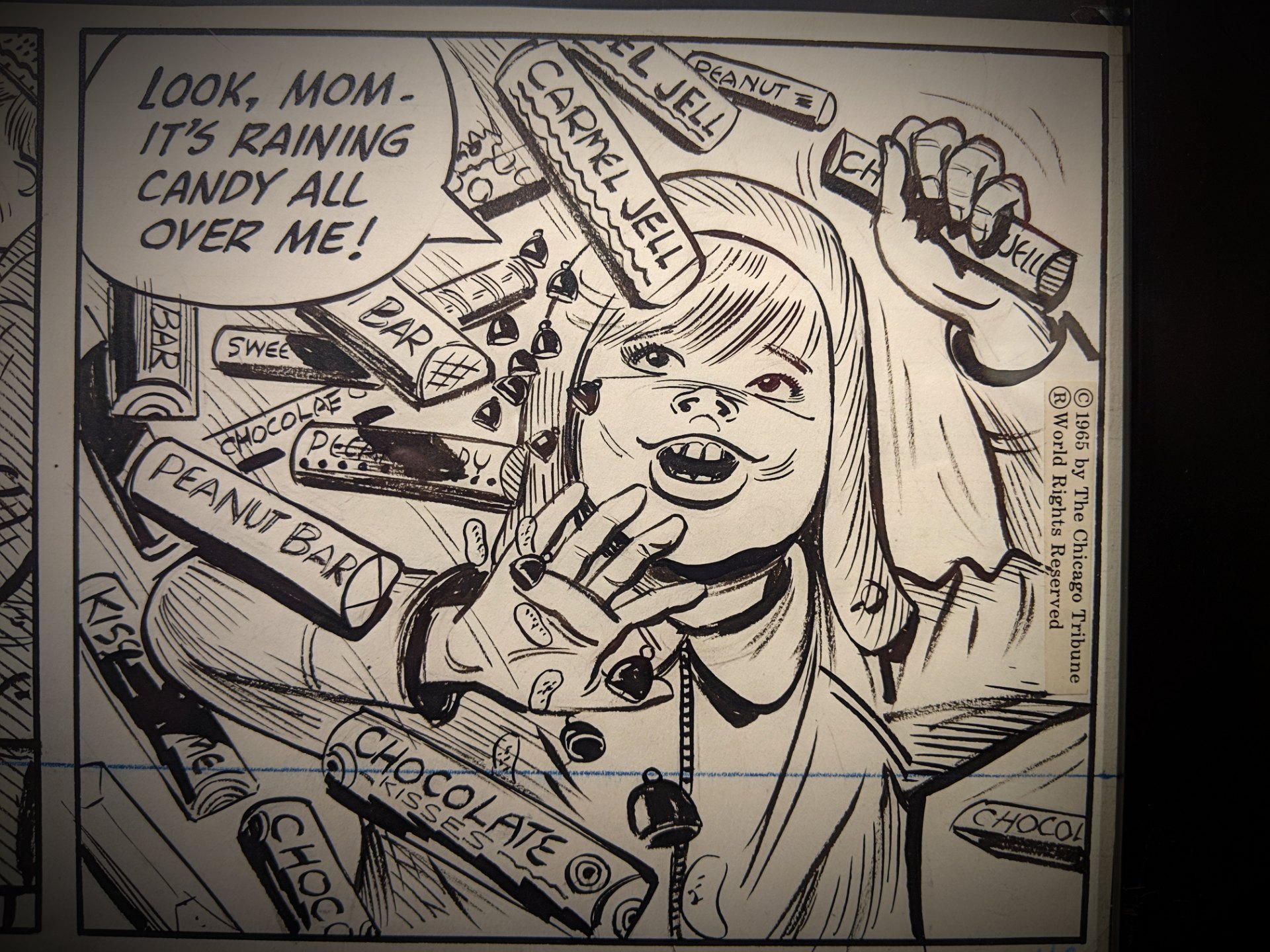
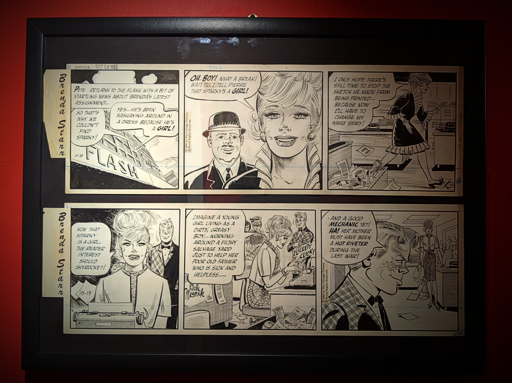

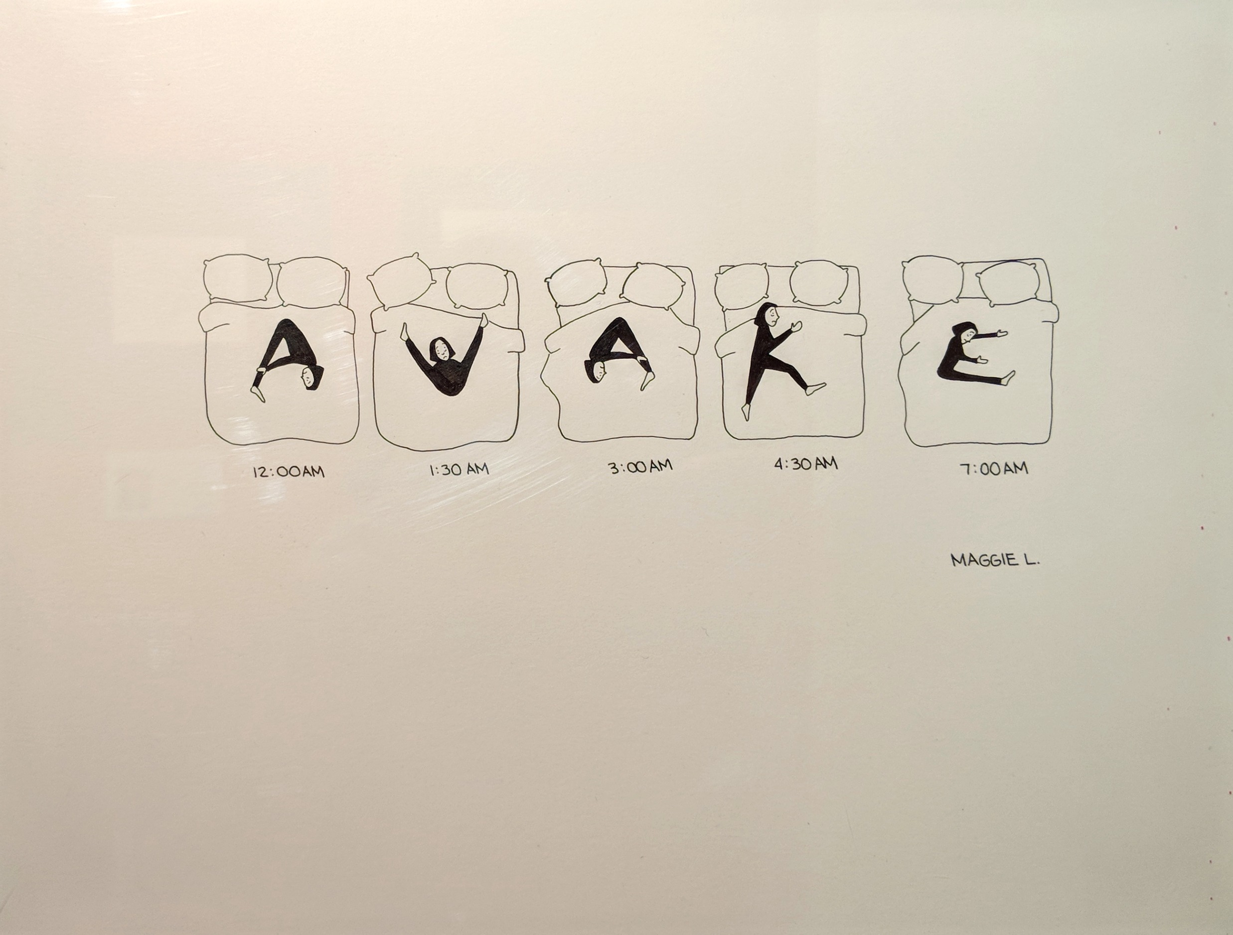
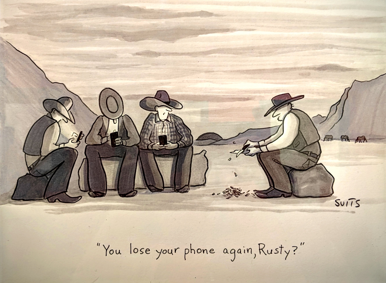
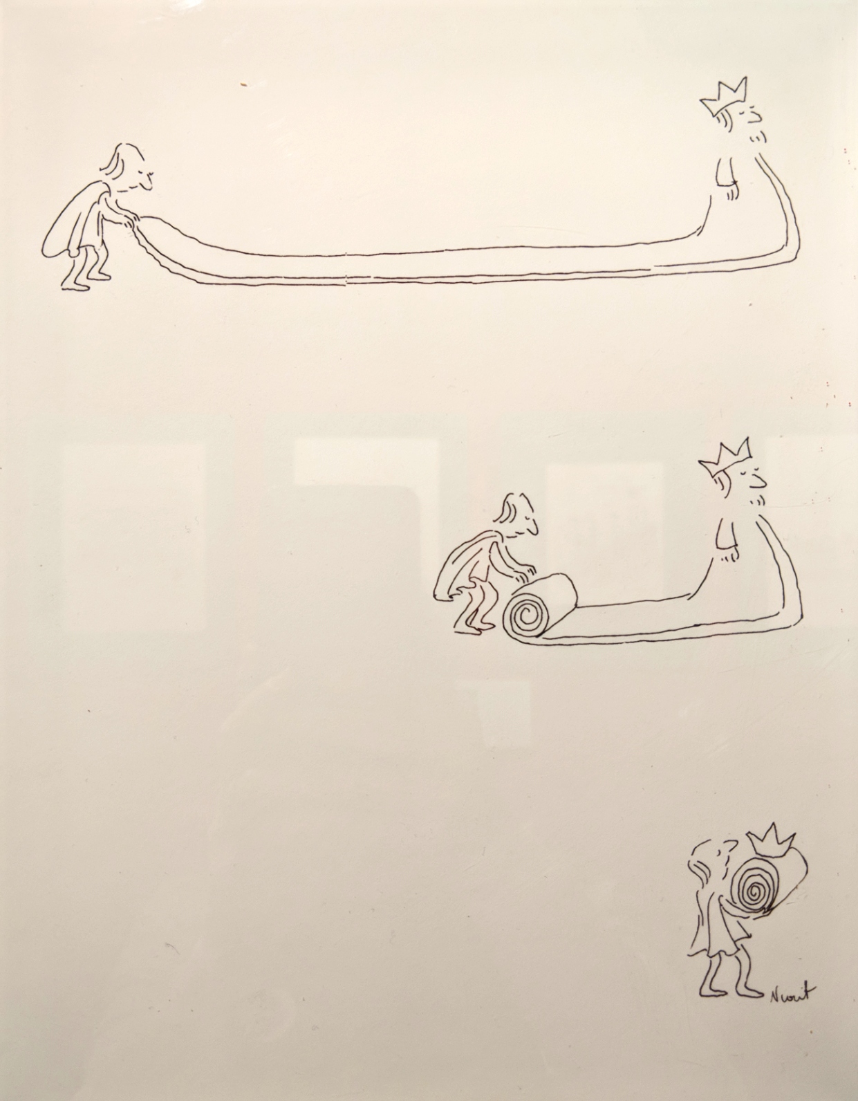
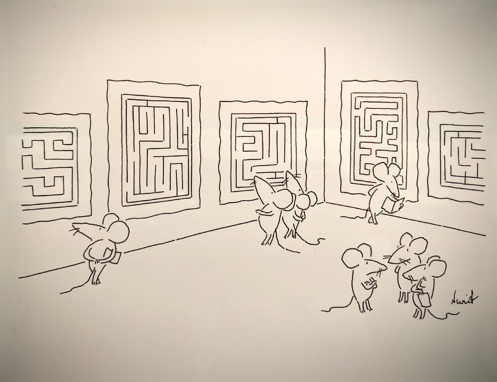
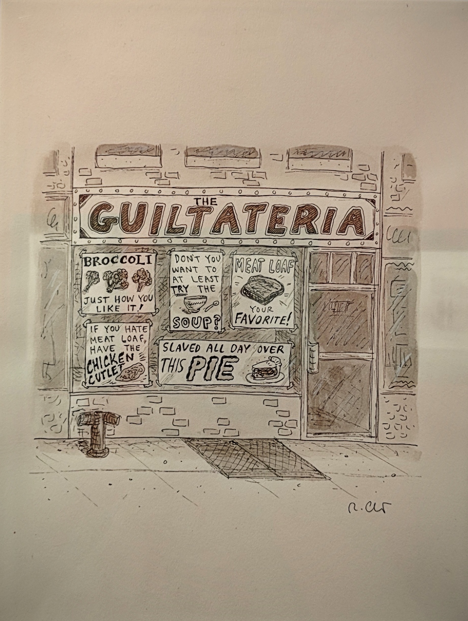
Random squares from an exhibition @ The Society of Illustrators
February 9th, 2019
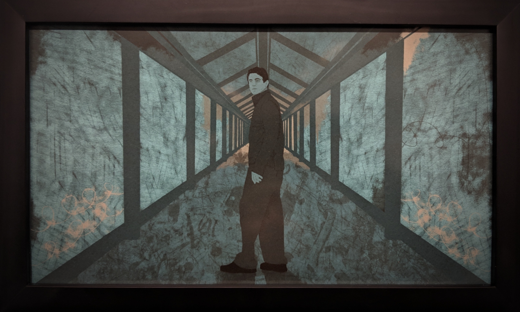
Rebecca Hendin
Lost in A System, Digital
Editorial series, for BBC News
February 9th, 2019
”With the vote won in 1920, and a new found freedom, many women moved to the city to find work. In 1925, journalist Harold Ross and his wife Jane Grant, a reporter for the New York Times, created The New Yorker, a humor magazine for the urban elite. When Ross began to look for talent to contribute to this new endeavor, he sought the best. Some of the best included cartoonists who were women; with the support of The New Yorker, they became some of the most heralded cartoonists the art form has known.” [source]

*Eleonora Duse (1858-1924) was an Italian actress, often known simply as Duse. She is regarded as one of the greatest actresses of all time, noted for her total assumption of the roles she portrayed.”
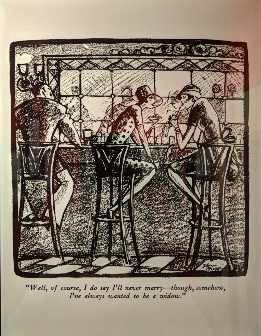

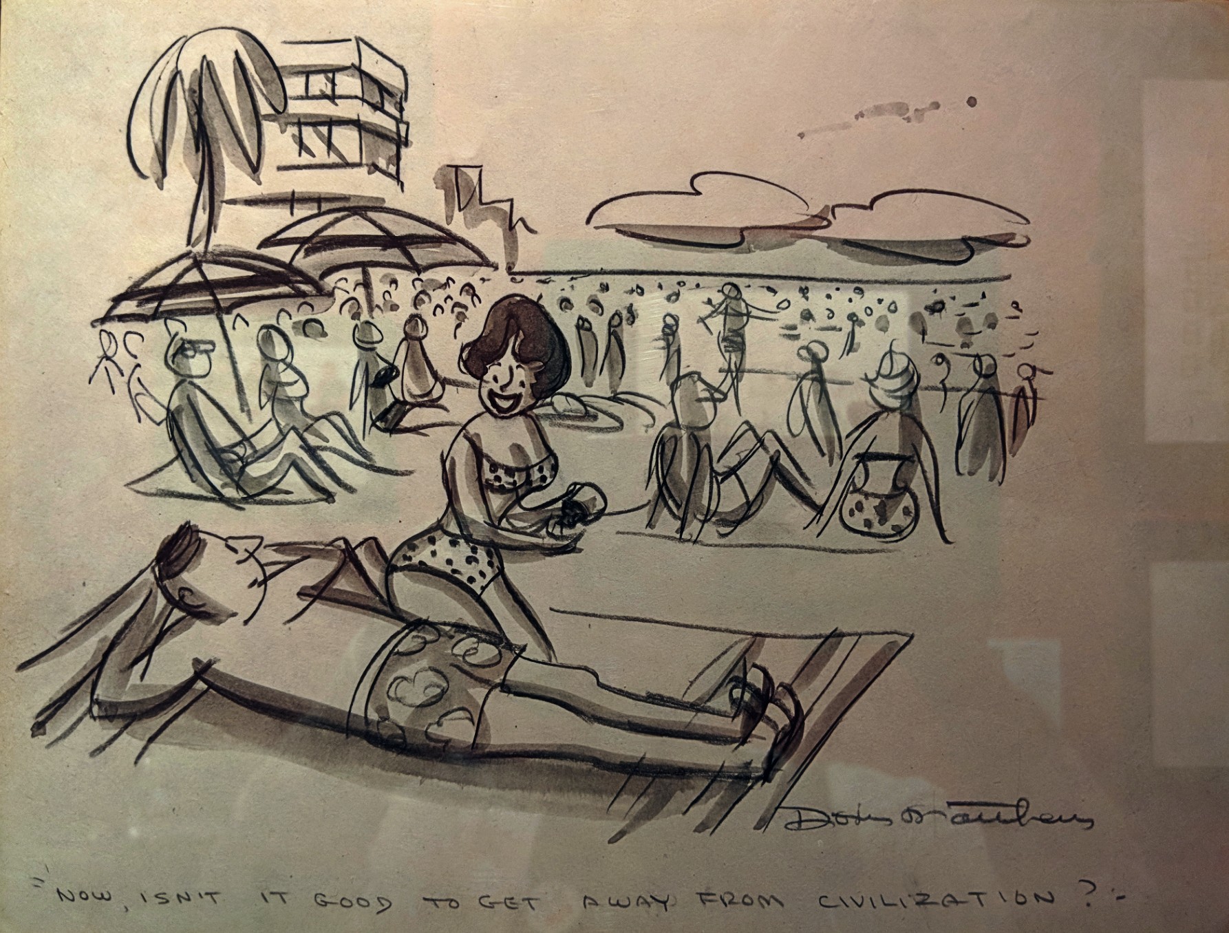

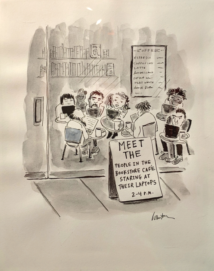

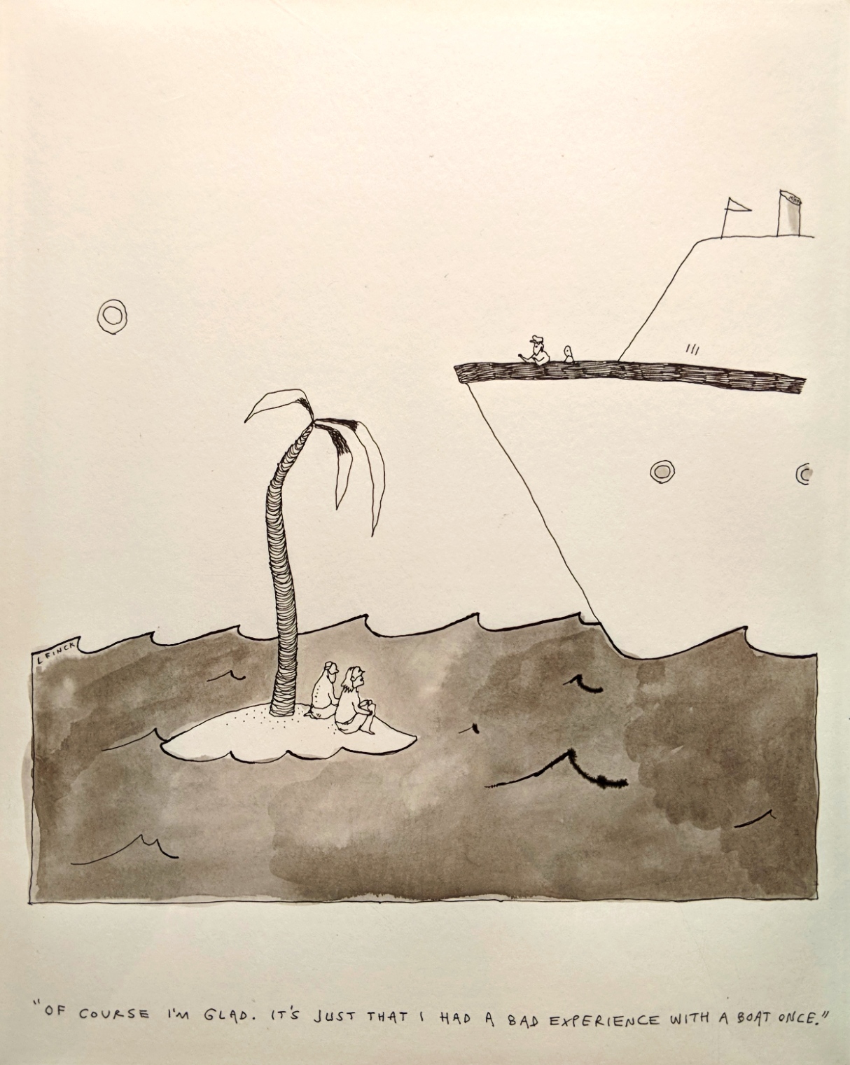
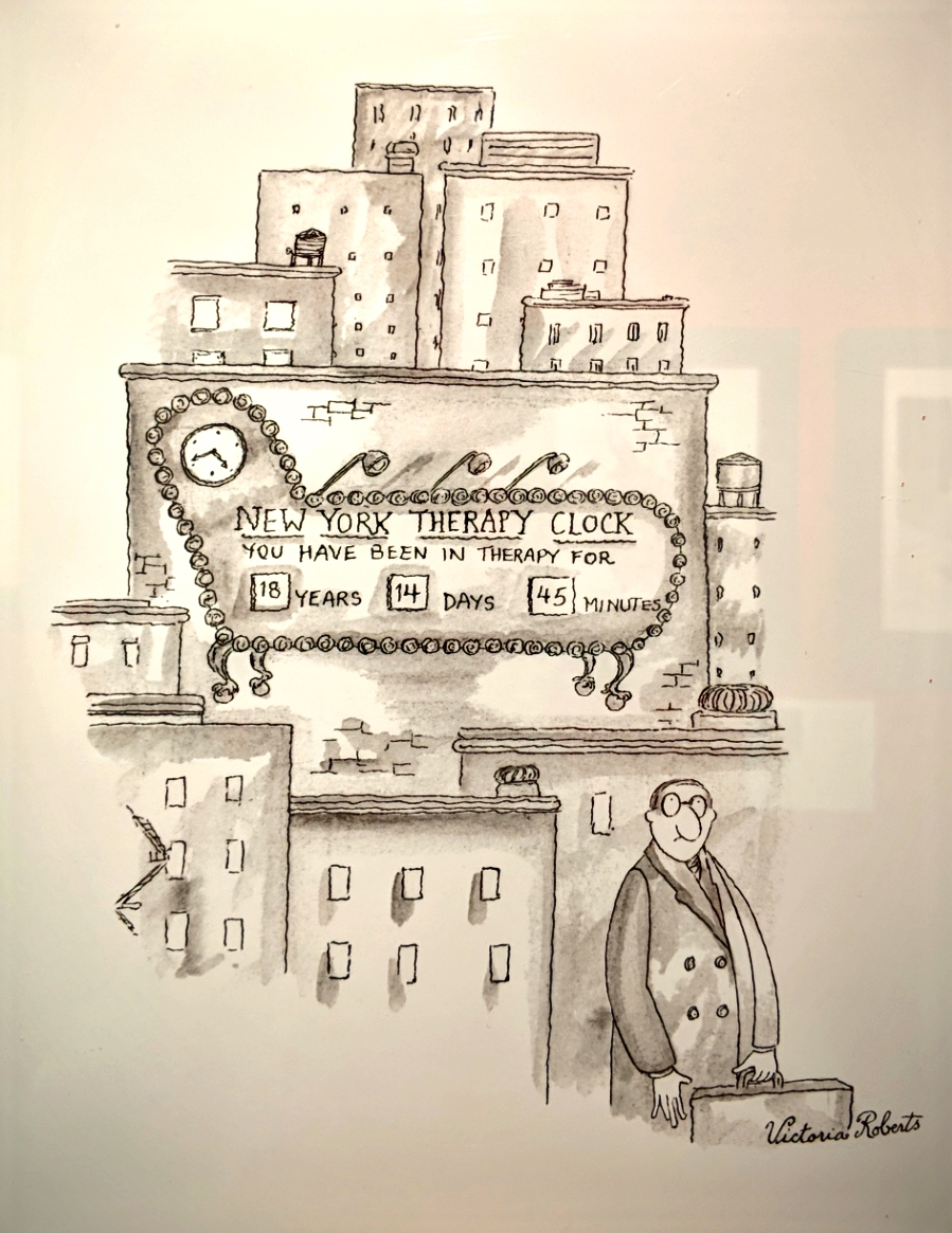
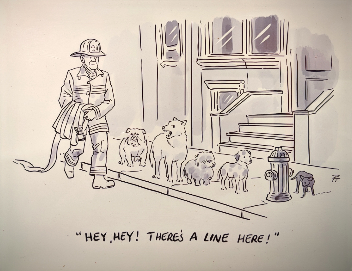
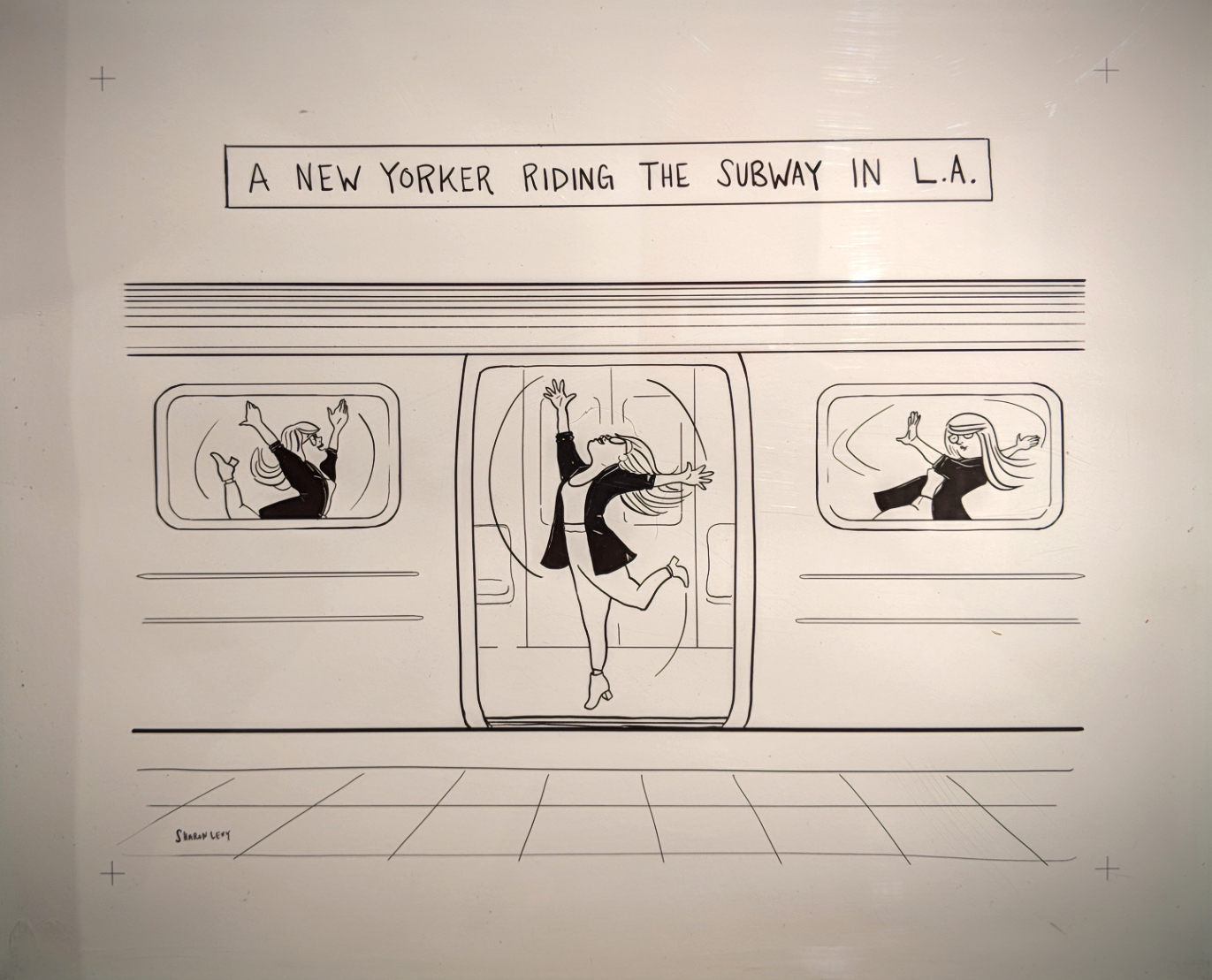


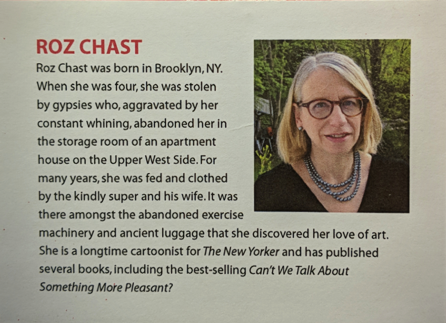
These were just a few of the many talents showcasing their work in this exhibition, their creative, witty personalities expressed in their cartoons and beyond – as in Roz Chast’s bio, above.
All of the cartoons shown in the exhibition were published in The New Yorker magazine, © The New Yorker & the artist. The majority of art is the property of the cartoonist.
The Society of Illustrators
July 28th, 2018
Original art from the Museum of Illustration
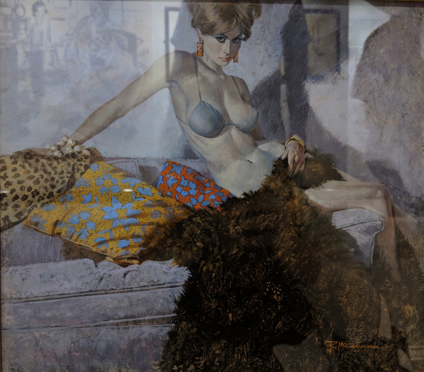 The Scrambled Yeggs by Robert McGinnis
Cover illustration for the story by Richard Prather
Fawcett Gold Medal Books, 1960, 1968
Designers Colours and Casein White on hot press illustration board
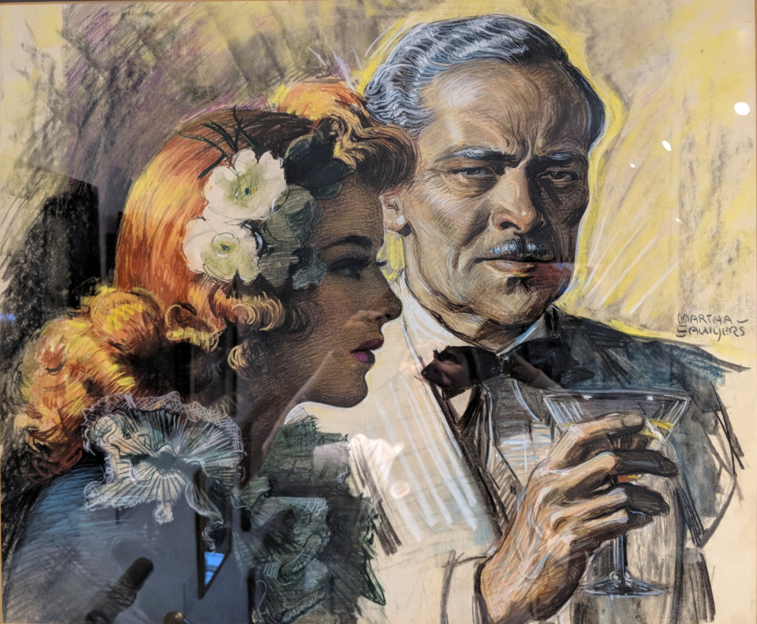 Cafe Sinister by Martha Sawyers
Illustration for the story of the same name by Ben Hecht
Caption: ”I noticed a few evenings later that the baron had a different girl with him. ‘Well, we’ve got a new clue,’ I said. ‘We’ve found out the baron has a redhead fetish.”’
Collier’s magazine, August 21, 1943
Pastel
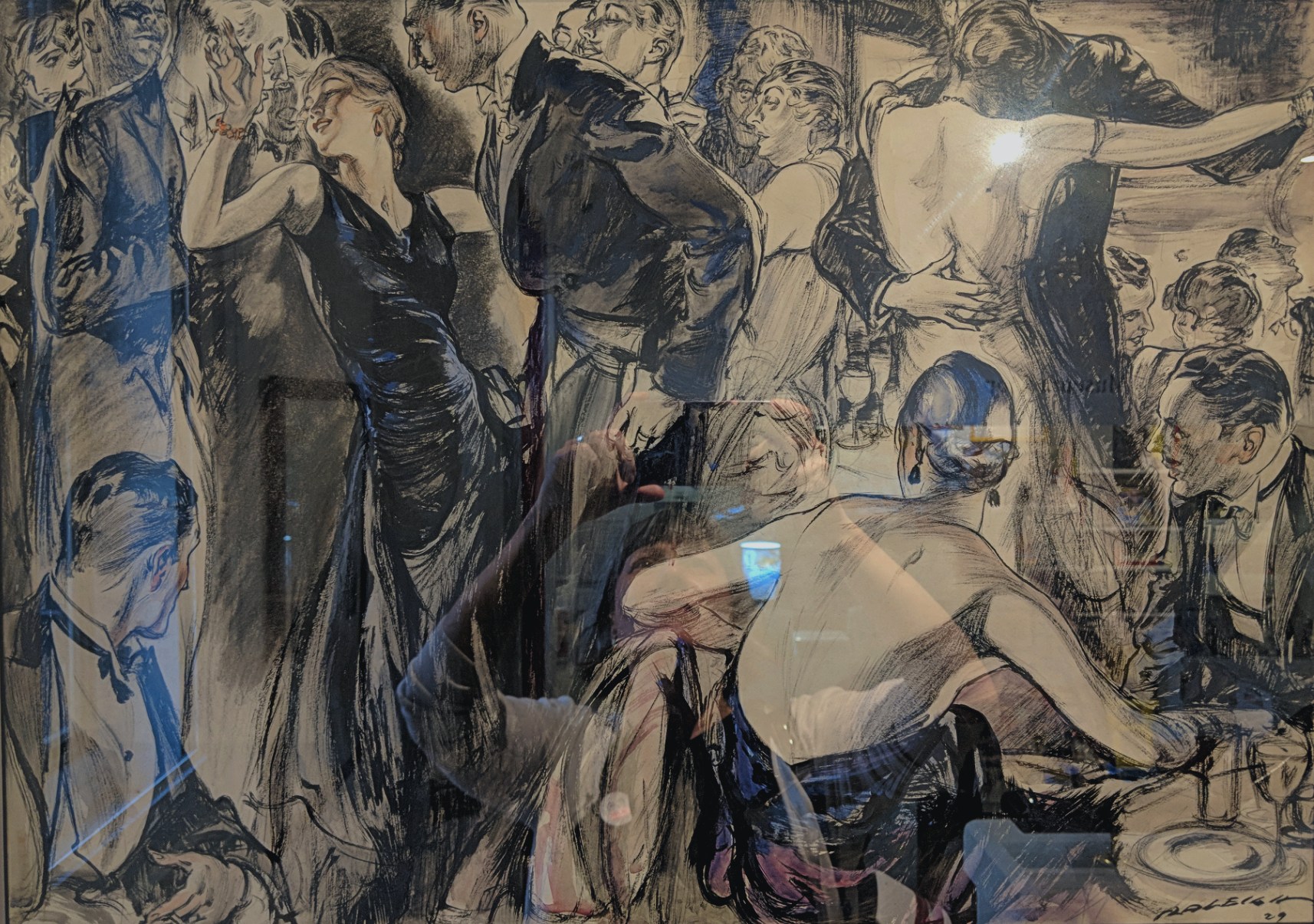
 Hail and Farewell by A. Carter
Illustration for the story by Williston Rich
The American Magazine, December 1938
Oil on canvas
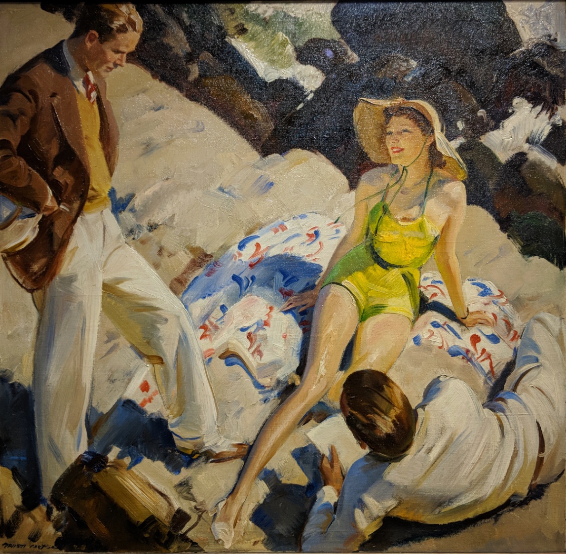
 The Party Dress by Henry Patrick Raleigh
Interior illustration for the serialized novel by Joseph Hergesheimer
Caption: ”Lea cut in on Francis. ‘Against my better judgement,’ he said to Nina, ‘I am obliged to tell you are a sweet affair.’ Nina was in a glow of triumph. What especially engaged her was the fact that men rather than women spoke of her dress and praised it.”’
Hearst’s International combined with Cosmopolitan, November 1929
Ink and watercolour on illustration board
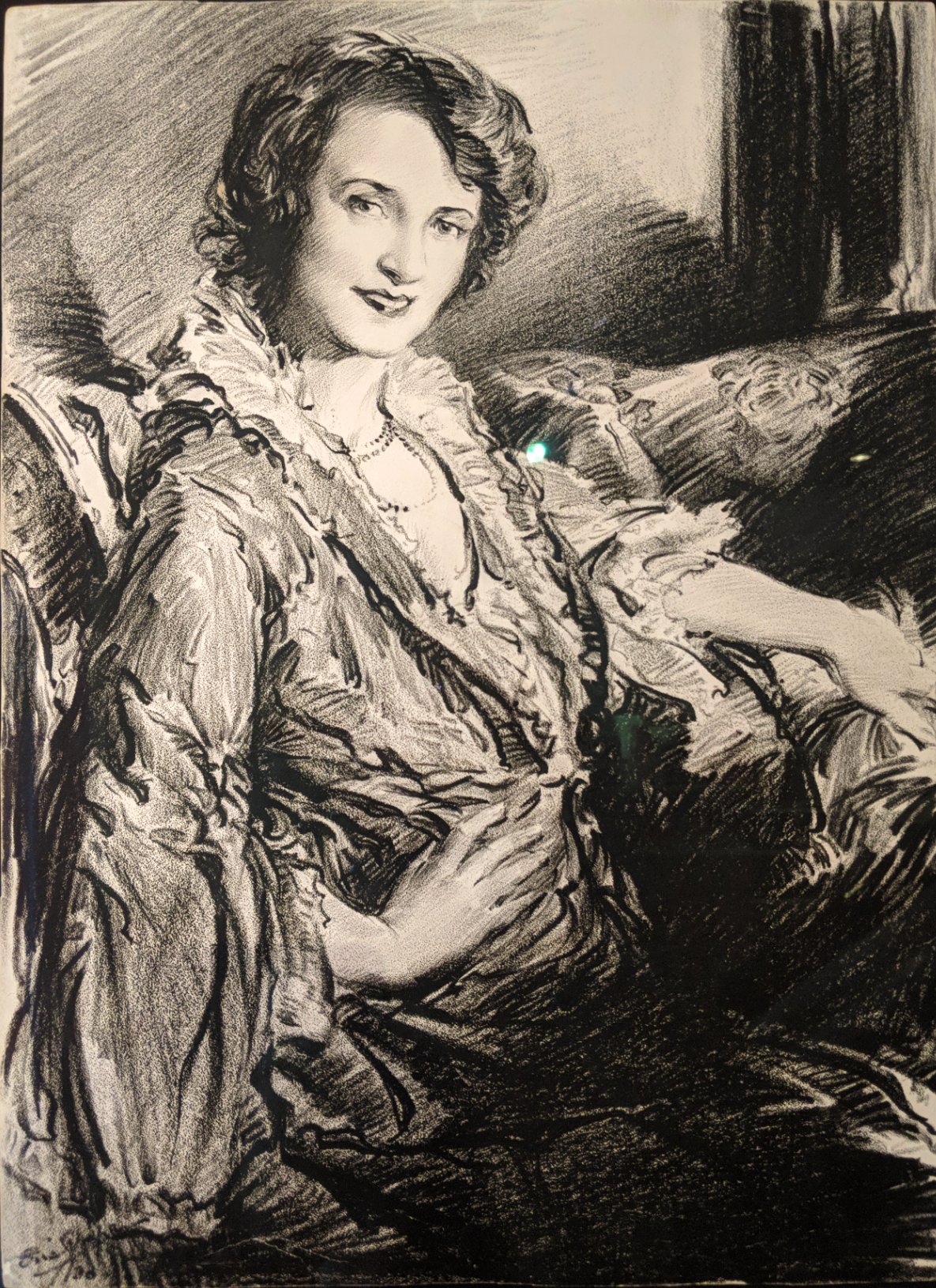 Portrait of Billie Burke by Frederic L. ”Eric” Pape
Published in the theatre section of the Sunday New York Herald Tribune, advertisement for ”The Truth Game”, December 28, 1930
Litho crayon on paper
Society of Illustrators
July 28th, 2018
For all the Marvelites out there…!
 Daredevil King-Size Special #1
Electro, and the Emissaries of Evil! – 1967
Written by: Stan Lee || Penciled by: Gene Colan
Inked by: Marie Severin || Lettered by: Sam Rosen
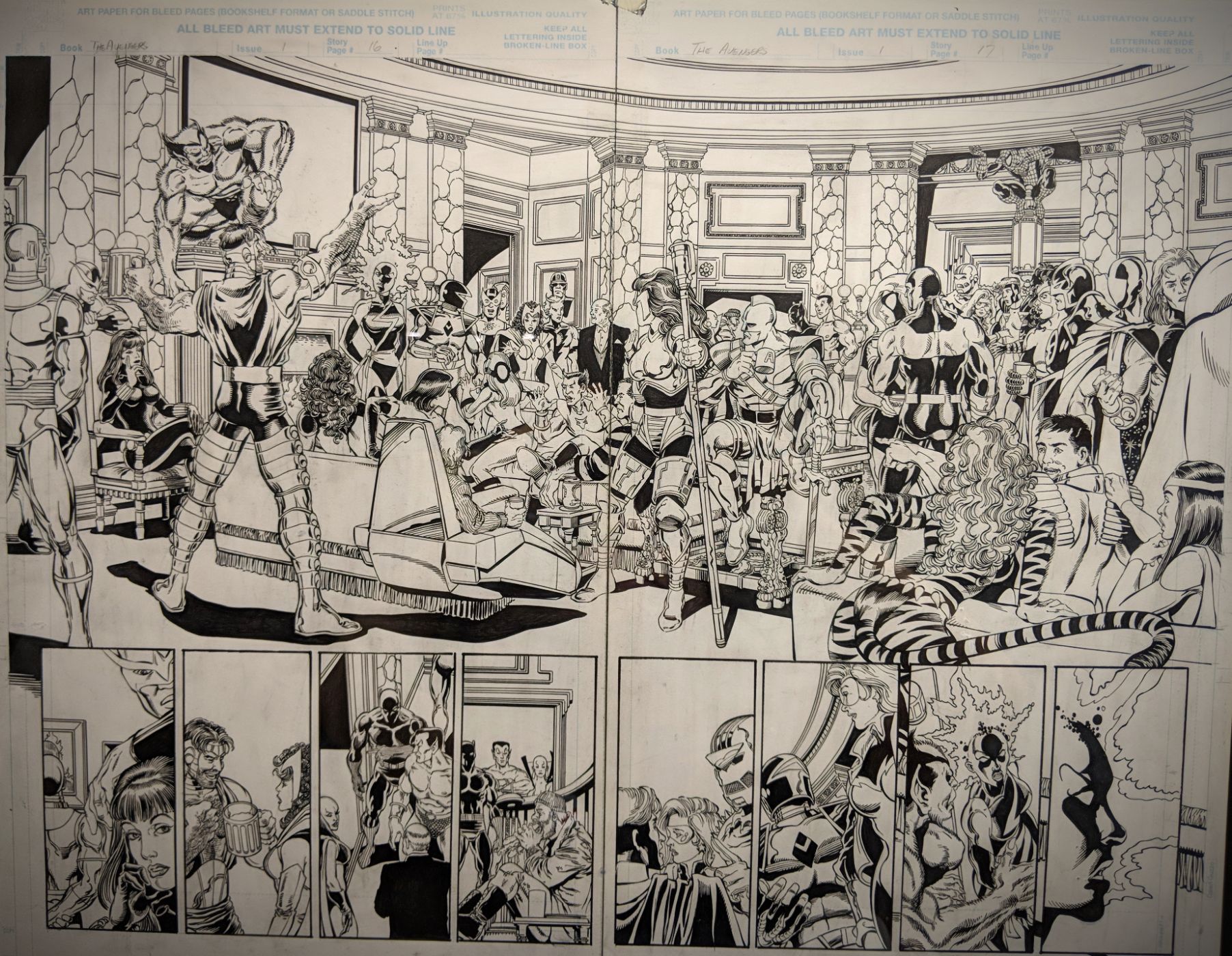 The Avengers #1
Once an Avenger… Page 16-17 – 1968
Written by: Kurt Busiek || Penciled by: George Pérez
Inked by: Al Vey || Lettered by: Richard Starkings
 Marvel Knights = Black Widow #1
The Itsy-Bitsy Spider 1/3: ”Uninvited” Cover – 1999
Written by: Devin Grayson || Art by: J.G. Jones
Lettered by: Richard Starkings
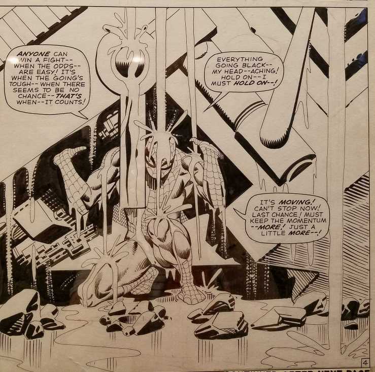
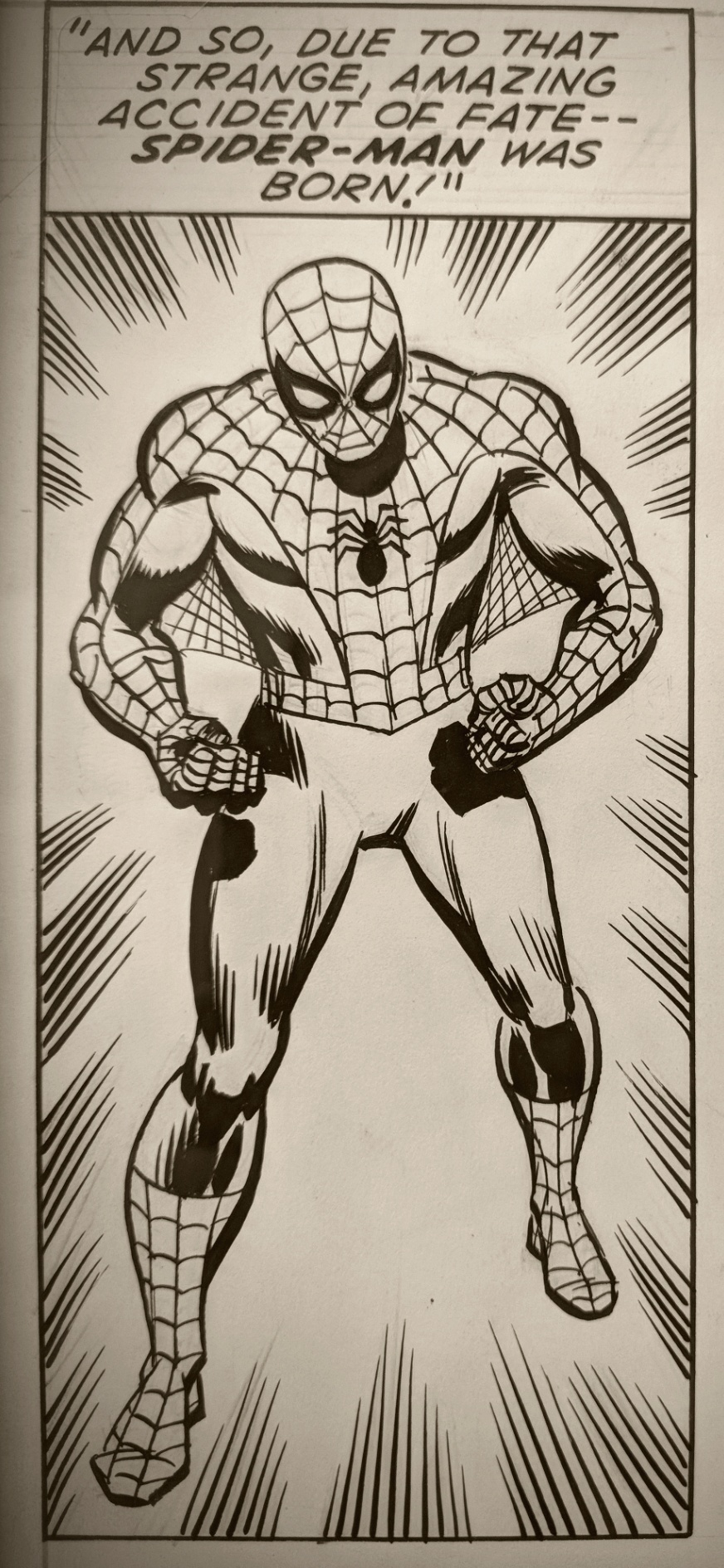 The Amazing Spider-Man #94
On Wings of Death! Page 4 – 1971
Written by: Stan Lee || Penciled by: John Romita Sr.
Inked by: Sal Buscema || Letter by: Artie Simek


 The Amazing Spider-Man #94
On Wings of Death! Page 6 – 1971
Written by: Stan Lee || Penciled by: John Romita Sr.
Inked by: Sal Buscema || Letter by: Artie Simek
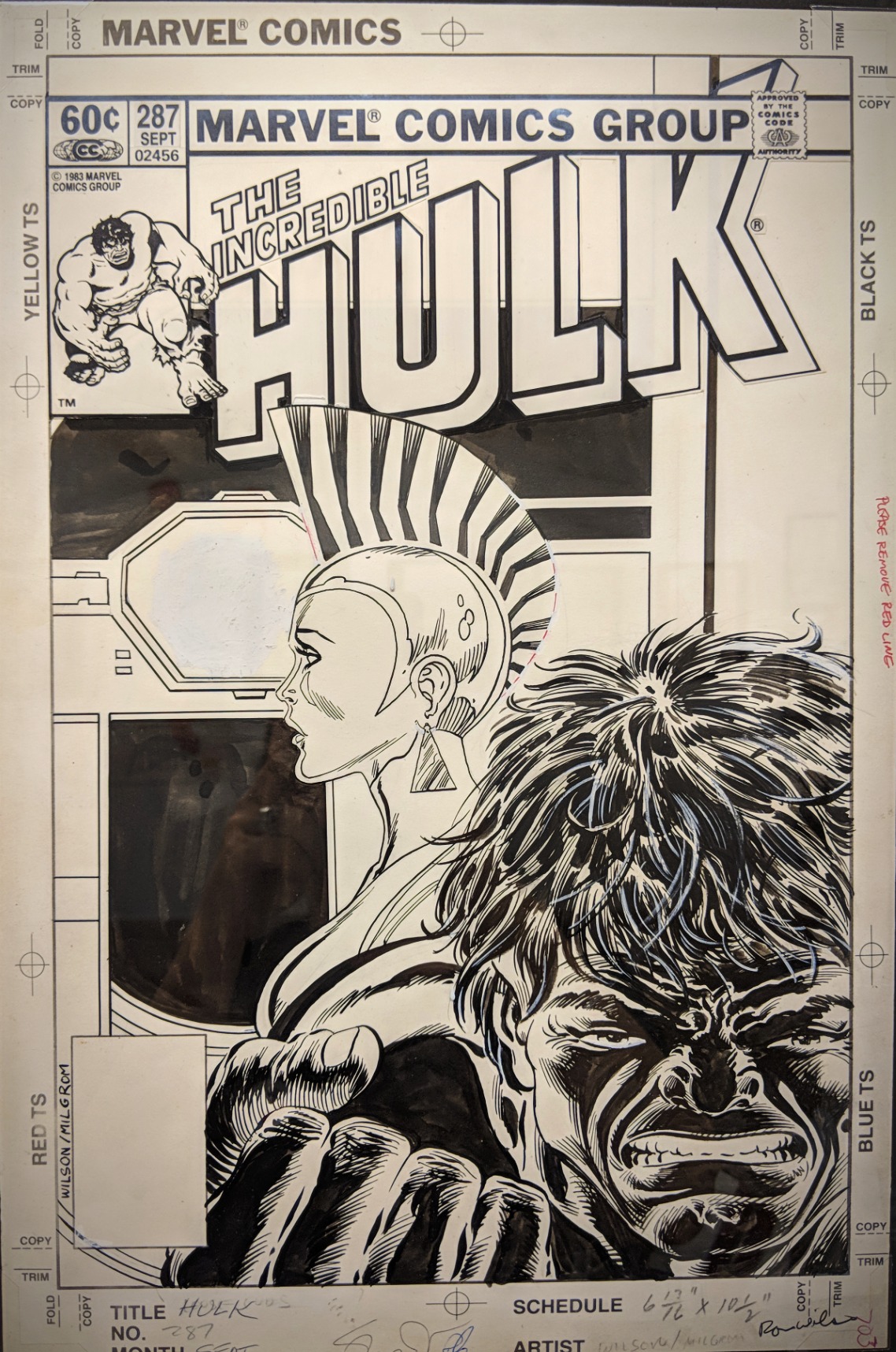 The Incredible Hulk #287
Loose Ends Cover – 1983
Written by: Bill Mantlo || Penciled by: Ron Wilson
Inked by: Al Milgrom || Lettered by: Jim Novak
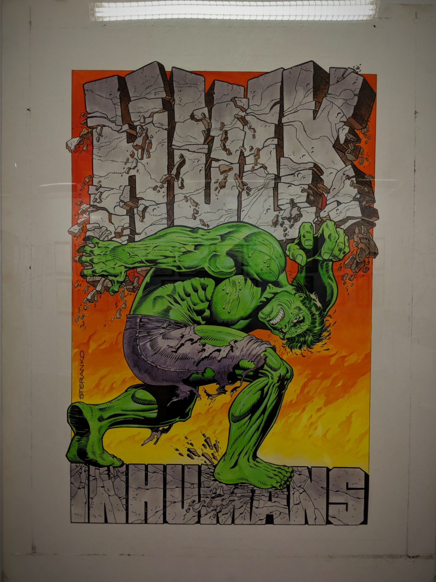 Incredible Hulk Special Vol 1
Battles the Inhumans (Preliminary) – 1972
Art by: Jim Steranko
 Avengers Assembled – Private Commission, 2009
Art by: John Byrne
 The Mighty Thor #159
The Answer at Last! Page 20 – 1968
Written by: Stan Lee || Penciled by: Jack Kirby
Inked by: Vince Colletta || Lettered by: Sam Rosen

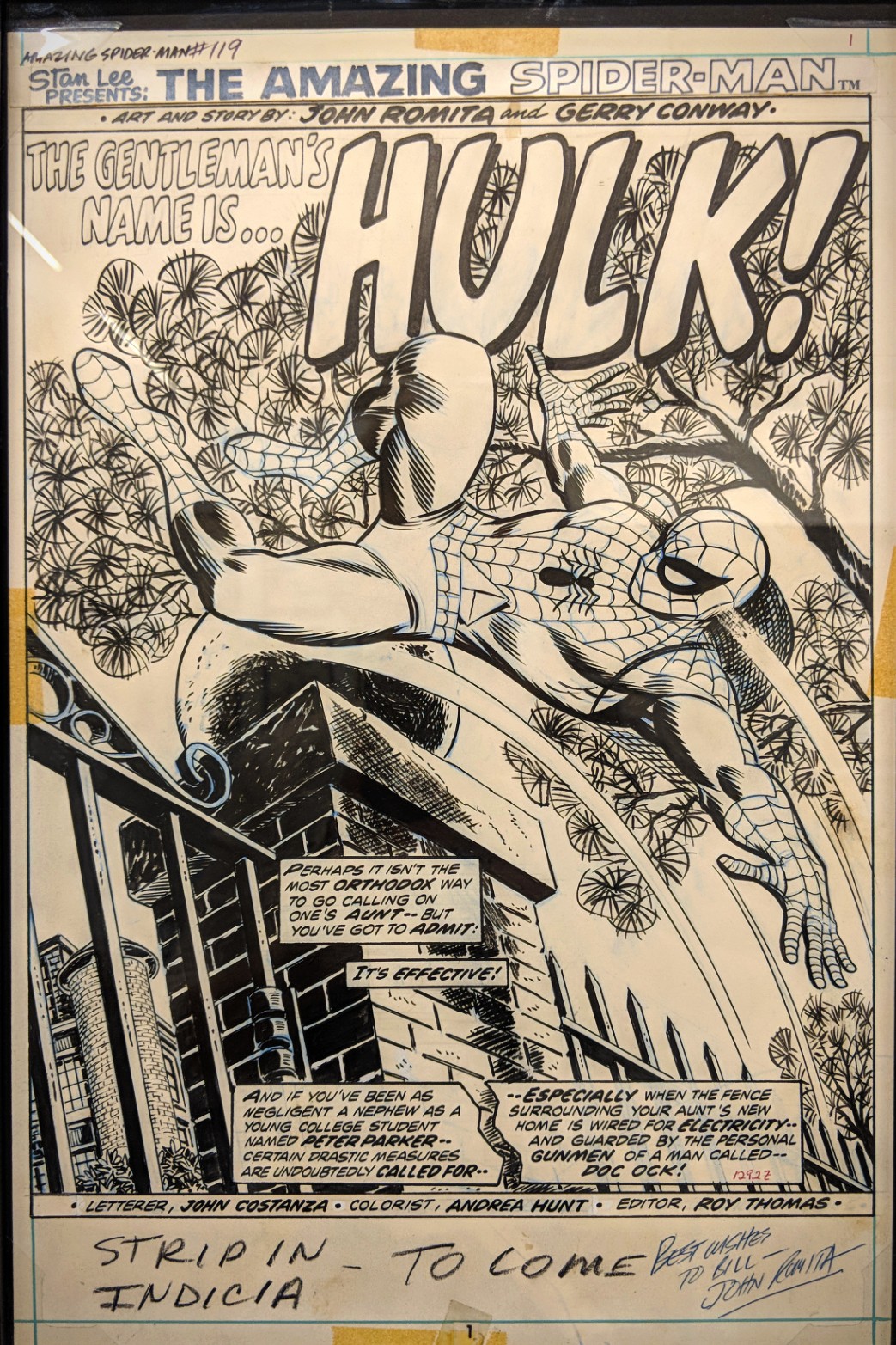 The Amazing Spider-Man #119
The Gentleman’s Name is… Hulk! Page 1 – 1973
Written by: Gerry Conway || Art by: John Romita Sr.
Lettered by: John Costanza

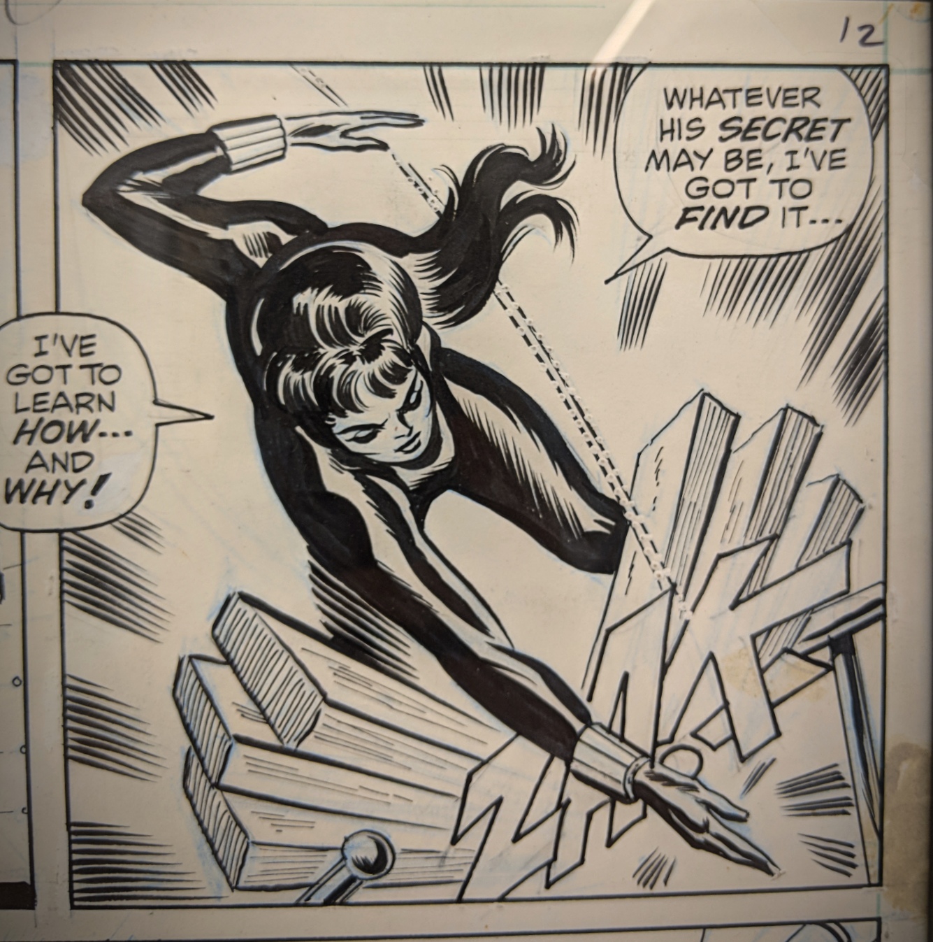
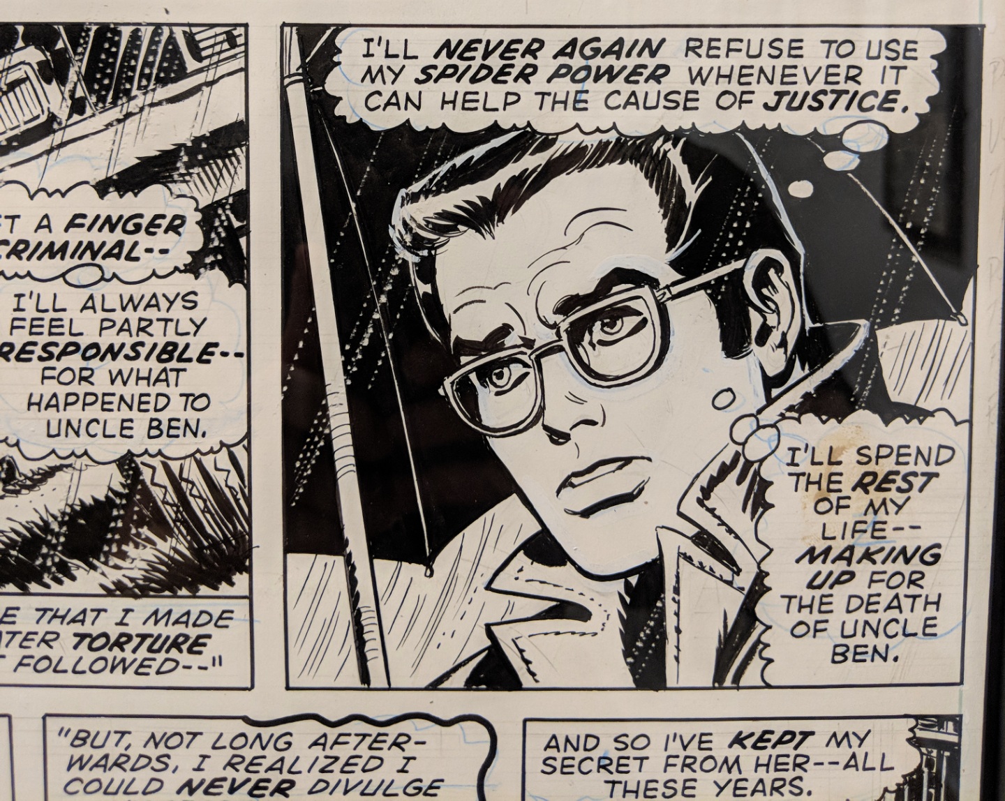
 The Amazing Spider-Man #86
Beware… The Black Widow! Page 9 – 1970
Written by: Stan Lee || Penciled by: John Romita Sr.
Inked by: Jim Mooney || Lettered by: Sam Rosen

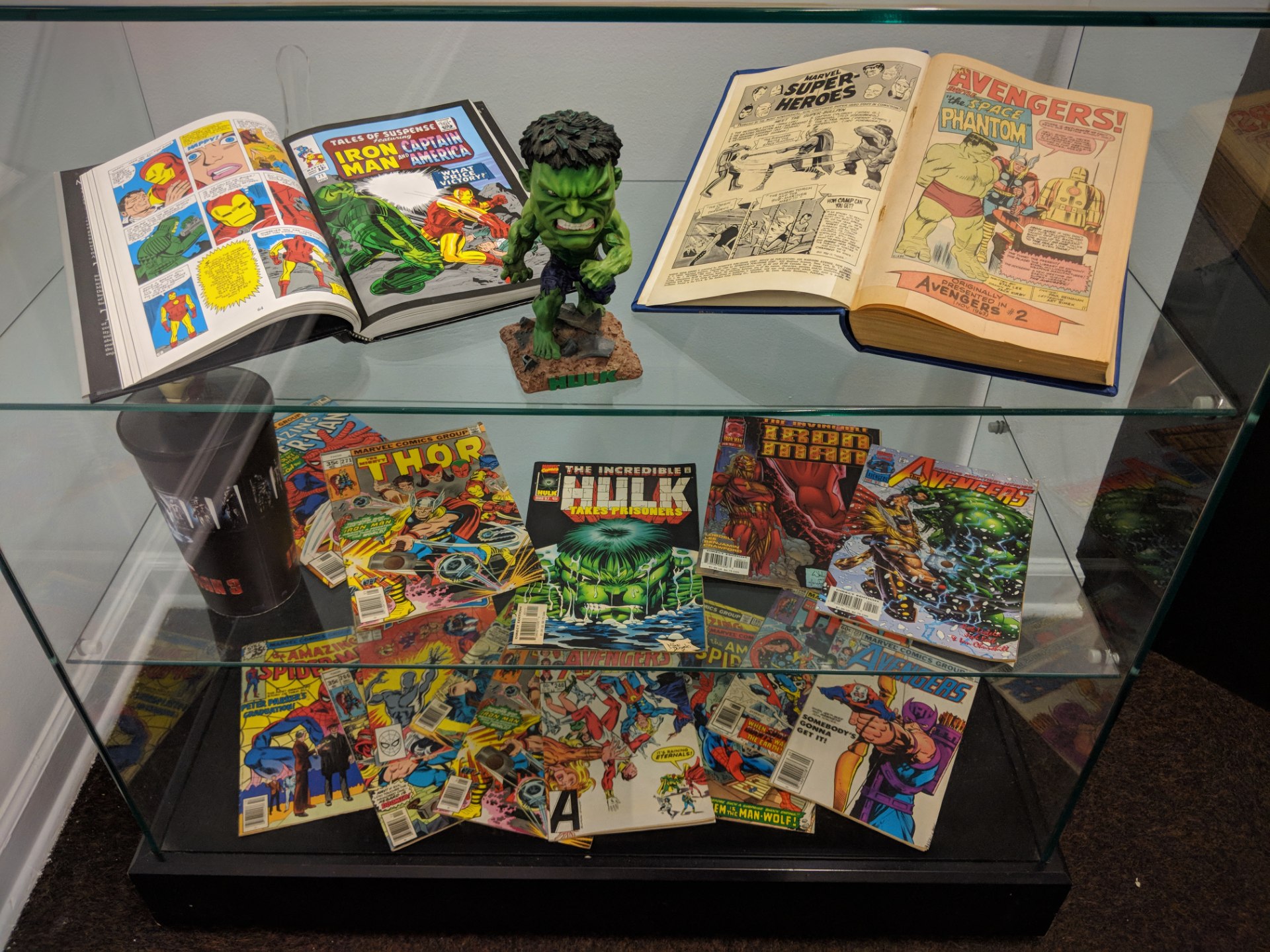
From an exhibition at the Society of Illustrators with original artwork showcasing characters from the Marvel Universe, featuring the Avengers and other heroes. It run between July – October 2018.
July 28th, 2018
In five scratchboard illustrations and one gouache.
In his 35-year career, Virgil Finlay produced over 2,600 illustrations, a remarkable achievement considering his labor-intensive and time-consuming drawing style.
”Instead of the typical pen and ink or carbon pencil drawings produced by most pulp illustrators, Finlay used a unique technique combining scratchboard—in which a clay-covered board is coated with black ink and the artist scratches away white lines from the black using a sharp blade—with intricate pen cross-hatching and an astonishingly painstaking method of creating tones called stipple.
Contrasted with hatching, or crossed lines, stippling is a time-consuming process in which tones are created with hundreds of tiny individual dots, carefully placed and dripped off the end of an ultra-fine dip pen, one dot at time.” [source]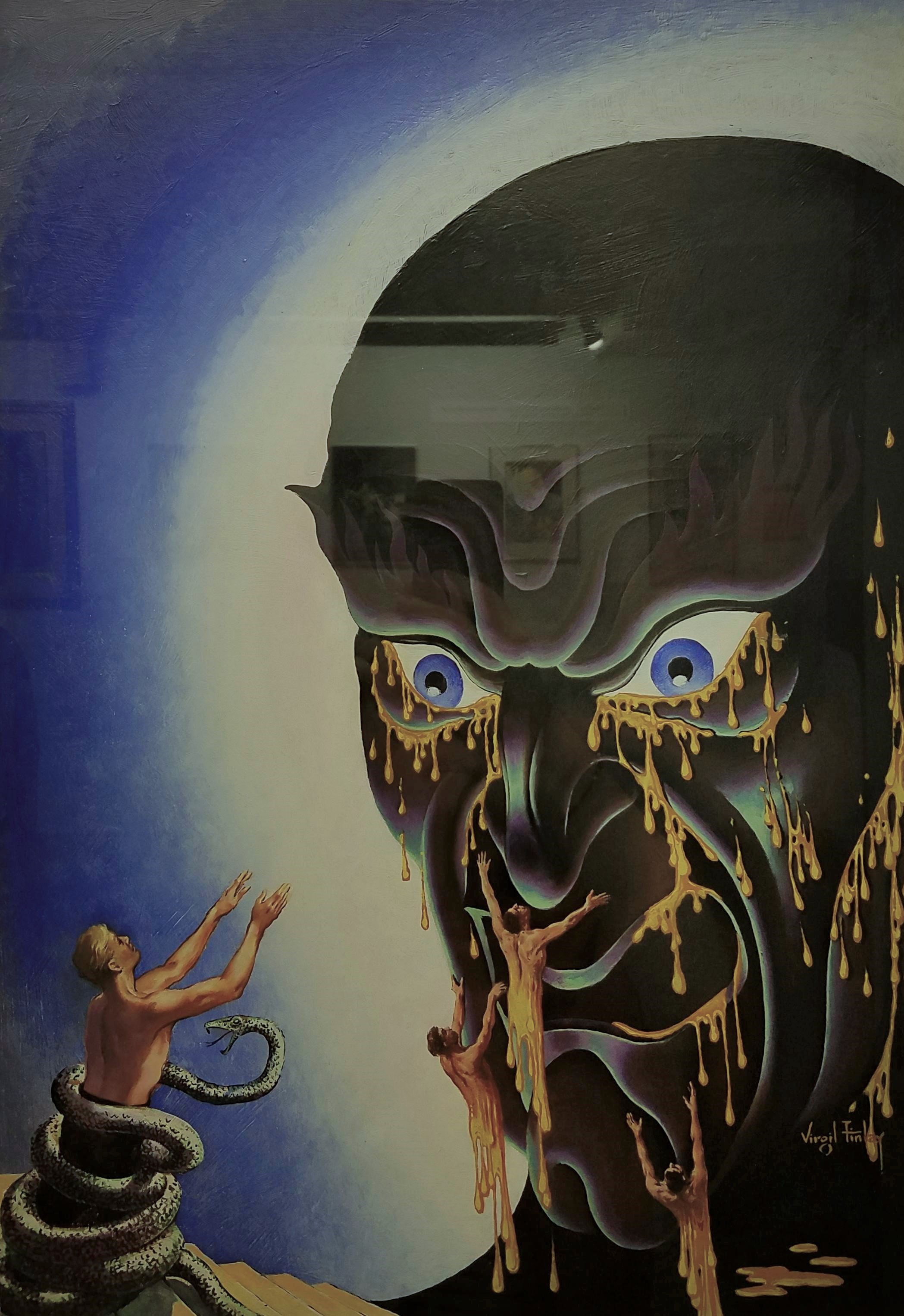 Face in the Abyss
Gouache on illustration board
Appeared on the cover of Famous Fantastic Mysteries magazine for ”Face in the Abyss” by A. Merritt, Frank A. Munsey Co., October 1940
”He came out of his coma. We left a sketch pad and pencils by the bed. He did a drawing, he went back into the coma, and died.”– Lail Finlay, Virgil Finlay’s daughter

 Three Against the Stars
Scratchboard, pen and ink
Interior illustration in Fantastic Novels Magazine for ”Three Against the Stars”, by Eric North, New Publications, Inc., May 1950
 The Lovers
Scratchboard, pen and ink
Appeared in Startling Stories magazine for ”The Lovers” by Philip José Farmer, Better Publications, August 1952
For the first time in science fiction history an Earth man and an alien woman have a sexual love affair in Philip José Farmer’s ”The Lovers”. This was quite groundbreaking yet controversial in 1950s American pop culture; however, it would seem quite tame compared to today’s science fiction books and films.
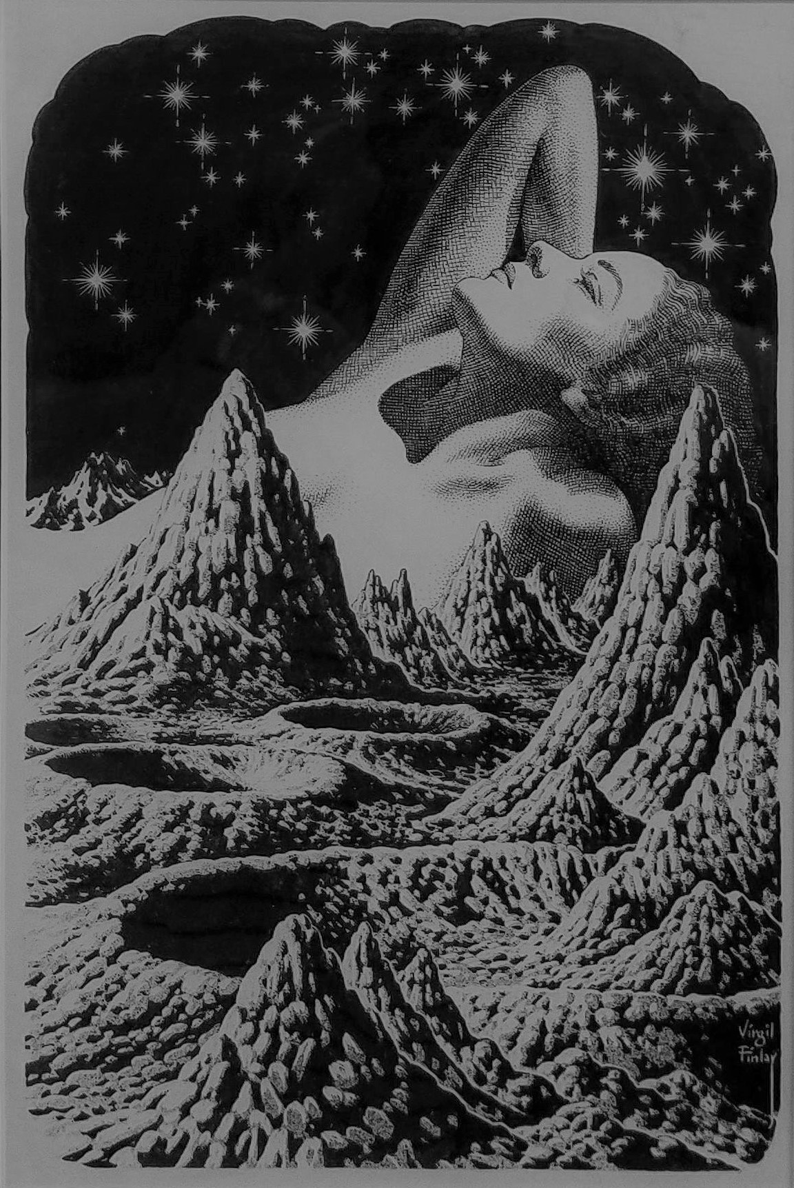 Woman reclining in lunar landscape, c. 1955
Scratchboard, pen and ink
 Conquest of the Moon Pool
Scratchboard, pen and ink
Interior illustration in Fantastic Novels magazine for ”Conquest of the Moon Pool” by A. Merritt, New Publications, September 1948
From ”Conquest of the Moon Pool”:
”… and suddenly there before us stood two figures! One was a girl – a girl whose eyes were golden… whose softly curved lips were red as the royal coral and whose golden-brown hair reached to her knees! And the second was a gigantic frog – a woman frog… six feet high if an inch and with one webbed paw of its short, powerfully muscled forelegs resting upon the white should of the golden-eyed girl!”
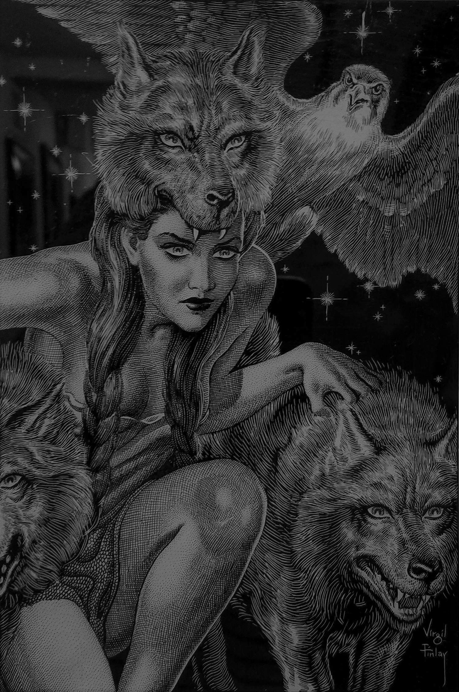 Lur the Witch Woman with Her Consorts, Dwellers in the Mirage
Scratchboard, pen and ink
Appeared on the cover of Fantastic Novels for ”Dwellers in the Mirage”, written by A. Merritt, Frank A. Munsey Co., NY, April 1941
”Dwellers in the Mirage” introduction:
”The strangest adventure any man had encountered since time began faced Leif Langdon when he tumbled through that Alaskan mirage into a lost world.”
Adenturer Leif Langdon stumbles upon an uncommonly warm, hidden Arctic valley where he finds and falls in love with Evalie. Also in this valley are the Little People – elfin warriors fighting against Lur the Witch Woman and her demon riders who raid the Little People’s land for sacrifices to Kraken, their dark lord. Tapping into buried memories of another lifetime, Langdon realizes he had a past life as Kraken and as Lur’s lover. So begins Langdon’s inner struggle between his two selves.
All artwork by Virgil Finlay (1914 – 1971), photographed at the Society of Illustrators
August 15th, 2017
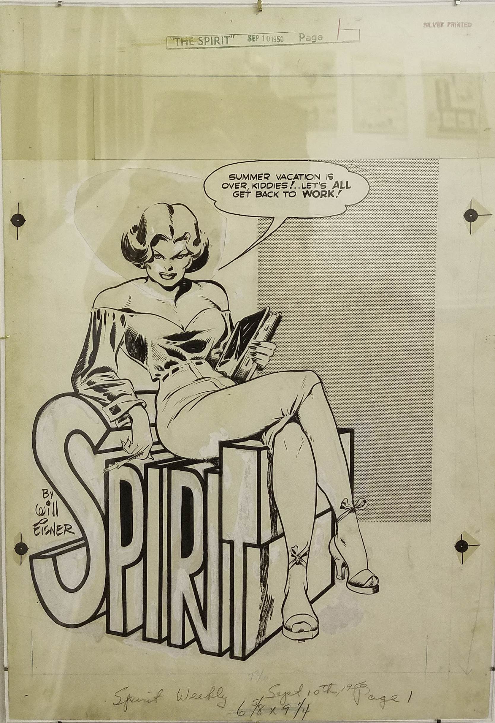 The Spirit: ”Teacher’s Pet” page 1
September 10, 1950
Ink on paper
From WILL EISNER: The Centennial Celebration 1917-2017 retrospective @ the Society of Illustrators.
June 3rd, 2017
The legendary Steve Ditko passed away late last month (found unresponsive in his Midtown apartment on June 29, 2018) but reports of his death reached the world only yesterday (July 6, 2018). He was ninety years old.
Rest in Peace Dear Sir. Thank you for your amazing work!
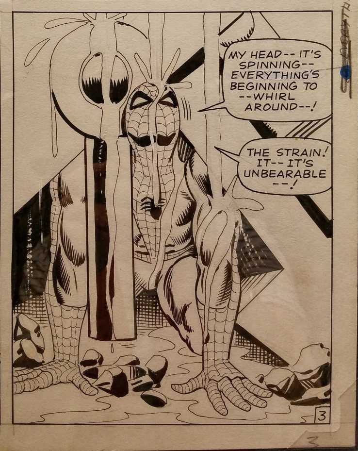
 The Final Chapter – Art by Steve Ditko (1927-2018)
A lot of advertising of that period would, in one way or another, be considered inappropriate or offensive by today’s standards. But, make no mistake: the Cream of Wheat Chef knows exactly what every boy and girl needs and serves it with a smile!
 Edward V. Brewer (1883-1971)
“A Good Start is Half the Journey”
Cream of Wheat advertisement, 1926
Museum of American Illustration, Permanent Collection
Oil paint on canvas
Apparently Emery Mapes, one of the owners of the Diamond Milling Company that produced Cream of Wheat, preferred to hire local talent rather than nationally known illustrators. So, from 1911 to 1926, St. Paul native Edward Brewer was the dominant hand in advertising the porridge. This work, done at the end of his tenure with the cereal maker, typifies the homespun ethos the company wished to convey to the general public, something at which Brewer showed great skill. It was Mapes who originated the concept of ”Rastus” the chef, the logo which had from 1890 to the 1920s appeared as a woodcut image. Brewer developed the image that we see here. It is believed to be the face of a Chicago chef, Frank L. White, who received $5 to model in his chef’s garb and which remains the face of Cream of Wheat today.
The Society of Illustrators
June 3rd, 2017
subjective worldview
Actor, writer, cook and author
Travel experiences & Strasbourg city guide
Writer
joy, happiness, travel, adventure, gratitude
"Rêve onirique & Bulle d'évasion"
makes pretty things on paper
This WordPress.com site is Pacific War era information
Welcome to my curious world of words....
Photographs, music and writing about daily life. Contact: elcheo@swcp.com
Free listening and free download (mp3) chill and down tempo music (album compilation ep single) for free (usually name your price). Full merged styles: trip-hop electro chill-hop instrumental hip-hop ambient lo-fi boombap beatmaking turntablism indie psy dub step d'n'b reggae wave sainte-pop rock alternative cinematic organic classical world jazz soul groove funk balkan .... Discover lots of underground and emerging artists from around the world.
A 365 analogue photography project
Barcelona's Multiverse | Art | Culture | Science
Een digitaal atelier aan de (zee)slag.
‘Doodling Ambiguity’s in Ink.’
Miscellaneous photography
Glimpses along the way on a journey of discovery into symmetry...
